After creating a menu and adding links to it, you may wish to customize the menu’s appearance. This guide will cover common changes you may wish to make to the menu’s design.
In this guide
If your theme uses the Site Editor (i.e., you have Appearance → Editor in your dashboard), you can control the menu design from the Navigation block settings by following these steps:
- From your dashboard, navigate to Appearance → Editor.
- Click anywhere in the preview of your site to open up the editing area.
- Alternatively, select Patterns and choose the header or other template part containing your menu.
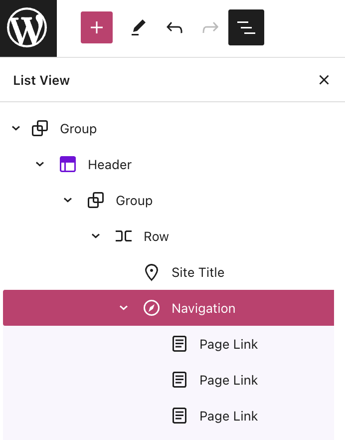
- Open List View at the top-left corner of your screen (it’s the icon that looks like three horizontal lines above each other.)
- Select the Navigation block in the List View.
- View the Navigation block settings on the right side of the screen.
- From here, you can control many aspects of the menu’s appearance, including:
- The text and background color of the menu and its individual links.
- The menu items’ font size, letter spacing, case, and more.
- The space between menu items.
- The appearance of the menu button on mobile.
- Click the Save button to save your changes.
Learn how to use each setting in our Navigation block settings guide.
This video demonstrates how to use the Navigation block settings to edit the colors and text of a menu.
Some themes that don’t use the Site Editor will have limited menu styling options for the menu colors available under Appearance → Customize. To explore these color options, follow these steps:
- Visit your site’s dashboard.
- Go to Appearance → Customize.
- Select “Colors & Backgrounds“, where you may find a series of circles. Each circle determines the color of various elements of your site, such as the link color and background color.
- Each theme is different, so select each circle to explore which elements change color. Choose a new color — the preview window to the right will show you the new color on your site.
- If you are happy with the result, click the “Save Changes” button to apply the new colors to your site.

If the options here do not allow you to achieve your desired colors, check out our fully customizable Site Editor themes.
If you wish to change the position of the menu, consider the following options:
- Use a block theme, which gives you complete control over the placement of elements like your Navigation Menu, Logo, and every other aspect of your site. See Select and Move Blocks for more.
- Use the Pages List block to place a list of pages on any part of your site that accepts blocks.
- Look for a theme that displays the menu in a position you like. The position of a menu is a major factor in your choice of theme, and there’s sure to be a theme that displays the menu in the perfect spot for you. Learn more about switching themes.
A menu on desktop screens typically appears as a list of text links in one line. On smaller screens (tablet and mobile devices), there may not be enough space to show all the text links in a way that mobile visitors can easily tap.
Instead, it’s common to collapse the menu items behind a button that’s called an “overlay” or “hamburger” menu (named because the three horizontal lines resemble a hamburger.)

From the Navigation block settings in the Site Editor, you can adjust the display of the Overlay Menu.
By default, the Overlay Menu is set to display on “Mobile.” You have the option to change the setting to “Off”, meaning it will never display. Or, you can set the overlay menu to “Always” show, regardless of device type.
Website visitors are accustomed to seeing an icon or hamburger menu on mobile devices. Displaying the desktop menu, i.e., turning off the overlay menu, may make it difficult for your visitors to navigate your site on mobile devices.
Classic themes and third-party themes may implement their own default settings for how the menu is displayed on mobile devices. Check the documentation for the theme you selected to learn more.
Visit the Navigation block guide to learn how to use all of the features of the block.

This feature is available on sites with our WordPress.com Explorer, Creator, and Entrepreneur plans, and the legacy Pro plan. For sites on the free and Starter plans, upgrade your plan to access this feature.
CSS classes are an advanced menu property you can use to apply a CSS class to individual menu items.
How you apply CSS classes will depend on whether you’re using a block theme, which uses the Site Editor under Appearance → Editor, or a classic theme, which uses the Customizer under Appearance → Customize.
Select the appropriate tab for your type of theme:
To add a CSS class in the Site Editor, follow these steps:
- Open the Navigation block settings.
- Click the Settings ‘cog’ icon and open the section labeled “Advanced.”
- Add your CSS class.
You can also set a CSS class for individual links in the Navigation block. Select the individual link before visiting Advanced.
Visit our guide on the Navigation Block to learn about all the features of the block.


Learn more about adding custom CSS.
