Everyone who uses the Internet looks at website layout examples every day. Yet, unless you are a designer or in the process of building your own site, few of us ever stop to think about what actually makes a good web-page structure.
You may instinctively feel it when you encounter one that is less than satisfactory. But do you know how to design a website layout that both pleases your visitors and allows you to achieve what you want with your site?
If the answer to that question is no, don’t fret, that’s exactly what this article is here for. In the following, we will define what a website layout is and which elements are important to create one. After that, we go over different types of layouts including some examples. Finally, we tell you how to choose a layout for your own website as well as how to create a simple mockup to visualize it.

Website Layout: A Definition
Let’s start with the most basic question, what do we even mean by “website layout”? In a sentence, it means the way that the elements on your web pages (content, navigation, header, footer, and everything else visible) are arranged to present the information included within them.
In contrast to website structure, layout focuses on the individual page experience and how users consume the content on your pages. It is less concerned about leading them around your site as a whole (though, of course, that’s part of it as well).
While different web pages on your site can (and should) have different layouts, the basic structure usually stays the same. For example, the information needed on a shop page is very different from that of a product page or something like an About section. At the same time, the basic layout elements, especially header and footer, usually stay constant across most pages.

This makes for a consistent user experience, while allowing for flexibility to deliver different types of content to users.
What Is the Goal of Your Website Layout?
Good layout has the power to keep users on your page longer and engage them. Bad layout can do the opposite. In times where most visitors leave your site within ten seconds, you need all the edge you can get. Here are some things that good website layout accomplishes:
- Makes a good first impression – Users decide within less than half a second whether they like your site or not, so you better make sure your layout is on point.
- Naturally leads the eye to important content – The focus of every website is content, whether that is products or information. Your page structure can either direct users towards it or away from it.
- Provides strong user experience (UX) – A good layout helps visitors find what they are looking for, both on page as well as sitewide. It also sets elements in relation to each other, determines their sequence, and gives weight to the right elements.
- Gives guidance – Layout provides guide rails for your users. It places the most important content at the top and leads them down the page toward your goal.
The best website layout is one that you barely notice because you can easily find every element you are looking for. It is also one aimed at your target group, their preferences, behaviors, and needs.
11 Common Types of Website Layouts
In order to give you ideas about what a website layout can look like, let’s go over some common types, the kinds of websites they are most suitable for, and examples. Be aware that for some of these, the distinction is a bit fluid. You can often apply more than one layout principle to a single site.
1. Z-pattern
This Z-pattern layout is based on the way many people naturally look at website content. They start at the top left, scan to the top right, then go down to the left and to the right again.

You can take advantage of that, for example, by placing the logo in the upper left corner and the navigation menu across from it. Your most important information, such as your heading and visuals, appears diagonally down left from that, while the call to action is to the right of it again.
This website layout is very skim friendly and most appropriate for sites that have relatively little content that you want to give much attention to, like CTAs, forms, and buttons.
You can also line up several Z-patterns with alternating elements to lead visitors down in zigzag form and keep them engaged.

2. F-pattern
This layout is also based on common page-scanning behavior, first discovered/defined by the Nielsen Norman Group.

It is observable on both desktop and mobile and especially for more text-heavy sites. That makes it well suited for websites with lots of options or written content that needs to be scanned quickly, e.g. news sites or search result pages. You can take advantage of it by using the left side as an anchor.

However, it is important to note that NNG has come out in recent years saying that, while the F-pattern is a natural reading sequence, it is not good for users and websites. They state you should encourage readers to consume the rest of your content through text formatting like bullet points or visuals like icons and images.
3. Magazine
Magazine layouts are inspired by printed newspapers and magazines and there are many examples of this kind of website out there. They usually consist of multiple columns made up of individual containers that create a complex visual hierarchy.

In this website layout, different elements often have different weights assigned to them to show their relative importance. You can do this, for example, with bigger headlines or the use of images. This creates a multi-level hierarchy.
The goal is to allow visitors to scan a great amount of information quickly. As a consequence, it’s a great choice for content-heavy websites, especially those covering a multitude of topics. Dashboards, such as for web applications, are also good candidates. The Gazette theme is another great example for how to use a magazine layout.

4. Grid
Also called box-based website layouts, grid layouts distribute elements across the page according to a clear underlying order.

The result is a well-structured and geometrically-arranged design. It’s ideal for sites that have a lot of content of equal importance, e.g. portfolios. Linked pages often appear in the form of an image plus title and a short abstract.
If your content does not all have the same priority, there are lots of options to determine relative importance of different elements as well.

5. Modular
Next in our list of website layout examples, we have a special kind of grid structure, which is also known as block layout. In it, each unit of content has their own space, is evenly spaced, and thus easy to locate. You might be very familiar with it from Pinterest and other sites that use a card layout.

This website layout is also great for mobile design, as it rearranges well for smaller screens. If you want to use it, it is most suitable for business websites, content collections like product pages, or the display of custom post types.
6. Single-Column
Our next website layout example arranges all content in one vertical column and orders it sequentially.

Single-column layouts are popular and easy to use, especially on mobile, where users prefer to scroll over clicking from page to page. To that end, it benefits from a back-to-top button and sticky menu.
If your content is very text-heavy, remember to break it up with images to ensure readability. As you can imagine, this website layout is frequently used for blogs and anything that has a feed-like content pipeline. Landing pages are also a good candidate.
7. Content-Focused
As the name already suggests, this layout is most appropriate for websites whose primary appeal is (written) content. It’s similar to the single-column variety, often with one main column and one or more side columns for additional information.

While the focus is on the primary content, you can surround it by other elements that you want visitors to notice after landing on the page for the main attraction. This could be a newsletter signup form in the sidebar, advertisement for your product or service, or a sales banner.
Naturally, this page structure lends itself best to blogs or other websites that mainly deal in writing. At the same time, singular pages on websites with a different layout can also benefit from a content-focused approach.
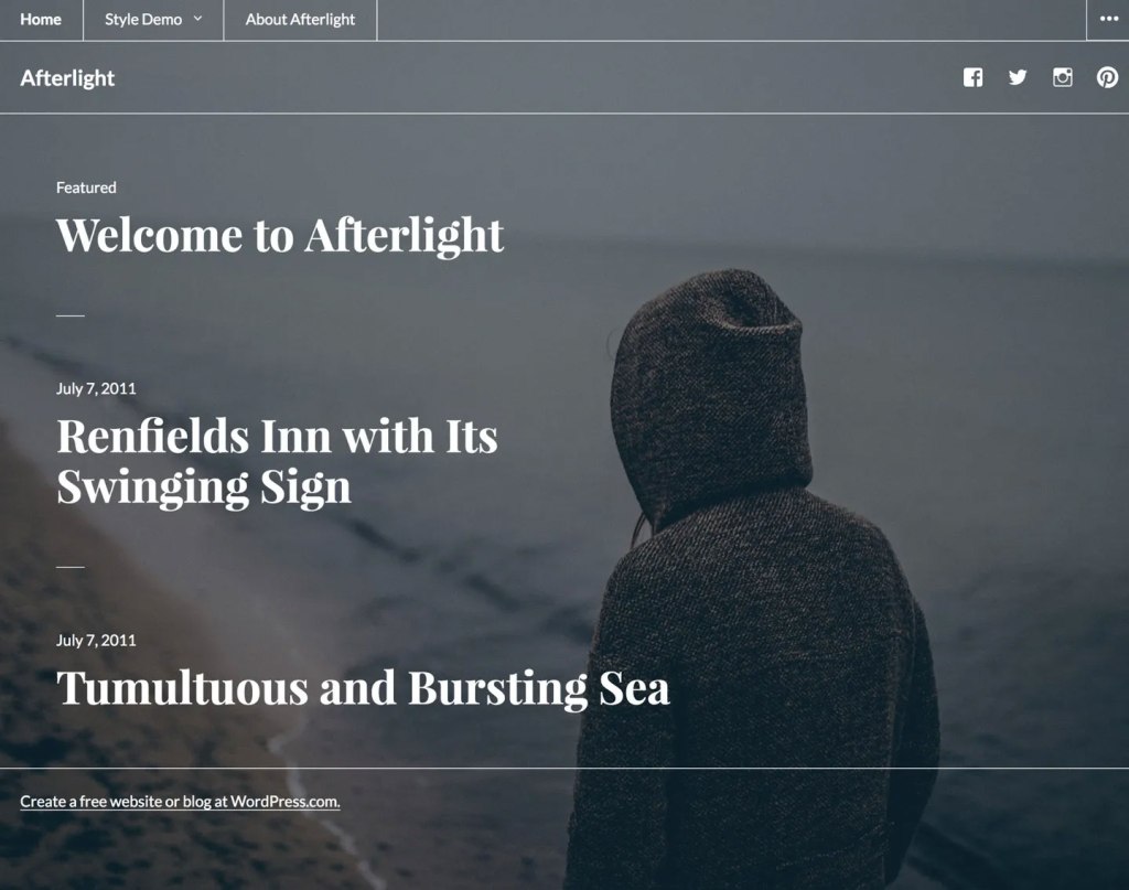
8. Full-Screen
This is a website layout that covers the entire page. There are no sidebars, the screen comes across as a singular unit.

Sometimes this design is coupled with a modular build that scrolls screen by screen, so that each section is like a separate page. It often has an image or even video in the background.
Full-screen layouts are best suited for one-page designs, storytelling, and product pages. They work best if you couple them with captivating colors and/or visuals. If you like this look, the Afterlight theme might be a good option for you.
9. Hero
A special type of full-screen website layout with a large image at the top (also called “hero image”) that contains the main elements like your site title, CTA, etc.
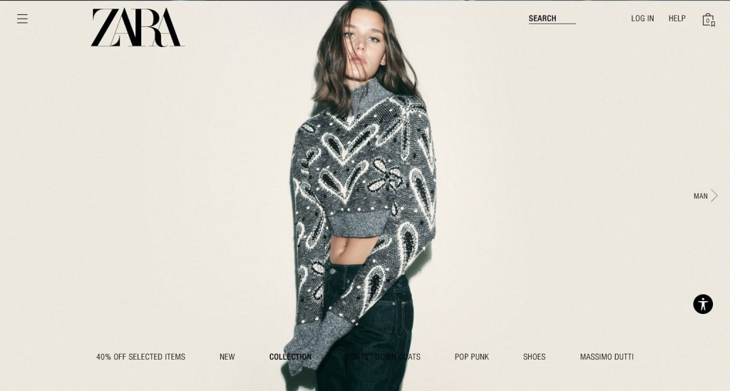
Hero layouts are a good way to quickly capture attention and clarify the topic of the page, especially for products. It’s a big, bold visual statement with additional information in the form of text elements.
The layout works best for product pages and ecommerce websites in general. However, some blogs also use it.
10. Split-Screen
In this website layout, the screen is divided in the middle.

Split-screen layouts provide a balanced symmetry allowing you to represent two different ideas and give them the same consideration. Alternatively, you can also show off the same idea from different angles or use it to divide ecommerce customers at the start of their journey.
Split screen is a great option for websites that use two different types of content (e.g. images and text) or provide two distinct customer journeys. It’s also suitable simply for websites that want a modern look. However, it’s not so great for text-heavy designs because it doesn’t scale well, especially on mobile.
11. Asymmetrical
A design similar to split screen or grid but with uneven distribution, offering an added dynamic.

You can use scale, color, width, and more to provide different focal points and highlights on the page. However, asymmetry does not mean chaos. There’s an underlying order that provides elegance and congruity.
What are good candidates for asymmetrical website layouts?
Websites that want to go for something modern, innovative and guide the user’s attention in dynamic ways. Business websites, online portfolios, or landing pages are prime beneficiaries.
How to Choose a Website Layout

With a better idea about what types of website layouts exist, how do you pick the right one for your website? Here are a few practical tips to do so.
Consider the Type of Website You Are Building
As you have seen above, different website layouts are more or less suitable for different types of websites. Therefore, in order to choose the right one for you, you first need to be crystal clear about what kind of site you are building.
Business sites, shops, blogs – they all have very different focal points and demand different layouts. Clarity in this area is the first step towards making the right choice.
Define Your Goals
In addition, layout is also subject to what you are trying to achieve. When creating one, always do so with a goal in mind. What does success look like for you? What user behavior are you trying to encourage?
Knowing this beforehand allows you to make design choices that complement your goals.
Do Your Research
Your website does not exist in a vacuum. Look at websites that are the same type as yours (e.g. blog, ecommerce, B2B, B2C, etc.) but sell different types of products/services or serve different industries/niches than your own.
When you do, identify common website layouts, best practices, what looks good, and see what you can do better with your layout.
Consider What You Like
Yes, a website is primarily there to serve other people. However, at the same time, it also needs to be something you like. If you are turned off by your own website, it’s unlikely that you will put in the energy and enthusiasm needed to run it and make it successful.
For that reason, while considering which website layout to choose, also do some introspection. Think about what you personally like and would like to see on your site.
Base Your Design on Common Layouts
The website layouts we discussed above are commonly known because they work. They have proven to be usable over time, are familiar to users, and ready to go. Therefore, it’s a good idea to go with one of the established layouts and then add your individual flavor to it.
Creating a Website Layout Mockup
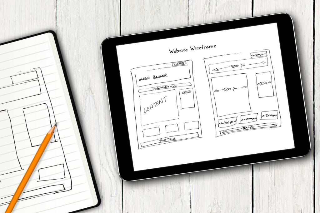
WordPress themes are flexible enough to support different types of page layouts out of the box. But what if you are designing your own theme or are working with a website developer? In this case, you might want to create a wireframe. This helps to map out your page layout and is also good to clarify your ideas and get them onto paper.
What Is a Wireframe and How Do You Create One?
A wireframe is like a map of your page. It’s not the finished design but something that shows its structure.

Here’s how to create a simple wireframe:
- Think about the user journey – Be aware what your goals are with your layout, where you want to steer visitors and what you want them to do.
- Get sketching (and start with mobile) – Wireframes are not meant to be superfancy or detailed. Therefore, you can get started right away (see the tools below). A good idea is to start with the mobile design, then move on to larger screen sizes.
- Create the basic framework – Take a bird’s-eye view, tackle the basic design problems first. Think about where to place the navigation and other basic UI elements.
- Identify content areas – Mark where your content goes. For that, it’s important to know the content you will use ahead of time (both word count and images) so that you can accurately include it in the map.
- Iterate – Even if you are satisfied with your first idea, do a few more passes to give yourself options. It often takes a while for the best ideas to bubble to the surface.
- Test – Once you have some website layout ideas collected, it’s time to put them in front of potential users and collect feedback. The tools listed below are suitable for that as well. Getting some real-life feedback is great to improve and get closer to the final version.
- Rinse and repeat – Do this over and over until you are satisfied with the results and ready to move to the design phase.
Pro Tip: Did you know that sites hosted with WordPress.com includes wireframe block patterns that you can use? These are patterns that are closer to a blank slate for your page without much design, but they include a basic structural layout. Just choose a wireframe pattern you like from the patterns library and customize it to suit your needs.

Additional Tips
In order to create the best possible website layout, here are some tips and concepts to keep in mind:
- Create a visual hierarchy – Decide which elements are the most important and build your website layout so that it focuses on them. Make sure that they are placed where they are easily noticeable and identifiable.
- Use a grid – Almost all web design is based on some sort of grid. It provides order and a basic structure and scaffolding that you can order your page elements along.
- Employ the rule of odds – Use odd numbers of elements rather than even. That way, the focus is always on one element instead of in between two of them.
- Ensure scanability – We have already talked about reading patterns. When designing your website layout, be sure to accommodate the way visitors consume content to make it easy to catch the gist of your site.
- Focus on the fold – The fold is where the screen cuts off when someone first gets to your site. Above it, in the part that visitors see first, you should have your most important content and call to action.
- Use enough white space – Negative space, the part without content, is as important as the content itself. It provides space to breathe and allows the emphasis to be where you want users to focus.
Tools for Wireframing

You can use different kinds of tools to build wireframes:
- Pen and paper – Classic but powerful, easy to use, and great to quickly whip up some website layout ideas without having to learn a new tool.
- Whimsical – A collaboration tool that works for wireframes and also allows you to get feedback. It’s also easy to use and has a free plan.
- Invision – Similar to Whimsical. Also works for collaborative designing. Comes with wireframe templates and has a free plan for up to three online whiteboards.
- Figma – A popular tool for design and prototyping that has free wireframe kits to hit the ground running. Use the free plan to get started without paying.
- WordPress.com’s wireframe patterns – If you want to start with an pre-designed wireframe template, and adjust from there, WordPress.com has some patterns to make this simple.
Find the Right Website Layout for Your WordPress Site
The layout is one of the most decisive factors for the usability of your website. For that reason, it deserves ample consideration so that you can serve your visitors in the best way possible.
Established page structures are a great way to get started. They have proven themselves over time and are able to fulfill established user expectations. While you can (and should) add your own flavor, you don’t have to reinvent the wheel. It’s also often feasible and sensible to use more than one layout in a website, especially on different pages.
When making decisions, consider your type of website, goals, industry, and personal likes. Then, use wireframing to capture your ideas for your website layout. And remember, it’s all about your users. The best layouts are those that they hardly notice.
Want more tips? Get new post notifications emailed to you.

WordPress.com Gives You More
Our designers create beautiful block-based themes, with Site Editing built-in. Curious to know what some of them look like?
ABOUT THE AUTHOR

 Go WordPress