
Nowadays, consumers use many types of smart devices, each with its own optimized website dimensions. The days of simply having one “desktop” and one “mobile” layout for your website are a thing of the past.
Computer displays range from an 11-inch MacBook Air screen, to ultra-wide 34-inch monitors; and in the same way, mobile devices include everything from an iPhone 4’s 3.5-inch screen, all the way to 12-inch tablets.
There is no standard screen size out there. This is why your website must be 100 percent responsive.
What is a responsive layout?
Responsive design is an approach that makes web pages render properly across a variety of devices and screen sizes. To say that a website is truly responsive (and optimized for use on any device), you have to make sure that its menus, buttons, font sizes, and other elements are formatted to be functional and display correctly regardless of a device’s screen size.
For website owners, the biggest advantage of creating a responsive layout is having a single site version to maintain, and delivering a uniform experience across all devices.
Fortunately, nearly all of WordPress.com’s themes are responsive, and there are additional ways to optimize layouts, which makes your life easier.
How to pick a responsive design
Your website theme is a very important choice. Whether you pick a free or premium theme, be sure to select a responsive one by using the Search by Layout filter. WordPress.com’s responsive themes come with the most important elements optimized for all website dimensions. The menus, images, and site grids will look great at any resolution.
Pay attention to custom elements
If you are a power user and wish to apply some custom font sizes or image widths using the Visual Editor or the Custom CSS feature, do so with all devices in mind. For example, a font size that is too small can become unreadable on smaller screens, making your website difficult to browse. You can use CSS media queries to only apply certain rules to a particular website dimension or override a specific style in order to fix it. Note that custom CSS is only available on WordPress.com Premium and plugin-enabled plans.
Keep it simple
When creating your website content, avoid using too many elements on the same page. This will create a more elegant experience for your visitors, but will also make it easier to adopt elements and improve responsiveness.
Set your content priorities
If your content doesn’t display well on smaller screens, you will probably want to hide something using CSS media queries. In this case, be sure to show the most relevant content on your page. Prioritizing content and showing it properly is always a better choice than displaying everything in a disorganized manner.
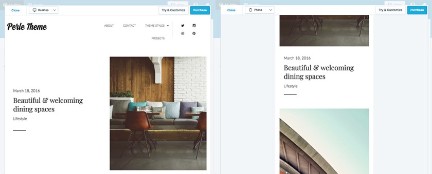
Use the device preview
Naturally, you should verify how your site looks across all possible devices to check for and correct any imperfections. A fast way to do this is with the device preview feature within your WordPress.com Customizer. From your desktop computer, you can preview the design as if you were on a mobile phone or tablet.
A comfortable browsing experience from any device will make your website more effective and keep your visitors happy.
ABOUT THE AUTHOR

 Go WordPress