
Writing articles and blog posts requires creativity and energy. As your website houses this carefully crafted content, you’ll want it to look attractive and visually pleasing. It’s also important that visitors are able to intuitively navigate and understand your site.
To ensure that site visitor needs are met, you can follow a few basic web design principles. They don’t require any existing design skill, as they’re accessible pointers that can be applied to any site across any industry.
Whether this is your first website or your fortieth, learn about the seven design principles that can strengthen your site’s user experience while ensuring that it’s easy on the eyes.
1. Balance
Balance makes websites pleasing by adding a sense of symmetry to each element on a page. There are two types of balance:
- Symmetric, in which each “half” is equal. In the image below, the left and right halves of the page are nearly identical.

- Asymmetric, in which each “half” is unequal, yet still balanced. In the image below, the large graphic on the right is “heavier” than the text on the left, but the overall design is still balanced.
2. White space
White space is exactly what it sounds like: empty space.
Giving site visitors room to breathe allows them to focus on your content. In turn, this improves their comprehension.
Beyond that, it draws visitors attention to your page’s most important elements, while giving their eyes a moment to rest and process what they’ve seen without being inundated with too much information at once.
3. Grids
Most websites are designed based on a grid system. In essence, this splits a page into columns and rows. Grids ensure that everything on your site is aligned, which keeps layouts clean and balanced.
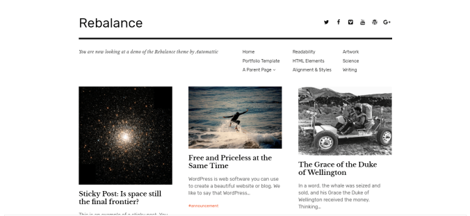
Most WordPress.com themes are based on grids. In fact, Rebalance demonstrates grids, white space, and balance in action.
Furthermore, your theme’s page templates can help you to create balanced designs.
4. Color
The colors that are used on your site can elicit specific emotions, as certain colors make people feel certain ways. The contrast between multiple colors can improve readability, and draws attention to certain elements. You might create a button in a contrasting color that stands out from the rest of your page elements.
Choosing colors that complement each other can be difficult, which is why WordPress.com Premium and plugin-enabled plans include a built-in palette feature.

To change your theme’s colors, navigate to the Colors tab in the Customizer.
5. Graphics
Many people are visual learners, and using descriptive imagery is a great way to support your content while adding to your site design.
However, there are two important factors to consider when using graphics. First, limit the use of large images “above-the-fold.” This is the area of your site where visitors land before they begin scrolling down to view more content. Second, be sure to optimize your images so that they don’t delay your site with long loading times.
6. Typography
Typography includes the fonts and sizes of your website’s text. Typography affects the ability to read and understand your content. So, what makes for good typography?
-
Your text shouldn’t be too small or too large. For body copy, 16px is optimal, with 12px being the absolute smallest size that is still viewable across mobile devices, according to Google.
-
Use legible fonts. All WordPress.com themes come equipped with a selection of fonts that strike a balance between design and readability.
To select your WordPress.com site’s font, head to the Fonts tab in the Customizer.
7. Consistency
Consistency entails providing visitors with a cohesive experience by maintaining the same style or design aesthetic throughout your entire site.
In general, WordPress.com themes keep these web design principles consistent. Beyond that, you should strive to use the same capitalization style and colors across your pages and content.

