Most website pages have a few common sections including a header, footer, content area, and sometimes a sidebar.
The header is one of the most important sections of any website, primarily because it is the first element that visitors see. If the header doesn’t immediately capture a visitor’s attention, they might not stick around.
Great WordPress site headers don’t all follow the same playbook. Some just have an element or two. Others may be filled with a menu, search bar, social icons, logo, and more. Understanding WordPress site header options and best practices will enable you to design the best header for your audience and goals.
In this article, we’ll talk about what website headers are and the elements they typically include. We’ve already covered how to edit the header on your WordPress website, so refer to that if you need a reminder.
What is a Website Header?
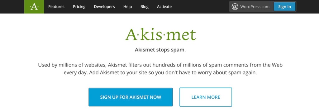
The header on a website is the top section of any page. On the Akismet website, for example, the header is the dark horizontal section at the top of the screen. It includes a logo, the navigation menu, and a button that enables users to access their accounts.
It’s important to understand that WordPress menus and headers aren’t interchangeable terms. The header section can include a menu, which is a list of links that visitors can use to navigate your site, but it doesn’t have to.
The elements included in your header will depend on the purpose of your site. An online store might have cart icons, product search bars, and links to account pages. A blog might have a list of post categories, social media links, and an email signup form.
The style of the header typically depends on your theme. Simply changing themes can completely overhaul how your WordPress website header looks and may even change what is displayed.
We created a demo site and here’s what its header looks like when using the Twenty Twenty-Two theme.

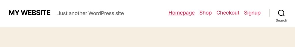
Now, let’s see how it looks when using the Twenty Twenty-One theme. Notice that the site’s tagline, “Just another WordPress site” displays, when it didn’t in the previous example.

And here is how it changes with the Twenty Twenty theme. The tagline is also displayed with this theme, although its position in the layout shifts. Notice that another element automatically appears as well – the Search icon.
Some themes allow you to customize the elements within the theme’s header, and some don’t. If you want to adjust the design or need detailed control over which elements appear, and where they appear, you’ll want to refer back to the article mentioned previously for instructions on editing the header.
6 Elements of a Well-Designed Website Header
Although the elements that you see in the header will vary from one website to another, the options below are among the most popular.
Keep in mind that you might not want to include all of these elements. Inserting too many features can make the header feel confusing and overcrowded. Instead, you should aim to have just enough information without overwhelming your visitors.
1. A Logo
Your logo should be one of the first things that every visitor sees when they come to your site, so it should go in the header.
The location of the logo may vary. Most websites place the graphic in either the middle of the header or in the left corner. This positioning makes it stand out and catch readers’ eyes.
In our demo example, there was no logo. The site title took the place of the logo. This is also common and acceptable if you don’t have a logo.

Some sites will include both a logo and a site title, and sometimes the site title is part of the logo image. This is also perfectly acceptable. Notice how this looks on the Pocket Casts site.

The key is to make sure you have your site’s branding in the header, and that branding can consist of a logo, a site title, or both. Need a logo designed? Our logo maker can help.
2. The Navigation Menu
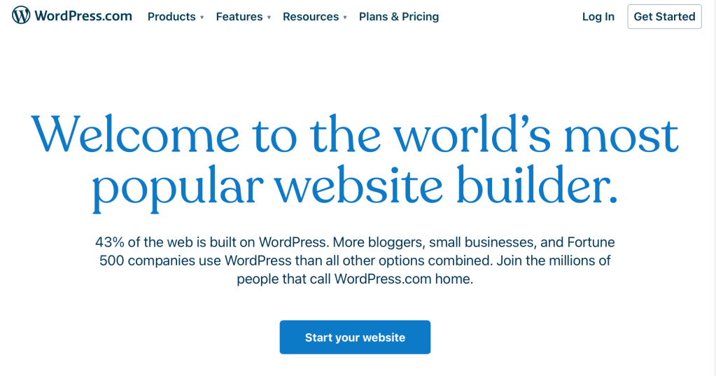
The navigation menu is usually the most crucial element in any header. If you choose to include a menu, it should link to all of your website’s most important pages. WordPress.com’s menu contains 4 primary links: Products, Features, Resources, and Plans & Pricing.
Unless your site has very few pages, don’t cram all of your page links into the menu, even if you think all of the pages are important. Nest related pages under the main links in dropdowns instead.
For example, the Resources link in WordPress.com’s header shows 7 products in the dropdown.

Links in the navigation menu should be easy to read, and the text for each one should tell visitors exactly what to expect once they click on it.
The navigation menu can also include buttons like Log In, My Account, and Shopping Cart.
3. Search Bars
If your website has a large library of content, it needs a search feature. WordPress enables you to add a search bar anywhere on your site using the Search block, and the header is the perfect place for it.
For example, this blog had a search bar in the header to the far right, after the navigation.

To save space, some headers include “hidden” search bars that only display when you click on an icon. This can be a clever design approach if you have a lot of items in the navigation menu and not enough space for a full search bar. WooCommerce has its search icon to the far right of the header, and when clicked, the search bar opens up.


4. Social Media Icons
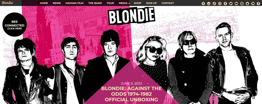
If your website has a social media presence, you can link to your profiles using icons. Social media icons take up minimal space and putting them in the header increases their visibility. In this example, Blondie includes 11 icons, which might be more than most people should consider using. The top 3 or 4 social networks are usually recommended, but if your followers are active in more networks, then you’ll want to include those as well.
5. Contact Information
If you run a business with a physical location or you have a customer contact center, you can include contact and address information in the header. Local businesses, real estate agents, service providers, and consultants also like to make sure their contact info is prominently displayed. For example, adding a phone number in the header can greatly increase the leads a service provider or consultant may receive.

6. Call to Action
While a phone number in the header might be the call to action your site needs, other sites might require a different call to action. Perhaps you want visitors to sign up for your newsletter or create an account. The header is a great place to put a button, link, or form that encourages users to act. In the example header shown below, the large pink button in the upper right corner is the Call to Action for this site.

Bonus Tip: How Do I Find the Right Size for My Site’s Header?
A website’s header should typically have the same width as the rest of its design. The header should also resize for smaller screens and scale at higher resolutions.
But setting a maximum header width is essential to avoid elements scaling too much. Otherwise, you might end up with a header that has too much space between its components.
If you’re using Full Site Editing, you can customize the maximum width for the columns that contain the header element. Alternatively, you can use the editor to set the header to scale to full width automatically.
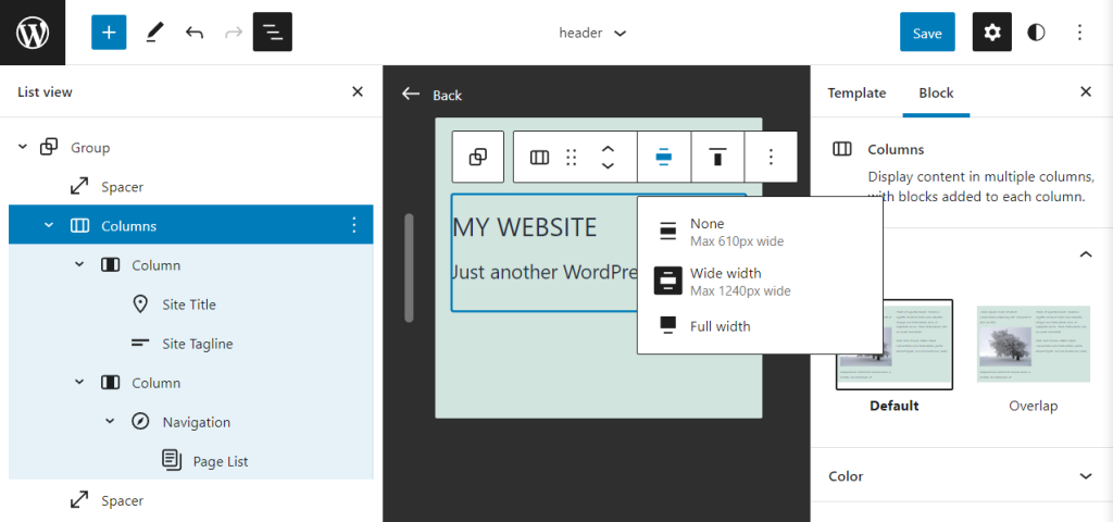
We recommend setting the Wide width option to the same horizontal resolution as the rest of your site’s layout. Typically, a maximum width of 1200 pixels looks great across all screens, even higher resolution ones.
Design an Effective WordPress Site Header
The header is one of the most critical parts of any WordPress website. This small area of your site has great impact so it is important that you give it the attention it deserves when designing it. Carefully consider the elements that will be included such as your logo, navigation, search, social, and a call to action.
You might also like: Seven Web Design Principles for Every Type of Site

