
You’re ready to release your product into the wild. You’ve planned out a launch campaign that’s designed to make a big splash. The last thing on your list is creating a high-converting landing page that compels visitors to take action.
As conduits for your broader marketing strategy, product landing pages are important because they present targeted messaging in a conversion-friendly format, which can be optimized through A/B testing to achieve superior outcomes. As a result, they’re known to drive qualified leads and ultimately boost sales.
By leveraging the many strengths of landing pages, you can effectively showcase your products, engage your target audience, and achieve your marketing objectives.
After reading this blog post, you’ll understand the key components every product landing page should have as well as the six steps you should follow to create one from scratch.
The Anatomy of a Typical Product Landing Page
To help people understand the key components of a typical landing page, Emily Kramer, Co-Founder at MKT1, crafted this framework:

It’s essentially a formula for how to create a high-converting landing page. By combining your in-depth understanding of your product with her guidance, you should be able to craft a landing page that drives sales.
To be clear, there’s no one-size-fits-all template for product landing pages. However, most do include some combination of the following sections:
- The hero section
- The social proof section
- The benefits section
- The use case section
- The call-to-action section
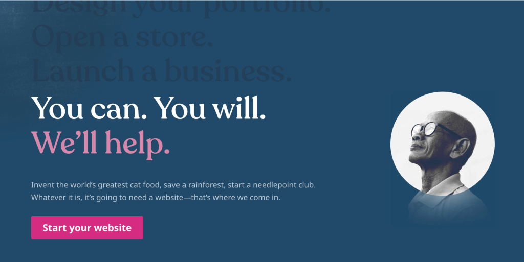
The Hero Section
The hero section of a product landing page is arguably the most crucial area. It is the first thing visitors see when they arrive on the page, and its purpose is to immediately captivate their attention and entice them to explore further.
Occupying the above-the-fold position of the landing page, the hero section includes several key elements:
- A compelling hero image or video that showcases the product
- An attention-grabbing headline that communicates the value proposition
- A brief subheadline that elaborates on and reinforces the value proposition
- A distinct call-to-action (CTA) button that compels the visitor to take action
By instantly capturing the visitor’s attention and effectively communicating the product’s core value, the hero section primes the visitor to convert.

The Social Proof Section
The social proof section of a product landing page serves to instill trust, credibility, and a sense of security in potential customers. It provides evidence that other people have used the product, had a positive experience, and would recommend it to others.
A typical social proof section includes a selection of the following elements:
- Testimonials from high-profile customers
- Statistics about how many customers your business serves
- Logos of well-known customers
- Endorsements from experts or influencers
- Stories covered by the media
- Certifications and awards from industry associations
- Links to in-depth case studies
By leveraging the power of the crowd, the social proof section helps to build trust and alleviate fear, which increases the likelihood that they’ll buy your product.
The Benefits Section
The benefits section of a product landing page is designed to clearly communicate the value your customers get from your product. It emphasizes how the product solves the customer’s problem, fulfills their needs, or otherwise improves their life.
Your benefits section may include some combination of the following elements:
- A clear, concise, and compelling value proposition
- A list of key benefits and a description of the features that drive them
- Specific, measurable results that customers have achieved
By highlighting the transformation or outcomes achieved by using your product, the benefits section motivates customers to buy, which improves the conversion rate of your landing page.

The Use Case Section
The use case section of a product landing page highlights the product’s practical value by showcasing how it can be applied across a variety of real-world situations. This section serves to bridge the gap between your product’s features and the benefits they confer.
A typical use case section includes one or both of the following elements:
- Different scenarios in which your product could be useful
- Examples of how the product has been used by others
By demonstrating a variety of scenarios where the product is useful, the use case section makes the product appear versatile, which helps convince customers it’s likely to meet their needs, no matter how unique they are.
The How It Works Section
The “how it works” section of a product landing page is dedicated to clearly and concisely explaining how a product functions. It’s essential in helping prospective customers imagine the steps they must follow to use your product.
This section offers a step-by-step walkthrough that reveals how easy your product is to use. It may also highlight the transformation between the customer’s before and after states, or answer frequently asked questions, especially if understanding your product is difficult.
By demystifying your product and making it accessible to potential customers, the “how it works” section assures customers that they can make use of the product.

The Call-to-Action Section
The call-to-action section of your product landing page encourages visitors to take action, whether that’s to sign up for your product, make a purchase, or schedule a demo with your sales team. A well-crafted call to action (CTA) can significantly improve conversion rates.
This section includes a visually distinct CTA button with persuasive copy, which may promote a sense of urgency or scarcity. It often also includes microcopy describing a money-back guarantee, free trial period, or a promise that you won’t ask for a credit card. Sometimes, a secondary CTA link is displayed for those who aren’t ready to commit.
By crafting a persuasive call to action and making it prominent on the page, the call-to-action section guides visitors to take the next step in the buyer’s journey.
A 6-Step Process for Crafting Product Landing Pages
Step 1. Define your target audience
Before you can craft a product landing page that compels visitors to take action, it’s crucial that you understand your target audience. Only then can you align your messaging with their pain points, goals, needs, and preferences. And that’s important because highly targeted messaging is more likely to stand out from the competition, resonate with your audience, and deliver a high return on investment.
There are multiple ways to identify your target audience. Your approach will likely include a blend of the following methods:
- Analyzing your customer base. Determine who your product best serves today, and profile their demographics, firmographics, locations, psychographics, and behaviors.
- Conducting market research. Through surveys, focus groups, or interviews, determine which segments of the market would be best served by your product.
- Looking at the competition. Map which segments of the market are already served by your competitors to determine the underserved segments of the market.
- Evaluating your product. Analyze the strengths and weaknesses of your product to determine who might be interested in the value you deliver.
Once you have a better idea of who to target, you can segment your target market into smaller groups based on their shared characteristics and craft buyer personas. Buyer personas are semi-fictional profiles that represent your ideal customers. They’re valuable because they help your team craft messaging that resonates with buyers. By aggregating the findings from your customer research, these profiles offer digestible insights about your target market.
Here’s a template from Miro you can use to document your personas:

Step 2. Craft a compelling value proposition
Once you have a strong grasp on your target audience, it’s time to define your value proposition.
A value proposition is a clear statement about how your product serves customers that differentiates you from your competitors. It highlights the most compelling reason why they should do business with you.
To craft an effective value proposition, you must merge what you learned about your target audience with your knowledge of the benefits your product delivers. What’s the one key takeaway you want potential customers to remember?
If you’re having trouble honing in on the one thing that differentiates you in the mind of your audience, try first defining the functional, emotional, and accrued benefits that your product delivers. From there, group the benefits into categories based on theme. The most prominent theme may be your value proposition.
To be sure it will stand out in the market, compare it against your competitors’ messaging. Once you’re confident that you’ve landed on a unique value proposition, you can use a tool like Wynter to validate it with your audience.
Step 3. Design a visually appealing landing page
Design serves an important role in the success of a product landing page. Engaging visuals not only capture the attention of visitors, but also reinforce your key messages while making complex concepts easy to understand.
Be sure to choose on-brand colors, typography, and images that help showcase your product. Prioritize clarity over creativity to achieve a higher conversion rate, but be careful not to sacrifice a delightful customer experience along the way.
You’ll also want to ensure your landing page’s layout and features seamlessly adjust to all the different sizes of desktop and mobile devices, as responsive design improves both the user experience and visibility on search engines.
Step 4. Write persuasive copy
Crafting persuasive copy plays an essential role in converting your landing page visitors into customers. It convinces them to take action by underscoring how your product helps them alleviate pain, gain benefits, or achieve their goals.
Your headlines should be clear and concise but attention-grabbing. They should highlight the key benefits or capabilities of your product’s features.
Your subheadlines should reinforce the key point each headline makes. You may want to use power words that trigger emotional responses or add credibility with key statistics about how customers use your product today.
When elaborating on the key message, avoid writing lengthy paragraphs. Instead, use bullet points, which facilitate the ability to scan.

Step 5. Choose your call to action
A call to action is a button or link that prompts your visitors to take a specific action, such as making a purchase, signing up for an account, or scheduling a demo. It tells visitors how to take the next step in their journey toward becoming a customer.
To grab the visitor’s attention, use a distinct color and larger size to make calls to action stand out on the page. Choose action verbs for your button or link copy, as these will compel your visitor to convert. It’s a best practice to sprinkle your calls to action throughout the page, with one above the fold (below your headline and subheading), one at the very bottom of the page, and one somewhere inbetween (typically following your most persuasive section of content).
When it comes time to choose your call to action, keep in mind the stage of the buyer’s journey your prospects are in. Early in their journey, you may want to prompt them to download a whitepaper or register for a webinar — something that’s relatively low-commitment. Later in their journey, you can encourage them to book a demo, make a purchase, or sign up for an account.
Step 6. Test and optimize your landing page
After you push your landing page live, it’s time to test and optimize the elements on the page. What works for one product or company rarely works for another. That’s why it’s so important to validate your assumptions and gather evidence for your choices. Without completing this step, you’re unlikely to earn above-average conversion rates, leaving you with less revenue and fewer customers than you might otherwise have.
The first step is to form a hypothesis about what might improve your conversion rates. To do so, try using heatmap software, such as Hotjar, Mouseflow, or Smartlook, to analyze visitor behavior. What key areas do they skip over?
Take your call to action as an example. You might propose a variation in color, size, placement, or wording you believe will improve results. Next, leverage A/B testing software to see how it performs compared to the original.
By continuously testing and tweaking, you can find the optimal version that results in the highest conversion rates—and reap the benefits of your improvements.
Conclusion
To create a compelling product landing page, you need an in-depth understanding of your audience, a unique value proposition that stands out against your competitors, and persuasive copy, visuals, and calls to action that entice visitors to convert. By strategically leveraging a captivating hero section, trustworthy social proof, clear benefits, and practical use cases, you can guide visitors toward becoming a customer.
Keep in mind that crafting a landing page is only the first step. By conducting A/B tests, analyzing user behavior, and making data-driven changes, you can boost your landing page’s effectiveness and increase its performance over time.
Want more tips? Get new post notifications emailed to you.

