
So you’ve decided to launch a website.
You’re probably feeling both excited and overwhelmed — especially if this is your first time going through the process.
Without a background in design, it can be difficult to know if your website looks and functions in a way that encourages visitors to take the action you want.
But being purposeful with design doesn’t have to mean having years of experience — just look at the straightforward best practices and tips in our website design infographic.
Follow these eight design dos and don’ts to create an aesthetically pleasing, highly functional website that you will be proud to share with the world.
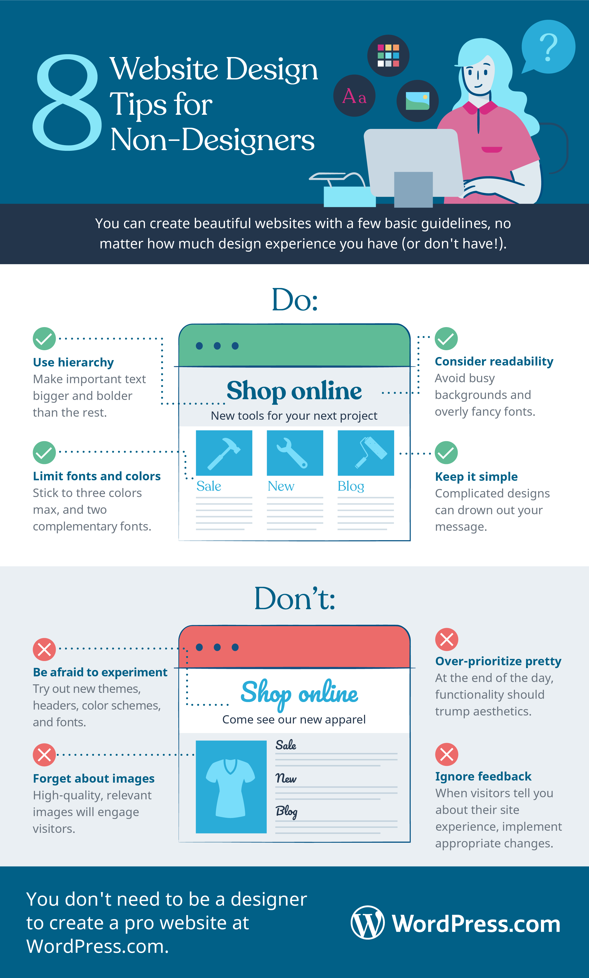
1. Do use hierarchy to order content
This tip may sound complicated, but the premise is rather straightforward: the information that you want people to read first should appear first, and be bigger and bolder than the rest.
You can organize according to the importance of your different elements. Before jumping into the visual design, you’ll want to create an outline for the content you’ll be sharing on each page.
You can and should create a hierarchy in your website’s design by using elements like headings and subheadings to draw viewers’ attention to the most important information. Bold colors and eye-catching fonts can also be used to show which content is most important and should be read first.
Remember that in most situations, simpler is better. Websites loaded with all of the visual bells and whistles are cool to look at — but do they actually convert?
2. Do limit fonts and colors
An overdone design might actually distract your visitors from the main goal of your website. It’s often the most basic designs that are the easiest to navigate and, as a result, help visitors make decisions quickly and confidently.
When considering each new page element, ask yourself this key question: “Will this help the user reach the goal or distract them from it?”
According to The Next Web, “No matter what colors you choose, they have a definite influence on the design as a whole — from communicating contrast or similarity, to evoking precise emotions.” As a rule of thumb, you should use a maximum of three colors in your site design. Using too many colors can make a site look messy.
Similarly, Canva suggests limiting the number of fonts used, as “the eye finds it hard to scan multiple typefaces.” If you’re new to the design world, you can’t go wrong with fonts in the same family (Arial, Times, Courier), as they’ll naturally look good together.
On a related note, whichever fonts you choose should be easy to read at all sizes — especially if your website has a lot of written content (like a blog).
In addition, make sure that you’re not overlaying text on busy backgrounds, as the contrast between elements will be difficult to read.
3. Do consider legibility
One common mistake that amateur designers make is using fonts or colors that impair readability. For example, a decorative font like Curlz MT or yellow text can be hard to read (even if it looks nice with your theme). Be sure to periodically take a step back and consider the legibility of your design.
4. Do keep it simple
When in doubt, keep your design simple. If you do too much with your design, it can end up looking messy.
ELearning Industry highlights that “effective design is clear-cut and balanced to help viewers focus on important information.” It’s better to present your information clearly without any design frills than to go overboard and lose your message.
5. Don’t forget about images
One rule that consistently shows up in lists of website design best practices and tips is to use visuals to complement your copy instead of as your primary design elements.
Great visuals encourage visitors to read by breaking up text so that it doesn’t seem as long and overwhelming.
Pictures are necessary to create engaging content. HubSpot notes that viewers only remember 10 percent of the information they hear, but if there’s a relevant image paired with the information, they retain 65 percent of the message instead.
However, it’s easy to go wrong with images. Pixelated or warped pictures distract visitors from your content. Be sure to familiarize yourself with basic photo-editing skills, like cropping and resizing.
To really make an impact, make sure that your chosen visuals are:
- Relevant to the topic at hand
- High-resolution
- Not stock photos whenever possible — custom images will have a bigger impact than something people feel like they have seen elsewhere on the internet
Here’s a bonus design tip: aligning photos in a grid formation will make them look more professional than if they’re placed randomly across a page, according to Canva.
6. Don’t be afraid to experiment
Even experienced designers make mistakes. Trial and error is important as you work toward a functional site design, so take risks and try out new things. If you don’t like the result, you can always change it.
With your WordPress.com site, try new themes, change your header, or play with the color scheme. Even the smallest changes can make a big difference in the overall appearance of your site.
7. Don’t over-prioritize pretty
Naturally, you want your design to look good; but you shouldn’t prioritize aesthetics at the expense of functionality. First and foremost, your website needs to inform viewers. Consider whether it achieves this goal before you add more decorative elements.
8. Don’t ignore feedback
Design is subjective. What you think looks good might not resonate with others.
Keep an open mind when it comes to user feedback. If your visitors are struggling with a certain aspect of your site, — whether it’s legibility, navigation, or something else — acknowledge them and take their comments to heart. Otherwise, they may not come back for repeat visits.
Any marketer worth their salt won’t recommend making a final decision between two design elements without testing them first.
It’s fine to make assumptions about your audience as long as you follow up to determine if you were right or wrong. In many cases, you may be surprised by what your audience actually responds to.
Harvard Business Review defines A/B testing, or split testing, as “a way to compare two versions of something to figure out which performs better.” Check out a free tool like Google Optimize to A/B test various website elements.
It doesn’t hurt to go straight to the source by asking members of your audience for feedback. User testing can be a great way to gain insight and make your fans feel heard and appreciated.
When you follow these eight design tips, you will be positioned to create a professional-grade website — even if you’re new to design. Keep them in mind and see how they improve the overall look and feel of your site.

