
10 Ways to Make Your Site More Accessible
May 21 is Global Accessibility Awareness Day. Is your site reader-friendly for all of your visitors?
Today, Global Accessibility Awareness Day, raises awareness around digital access and inclusion and improving the web experience for everyone. This year, WebAIM analyzed one million homepages for accessibility issues and found that 98% of websites had at least one WCAG (Web Content Accessibility Guidelines) failure on their homepage, such as low-contrast text, missing image alt text, and empty links. These types of accessibility barriers make it difficult or impossible for some visitors — people who are blind, deaf and hard of hearing, and disabled, for example — to use your site.
We encourage you to audit your site to ensure it’s accessible for all readers; the WAVE Web Accessibility Evaluation Tool can identify various errors on your site in seconds. Here are some web accessibility tips to get you started, and be sure to explore the guidelines and resources on the W3C Web Accessibility Initiative (WAI) website for deeper learning.
Use an accessibility-ready theme
You can choose from among a variety of designs for your site, but some themes have features that add complexity, making it harder for disabled people or visitors using screen readers to access your content.
When choosing a theme, consider an accessibility-ready design, like Balasana, a free minimal theme for your business website; or Mayland, a free visual theme that’s great for photographers and storytellers. These themes have been checked by the Theme Review Team and pass basic accessibility requirements.

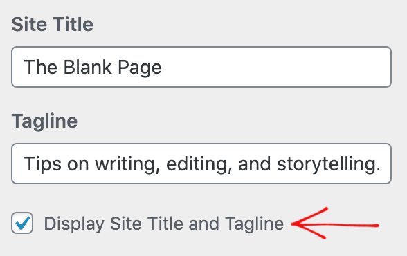
Display your site title and tagline
Many themes allow you to upload a custom header image, which is a visual way to brand your site, display the title of your blog, or promote the name of your business. But some themes may not support alternative text, or the written copy that appears in place of an image on a page if the image fails to load on your visitor’s screen.
Instead of conveying your site title and tagline within a header image, display your site title and tagline text. Go to Manage → Settings, and at the top under Site profile, fill out your Site title and Site tagline. Then, head to Design → Customize, go to Site Identity, and check the box next to Display Site Title and Tagline.
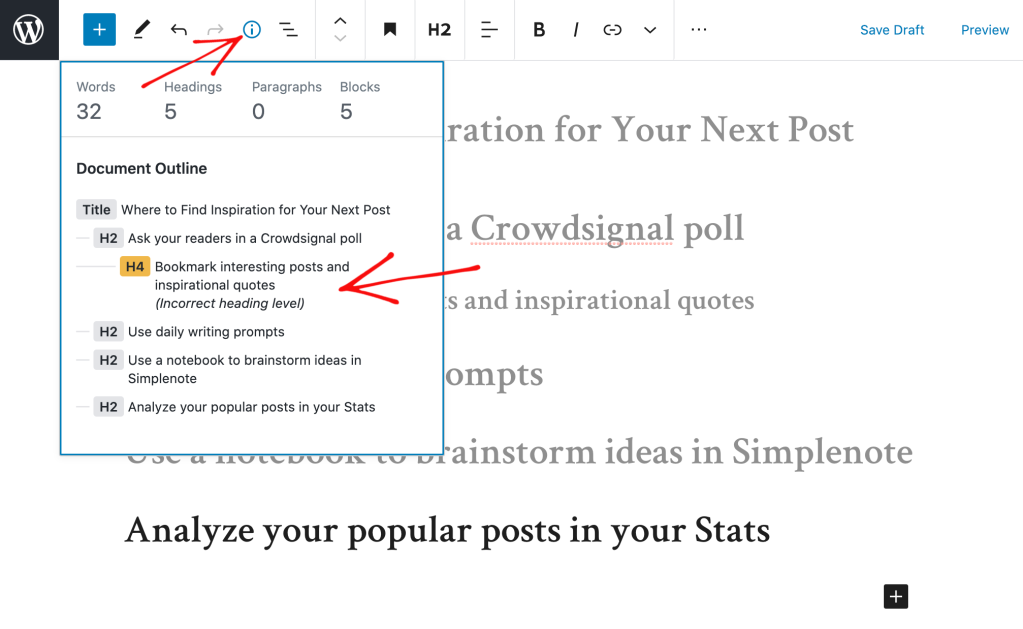
Structure your pages and posts with appropriate headings
Add headings with the Heading Block to organize pages and posts and make it easier for readers to follow your content, which is especially important for longer pages and posts. Click on the “i” icon in the top toolbar of the block editor to view any errors and incorrect heading sizes.
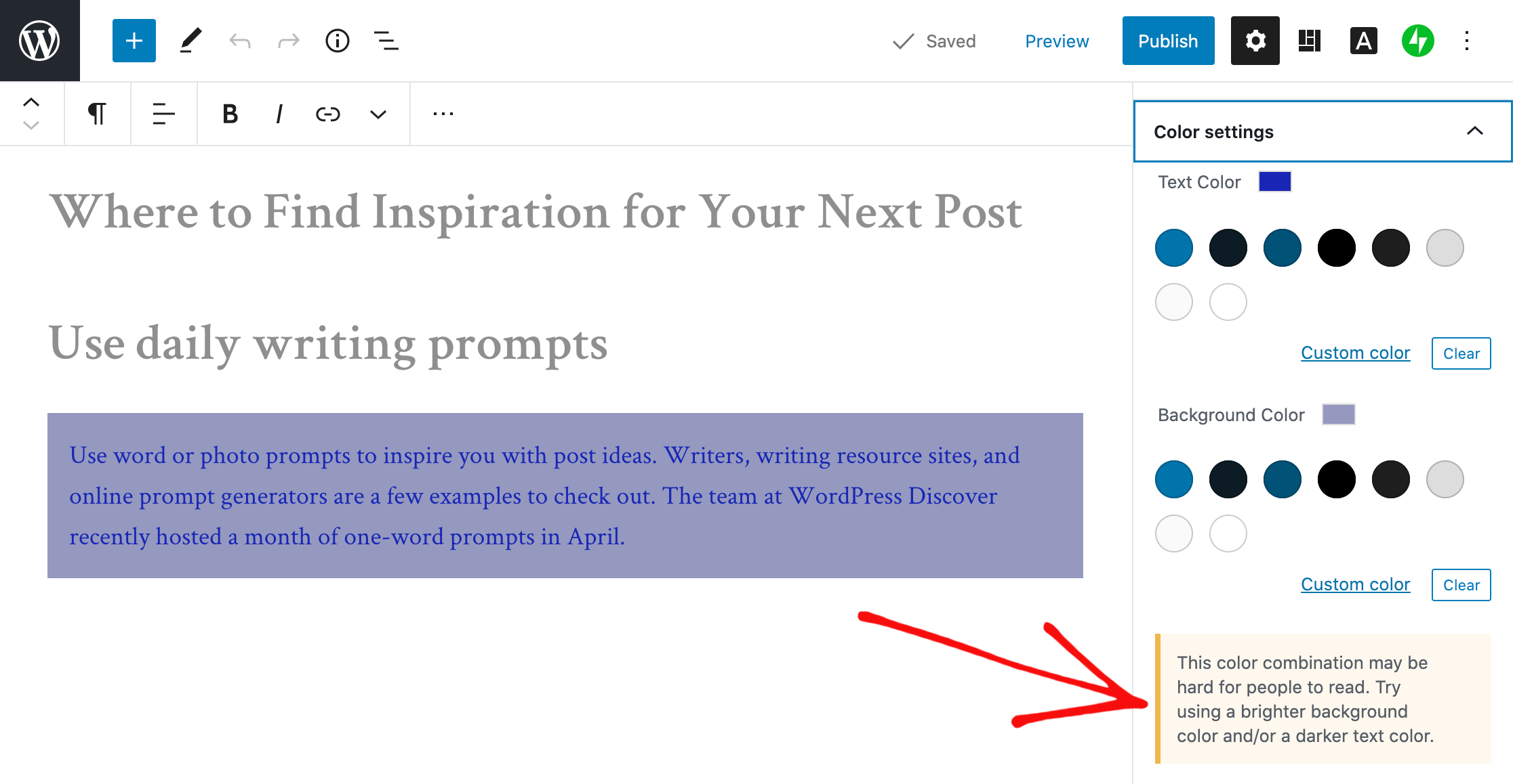
Select fonts and colors for legibility
Fonts and colors are essential components on your site, adding personality and style and strengthening your visual identity online. Avoid font styles and sizes and color palettes that make your site difficult to read, and pay attention to contrast, or the difference between the darkness of your text and the lightness of your background.
The block editor will display an error message in Color settings when it detects poor color contrast in the specific block you’re working on.
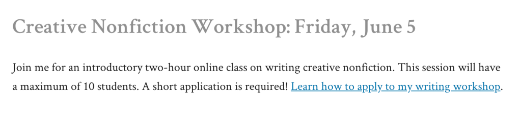
Clearly describe your links
When linking to another page or post on the web, make your linked text descriptive. For example, “click here” is not as effective as “learn how to apply to my writing workshop.”
Include captions with your images
When adding an image with the Image Block, add a description of the image in the caption underneath it. While captions are optional, they improve the experience for all readers by providing more context.
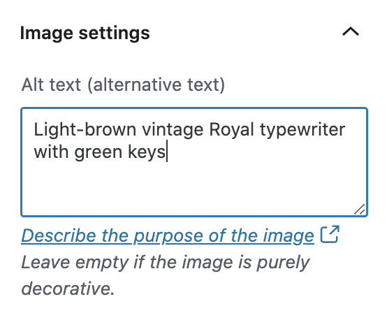
Add alt text to your images
Alt text is essential for people who are blind or use screen readers (they can hear alt text read aloud), or people who have disabled images for speed or bandwidth reasons. Alt text is also important for your site’s SEO — it helps search engines understand what your site content is about.
When adding an image with the Image Block, go to the block’s settings on the right and add the alt text in the box under Image settings.
Learn more about W3C’s image accessibility guidelines.
Create easily clickable CTA areas
With the Buttons Block, you can add call-to-action buttons to your pages and posts quickly. For those of you who design and embed your own buttons with Image Widgets, make buttons, icons, and other CTA elements with wide-enough areas that are easy to click or tap from different devices.
You can apply this tip to text links as well. Tapping a linked hashtag or asterisk within a sentence, for example — especially on a small screen — may be difficult for some people.
Include captions or transcripts for multimedia content
If your site includes video content, consider adding captions or including transcripts (documenting speech, sounds, as well as actions seen on-screen). Podcast transcripts are also incredibly helpful; here’s a transcript of a recent Distributed episode with neuroscientist Adam Gazzaley.
It’s best if video and audio content does not auto-play, but if that’s not possible, options to pause or adjust the volume should be obvious on the page.
Never stop learning and improving
This list is just an introduction to a few best practices and guidelines! If you’re interested in learning more, explore the resources on the W3C Web Accessibility Initiative (WAI) website. You can also explore ways to get involved in improving the accessibility of WordPress.
Learn more about Global Accessibility Awareness Day and participate in online events, webinars, and podcasts.
- May 21, 2020
- Better Blogging, Diversity & Inclusion, WordPress.com

Informative post 👍
LikeLiked by 14 people
This is really very helpful. Thank you sharing.
LikeLiked by 18 people
Using accessibility guidelines as a baseline for creating websites benefits everyone. Thank you for sharing some really good tips in this post.
LikeLiked by 16 people
Very good information! Thank you!!
LikeLiked by 15 people
Thank you sharing this insightful advice. Please what theme can I use for personal freelance web design business?
Thank you.
Shola
LikeLiked by 11 people
I’d stick with the recommend themes at the top of this page: https://wordpress.com/themes
If you have projects you want to highlight visually, Dalston is one example: https://wordpress.com/theme/dalston
A front page where you can feature parts of your site on the homepage, like Hever, may be worth exploring, too: https://wordpress.com/theme/hever
Thanks!
LikeLiked by 8 people
Thanks Cheri. Alright. You take care..
LikeLiked by 5 people
This is very helpful. My blog is about providing low cost budget Marketing tips for Entrepreneurs yet I don’t get traffic to my page.
I feel this should help.
LikeLiked by 10 people
Just one doubt. Is Astra theme also accessibility ready?
LikeLiked by 10 people
I don’t see Astra listed in the accessibility-ready themes: https://wordpress.com/themes/filter/accessibility-ready
However, looking at the Astra site, it appears that it is indeed accessibility-ready:
Please note that because it’s not listed on *our* WordPress.com Theme Showcase, it’s not available to WordPress.com users unless you’re on the Business plan, on which you can install third-party WordPress themes like Astra.
(For reference, here’s the difference between WordPress.com and WordPress.org: https://wordpress.com/support/com-vs-org)
LikeLiked by 5 people
Very good info thanks👍
LikeLiked by 9 people
Its way too informative ! Hope that i will gain followers through it
LikeLiked by 10 people
Great information. Very useful.👍
LikeLiked by 9 people
That’s so useful!
Thanks x
LikeLiked by 10 people
Great insights 💯
LikeLiked by 10 people
Very helpful post for new user👍
Thanks for sharing 💐😊
LikeLiked by 9 people
I had never thought of this before. It would be useful to have this more obvious when people first come to WordPress.
LikeLiked by 9 people
A very interesting post. I have been working on and off for several days now getting the theme we have chosen – Natural – to be Accessibility compliant. We have generally succeeded in practically everything except a very minor contrast issue on the contact form where the Wave check identifies the word “(required)†attached to the field “required†toggle as below the Accessibility contrast level. In edit mode it is red but on the site it comes out as light grey and this is unacceptable. I have tried several times to get the WordPress Happiness engineers to resolve this with a CSS addition but because we are on the Personal plan they require that we upgrade to the next level before they will help. We are not prepared to upgrade just for this and we do not need any of the facilities that an upgrade offers other than a bit of help to meet accessibility standards. This seems to be at odds with the message you give in this blog. Grateful if you can assist.
Campbell de Burgh http://www.briantspuddle.info
Sent from Mail for Windows 10
LikeLiked by 6 people
Very informative post👍
LikeLiked by 5 people
Very informative! Thank you!
LikeLiked by 8 people
This is really very helpful. Thank you sharing.
I’d love to chat more about this. I need guidance and a few pointers on how to apply this information.
LikeLiked by 9 people
Thanks for sharing! Very informative!
LikeLiked by 8 people
Thanks for sharing such an informative article.
LikeLiked by 9 people
Very helpful…..thank you.
LikeLiked by 8 people
Great insight
LikeLiked by 8 people
Really Informative post.
LikeLiked by 9 people
Thank you for sharing this. I have learned so much by your post!
LikeLiked by 7 people
Thank you for your information! There is quite a bit of learning to be had.
LikeLiked by 9 people
Thanks for your informative article.
LikeLiked by 7 people
This is really helpful.Thank you.
LikeLiked by 6 people
Like many of the bloggers, I’m grateful for these tips. I’m still very new to all this and I will attempt to implement these tips, but if I’m struggling, is there somewhere or someone I can reach out to for questions? I want to do my best and allow anyone to enjoy my site. Thanks.
LikeLiked by 6 people
You can ask questions and get suggestions from our staff: https://wordpress.com/support/contact/
Thanks for reading!
LikeLiked by 3 people
Thanks for the reply! That’s lightening fast service. Top-notch. I’ll check it out for sure.
LikeLiked by 6 people
Thanks it is very inspiring
LikeLiked by 7 people
Nice one… It’s really good.
LikeLiked by 5 people
This is very helpful 🙂
LikeLiked by 5 people
Thanks Cheri for such wonderful coverage and presentation
LikeLiked by 4 people
Thanks, very interesting.
LikeLiked by 6 people
very nicely explained
LikeLiked by 6 people
Very useful information for me i really thanks to you
LikeLiked by 8 people
I try to post something on my blog and I can’t do it — can you help me.
LikeLiked by 7 people
Hi there — please contact our Support team if you have questions on posting to your blog: https://wordpress.com/support/ Thank you!
LikeLiked by 3 people
Thanks alot, it was really helpful especially the first point you made.
LikeLiked by 8 people
Thank you Cheri for this tip. I found it helpful.
LikeLiked by 6 people
This is really informative and helpful. The last piece of advice was perfect and very true to the nature of blogging.
Thank you!
LikeLiked by 7 people
Very helpful tips
LikeLiked by 7 people
Thankyou 🙂
LikeLiked by 8 people
Thank you. This was very helpful.💯
LikeLiked by 6 people
The post is very good for beginners
Thanks
Collinsgold
LikeLiked by 5 people