Many blocks in the WordPress editor contain color settings for you to control the colors of your content. This guide will show you how to use these color settings.
Color settings are available for:
- Styles – change the colors used throughout your entire site at once.
- Blocks – change the colors of specific elements.
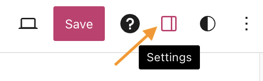
When you select a block, you will find additional block settings in the right sidebar. If you do not see the sidebar, you may need to click the Settings icon in the top-right corner to bring up the settings. This icon looks like a square with two uneven columns:
Within the block settings, you may find the color settings right away. Other blocks have their color settings located under the Styles tab. The image on the right shows a Column block with the color settings underneath the Styles tab, accessible by clicking the circular icon.
Note that not every block includes color settings. The available color settings will vary depending on the theme and the type of block.

Using the color picker, you can select a color for different elements in the block, such as the text, background, and links. Click into each of the corresponding numbered sections as explained below:

- Click on the color circle to open up the color picker.
- Click any of the existing colored dots to select a predefined color option from your color palette. You can choose which colors are shown here using Styles.
- Click into the box area to set a custom color.
- If you already have a custom color code that you’d like to use, you can paste it into the box area. This code will automatically update if you choose a different color using any of the other options shown above.
- Click on the dropdown icon to select a different color profile. You can choose between
Hex,RGB, andHSL. - Click and drag the circular icon left or right to increase or decrease the opacity or transparency of your chosen color.
- Click and drag the circular icon left or right to choose a different color.
- Click and drag the circular icon anywhere within the box area to select a different shade of the current color.
- Click to copy the current color code to your clipboard.
- Click the three dots and then click reset to revert any of the selected color options. This will return the color to the theme’s default colors.
To reset your color choice, click the Clear button at the bottom-right of the color selection area.
Gradients allow you to select two or more colors to gradually blend together. Click into each of the corresponding numbered sections as explained below:

- Click on the color circle to open up the color picker.
- Click to set a Solid color for your background. This works the same way as the text or link colors covered above.
- Click to set a Gradient for your background.
- Click any of the existing colored dots to select a predefined gradient from your color palette. You can change which colors are shown here using Styles.
- Click any of the circular icons within the box area to select a custom color to include in the gradient. You can also click any other section within the box to add additional colors.
- Click on the dropdown icon to select the Type of gradient. You can choose between
LinearandRadial:- Linear creates a gradient between the two colors along a straight line.
- Radial starts from the center and moves to the borders.
- Edit the number in the box to select a custom value for the gradient Angle. This only appears when you’ve selected the
Lineargradient Type. - Click and drag the small colored dot within the circle to adjust the gradient Angle. This will automatically replace the value in the Angle box covered in #7 above.
To reset your color choice, click the Clear button at the bottom-right of the color selection area.
The duotone filter option is a two-tone color effect you can apply to your image blocks like the Image and Cover blocks. Think black and white photos, but in any color combination you choose.
To get started, select the Duotone Filter button in the toolbar or block settings, and choose from the examples or set your own colors:

To set your own colors, select the dots within the color bars:
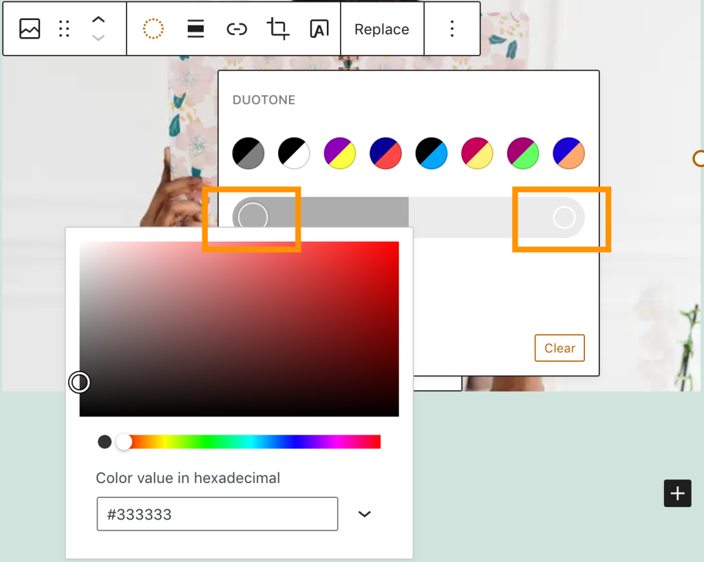
To remove the duotone filter, click the Clear button at the bottom-right of the color selection area.
