
You created your WordPress.com website with certain goals in mind. Whether you’re trying to increase sales, generate leads, or increase email newsletter sign-ups, each page of your website should be designed with objectives in mind.
For most of these pages, a call to action (CTA) is the best way to pursue these goals. A CTA prompts users to take a specific action like signing up for a newsletter, downloading an e-book, visiting an online store, or filling out a form. Your specific call to action, as well as the CTA design on each page, have a huge impact on the success of your WordPress.com website.

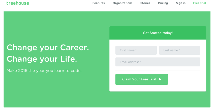
“Click here to learn more” can only get you so far. Smarter CTA design could help you unlock better marketing results for your website. Calls to action (CTAs) are interactive buttons on your website that invite visitors to take a certain action. CTA buttons can be used to ask visitors to:
- Subscribe
- Get Started
- Demo
- Learn More
- Sign Up
If you’ve never created a CTA before, here are some tips on creating a message and design that will drive results for your website.
Crafting your CTA message
Since you’re creating a call to action, the first step is to make sure your CTA is action-oriented. Use active verbs to prompt a specific user behavior: phrases like “Click here to get started,” “Download the report,” and “Submit your request today” are all examples of action-oriented CTAs that provide users with clear direction on how to proceed, according to IMPACT.
It’s important to create a CTA message that is consistent with the web page where it’s located. On the main page of a software website, for example, a CTA might invite users to “Learn More” about the specific software services offered. But on specific software pages, the CTAs might say something like “Request a Demo,” or a similar CTA that is geared toward taking the next step in becoming a customer.
Regardless of the goal of your CTA, make sure the message is clear and concise, helping users understand what they should do next and why.
The top 10 percent of websites have conversion rates of 11.45 percent or higher, according to WordStream. The cross-industry average, per the same source, is closer to 2.35 percent. Mastering the principles of CTA placement and design can help you convert visitors into leads.
5 tips for CTA design and placement
CTA buttons are among the most important design elements on your WordPress.com website. Well-designed CTAs aren’t the only necessary element for conversion. Your site also needs high-quality content and strong user experience (UX). However, a web page with exceptional calls to action can help your business achieve greater conversions. Keep in mind the following principles for design and placement.
The new WordPress.com block editor includes a Button block specifically for creating CTAs — use it to insert a button in any post or page.
1. CTA placement matters
Traditionally, marketers have embraced the best practice to place CTA buttons “above the fold” on landing pages or on the top portion of a web page, which is visible without a user having to scroll. This is still a best practice, but the center of a web page isn’t your only option for placement. Some other options for placement with high conversion potential include:
- At the top of a web page
- At the end of blog posts
- In the sidebar
- In a welcome pop-up message
- In the middle of a long blog post
- In email marketing content
Keep in mind the flow of UX and reading when placing CTAs, and strive to achieve placement that is noticeable but not disruptive to your audience.

2. Make it look like a button
A CTA button should look, well, like a button. It should be immediately recognizable to website visitors as something that can be clicked on. While you can experiment with creative CTA design, ensure your buttons always feature the following characteristics so they’re identifiably a button:
- Defined shape or colored border
- Contrasting color to the web page or content
- Visible text that invites the reader to take action
Your buttons don’t need to be a bright orange or green rectangle. You’re free to experiment with using ovals, rounded corners, or colored borders. As long as your buttons are visibly a button and stand out against the web page, the sky is the limit.

3. Create exceptional copy
Your CTA text can create a sense of urgency in your website visitors, encouraging them to sign up, download an ebook, or register for a webinar. As ConversionXL highlighted, there’s no “‘guaranteed best’ font type or size for a call to action.” Optimizing your copy can determine whether prospects click your buttons. Examples of high-performing CTA copy can include:
- Access My Whitepaper
- Keep in Touch
- Join the Community
- Let’s Talk
- I Want to Learn More
4. Size it right
A big CTA can stand out against a web page, but it’s no guarantee. An enormous CTA could get ignored due to a UX phenomenon known as “banner blindness” or human tendency to ignore banners. At the same time, tiny buttons can be difficult for mobile users to click on. Any clickable elements on your website should be at least 44 x 44 pixels for mobile users, according to Luke Wroblewski.

5. Test your results
Regardless of how you choose to design and display your CTA, you’ll want to test this performance to ensure you’re driving the best results possible — keep an eye on your stats to see how your button is doing.
Testing your buttons is the best way to achieve conversion optimization. If you have a plugin-enabled plan, you can also use plugins like Optimizely, which can integrate with WordPress.com to let you test a range of elements. Test various design elements of your buttons to understand how each impacts conversion rates:
- Color
- Copy
- Size
- Placement
If you want your website’s audience to engage with your business, good CTAs will be a cornerstone of your strategy. Follow the best practices of creating CTAs to turn your WordPress.com site into a conversion machine.
Want more tips? Get new post notifications emailed to you.

