Beep Beep Boop screen is a joke. Is this a glitch?
-
Thanks for the sticky post, very useful!
Perhaps this is something that’s included in “make it easier to search long tag lists” (and after 20 pages of this I honestly can’t remember if you’ve said something about it, sorry!), but as several others have pointed out, categories now display in alphabetical order instead of in a hierarchy. This makes the categories harder to navigate (IMO), and it also makes it quite difficult to tell which categories are children of which – especially if you like me have a lot of categories, and some with similar names. I for one would really like to have the old, hierarchical category structure back.
-
1. Can’t preview a post as it’s a ‘pop-up blocked’
From your reply I’m assuming you are using Chrome. You can unblock popups for WordPress.com by going here:
chrome://settings/contentExceptions#popups
Please add “https://[*.]wordpress.com:443” and set it to allow. Let me know if you have questions about this.
2. The auto-post-to-twitter box is EMPTY so I can’t just edit it — it’s not THERE. There’s also no where else to get the shortlink.
3. The editor takes ages to load and sometimes crashes Chrome.
4. You no longer have the side bar!!!!!!!!!! The quickest way to get to already drafted posts was “new post” then “all posts” — which is now no longer accessible!
5. The drop-down tags box is so tricky to use because it pushes the scroll section down the page as you use it!
6. There’s no scroll bar inside the actual editor. I seem to remember having problems before so I’m not sure if it’s new, but it sucks either way.We are aware of both of these issues and they have been reported to our developers. Please use the link back to the old editor as a workaround for now. I’m sorry about the inconvenience.
7. The publish/timing sections are confusing and bulky. The entire interface is bulky and thus too big for a screen, which is a pain to scroll for miles. And the publish button is now right at the bottom of the page! REALLY?!
This is interesting. When you say too big for a screen, can you please elaborate? I’m just a bit confused because I wasn’t sure how this new editor’s interface is bigger than the old editor?
As for the publish button being at the bottom of the page, in theory it sort of makes sense as you finish writing up a post you’d be at the bottom of the page before you hit Publish. However, I know theory and actual practice is very different. Let me know your thoughts on this.
8. Everything is so randomly placed! Put the schedule and sticky and publish statuses all in the same area again!
I’ll have a talk with my team about location of the sticky. I can see that moving from the Publish module to Advanced Settings was a big move.
-
Ok… so how I turn the new editor OFF?
The old one is great, I don’t need the new one. Thanks!
-
Has anyone yet asked about the “Confirm Navigation” warning? The classic editor warns me when I try to close before saving (a feature that has saved many posts), but the boop editor doesn’t seem to do that yet.
Thanks for bringing this up! You are correct, and I definitely see this as a great preventative measure to not lose posts. I have just reported this to our team.
-
Working in visual editing mode, if I see an italic in the blockquote, it will now show as non-italic to a reader. And if I make it non-italic, it will show as italic to a reader. This is clearly nonsense.
This has been reported to our developers.
-
You say ” Try that out as it will give you a screen that looks similar to this:”
However, when I click that full screen button I do indeed get a full screen, my entire monitor goes blank, and the toolbar is actually hidden beneath the blue “WordPress.com” bar. So no use at all.We aware that it’s hidden under the WordPress.com bar, and that has been reported. Can you try clicking within the text editor in full screen mode? The toolbar will come down. Let me know if you find otherwise.
-
In some non-English blogs, this is a problem.
I would like to have the possibility to see the URL, and then to decide if it needs change.I never thought about this actually. Thanks for bringing it up. May I ask why in non-English blogs particularly is it important to see the URL when creating the slug?
I work a lot with image galleries. I made a draft in the new editor with all kinds of galleries (slideshow, square tiles, thumbnail grid, tiled mosaic) that I’ve used in the past, by copying and pasting the HTML code for each gallery.
I saved the draft and I previewed it.Currently in the new editor it is not possible to select gallery type. This would only be possible in the old editor at the moment. I’m sorry for the inconvenience, but please use the link to the old editor if you want different gallery types. Our developers are aware of this issue.
-
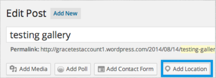
My theme, and probably some other themes too, has special post locations. There isn’ t a module, or a dropdown menu in the new editor to set the location. (https://otomobilaski.files.wordpress.com/2014/08/display-post-in.png)
Please note that that is the old editor, not the new. The new editor has the location prominently located as seen here:

In the old editor you can still get to location under title as seen here:
And the text box is too small. I know we can make it longer, but it must be wider. And it must be wider by default I think, it won’t be practical to reshape the box everytime I write. Currently, it limits me to write longer posts because I cannot see the whole post like I did before.
We are aware of this. Keep updated with our list of major sticking points here:
https://en.forums.wordpress.com/topic/new-post-editor-improvements?replies=1
-
-
-
I never thought about this actually. Thanks for bringing it up. May I ask why in non-English blogs particularly is it important to see the URL when creating the slug?
Because, for example in Greek, one greek letter/character is “translated” by WP software to 8 or 10 characters. The URL gets sometimes 4 or 6 or even more lines long, like this for example:
Διακήρυξη: Για την Πολιτική Αγωγή του αντιφασιστικού κινήματος στη δίκη της Χρυσής Αυγής
No one wants to deal with such lengthy URLs, as you can imagine. So, the best solution, IMHO, is to have the possibility to take a look first at the automatically created URL and then to decide if it needs change or not.
It’s a Greek language-related software general problem, that can ruin a post or a reference.
-
I forgot to mention that the captions of the photos are in a mess, too.
I can see them in the preview mode, I can see them and I can edit them in the new visual editor, but when I click on a photo to see the “Image details”, the caption box is empty.Unfortunately, I’m unable to reproduce this error. I created a screencast because I think it’d be easier to see:
Let me know if that’s not how it’s working for you. If you are talking about something else, let me know!
-
Actually, that original issue is not what I reported. I reported that it was neither OK in the editor nor in the (non-functioning) Preview. It was reversing on BOTH.
This is strange. Unfortunately I’m unable to reproduce this. Can you please open up a new thread and we can troubleshoot this a bit faster than in this main thread.
Sorry about the inconvenience.
-
The new editor does warn you when someone else is editing the same post. (I have 40 editors on my site), nor therefore does it give you the opportunity of “stealing”.
As admin of my site, I have lost the ability of editing posts created by others. The same goes for Editors who, according to WP, have access to all posts, pages, comments, categories, tags, and links.I’m sorry about this. We were able to reproduce this and it has been reported to our developers.
-
Yes, I use Chrome, which automatically blocks popups. I despise popups and thought everyone did. Does your team have a plan to change that to a “new tab” preview, instead of a popup? Or are you feeling that most of your clientele like popups?
Having the Preview open up in a new tab instead of a popup has been reported to our developers for review.
In the meantime, you don’t need to unblock popups for all sites. You can enable popups just for WordPress.com in Chrome by going here in your browser:
chrome://settings/contentExceptions#popups
Then, please add “https://[*.]wordpress.com:443” and set it to allow.
-
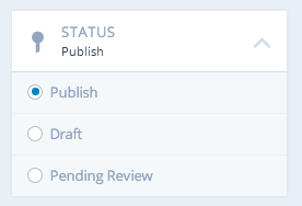
And there is still the problem of no “publish” button after a “preview”. It changes to an “update” button. Now I have to go to the dashboard, find the post, and open the classic editor to publish the post I previewed.
So in order to Publish after previewing a post in the new editor, change the status of the post to Publish and click update as seen here:
-
I don’t see in Jeremy’s “New Post Editor Improvements” the “Revisions” option.
Just added it. :)
-
Perhaps this is something that’s included in “make it easier to search long tag lists” (and after 20 pages of this I honestly can’t remember if you’ve said something about it, sorry!), but as several others have pointed out, categories now display in alphabetical order instead of in a hierarchy. This makes the categories harder to navigate (IMO), and it also makes it quite difficult to tell which categories are children of which – especially if you like me have a lot of categories, and some with similar names. I for one would really like to have the old, hierarchical category structure back.
Yes we have received multiple reports of this and has been included in the list to our developers – this is regarding making tags searchable and the hierarchical organization of the categories.
-
Essentially, the answer is “don’t use the new editor.” Everything I do will require extra effort. The interface slower and doesn’t work reliably. It has a lot of bugs. Many useful functions — and some critical ones — have been removed.
Can you explain exactly HOW this is supposed to improve our “blogging” experience? Because I cannot see a single advantage to this supposed improvement. It’s not easier to use, more functional, or less buggy. The word “disaster” comes to mind.
Personally? If I were working for your company — because you are in my area of expertise — I would tell you to roll back the whole thing and do some rethinking. Talk to users, NOT developers. Listen to input and learn what writers and photographers need and want. Chasing a “pretty interface” — the GUI that glitters — is foolish and self-destructive. It will lose you customers and credibility.
Bigger organizations than yours have collapsed from hubris. The list of “whatever happened to … ” is very long. You are not exempt from the laws that govern business. If you make your customers unhappy, make them feel disrespected and devalued, they will find another vendor. It may take a while, but it is as inevitable as the sun rising in the east.
You are going down a bad road. Why not turn back while you can?
Commonsense is an option at this point. Consider using it. -
@gracejiyoung, thanks for the response. Glad to hear it hasn’t fallen through the cracks but is being looked at. :)
- The topic ‘Beep Beep Boop screen is a joke. Is this a glitch?’ is closed to new replies.

