Here, we’ve compiled several common scenarios — and simple fixes — when creating photo posts.

Are you new to inserting images in your posts? Here’s a roundup of quick fixes:
Display a bigger image
Isn’t it unfortunate when you read a post with great photography — but the images are too small? The blogger might ask you to “click the image to see a bigger version,” too. This isn’t necessarily a no-no, but it’s an extra step for your reader to view your photos. Plus, with all the sophisticated themes out there that display full-width images beautifully, there may be a better way to showcase your images.
For a list of resources on images, check out this support page.
When you’re editing an image to insert into a post, you can set the size in the Attachment Display Settings section:
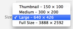
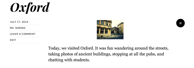
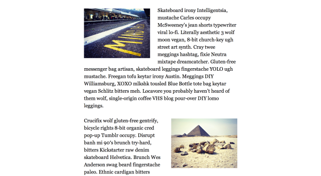
Be sure to experiment with and preview the sizes of your images. Oftentimes, a tiny image — set to “Thumbnail” — could be displayed bigger. For example, here’s a post with a thumbnail-sized photo, on the Ryu theme:
You don’t want your reader to squint to see the details of a snapshot, do you? Let’s see what this post looks like when the image’s size is set to “Large” instead:
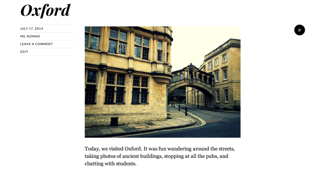
Here, the photograph takes center stage: it’s big enough, takes up an appropriate amount of space on the page, and there’s no clicking required. Each theme displays images differently — and some even have distinct styling for an image post format — so don’t be afraid to play around and see what your options are.
Experiment with the alignment setting
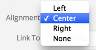
When you insert an image into a post, you have the option to display it to the left or right of your prose (“wrapping” your text around it), or opt not to use this effect (“None”). You can also simply center your image on the page, as shown in the Oxford post above, which offers a clean look.
You can set these options in the Attachment Display Settings section under “Alignment”:
Aligning your images left and right works well with image sizes set to “Medium,” but be sure to experiment in your own posts, and use the arrows along the borders of your images to shrink and enlarge them within your Visual Editor.
I personally like inserting medium-sized images throughout longform posts, alternating between left and right placement, which creates both variety and visual consistency on the page:
Alternatively, for posts with less text, you can center your image and set the size to “Large,” as in the Oxford post example above.
Also, consider the alignment of your photos especially if you have a left or right sidebar (or both). If your theme has a right sidebar with widgets, you might balance your site with left-aligned images in your posts and pages.
Consider the compositions of your images, too — if you’re inserting a portrait of yourself on your About page, for instance, pay attention to how it interacts with the rest of the page. Check out these two options:
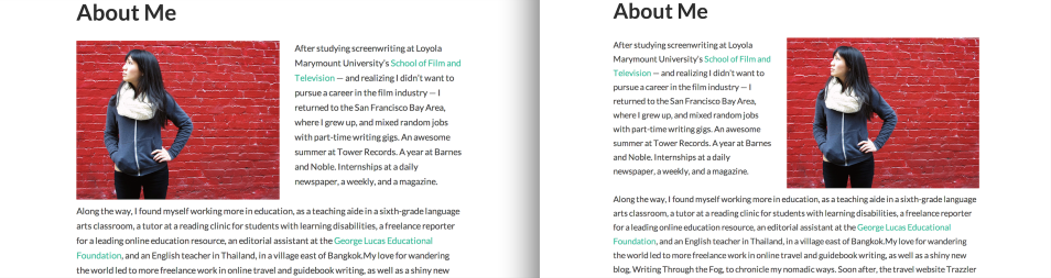
Both About pages use the same photo, with a left-aligned image in the left version and a right-aligned image in the right version. But the compositions are different, and you might be drawn to one over the other. I prefer the one on the left, as the empty red space feels placed in just the right spot. But some of you may prefer the right layout — the fact that the woman’s head tilts up, toward the “About Me” heading, is also a nice visual touch.
Simply put: experiment with the alignment setting!
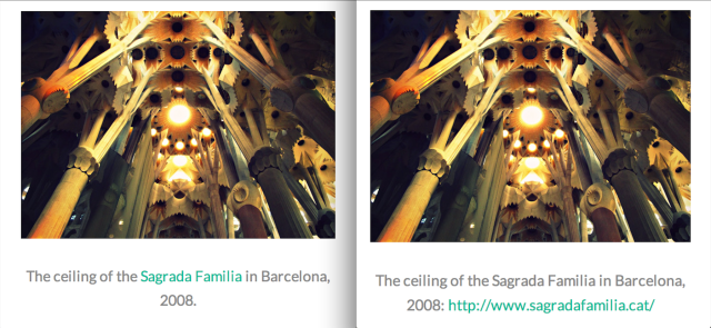
Create clean, appropriate captions
While they say a picture is worth a thousand words, it’s generally good practice to include captions with your images so your readers know what they’re looking at. When editing an image in your Media Library, you can drop in a caption in the Attachment Details section:
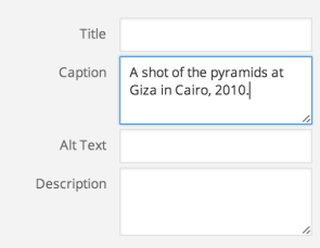
A caption provides more information, but should be succinct: one or two lines maximum. If you’re creating a travel post, for example, include details like the location, year, and subject(s), but leave longer, more narrative descriptions for the post itself. Don’t type an entire paragraph in the caption field, as shown below. Captions that are too long can look messy on the page:
Furthermore, if you’re inserting links in your captions, avoid pasting entire URLs. You can use HTML in caption fields, so use it to create clean copy. So, typing this…

…will create linked text, shown on the left below, which looks much better than the caption with the URL on the right:
Balance text and image
In point two, we considered the left, right, and centered alignment of an image. Here, step back and think about the ultimate placement of your photo on the page. Is it appropriate right at the top, underneath the post title and above your opening line? Does it belong at the very bottom, to close out your piece?
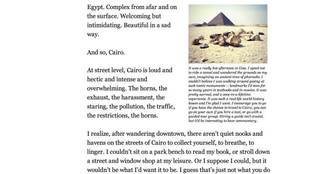
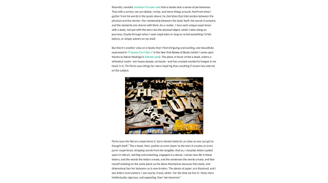
Or, perhaps it’s best in the middle of your post — as a tool to break up your text and offer a moment of pause between part one and part two, or one big idea and the next:
Train your eye to look at your post critically in preview mode before publishing it. Does the post feel bottom-heavy with an image at the end? Does a particular section of the post need a splash of color or breathing space?
Use a photograph as a visual divider: landscape-oriented (horizontal) images work well, as does stock and abstract photography, which you can find on these photo sites.
If you have additional tips to share, let us know in the comments.
Currently blogless? You’re a click away from sharing your story.
Create your blog at WordPress.com


This was really helpful, thanks.
LikeLike
story of my life, struggling to post images.
LikeLike
Thank you Cheri! I’ve had constant problems with sizing images in my posts. Its fine on a computer but when using my phone or tablet it can be a total pain.
These are excellent tips
LikeLike
A really clear, comprehensive and easy to follow post. When I began blogging at the start of the year, I had no clue what I was doing, but through trail and error managed to work out how to add photos and links to clips from youtube. The preview option is a great tool to use when deciding on the final look for a post.
LikeLike
Hi Cheri – Can you tell me how I stop the link/s in my post from being underlined – like the example you show in the caption? Is there an obvious way (I do tend to miss the obvious!) or does it depend on your theme? Thanks.
LikeLike
Hi there — I’m not 100% on this since I’m not a theme/CSS whiz, but yes, it could depend on your theme, or if you’ve got custom CSS somewhere that makes the styling this way.
Looks like you have the WP.com Premium upgrade, right? This includes the (Custom Design/CSS upgrade), so you could try adding some custom CSS in your Customizer to try and remove the underline.
One place you can ask for help is here: https://wordpress.com/forums/forum/css-customization
You can also search for similar requests in the forums (or even Google). I found something like this, although it’s not the quite the same issue as yours.
The moderators, staff, and users in the CSS forum could help you.
LikeLike
This is exactly what I was wondering about this morning. Thanks so much.
LikeLike
This was a great post. Very useful and informative. I can and will use all of these tips! Thanks again!
LikeLike
Very helpful thank you, I am new here and struggling to put pictures on my pages, thanks again
LikeLike
Thank you for the suggestions! Very helpful. Although in spite of being familar with html I still get soooo lost, but will reread and retry until I eventually get it. Again, thank you!
LikeLike
I totally support the “Display a bigger image” notion. A lot of bloggers have taken beautiful photos yet display them in tiny thumbnail which cannot show the readers how lovely the photos are.
If the bloggers are lazy to always change the size option to large, they can go to Setting> Media and adjust the image sizes for thumbnail, medium and large format. Best to display the photos as the content width. Look neater that way.
LikeLike
LikeLike
This is the problem I am having a great picture but jus not in the right place so annoying hopefully I will get there eventually
LikeLike
Beautiful, thanks for the info! Really helpful!
LikeLike
Getting braver with using images, so this helped a lot. Thankyou
LikeLike
lol oh god thank you for this
LikeLike
Thank you for sharing these tips, really invaluable.
LikeLike