
Four New WordPress.com Color Schemes
We’ve added four new color schemes to customize your WordPress.com dashboard!
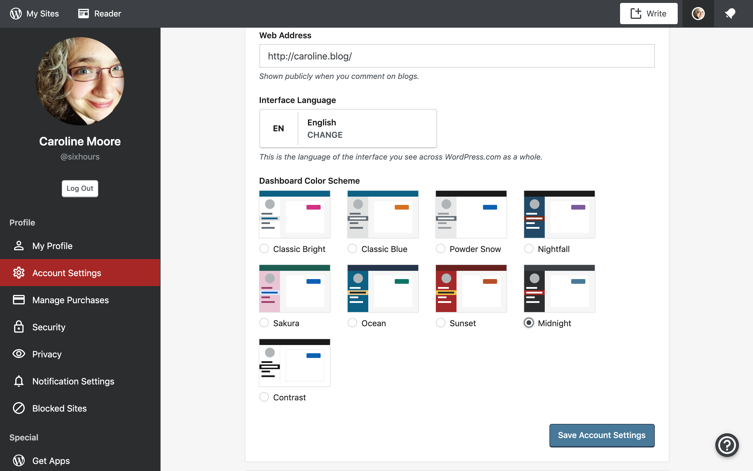
We heard you: You want bolder and brighter colors on WordPress.com. Today we’re bringing your WordPress.com dashboard to life with four new color schemes: introducing Midnight, Sunset, Ocean, and Contrast.
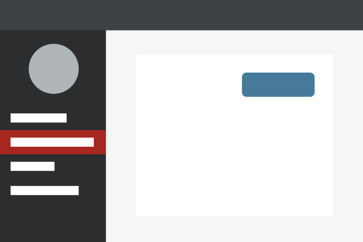
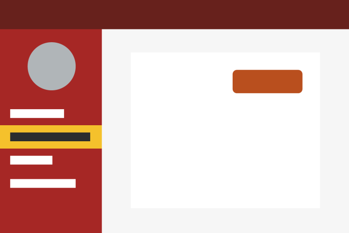
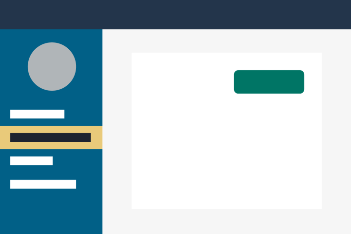
You may recognize some of these colors as old friends. Midnight, Sunset, and Ocean are based on early versions of WordPress — a nod to our roots as we evolve:
If bright and bold isn’t your jam, you might prefer Contrast, a black-and-white scheme meant to bring your WordPress.com dashboard into sharp focus:
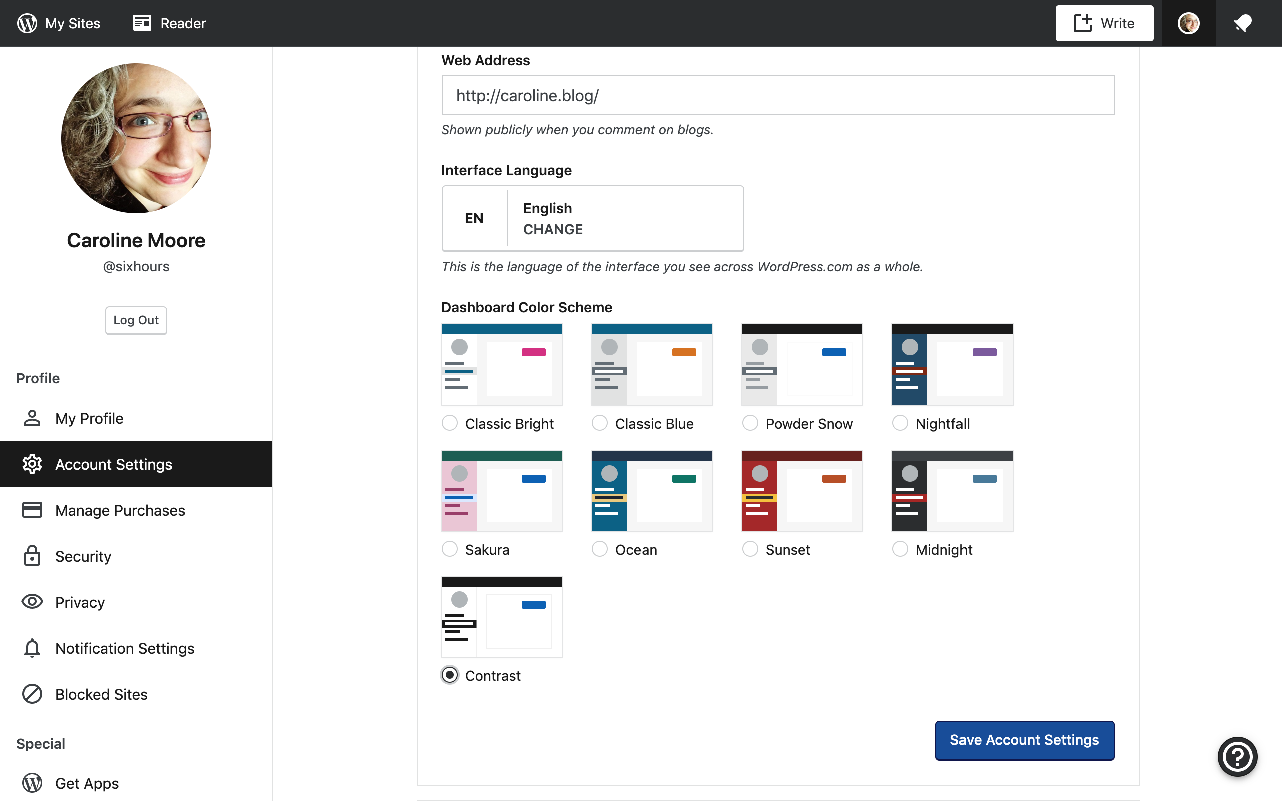
As part of our commitment to inclusive design, the new palettes are optimized for contrast and increased legibility. Whichever color scheme you choose, your dashboard remains stylish and readable.
Here’s how to customize your color scheme:
- On your desktop, sign in to the WordPress.com account that you’d like to customize.
- Click your account avatar in the upper right corner.
- Select Account Settings
- Select one of the options under Dashboard Color Scheme
- Click Save Account Settings to apply the change
- July 24, 2019
- Dashboard

Neat!
LikeLiked by 15 people
Awesome!!!! I was just playing with the color schemes and themes yesterday. So this is timely. Thank you for sharing 😀
LikeLiked by 14 people
Beautiful
LikeLiked by 17 people
I love the “Ocean” one. I’m curious, are there any plans of incorporating color schemes into the Windows app?
LikeLiked by 17 people
Love it
LikeLiked by 13 people
These are nice options – I assume they are just for hosted blogs. I don’t get a choice of colors with my free blog when I checked, but that’s OK.
LikeLiked by 8 people
It’s also available for free sites. Check this link in your account: https://wordpress.com/me/account
LikeLiked by 15 people
Hi Carla……thanks – we checked that page twice now and our page “ends” before those options are displayed at the bottom. Strange! Thanks anyway though……
LikeLiked by 8 people
Captivating colour schemes. I liked them
LikeLiked by 10 people
Beautiful ☆☆☆
LikeLiked by 6 people
Thank you, love them!
LikeLiked by 10 people
Love them!!! thanks for posting 😁
LikeLiked by 8 people
Oh, that’s cool. Gonna try it. Thanks 😊
LikeLiked by 9 people
Lovely selection. 😍
LikeLiked by 13 people
For me there’s actually not much choice as there’s only two options that have the orange colour for the notifications “spot” that appears by the bell. Many of them have blue spots that don’t have clear enough contrast on the bar that the “bell” is on. I dislike the bright pink colour so avoid that. That leaves me my current classic choice plus one other. Can’t say I’m excited about it.
LikeLiked by 9 people
Thanks for the new color schemes! Looking forward to having Coffee, too. (I ❤ coffee!)
LikeLiked by 8 people
Hi Caroline. I am going with Classic Blue, but as an advertising and brand communications professional, I have a suggestion. I think WordPress as a company should stick to its brand colour, which I think is a particular shade of blue. You ought to retain this as a fixed colour for your header/masthead and then suggest other colours around it that might work as good combinations. That way, you retain WordPress’s brand identity and at the same time, you allow bloggers to customise their dashboard to suit their tastes. What do you think?
LikeLiked by 8 people
Thank you for the FYI. I changed my color immediately.
LikeLiked by 9 people
this is amazing!!!!!
LikeLiked by 12 people
I am very happy with mine, but I love that you keep adding more.
LikeLiked by 12 people
Awesome!
LikeLiked by 12 people
Love it!
LikeLiked by 10 people
These new colors are great! I really like the “Sunset” combination, as it compliments my blog logo. Really excited for more color palettes to be introduced!
LikeLiked by 8 people
Beautiful😀
LikeLiked by 11 people
Happy for the sea
LikeLiked by 10 people
love it !
LikeLiked by 9 people
Wow, can’t wait to try these out
LikeLiked by 11 people
Thank you for all the information. I just love the new colours especially the “Sunset” It is always good to, go in for new things and changes, that means we are moving ahead in life 🙂
LikeLiked by 10 people
Thank you, I’ll choose the red and black one!
LikeLiked by 8 people
I like Sakura (.. actually I used Sakura theme as I have recognized the new theme changes and just liked the colors tender and nice ) .. then now found the theme name is “ Sakura : cherry blossoms “ one of the flowers I like a lot 🙂
LikeLiked by 8 people
Captivating variety of color scheme
LikeLiked by 7 people
Thank you so much! I jumped straightaway to the Settings haha.
LikeLiked by 10 people
These colors are so attractive
LikeLiked by 9 people
Thanks for improvements, dashboard seems alive now
LikeLiked by 10 people