
Customize Your WordPress.com Dashboard
January 8, 2019
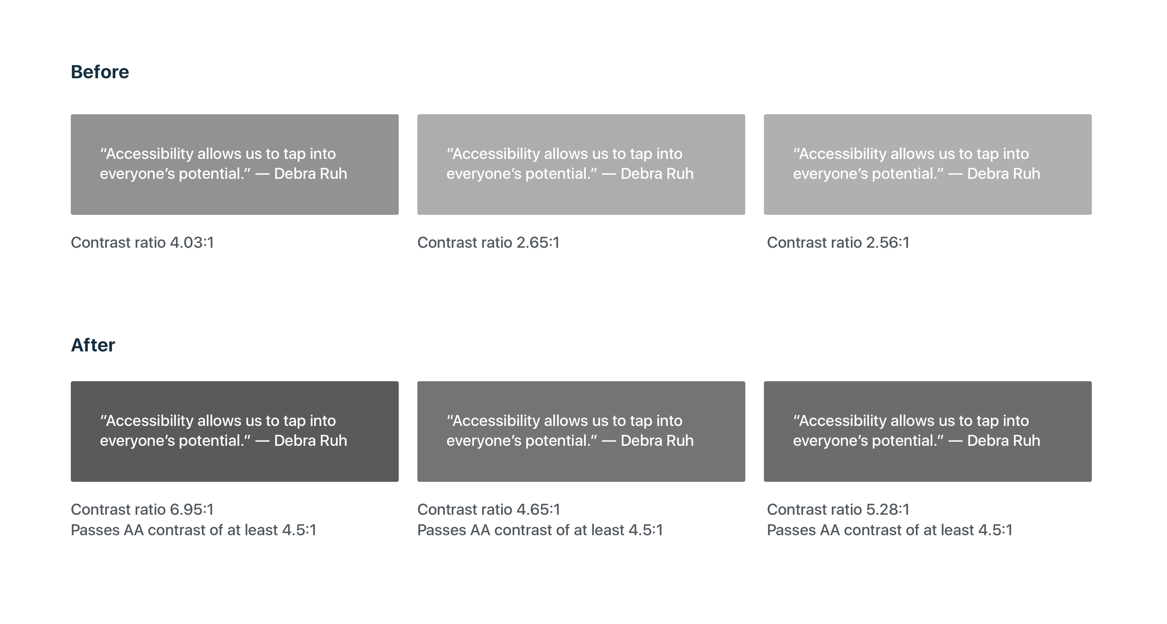
We’re happy to announce new improvements to your WordPress.com dashboard for a more accessible and customized experience. From your desktop, you can now customize your dashboard by choosing one of our two new color schemes, Classic Bright for a fresh modern feel and Classic Blue as the standard you’ve known and loved. As part of our commitment to inclusive design, these new colors have been optimized for higher contrast and increased legibility with a contrast ratio of at least 4.5:1.

We’ll soon be introducing additional color scheme options that will continue our mission of a better more accessible web for everyone.
Here’s how to customize your color scheme:
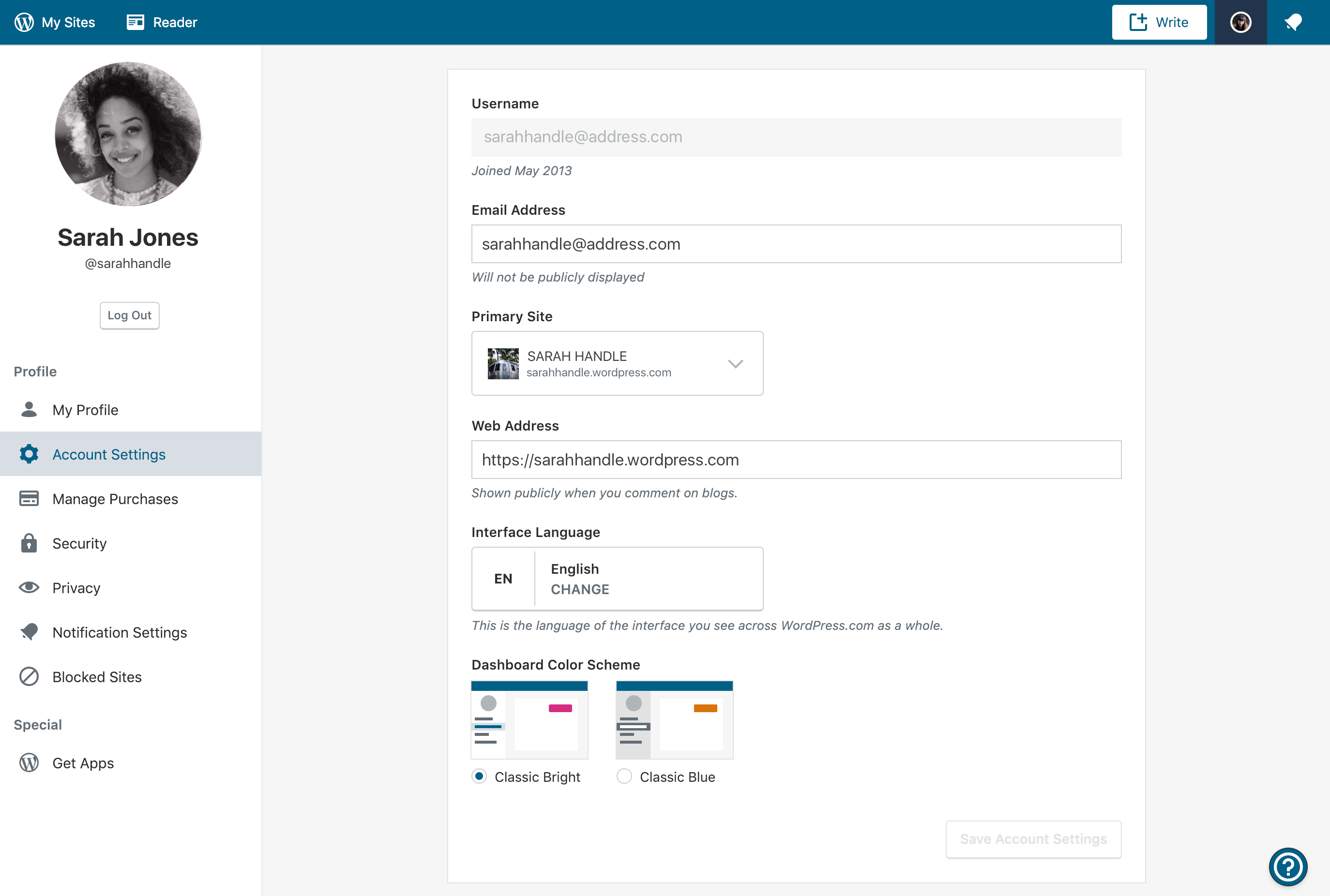
- On your desktop, sign in to your WordPress.com account that you’d like to customize.
- Click your account avatar in the upper right corner.
- Select Account Settings
- Under Dashboard Color Scheme select an option
Have ideas for color schemes you’d like to see? Please comment below.
Join 110.3M other subscribers
- January 8, 2019
- Admin Bar

Loved the earlier much brighter scheme. Now the colours feel more sad and depressive.
LikeLiked by 29 people
Yes, that’s what I thought! When I first noticed the change it looked to me like some temporary connection issues, as if everything went offline.
LikeLiked by 22 people
Improvement is always great, but my memory tells me that the ‘standard I’ve known and loved’ was blue and orange, not just blue?
LikeLiked by 17 people
yes, it was – on the map, specifically, and also markers signalling posts from today/this month etc.
LikeLiked by 7 people
ps: I for one am not a fan of the pink scheme.
LikeLiked by 13 people
both color schemes are beautiful. thank you wordpress.com.
LikeLiked by 7 people
I don’t want to spread negativity, but both currently available themes are extremely dark. Yes, that applies to ‘Classic Bright’ too. In the dashboard, the pink highlighting the day on the stats chart barely stands out, it’s so dark, very close to the blue. The world map with traffic source doesn’t even have the pink at all, it’s just all dark greyish blue.
LikeLiked by 19 people
Yes, you are right. I’d prefer a highlight in the traffic source, too
LikeLiked by 9 people
Please feel free in this case to spread the negativity.. I hate this new scheme and want the orange colour back, as it was. Now you can barely tell what you’ve put a “like” on.
LikeLiked by 11 people
The former, brighter color scheme please.
LikeLiked by 17 people
I would agree that both current options are a “tad dark.” Much enjoyed the older colours.
LikeLiked by 12 people
+1
I think it’d be nice if the masterbar was the older blue for Classic Blue, because this does just seem a bit too gloomy.
LikeLiked by 10 people
I agree
LikeLiked by 6 people
I’ve just logged in, in New Zealand, and was horrified to find that the colour scheme had been changed for me without my choice. The usual tan-coloured dot for notifications was a sickly pinky colour (as was the login button). When I clicked to “like” something it just went a darker blue and wasn’t clearly different at all. I don’t appreciate the interference of WP in matters that were perfectly fine as they were. Now I’ll have to go and try and get it configured back to how it was. Why couldn’t you have just left it as it was?
LikeLiked by 13 people
And I’ve gone into Settings and I don’t have a choice shown there that allows me to go back to the old colour scheme. Please reinstall the old scheme, I loathe this one.
LikeLiked by 11 people
It looks sad and monochromatic, kind of dark and just. . . blue?
LikeLiked by 7 people
The original classic blue, white, and yellow theme would be nice to have back. . .
LikeLiked by 9 people
Left ours like it was, satisfied. 🙂
LikeLiked by 6 people
How did you do that? This change was imposed on me – there already when I logged in. There was no choice to revert to how it was.
LikeLiked by 8 people
I’m pleased with what I have had , I’m afraid if WP has commited to formats that I’m not happy with I will be closing out my blog. Hopefully that’s not going to happen.
LikeLiked by 9 people
Nice. How about a “dark mode”?
LikeLiked by 11 people
I love the readability and refreshed feel of the new color schemes. Bravo!
LikeLiked by 8 people
Really? How is it more readable to see what you’ve put a “like” on when the star only goes a darker shade of blue instead of orange?
LikeLiked by 9 people
It’s much better contrast from the foreground to the background — and thus easier on my old eyes, especially on my mobile devices where often tiny text is hard to read without my glasses on.
LikeLiked by 5 people
How is blue more contrasting to blue than the good old orange?
It’s interesting that you say the new scheme is easier on your eyes, for some reason my eyes have been hurting ever since the change, something in this colour scheme is extremely eye straining in my case.
LikeLiked by 7 people
The classic blue isn’t the same as what it was. When the colours just changed on me I thought my computer screen had glitched, then realised the scheme had changed. Saw this post and changed the setting back to Classic Blue but the colours on the map, the lack of orange bar, everything is different and honestly both schemes are harder on the eyes than what we had.
LikeLiked by 16 people
Let’s say that I don’t have any issues with the colors, bright, blue could be anything, I will get used to it. But as a fun fact I can’t see the text anymore on the Notification option, just the picture of the blogger who liked or is following my blog. And this is happening when I am in the My site. When I enter the Reader I can see also the notification text. This seems to be a bug.
LikeLiked by 7 people
Honestly, it is kind of depressing and the pink isn’t all the great… I much preferred the orange. I would be a lot happier if there was an option to go back to the old one, which was way better.
I wrote an article reviewing it too, if anyone wants to read it: https://wp.me/pa0p2b-8a
LikeLiked by 15 people
First, thanks for always trying to improve things for us. But, sometimes, the way it is works just fine. I went in to free myself from the pink— I’ve grown too accustomed to the blues and/or I’m a creature of habit— so I accessed “account settings” and clicked “classic” to revert to what some might consider the same ol’, same ol’ but what I think is just perfect. And it’s just not the same. Too dark and hurts my eyes. I like the lighter hues the way they were. And, yes, while it’s novel to scroll over any given day to see the contrasts better, I’m not convinced that the new-and-improved works better for me. So, what’s the likelihood that we’ll get back what we had before? Thanks so very much!
LikeLiked by 16 people
Here’s my honest response: The more your folks at wordpress change and upgrade, the more I feel like leaving wp. It look me some time to master the blog and the web site and I do not have patience for mastering new things every six months or every year. I get very frustrated with every new change. I am of the age that I need a person to totally walk me through every new change, a live person, on a phone or in a chat, or better yet, in the room. So when you change something else, please do not inform me of it. It just makes me nervous. I have reached the stage in life where I accept What Is.
LikeLiked by 18 people
Being able to switch between two equally lame and unattractive color schemes is not “customization”.
LikeLiked by 24 people
Why do you provide this option only through the Dashboard “Settings”. When I joined WP there was no link provided under “My Sites” to the Dashboard and it took ages before I read you have to add wp-admin/ onto the end of the blog url to get the Dashboard. Under the “My Sites” Settings which I can easily access you don’t colour scheme options. There’s such a disconnect between “My Sites” and “Dashboard”.
LikeLiked by 11 people
I agree with many of the comments above concerning the new colours. The blue is dreary. When the bright pink is present, the blue appears even more drab. A colour with more life and warmth would be appreciated. That should be possible while also delivering greater contrast. Yes, improving accessibility is good, but not at the cost of colouring everything dull.
LikeLiked by 12 people
I miss the orange. Orange contrasts well with blue. I would prefer a choice between “Classic Orange and Blue” and the new “bright” scheme. The so-called “Classic Blue” hasn’t enough contrast, so is no improvement.
LikeLiked by 8 people
I want the option to revert to how it was before. To just impose this new scheme is insulting. It always was fine on my laptop. Maybe folks using WP on cellphones screens and such benefit from this, I wouldn’t know. But for me, I want the colours just how they were!
LikeLiked by 6 people
Hi Courtney My name is Deb Peisner. I now have a wix site and am no longer using my WordPress site. I am getting these continual spam type of e mails. Do I need to turn off my WordPress site due to moving my domain to my new wix site?
LikeLiked by 5 people
Hi! Can you forward one of those email to help@wordpress.com please? We will be happy to take a look and help further.
LikeLiked by 3 people
I applaud your desire to change, improve, innovate. I’m probably in the minority, but perhaps you could have a two-track system: one for those who thrive on change, and one for people like me who have limited time and need every second of it for substance over a frequently changing format. Do consider my/our needs. Thanks.
LikeLiked by 7 people
Not sure what improved. Can barely see where is the like button.
LikeLiked by 6 people
Thank you for trying to improve this platform.
Now that I’ve gotten the niceties out of the way, who’s the genius behind this idea? The color scheme is a TOTAL failure. It’s too dark. And stats for today show up either in pink, or in the same color as other days. What diversity. LOL.
I’m all for changes, but at least give us the option to keep it the way things were. This is madness.
LikeLiked by 11 people
Nice..
LikeLiked by 4 people
Since I’m new to word press and publishing this is great information! Thank you so much!
LikeLiked by 4 people
Present appearance is good no offenses but we should try the new one. Somehow little changes are very much necessary.
LikeLiked by 5 people
Would it be possible to also leave the option to revert back to old color scheme?
It’s great you are trying to be inclusive and make it easier for people with vision problems, but there are also people like me who have neurological issues and have trouble adjusting to any change. It takes me a long time and a lot of effort to deal with even for a small change such as color scheme.
LikeLiked by 6 people
A most welcome improvement, thank you. I definitely prefer the higher contrast, so much easier to read. The “new” blue is darker which I prefer over the “old” blue. The added pink is a nice touch. I always use the classic editor and classic Stats, Comments, etc. so don’t see the “new” color scheme except when visiting the Reader and when I log in. And, yes, please give us more color choices in the near future, green would be lovely.
LikeLiked by 4 people
If it ain’t broke, don’t “fix” it.
The new color schemes are atrocious. Give me back the orange bars for the stats and the yellow to orange/red colors on the maps. It’s very difficult to see the gradient on the maps with that dull blue-gray tone.
I also agree with Judy L. above. Many of us bloggers are not techies and the more you screw around with the platform with the frequency with which you do it, the more inclined I am to take my five blogs/websites elsewhere. (And I’ve only dipped my toe into the whole Gutenberg blocks thing—again, making something relatively simple more complex.)
I’m all for improvement where real improvement is needed, not just for the sake of doing “something.” You can do better, WordPress.
LikeLiked by 9 people
agreed, the maps’ contrast is the worst this time.
LikeLiked by 3 people
Still won’t improve my traffic
LikeLiked by 4 people
Siding with all the above comments, please reintroduce the old theme as the third option, ‘Classic Original‘..
Thus, everyone’s problems, including mine will be solved. 🙂
LikeLiked by 9 people
Hey. Can anyone help me? I updated my blog today. But whenever I use a browser to read the blog. Everything goes out of screen. Has anyone dealt with this problem? Please help.
LikeLiked by 4 people
Okay, fair point, you added a chart comparing the contrast between the new colours vs white. I agree that the contrast is better there (you made the colours darker, so it’s obvious that dark is more contrasting to white).
But, you missed the point where new colours also have to be contrasting between one another, not just white.
And I’m sorry to break it to you, but two dark colours don’t contrast at all.
GUI is supposed to highlight the important information effectively, so that it’s clear and instantly visible. With the current, plain dark colour scheme, I can’t instantly tell which day I’m on in the stats chart, I can’t instantly tell where my traffic comes from looking at the map, I can’t instantly tell if there’s a notification dot on the bell and I can’t instantly tell whether I’ve already liked a post or not. All of those things which should be intuitive and visible at first glance are now extremely eye-straining and since the change I’ve had trouble managing my site for longer than 5 minutes at a time (I had to switch to doing certain actions on my mobile app, which still has nicely contrasting colours).
LikeLiked by 7 people
But, you missed the point where new colours also have to be contrasting between one another, not just white.
pretty much!
LikeLiked by 4 people
Same comment as many other here, please add back a third scheme like the old one with light blue/orange.
LikeLiked by 7 people
Love how customer-friendly WordPress.com positions itself to be, when they don’t even listen to their own customers. Will migrate to Bluehost after my plan expires.
LikeLiked by 9 people
Oh dear! I don’t think these changes are very good, especially given that the classic blue is nowhere near like it used to be. Like many others have said, the new colours are too dark. Brighter colours would not only stand out a lot more but would also be very eyecatching.
I know there are more colours on the way, but can we have some bright, cheerful colours, please? How about some yellows and oranges as a start. Or, how about starting by giving us back the classic blue colour, as it used to be, as an option?
LikeLiked by 8 people
Can we please have an option to go back to the old color scheme? The new one is NOT the same.
LikeLiked by 9 people
This option is there just follow the instruction she gave above and choose the classic blue which is the default theme.
LikeLiked by 4 people
Take that back. The Classic blue theme is similar to the original theme but the orange color is a little more deeper and so is the blue. Moreover the like’s color still remains the hideous blue color.
LikeLiked by 4 people
It is orangetblue now. It was just dark blue this morning.
LikeLiked by 4 people
Yeah but the like’s color is still dark blue in color
LikeLiked by 3 people
Really? Ergh. It’ll be hard to see, then.
LikeLiked by 4 people
Yeah sadly.
LikeLiked by 4 people
Hello, I seem to have a problem: after the re-styling in the tablet version I cannot view the text of my notifications! (Luckily only in the tablet version.)
LikeLiked by 4 people
Why do I have to keep looking at “ad” of some sickening fat gut and a bunch of scam ads.
I pay for the level that is supposed to eliminate ads, instead I have to keep looking at some fat gut and scam ads.
What is gong on? Why can’t I eliminate the ads? My fees were raised 26% this year and I still need to look at scam ads?
>
LikeLiked by 5 people
I simply HATE when new changes come and I do not have the option to keep with the same good old thing that I had before. Can you please reverse that awful color scheme change and give us the option to keep the standard one, the real and true “Classic Bright”? Things have changed within the pages as well when I’m editing them. That’s really annoying.
LikeLiked by 11 people
Please can you return the colours to as they were as the default theme, then when the designers can work out how to deploy a change correctly have it as an option to change the colours (to the depressing themes they have chosen), not force it.
Even if you do change to classic blue, the stats current day is no longer highlighted orange, it is the same dark blue.
I spoke to support as i thought it was something i messed up, they accepted my concerns about the forced colour change, this was hard to read as the chat window was the horrible pink colour with white writing, but they can only tell me the designers decided to do it, and blogged about it the day they pushed out the change.
LikeLiked by 8 people
Restart your computer system when you select classic blue theme and log back in wordpress and that orange color on stat will resume, however the classic blue theme is not the default theme but is similar to it and on the contrary, the like’s color (star) remains the hideous blue color
LikeLiked by 2 people
Great blog. what about light theme it looks great. thanks for sharing.
LikeLiked by 4 people
thankyou
ในวันที่ พ. 9 ม.ค. 2019 เวลา 02:51 The WordPress.com Blog เขียนว่า:
> Courtney Burton Doker posted: ” We’re happy to announce new improvements > to your WordPress.com dashboard for a more accessible and customized > experience. From your desktop, you can now customize your dashboard by > choosing one of our two new color schemes, Classic Bright for a fresh mod” >
LikeLiked by 4 people
Love it.
LikeLiked by 5 people
This is great but I like the original theme we had first :I
LikeLiked by 5 people
Hmm… NICE
LikeLiked by 4 people
NO, no, no … just STOP IT with all these ridiculous tweaks.
LikeLiked by 9 people
Well, color impression is Germaine yet, I will stick to the original. Thanks.
LikeLiked by 6 people
I find it refreshing but would like to see more options. Orange is always a good color because it represents warmth and happiness. Green, also is a good color because it represents newness and growth. Even, black, which can be stark and sexy. Those that like neutral may go for khaki and brown tones. There are a plethora of color options so offer more, please. Thank you.
LikeLiked by 8 people
Please, please, please get rid of that ghastly pink
LikeLiked by 10 people
I will have to study this later, but … is the new default for the “like” going to stay at blue – if I am unable to read all the new posts in Reader at one time, it is difficult to see where I left off. Sometimes I go through Reader and have time to read the short post, mostly the photographers I follow, but need more time to read lengthier posts and comment on them – I can’t see where I left off. Is this something we can manually adjust?
LikeLiked by 5 people
Yay for a better contrast. And I just love this deeper, richer blue. It’s easier on the eyes and gets out of the way.
LikeLiked by 5 people
I like this new update for dashboard. Yeay!
LikeLiked by 4 people
For those of you who don’t like this latest debacle, I am sorry to have to state this, but WordPress is not going to change things back to the old way. That train wreck that’s our stats page? It’s still ugly and when it was originally rolled out, there was plenty of negative feedback and it did not one bit of good. Save your ire. They’re not listening. They never do.
LikeLiked by 7 people
Hate it. Atrocious pink. There was nothing wrong with the previous color scheme. Why waste time on this nonsense? Also not thrilled with the new editor and have been using the mobile version to avoid it. Not my preference for writing. I rarely complain but my tolerance for the unnecessary changes is growing short.
LikeLiked by 16 people
I agree with exploribgcolour’s comment. I could never find the dashboard or anything leading to it (not for that matter to forums or support to ask them) and now find that it is hidden under the ridiculous name of WPadmin. Who realises that that is the dashboard? Please change the name under My Sites from WPadmin which is meaningless to Dashboard which you often refer to.
LikeLiked by 7 people
Add me to the list of people who preferred the old color scheme. When I post links to other posts in the Reader, the blue link is so hard to distinguish from the black that I don’t think people will notice it’s a link….and I don’t like the blue like button either. I have not tried the new editor yet, but have heard nothing but complaints about it too…..will that be forced on us too? Please, if it’s isn’t broke, don’t fix it! Not everyone has tons of time to sift through all these changes.
LikeLiked by 3 people
Why are my stats (the columns) black, along with the mapped locations of those who have read my posts? Just wondering if it’s my computer?
LikeLiked by 4 people
Not a fan of dork blue and icky pink. The other choice is just dork blue. Classic Bright is annoying and hard to read. Classic Blue is just hard to read. This is a major fail.
LikeLiked by 4 people
I hated the pink thing, so I changed it to the Whatever Blue, and it was WORSE. Also, the new editor, who works in blocks, make it much more difficult to format a single word in a paragraph. The color scheme for text and backgrounds is not particularly working. Pure black is impossible, only very, verydark gray. I feel I’m in the LEGO movie.
LikeLiked by 7 people
I find that the orange colour highlighting a selected column in the charts is better than the new ‘pinky-purple’. More options of colour schemes, as others have requested, would indeed be welcome. However, could you please change the orange text highlighting the most frequent number of views per month and the highest average views per month in tables — the bright orange here on the white background is hardly visible (perhaps red text or a yellow background coloured cell would make the record figure more noticeable).
LikeLiked by 7 people
Hi everyone :wave:
I wanted to share an update that we were experimenting with different accent colors for the Classic Blue theme and decided to land with orange. Hopefully by now this shift should be propagated to everyone.
Best,
Courtney
LikeLiked by 5 people
Hello Courtney,
I am glad to see that WordPress has taken some thoughts from their users! Although the new orange color is not as ‘bright’ as the old design, it certainly looks better than the old navy blue. Thanks!
Regards,
Connor
LikeLiked by 3 people
I noticed the change and have posted on my Exploring Colour blog about how glad I am to have an orange bar back again on the stats chart. That’s great, BUT its still not good enough that the orange colour has not yet propagated to when I hit the “Like” button on posts in Reader. It still just goes to a dark blue solid star. If I’m browsing down Reader to see what I may have missed the contrast between a blue unfilled star and a darker blue filled star is simply not enough!! Please, please attend to this as well PLEASE!!
LikeLiked by 3 people
PS. I actually like the new blue in the Classic Blue scheme. Obviously different people have different preferences for the blue therefore I’d like to see an option for “Classic Blue” and another option for “Classic Blue – Original”. So many people like the orange that I’d expect you’d retain the orange in both schemes. I’d like WP to also please re-configure “Likes” so that if I click on “Like” then the star goes orange. And also in the Traffic chart, now we have an orange “Current” bar, lets have the current day’s posts with an orange line (vertical bar) beside them. Thanks.
LikeLiked by 4 people
Thank goodness for adjusting the shades, current accents are still worse than what we used to have but better than what the first update brought.
Now bring back colours to the world map and it might actually be bearable!
LikeLiked by 4 people
Adding orange to the Classic Blue is certainly a change in the right direction. Make both the blue and the orange a bit lighter and we would be back to where we were, which was fine. But this is an improvement. Thanks for making it.
LikeLiked by 3 people
Better contrast is good but the stats map is so dull only in shades of grey and blue etc. i liked the RED to tell me where most of my readers were located. Also in Reader when I”like” a post it just goes to a darker blue. The yellow/orange would let me know what posts I had already liked. So I’m not a fan of the new design.
LikeLiked by 7 people
Text in a light colour on a dark background is always difficult to read. If the background is a dark colour the text should be in white. It would help more if you could fix this.
LikeLiked by 5 people
I prefer a mixture of med to dark gray scales with very light gray to white fonts presenting option boxes. And with bright colors for the chosen box options. The brighter colors for the chosen options would have the reverse color in fonts. Med to dark gray fonts. I can see better with the dark color option than I can with white backgrounds.
LikeLiked by 3 people
Love the new color scheme 🍁😊
LikeLiked by 3 people
i don’t know how to use this..im beginer here
LikeLiked by 3 people
With the new scheme it is much harder to see which notifications have been read and which haven’t, seen they’re almost the same colour. It’s also harder to see which posts in the reader I have liked, whereas before it was quickly apparent.
LikeLiked by 6 people
I like the new colours. Thank you for the new improvements. Looking forward for further changes for the better in the coming years 🙂
LikeLiked by 3 people
I exclusively use the mobile app and always appreciate when features are made available on mobile and not just desktop.
LikeLiked by 3 people
Mantap
LikeLiked by 2 people
Mantap bg
LikeLiked by 3 people
I appreciate WP’s commitment to inclusive design. However, the new themes are harder on my eyes, not easier. It would be wonderful if we could have the option of a light theme, like the classic themes available until just a few days ago, as well as the high-contrast themes. 🙂
LikeLiked by 2 people
So….this is why my dashboard has so much pink now? Pink buttons, pink stats….Not that I mind the color pink, I just thought maybe a feminist hacked my account.
LikeLiked by 5 people
As usual, WordPress is behind the times.
LikeLiked by 1 person
Hi….
LikeLiked by 2 people
Can we still use the old theme?
Not the Classic Blue, the original one with blue and orange!
These new color are so bad!
LikeLiked by 2 people
Hai
LikeLiked by 2 people
i like this new colours
LikeLiked by 2 people
thanks
LikeLiked by 2 people
wordpress is very power on SEO..
LikeLiked by 2 people
Yeah i love the new color
On Jan 14, 2019 9:30 PM, “The WordPress.com Blog” wrote:
Sarjoni commented: “wordpress is very power on SEO..”
LikeLiked by 2 people
Regarding colors, as long as I can read them easily, I don’t care much about them. I don’t know why they needed to be changed, but I don’t notice them (except for the bright pink, which is a little much). The bar denoting visitors as opposed to views, however, seems to have disappeared from my page in wp-admin.
If a color change is made, I’d like it to be the default font color. The gray is difficult to read. Black would be a help–if not the default, at least the choice to change easily.
I do everything from the wp-admin page because it’s convenient–I can go anywhere from there. The new blocks are nice–I used it several times–but the page hides buttons and icons, requires more clicks, and has less functionality than the classic editor. I can start new paragraphs in the classic editor without needing blocks.
LikeLiked by 5 people
I suggest the colour should be more brighter and simple
LikeLiked by 3 people