Make the Most of Your Mobile Site
You’ve spent time making sure your blog looks exactly the way you want — it’s got personality and complements your content. But what about the people who read your blog on a phone or tablet? Have you looked at your blog on a three-inch screen to see what they see?
Luckily, it’s easy to make sure your blog looks great, no matter the size of the screen.
Understanding mobile themes.
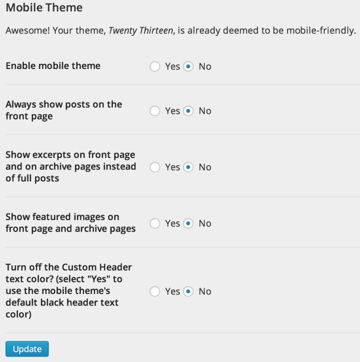
We assume you want your blog to look good on mobile devices. If you’re using a responsive theme (more on that below), you’re all set. Otherwise, we’ve taken the liberty of checking off the “Enable Mobile Theme” box, found in the Appearance >> Mobile section of your dashboard:
A responsive theme automatically adjusts itself for the size of the screen, so your blog still looks like your blog but is fast and mobile-friendly. Every new theme release is responsive, as are some older themes — see if your theme is on the list.
A responsive theme might shrink your sidebar to make more room for the main column, or turn words into symbols to save space (just like your WordPress.com dashboard does when you use it on a phone), but will always maintain the overall look of your blog:
(If you’re using a responsive theme but aren’t seeing it on mobile devices, make sure the “Enable mobile theme” box is not checked — you don’t need the mobile theme if you have a responsive site.)
If your theme isn’t responsive and you leave the “Enable mobile theme” box checked off, mobile readers will see Minileven, a version of the Twenty Eleven theme designed to be clean and quick on phones. Your homepage won’t look quite the same as it does on a full-size screen, but it’ll be neat and easy to read. Readers can also click the “Full Site” link to see your regular theme.

You can disable the mobile theme if you’d like, but it’ll make your site slower to load on phones and tablets, and you might not love the way it looks. Some people with older phones, like your friend who loves his flip-phone, might not be able to see it at all.
Mobile home page options
As you can see, there are a few other choices you can make about your mobile theme’s appearance:
If your site has a static home page instead of a blog, it might look blank on small phone screens. Tell the mobile theme to display posts on the front page, so there’ll always be content — head to Appearance >> Mobile and select “Always show posts on the front page.”
You can also control your header. If you’re using a custom header or background, most modern mobile devices will display them. Minileven also lets you adjust the color of header text to make sure it’s readable; some colors are too light to stand out against its white background. Go to Appearance >> Mobile and select “Turn off the Custom Header text color?” Your mobile site will be readable, and the desktop version will be unaffected.
You can also choose to display post excerpts on your mobile home page. A post that takes up half a screen on a desktop or laptop can occupy three-plus screens on a phone, may not make it to your older posts. Since your home page has less screen space on a phone or tablet, showing excerpts can be a great way to show off multiple posts without requiring your readers to do a ton of scrolling.
Mobile CSS
If your blog uses the Custom Design upgrade to add Custom CSS, you can apply those edits to Minileven. Go to Appearance >> Customize >> CSS and check off “Include this CSS in the Mobile Theme.”
You can also add custom CSS that only applies to your mobile theme — insert “.mobile-theme” at the beginning of your CSS selectors to target just the mobile theme and leave your fullscreen theme as-is.
With a few quick checkmarks, you can create a consistent experience for your readers across all kinds of devices.
Was this helpful? You might also like:
- Mobile Theme Gets a Facelift
- A Week of Responsive Themes
- An Intro to CSS, or How to Make Things Look Like You Like
- Branding Your Blog: Let’s Get Visual
- August 26, 2013
- Customization, Mobile, Themes


My theme is always the blue one. ALWAYS 😦
LikeLike
Definitely need a responsive theme for mobile optimization
LikeLike
interesting. this would apply for google searches also?
LikeLike
On mobile devices? Yes.
LikeLike
any way to globally activate mobile theme even as desktop theme?
LikeLike
The mobile theme, Minileven, is only available on mobile devices. Minileven is based on the popular and beautiful theme Twenty Eleven, with a lot of tweaks to optimize it for mobile screens.
LikeLike