New Theme: 2813
December 7, 2006
We’ve got a new theme for you, it’s a three-column very clean and minimalistic theme with full widget support. The two sidebars are on the right side and they’re pretty plain by default but once you get the widget action going it looks pretty sweet. This theme was developed jointly by Eli Foner, Paul Stamatiou, and Neil Patel.
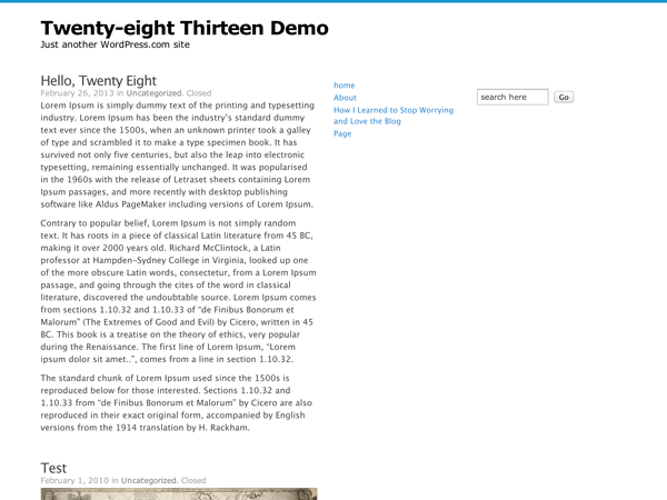
Here’s a preview:
Join 110.7M other subscribers
- December 7, 2006
- Themes

sweet..keep em coming…thanks
LikeLike
wow, you guys are on a roll! keep `em coming. thanks so much again!
LikeLike
Sweet
LikeLike
looks great ! am going to try it out now
LikeLike
Very nice, I love it, I may consider switching now =) Thank you!
LikeLike
I’m looking under the Presentation tab on one of my blogs and I’m not seeing it listed?
LikeLike
This theme is really nice. 😉
LikeLike
Great theme!!! I like this theme much more than your previous one “Fadtastic”, which I’ve just made my current theme.
Now, I’m going to update my blog. It was a bit difficult to find it among Available Themes, since I was looking for theme “2813”, not “Twenty-eight Thirteen”.
Or should I wait for a bit? I wonder if the next one will be much better?
LikeLike
Hi all,
Does the new theme have a customizable header?
LikeLike
Nice, but does it have custom header support? I’d really love a three-column theme with custom headers. Please?
LikeLike
I like three columns. Thanks for the new themes 🙂 So much choice!
LikeLike
Does anyone yet have this theme activiated yet?
LikeLike
Nice Theme 🙂
LikeLike
Cool theme – I love the minimalist stuff 🙂
LikeLike
Mmm.. weird and poor theme, but hey.. i bet it will have it’s fans.
LikeLike
Finally! a clean 3 column! Yay!
LikeLike
hmm… clean. hoping for no bugs in this one!
LikeLike
Looks like it will be good for people that make good use of their widgets.
LikeLike
Why always do the 3 columns with both on the same side? Just curious…Thx for the effort anyway!
AXE
LikeLike
That is a great looking 3-column. However, I sure wish you guys would try one with sidebars on the left and right instead of both on the right. That and a customizable graphic Banner and you would have my dream theme. 🙂
LikeLike
That’s a really nice look.
I spent a lot of time today umming and ahhhing over whether to convert to a 3 pane look. In the end I decided to keep my blog in the standard 2 pane mode because I think it appears even ‘cleaner’ and gives more real estate to the main posts … but thanks for increasing the choice, I’m sure a lot of people will jump on it!
: )
LikeLike
Great job!
LikeLike
I’m loving the additional of three column themes. Would there be a way for this theme or one like it to include a cutom header option? Just wondering…
It looks great!
LikeLike
its great, i might try it out…thanks.
LikeLike
Excellent Matt. Lots of themes pouring in!
LikeLike
As usual: it’s up on WP theme
LikeLike
Or at least, it will be on WP theme once it is a selectable theme. 🙂
LikeLike
Looks great. May be the next step for my blog!
LikeLike
Quite, quite nice!
LikeLike
I think its good but banner should be colorfull and background.. hmm other, menu is 2 coloums but its near so one menu should be left one menu should be right…
But its good.. Thnx a lot Matt
LikeLike
Hey matt !
Looks very neat and clean .. 3 columns n 3 developers eh 😀 ..
i will take my time next morning n chk this out : ) .. good luck
LikeLike
Uhhm… I don’t see it in the theme page…
LikeLike
Ooh, exciting :3
I’ll check it out (;
LikeLike
Sorry, wasn’t looking hard enough :S
LikeLike
Its Great! 😉
LikeLike
interesting…too white for my liking but keep it up. hopefully someone will be willing to try something less ‘modern’ and more chaotic…lol
LikeLike
I like that we are getting more options. THe latest theme’s have been looking pretty good!
LikeLike
Three themes in a row? Excellent!
LikeLike
fantastic!!!
Thanks, i thought i would never find a thing like well-cssed sandbox until i buy an update, but this is funtastic.
So, you lost 15$, guys ;p
LikeLike
nice add! tnx 🙂
LikeLike
Isn’t the name 281? http://paulstamatiou.com/2006/11/01/introducing-281-the-lightning-fast-wordpress-theme/
LikeLike
thank you for yet another 3-column theme … I prefer having 2 sidebars and its so nice to now have a couple more options to choose from.
blessings
mama kelly
LikeLike
Could you add Drunkey Love and Tarski as well? Would be soooo grand!
LikeLike
Looking good! Following the rule of KISS on this one. (keep it simple silly)
LikeLike
I keep checking the Presentations tab but I still don’t see the new theme listed. Any idea what might be happening?
LikeLike
This is such a rich tool! I am loving being here. Thank you so much for everything.
LikeLike
Looks like it could be a good one.
LikeLike
Matt, when i try it the two colums are bunched up and makit look rubbish, not like how its shown on the preview. Not sure why this is, I ee no one else has mentioned it. I agree with th comments that it would be great to have othe thre colums but thin fat thin with header we can put the image in. Ta ……. having saingd all that keep the good work going.
LikeLike
It is not correnct…
It is
Twenty-eight Thirteen
LikeLike
I tried it and the alignment of the sidebars are a little off….It seems as if the words in my post are running into the first sidebar….definitely needs a little bit more formatting or am i doing something wrong…?
LikeLike
LikeLike
Cool! For now Pressrow suites me best but I might choose to use this too anytime soon.
LikeLike
Great-more themes to choose from! Looking forward to more!!
LikeLike
As is said above, I think this theme (while pretty spectacular) could be even more valuable if it offered a few user-managed options such as:
a customizable header
the ability to align the sidebar to the left, or to have the sidebar straddle the blog.
It’s a wonderful theme as it is, but I wouldn’t switch to it unless I had these options.
LikeLike
The theme doesn’t start with the number 2, it’s titled “Twenty-eight Thirteen” 🙂
LikeLike
Nice..i love it
LikeLike
I love the new themes you all are coming out with, and I love having more choices. But I would like to see more variety in colors.
LikeLike
I might consider switching to this one. I don’t think I have enough content yet.
LikeLike
Great, tried new theme and looks good since I have set my widget 🙂
Thanks Matt
LikeLike
Great! Thanks…
Zeezat
LikeLike
Another 3 column theme and another theme altogether. Wow.
Well done, guys. 🙂
LikeLike
very simple yet cool look…
LikeLike
Good to have choices. Thanks. The theme is too white though. Not everyone would like it. Sort of makes the page look untidy. However, it’s another theme with two sidebars and I am happy that now there are several. I am still a fan of the Andreas theme though. Both the Andreas themes are great.
Looking forward to more.
LikeLike
i love white themes. this looks good.
LikeLike
Its very very simple!! Post in something jazzier 😀
LikeLike
I’m looking under the Presentation tab on one of my blogs and I’m not seeing it listed?
LikeLike
Let’s try it for a while then … 😉
LikeLike
it looks good… but i hope i can see it in my presentations so that i can use it.
anyway, congrats for the new theme.
LikeLike
Really nice!
LikeLike
Nice, a simple one, maybe too simple form some, but still a good theme
LikeLike
now we’re cookin’… would consider a switch… three columns.. great!
would be great if we could change the header? choose header colour or photo?
and even awesome if columns could be either side… but i love the clean, vacant approach…. now have to figure out how to paste in that technorati button… mmmm
LikeLike
This is my favorite of the new ones out! Love the minimalist look! Thanks!
LikeLike
“Could you add Drunkey Love and Tarski as well? Would be soooo grand!”
lotuseater, Tarski is already there. It’s my favorite theme (this week).
http://www.blindsquirrel.org
LikeLike
WordPress rules!!..3 columns the best..^_^
LikeLike
I don’t see it is templates section!
LikeLike
Looks nice with a 3 column theme. I’m kind of fond of my 1 column theme atm tho:)
LikeLike
I seem to change themes every few weeks, but this one looks good. I like the simplicity, it’s easy to read, and the 3 column thing seems just fine. I miss my gout monster a little (in the header), but I was getting a little tired of him anyway …
LikeLike
I wish to complain that nobody ever cuts me a new 0-column theme, no matter how many times I ask (I’ll start asking again, one of these days). I suppose I have to do that myself, don’t I? 🙂 I want to be seriously minimalist, and not just minimal-minimalist. What kind of animal do you want me to become? (please continue if you think of another pun, sound-alike, etc) and I’ll play with the theme as-is, to see if I might somehow twist it ways that “they” did not intend (okay, I mean you who have created and provided the new theme, each time). Otherwise, I’d call it “done” and “perfect” and that kind of thing. Thanks for not implementing all these suggestions ahead of time. Then we couldn’t comment at all, could we?
–g
LikeLike
It’s really simple, i like it… 🙂
LikeLike
This is the kind of theme that I like, white, clean, and simple. thanks..
LikeLike
Well, I wasn’t really sure if I was going to use this or not. I hadn’t liked the 3-column themes in the past but I have so much side-bar stuff now that is really looks great. I like now having links highlight when hovering, makes the links stand out more. Unlike other folks here, I could care less about custom header…
LikeLike
looks great, i will try now
LikeLike
My dream theme —
A three-column theme like Andreas 9, and the banner like Tarski.
Please, please, please . . . pretty please!
LikeLike
wow i like this new theme… it’s looks really nice n simple… i like it alot!!!
LikeLike
I’m gonna use it right now!
LikeLike
this would even be cooler than pressrow i’m currently using. any chances to choose between a left and right sidebar and instead of 2 right sidebars? i know there’s andreas…
LikeLike
Yah, 3 column that give the ability to post pages are great.
LikeLike
Very nice one indeed.
My compliments.
LikeLike
I agree with Gomarus …
Theme with three columns – widget bars on each side and custom header … and more selections with custom headers.
Great stuff … keep it coming.
LikeLike
that looks a good one
LikeLike
i like this one. it got me to change from the grassroots Benevolence theme. although i wish it had a customized header. and i want to move that dang’ed search box elsewhere.
LikeLike
Great theme except for the forced search box in the rightmost column (which doesn’t line up with items in the middle column) and the lack of back/next links when viewing individual threads.
LikeLike
Hi … i’ve got two questions regarding this theme!
– one is an “enhancement” request … or if it’s possible to have the main content coloumn width to be more (or equal) of 500px
– one is if it’s possible to have the code tweaking you did for having ALL the posts categories in the main coloumn (sinche the 2813 one works on a single “main” category content)
Thanks In Advance!
LikeLike
Ops ! I forgot …
it would be also lovely to have gravatars support in the comments!
LikeLike
Hi,
I’m not seeing this theme in my list now.
To add on to kfsone’s list, can we have the blog entries display their respective authors?
LikeLike
I just want it back. ; ) I had a logo designed for it, and a hack for a personalized header. I really like the whitespace and the simple design.
LikeLike