Superhero Theme – Mobile view transparent menu – needs correcting
-
Hi all.
In case the transparent part of my query got lost in this forum post: https://en.forums.wordpress.com/topic/how-to-anchor-the-superhero-themes-header-1?replies=2#post-2170522
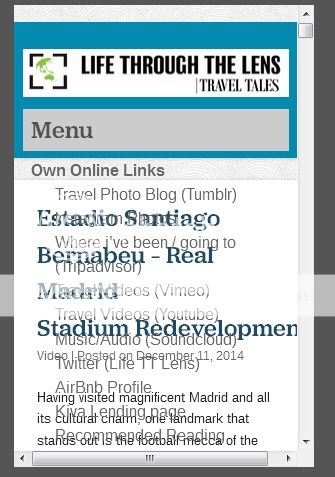
on only mobile view the drop down menus appear transparent (the menu text jumbles with the post text.
See image of the fault here: http://i996.photobucket.com/albums/af90/anth0888/mobileviewtransparentmenu_zps9b4ffdfa.jpg
Please advise how this can be corrected to have the menu options with a drop down white box/ or have non transparent in mobile view (the rest eg internet view and tablet view seems to work fine).
Thanks for your help.
The blog I need help with is: (visible only to logged in users)
-
Hi there, what is causing the issue is the position: static in your #masthead-wrap rule. In addition, the negative top value was causing your header image to be half hidden. Revise that CSS rule to look like the following.
#masthead-wrap {
    background-color: #0489b1 !important;
    height: 150px;
    padding-top: 1px;
}
Add the following, which give a background color to the mobile menu and adjusts it’s position and width so the top is at the bottom of the menu toggle panel and the width is the same as the menu toggle panel.
.main-small-navigation .menu { background: none repeat scroll 0 0 #ccc; margin-left: 0; margin-right: 0; padding-left: 10px; padding-right: 10px; padding-top: 5px; } .menu-home-container { margin-top: -15px; } -
Also, if you can let me know what you were trying to accomplish with the position: static and negative top value, I can help get that done for you.
-
Hi – I tried and It worked. The colouring for main small nav works but only for the header subject field – eg “online links – menu option works” but within the menu option the sub options still transparent.
Do you have the coding for the options within each main link option.
Thanks heaps.
-
You haven’t edited the #masthead-wrap rule in your CSS that I mentioned above. As long as you use position: static; this will be a problem. Replace your #masthead-wrap rule with the rule I gave above.
-
Position: static and your negative top value are producing this on smaller screens: https://cldup.com/yWqsVZOpke.png . I don’t think that is what you had in mind.
-
Ok. But I forgot to mention, the reson for the static is that this wordpress theme has a following menu/header. What I would like it the menu/header not to follow but remain at the top of the page, so when the user scrolls down the menu.header disappears from above (in a word the header/menu doesn’t main on screen.
Whats the best CSS code to acheive this?
-
I’ve corrected the css to your code now (removed the static and positioning). Just the menu position now.
-
-
Hi. Yes just done that. But only thing now left to do is resolve the header/menu position – as in not to remain on the screen as you scroll down.
What I would like it the menu/header not to follow but remain at the top of the page, so when the user scrolls down the menu.header disappears from above (in a word the header/menu doesn’t main on screen.
Whats the best CSS code to acheive this? (Thanks for all your help).
-
I just noticed, that at 600px, and only at 600px, due to the number of items you have in your menu, that the blue background obscures the title on your top post. Add the following CSS media rule to fix that.
@media screen and (min-width: 600px) and (max-width: 600px) { #page { padding-top: 350px !important; } } -
ok. Corrected that. Coming back to the header/menu field matter – Do you know the CSS code for for it to not remain on the screen?
-
To make the header/menu fixed position on tablets and phones, add the following CSS to the very end of your custom CSS. This also sticks the admin bar for any that may be logged into WordPress.com, otherwise it scrolls and then there is a gap above the header where the content shows through as it scrolls under the header.
@media screen and (max-width: 599px) { #masthead-wrap { position: fixed; } #wpadminbar { position: fixed; } } -
Ok thanks. On Phones it appears to not be scrolling.
Please advise the css code to have the menu/header in a fixed position for web / normal internet viewing? Thanks.
-
I’m not understanding exactly what you are wanting. When I view your site on my laptop or desktop monitor in my browser, the header and menu are fixed and do not scroll. With the above CSS I also see it not scrolling for tablets and phones. In other words, I’m seeing your header and menu fixed (no scroll) for all devices.
-
Sorry I think my expression is not very good.
I want the opposite of what is now. I don’t want the menu/header to be fixed on the screen. I want it to be fixed to the top of the page, so when someone scrolls down, the header/menu disappears.
This explains why orginally the header css had static.
Please advise the best CSS coding to change the header/menu to the opposite of what it currently is (to not be stuck on the screen)
-
-
-
- The topic ‘Superhero Theme – Mobile view transparent menu – needs correcting’ is closed to new replies.

 WordPress.com Forums