Problem with CSS, referred by WP engineer
-
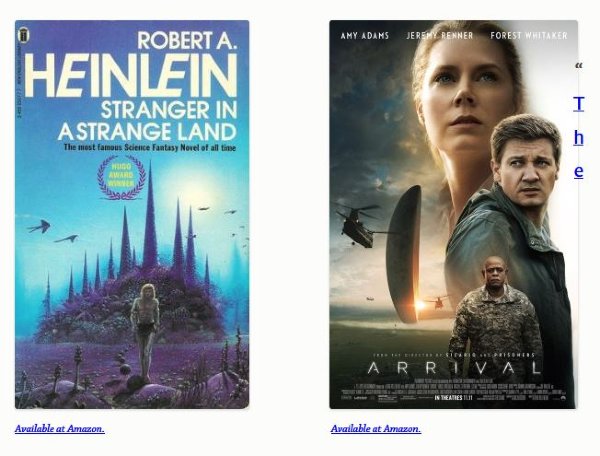
An image followed by a H3 headline. The headline bleeds into image – the text appears over the image.
The engineer did a CSS fix, but it broke text wrapping around images that are followed by a headline. That’s a standard format I use — right-justified image followed by headline, with text wrapped around the image — so we removed the fix.
Example today: https://fabiusmaximus.com/2017/02/28/language-in-arrival-and-stranger-in-a-strange-land/
See the image on the right, near the top (poster of the film Arrival) – and the text (“The) that overlays it.
The blog I need help with is: (visible only to logged in users)
-
Hi there, I checked the post you reference in Chrome, Safari and Firefox and so not see “The” overlapping the Arrival image. Did you get this fixed?
-
It is still there: — “The — four large characters in dark blue, vertically on the right side.
-
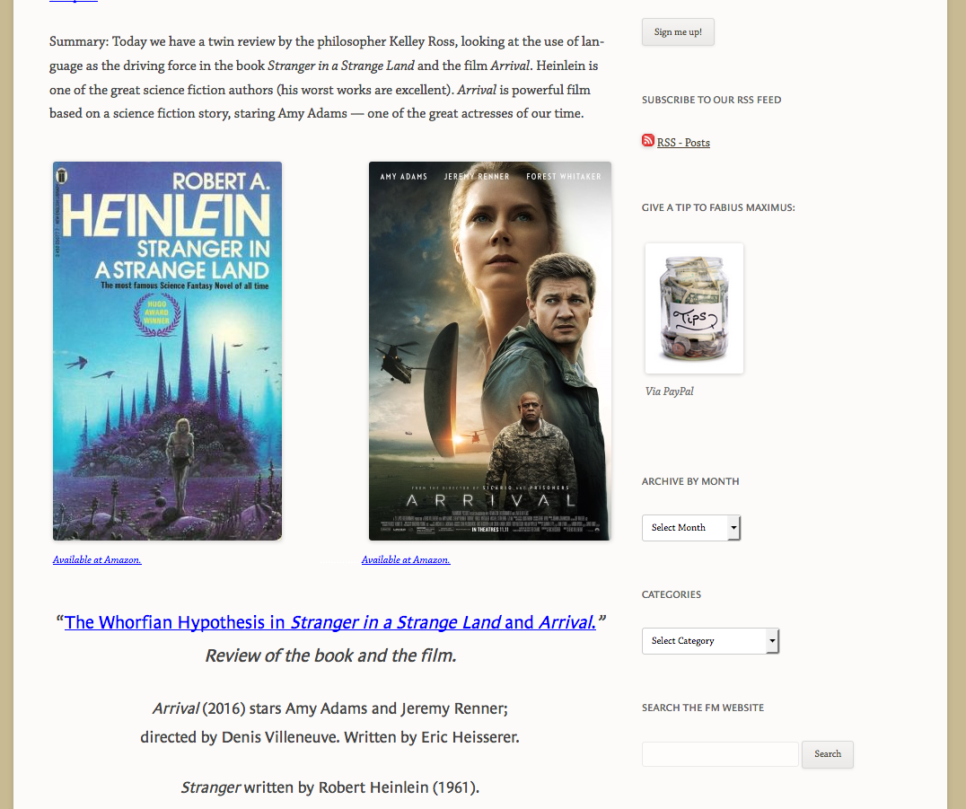
Hi, this is what I see with my browser window at a normal width (images side-by-side): https://cldup.com/h1kMdJRPuV.png
This is what I see when I narrow my browser to the point the images stack vertically: https://cldup.com/h1kMdJRPuV.png
You have a 55px left margin on the Arrival image set in the html for the image in the editor. Remove this from the Arrival image code
style="margin-left:55px;"
and then add this to your custom CSS.@media screen and (min-width: 600px) { .postid-102748 .wp-image-102750 { margin-left: 55px; } } -
TheSacredPath,
(1) Wow. Why do you have a different image than I do? I cleared my cache, and it still appears.
(2) What will this CSS code do?
-
If you look at the second screenshot, you will see that the content is overlapping the Arrival image and the Arrival image is shifted to the right. By making the change I suggest and adding that CSS, it will apply the 55px left margin to the Arrival image only at screen widths where the two images are side-by-side.
-
Can you take a screenshot of what you are seeing? I’m wondering if this is just a Windows/Chrome issue. Also, could you check in Internet Explorer?
Secondly, make sure the zoom level on your browser is at the default and not zoomed in or zoomed out.
-
Bingo! You scored. The image on Firefox looks ok. The image on Chrome and Microsoft Edge both shows an overlap. Is this commonplace?
Re: the CSS change
Will that apply to all images on my website? I don’t understand.
-
-
The code I included is targeted at that image only so that it doesn’t perhaps mess up another image elsewhere.
The image on Chrome and Microsoft Edge both shows an overlap. Is this commonplace?
Is this after you applied my code or before?
-
I have not yet applied your code. I’m unclear what it does.
Sadly, after 10 years on WP I’m still a novice at CSS.
-
It aligns the Arrival image to the left once the two images stack into a single column at approximately 600px in window/screen width.
You can add it and then save and see if it cures the other issue (The overlapping image) on Chrome and Edge on Windows).
The other suggestion I would have would be to edit that page and wrap the two images within a div.
<div>
[caption ...]

[caption ...]
</div>
- The topic ‘Problem with CSS, referred by WP engineer’ is closed to new replies.

 WordPress.com Forums