Images Show Too Wide(ly) For Mobile On The Hemingway Rewritten Theme?
-
Hello,
I do not have a mobile device to test this with but when viewing how my blog looks with the Hemingway Rewritten theme in Mobile Size using the WordPress.com Customizer and when using the Responinator.com (http://www.responsinator.com/?url=johnjronline.wordpress.com%2F), I notice that images are not being sized properly like the text so that it does not show too wide(ly)/narrow(ly), instead images are showing too wide(ly). (In the smaller/narrow mobile sizes)
Hemingway Rewritten WordPress.com Customizer Mobile Size Screenshot:
https://mediacru.sh/3o5NYdS_ZTY0
Some other themes properly size the images to not show too wide(ly)/narrow(ly) (Twenty Thirteen, Able, et cetera) Twenty Thirteen WordPress.com Customizer Mobile Size Screenshot:
https://mediacru.sh/bDco5tJF_pnO
Is this a bug or is this how the Hemingway Rewritten theme was designed?
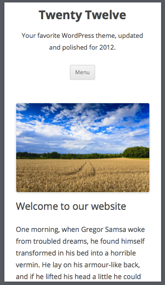
Also when using the WordPress.com Customizer set to Mobile Size for the Twenty Twelve theme, I notice that images show a bit too narrow instead of sizing the images at a proper size that is not too narrow or too wide, are there plans to change this in/for the Twenty Twelve theme?
Thank you,
-John JrThe blog I need help with is: (visible only to logged in users)
-
Thanks for the screenshots. I had a look on an actual iPhone and I see the same thing you’re seeing using the mobile view tools, so I’ll report this to our developers so they can have a look. We’ll keep you posted here.
-
-
Hello Kathrynwp, did you also notice the slight narrowness of images in the mobile size for Twenty Twelve as well?
-John Jr
-
-
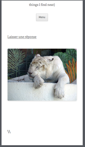
I guess that it depends on the type of image (it is probably easier to see with images of animals (including humans) and probably objects) and the image size/dimensions because this is what I see on some images:
https://mediacru.sh/u7prPVJpHfWB
It will probably be harder to notice what I am talking about if you are using scenery images and zoomed out images like the one on the Twenty Twelve Demo, I normally use images of animals/objects/zoomed in images/et cetera, and so it is more noticeable for those types of images.
Thank you,
-John Jr -
Could you provide a link to the specific post or page where that screenshot was taken? Thanks.
-
Sure and I will list others that you can notice this on, it is only a slight narrowness for some depending on the image but you can notice it:
A Dream With Several Different Strains / Strands / Types Of Consciousness With Pauline Croze
My Former Classmate EM Makes Healing Potions For My Former Classmate ME
Thank you,
-John Jr -
I added your tiger image to a post on my test site with Twenty Twelve and it’s not appearing squished at iPhone size, as you can see here:
I tested with:
– Resizer browser extension at iPhone 5 size
– Mobile resizer icon in the Customizer
– iPhone 5In order to really troubleshoot why your images are looking slightly squished, I think you may need to switch your theme to Twenty Twelve so I can see what’s going on directly. If you’d like to do that, just let me know.
-
-
Also the image in this post looks even more narrow for me than the tiger image and so do some of the other links that I already posted, and so they are better examples ;) :
-John Jr
-
I think we may have found the culprit. It looks like you’re pulling in those images from another site, rather than uploading them to your Media Library. This prevents the images from being resized correctly on smaller devices. If you first upload those images to your media library and then insert them into your posts, that should work better.
Would you like to try a test on one post and let me know how it goes?
-
I was going to mention that as a possibility, I usually use Wikipedia/Wikimedia Commons/Wikia, and I doubt that will change because this is the way that I like to deal with images for my blog for various reasons; but here is my Temporary Test Post (which I will delete after we confirm it works):
https://johnjronline.wordpress.com/2014/04/14/temporary-test-post/
It worked but why does this happen in Twenty Twelve but not some other themes that I have tested like Twenty Thirteen, Able, et cetera?
-John Jr
-
Hi there,
It worked but why does this happen in Twenty Twelve but not some other themes that I have tested like Twenty Thirteen, Able, et cetera?
First off, I’m glad it worked!
The answer to your question is in the original CSS for the theme. Some themes, such as Twenty Twelve and Hemingway Rewritten, only resize images that are added to the posts through the Media Library. They have rules like this:
.entry-content img[class*=”wp-image”] {
max-width: 100%;
height: auto;
}This targets only images that are: 1) inside your posts; and 2) contain the “wp-image” classes. The “wp-image” classes are added automatically when you add images into the post through the Media Library. When you add external images, those classes aren’t applied, and so the resizing does not occur.
Themes like Able and Twenty Thirteen have more general rules that apply the image resizing to ALL images. For example, they might have CSS rules like the following:
img {
height: auto; /* Make sure images with WordPress-added height and width attributes are scaled correctly */
max-width: 100%; /* Prevent images from overflowing their boundaries. */
}Since it’s being applied to the “img” element, all images in the theme, even external ones, automatically are resized to fit inside their containers.
I hope this helps clarify things! Let us know if you have any questions.
-
Hello Michiecat,
Thank you for explaining that, are there any plans to change the rules for Twenty Twelve and Hemingway Rewritten so that they can properly resize images not added to the Media Library?
Thank you,
-John Jr -
And if not, will enabling the Mobile Theme Option help improve this situation?
Also, is there a way to see how your blog looks with the Mobile Theme Option enabled (http://en.support.wordpress.com/themes/mobile-themes/) (when using the WordPress.com Customizer and Responsinator.com they seem to ignore/not show the Mobile Theme, but I could be wrong because I usually only have tested this with already responsive themes with the Mobile Theme Option enabled), if not are there any plans on adding this ability/option for those of us without smart mobile devices so that we can know how our blog looks with the Mobile Theme Option enable?
Thank you,
-John Jr -
The mobile theme is an alternative stylesheet that’s only normally activated by folks who are using an older, non-responsive theme, so it doesn’t apply to responsive themes like Twenty Twelve, Hemingway Rewritten, etc. It uses device detection instead of reacting responsively to viewport size so the preview buttons will not be able to display it.
-
-
Hello Kathrynwp,
Okay, that makes sense, thank you for answering that; and thank you for passing on my other question. :)
-John Jr
-
Hi John Jr,
I can’t make any promises, but I’ll pass this along to our team so we can take a closer look. If we end up making these changes, we’ll let you know.
- The topic ‘Images Show Too Wide(ly) For Mobile On The Hemingway Rewritten Theme?’ is closed to new replies.

 WordPress.com Forums