How to anchor the Superhero themes' header
-
Hi all.
This relates to making the superhero header not follow.
This is a continuation of this forumn post: https://en.forums.wordpress.com/topic/how-to-anchor-the-superhero-themes-header?replies=4
My css I used is:
#masthead-wrap{
background:#0489B1;
position:inherit;
}I did as what was written and yes it makes the header not follow, but it goes all strange:
– Makes the header size squeezed
– The header appear / start 1/4 down from the top – leaving a big blank space at the top.The blog is still in its original form (i’ve removed the new changes) – and i’d like it to look that way, just have the header not follow.
Can you please provide an extended css to have this corrected or advise. Thanks heaps
The blog I need help with is: (visible only to logged in users)
-
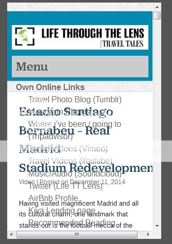
The screenshot of the attempt with the non following header is here:

As you can see it starts 1/4 from the top of the page and the vertical size of the header is compressed (compared to the current size of the header).
-
ok. Update I seemed to have made the header work – with some internet research.
#masthead-wrap {
background-color: #0489B1 !important;
position: static;
height: 150px;
padding-top: 1px;
margin-top: -120px;
}.main-navigation a, .main-navigation a:visited {
color: #E6E6E6 !important;
}.main-navigation ul ul {
background-color: #0489B1 !important;Problem now only is that on mobile view the drop down menus appear transparent (the menu text jumbles with the post text.
See image of the fault here: http://i996.photobucket.com/albums/af90/anth0888/mobileviewtransparentmenu_zps9b4ffdfa.jpg
Please advise how this can be corrected to have the menu options with a drop down white box/ or have non transparent in mobile view (the rest seems to work fine).
- The topic ‘How to anchor the Superhero themes' header’ is closed to new replies.

 WordPress.com Forums