Goran Theme Problems And Other Problems
-
Hello,
I would like to report some problems with the new Goran theme and a few other problems that I found, which is a nice theme by the way (the Edin theme as well, but there are a few things on both themes that I would like to see added/changed but maybe I will share that on another day), I will try to add more Goran problems/bugs/et cetera to this topic as I find them.
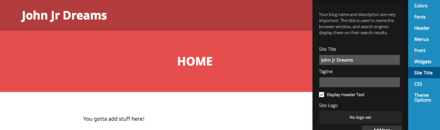
1. The Goran theme looks different in the WordPress.com Customizer (the Edin theme had a bug in the Customizer when it was first released as well, which is fixed now), the theme width is more narrow and the background width is wider, and the blog title shows on more than one line even when the blog title is not very long (I shortened my blog title from John Jr’s Dream Blog to John Jr Dreams, and it still shows on two lines in the Customizer instead of one even when there is enough space to fit it on one line).
Customizer:
https://mediacru.sh/gyCBWFlojdKF
Normal:
https://mediacru.sh/X0D2gLkynM9v
2. Even when not in the Customizer the Goran theme puts my blog title, John Jr’s Dream Blog, on two lines instead of one even when there is enough room; are there any plans on adjusting this to allow the blog title to show on one line as long as there is enough room? (I am currently using a shorter blog title, John Jr Dreams, to avoid this; but it would be nice to not have to do that)
3. The Recent Comments Widget has a strange uneven border around and across it that does not look so well or even, and it does not match the look of the this same widget in the Edin theme; and so I recommend adjusting this.
Goran:
https://mediacru.sh/XMAf5jPMZ2mZ
Edin:
https://mediacru.sh/vRaHgS02FjBZ
4. When you go to adjust the Header, the Preview area shows a green color border instead of the default color of the border around the blog title:
https://mediacru.sh/WewBYmvOgQlh
5. When you upload a header image the border sizer box/whatever is not properly aligned (on default the box/border/whatever goes past/under the image a bit or above depending on the size of your image, and so you have to manually align the box/border on your image properly) or sized probably, and when you crop your image the alignment does not show correctly causing the top of your image to be cropped out:
https://mediacru.sh/MitkqBebKo_Q
After manually adjusting the alignment:
https://mediacru.sh/NmvllNPJ4bXC
After publishing it the top of the image is not cropped out oddly:
https://mediacru.sh/nq-Zyf3JbHKQ
6. Previews of Uploaded Header Images in the Header section are not showing up for me, and previews of images in the Media Library are not showing up for me either (but this could be caused by a browser extension issue, but I have not tried disabling them yet):
https://mediacru.sh/6ZI7y_P0McUL
https://mediacru.sh/vBPJDcIwBrKV
I am too tired and I need to get some sleep, so I will stop there for now, and I will try to post more problems as I find them in the future.
Thank you,
-John JrThe blog I need help with is: (visible only to logged in users)
-
Very nice theme. Thrilled to see a “Top” widget for phone number.
When using a featured image with the Front Page template, I need help understanding how the featured image is being resized and/or cropped.
The documentation states:
“Featured Images for pages are 1230 wide by 1230 high.”
Does this mean precisely this size, or are these maximum dimensions?
I have uploaded different sized images and seeing inconsistent results, which could be due to my ignorance. :-)
-
@vernonblakejr
I have not test driven the theme. That said I know that featured image dimensions are critical to their display in all other themes, so I doubt that this one is an exception. -
@johnjronline – Thanks for the reports. See below:
1. I’m unable to replicate this. I tested out John Jr Dreams, and this is what I’m seeing:
2. I am able to reproduce this. However, I don’t think it’s a bug per se. It’s just that the site title area isn’t wide enough to fit John Jr’s Dream Blog on one line. You can fix this with the following:
h1.site-title {
width: 400px;
}
3. Reported! Thanks for passing this along.
4. Reported this as well!
5. Reported.
6. I noticed this as well. I’m not sure what’s causing this. I’ll continue to investigate!
When using a featured image with the Front Page template, I need help understanding how the featured image is being resized and/or cropped.
It looks like the featured image for the front page template is 1230 x 730. If you upload a featured image at that size, it should be displayed identically on the theme. Can you give that a try?
Also, could you link me to the site where you have Goran active?
-
Hello Jeremeylduvall,
1. I noticed this morning that this bug seems to no longer be there, but it was there last night oddly; but I am glad that it seems to be gone now. ;)
2. Thank you for that but I do not have the Custom Design Upgrade so I can not adjust the CSS, and so I was hoping that this would be slightly adjusted if possible to allow a slightly longer blog title if there is enough space.
3. Thank you, and you are welcome. :)
4. Thank you. :)
5. Thank you.
6. I am glad that you also noticed this and that you are investigating it, thank you, and good luck. :)
7. Yesterday I noticed that the meta bar/whatever link to the Goran Theme Page at the bottom of my blog was not working (this also happened the first day that the Edin theme came out) and if you tried to search for the Goran theme on the Themes Page it would not show up (this also happened the first day that the Edin theme came out), but there was one functioning theme page that I found somewhere (maybe the WordPress.com News post for both themes?); but later the meta bar/whatever link for both started working, and so now there are to different Themes pages for the Goran theme and one of them lacks the ability to Like the theme (this happened with the Edin theme as well when it first came out):
https://wordpress.com/themes/goran/
http://theme.wordpress.com/themes/goran/
Is/Are there supposed to be two different theme pages like this?
8. Are there any plans on adding Font information for themes under Quick Specs on the Theme Page for each theme so that we will easily/quickly know which fonts and what font sizes are used on different areas/parts of each theme?
Thank you,
-John Jr -
Hello Jeremeylduvall,
1. I just noticed that if you look closely there is now a small difference between how it looks in the Customizer where the background is now more narrow/smaller (you can barely see it) than when viewing it normally where the background is wider/larger (you can see it better), and maybe the alignment is slightly off (the the WordPress.com Bar/whatever and the Customizer Bar is probably responsible for the slight alignment difference between the two).
Yesterday I was testing it on Firefox 31 on Ubuntu 14.04 LTS, but now I am testing it on Firefox 31 on Windows 7.
Normal:
https://mediacru.sh/2HCVigzYitFR
Customizer:
https://mediacru.sh/Zfsfag2J4jF9
Thank you,
-John Jr -
The blog link is:
http://gorantheme.wordpress.com/
I think I see how it works:
1) If there is no text content (Front Page Title disabled in customizer & no page text), the featured image’s height is forced to approx. 550px while maintaining the aspect ratio. Refer to image to see how I measured:
http://gyazo.com/715334c005cc1818565cf77bd9eedddb
2) As you add text content, the image height increases with each additional line of text. I am guessing that extra padding is added to accommodate the responsive mode, whereby the image might otherwise shrink to a size smaller than the text within it.
I think this is a great theme, but this is a bit cumbersome. I am not a fan of large images that require one to scroll to see the content. I think the theme author was trying to overcome this by overlapping the text and image, and I think in many cases it will work just fine.
If the author is listening (Thomas Guillot), maybe the current functionality could be retained by providing a theme option to toggle (enable/disable) “overlap mode” for the featured image.
If enabled, the featured image will function as designed.
If disabled, the featured image will be placed as-is, and the text content would be placed beneath. This will allow for a banner image of 1230px and a user defined height. It would probably need to be applied to all of the page templates.
Any chance of that? ;-)
Otherwise, I suppose this could be accomplished with CSS upgrade, but seems like overkill.
-
See below:
Thank you for that but I do not have the Custom Design Upgrade so I can not adjust the CSS, and so I was hoping that this would be slightly adjusted if possible to allow a slightly longer blog title if there is enough space.
Unfortunately, you’ll need to purchase the Custom Design upgrade to make that adjustment.
Is/Are there supposed to be two different theme pages like this?
Yep! The following is part of the newer interface, similar to how your Sites page (wordpress.com/sites) should look:
The other version below is the “older-but-still-updated” version:
The two will eventually be combined as we will likely focus from one to the other. However, every theme should be present on both pages.
Are there any plans on adding Font information for themes under Quick Specs on the Theme Page for each theme so that we will easily/quickly know which fonts and what font sizes are used on different areas/parts of each theme?
That’s an interesting suggestion. I’m not sure why we don’t include this information. Could you let me know why you would need this information normally when perusing themes or how you would use it?
I just noticed that if you look closely there is now a small difference between how it looks in the Customizer where the background is now more narrow/smaller (you can barely see it) than when viewing it normally where the background is wider/larger (you can see it better), and maybe the alignment is slightly off (the the WordPress.com Bar/whatever and the Customizer Bar is probably responsible for the slight alignment difference between the two).
I checked out the screenshots you provided (thanks for that by the way!), and it looks like the difference here is caused by the responsiveness of the theme. When the preview loads, the browser window works as though the window only came to the edge of the customizer. So, the screen size is in fact a bit smaller than normal. In this case, the Goran theme shrinks the grey sidebars. Does that make sense?
Thanks for the explanation here. I’m going to pass this along as well. However, I definitely can’t promise that this will be implemented!
-
Hello Jeremeylduvall,
That is unfortunate, thank you for answering this, and maybe having an even shorter blog title now is not such a bad thing. ;)
Thank you for answering my question about the two different theme pages.
I like to know what fonts and font sizes are used for a variety of reasons such as: so that I can know which fonts and font sizes that I like and do not like for future reference, because I think that this is basic information that should be available with the rest of the specs, and for a variety of other reasons that I did not list. (I usually like having/knowing the details/specs/meta data/et cetera)
That does make sense, I was assuming that it might be responsiveness related, thank you for explaining that. :)
Are there any plans to add timestamps (the exact time (12:00 AM/PM/et cetera) when a post was published) for posts? (currently comments have them, but posts do not)
Are there any plans to add a tagline option?
Thank you,
-John Jr -
Thanks for your prompt replies and passing along my suggestion.
It would be a shame if my request (or something similar) is not implemented, or rolled into a new theme. The Featured Image / Text overlay looks good, but it takes a good bit of trial and error to find the right combination of the two so that the text stands out and is legible.
I manage many websites for clients and I am doing the opposite of what so many others are doing, I am migrating sites FROM self-hosted setups TO wp.COM because of the dramatically reduced software maintenance tasks, better security, fast page download speeds and very reasonable hosting fees.
I do miss some of the plugins, but I am quickly discovering that most of them were just bells and whistles that simply make no difference as far as the “success” of the website.
Having said that, I find it frustrating that I can’t find many themes on wp.COM (free or paid) with the right combination of “business” features.
Edin & Goran are BIG steps in the right direction, but I still find myself running into issues such as the one discussed in this thread. Breadcrumb navigation would also be a great option.
Probably one of the best themes wp.COM has available from a usability and site architecture point of view is the “Responsive” theme by Cyberchimps.
If wp.COM would create a theme with all of the functionality of the Responsive theme with the “styling” of Edin, Goran or Big Brother, you would have a winner! :-)
Okay, sorry for my ramblings… thanks again for your assistance.
-
Hello Vernonblakejr,
I agree about having breadcrumb navigation as an option, and I would also like to see a theme that combines some of those features from those themes that you mentioned and some other features that I like in some other free themes.
Thank you for sharing those suggestions.
Maybe you should create a topic here at the forums with a wishlist of features that you would like in a business theme (I made one for the future Twenty Fifteen theme), and maybe someone will make a theme that matches your wishlist one day (maybe that person will be you ;) ).
If I knew how to program/code I would try making a theme that matches my wishlist.
-John Jr
-
Hi all,
The recent comments widget has now been fixed.
I will now see what we can do for the remaining issues :)Cheers,
Thomas -
Are there any plans to add a tagline option?
No because Goran is primarily a business theme and was designed to upload a logo instead of a title/tagline. If a business doesn’t have a logo they would want just the title and not the tagline.
That said it’s possible to display the tagline but it would require the Custom Design upgrade to add some custom CSS
.site-description { display: block; } -
-
Hello Thomas Guillot,
Thank you for improving the Recent Comments Widget, but I notice that the divider/horizontal line between the first and second comments is much shorter than the other dividers/lines; is it supposed to be like that?
https://mediacru.sh/Lty_-N8cpSuy
I know that is a design decision but I still think that it should be an option because many businesses do have slogans (and there are non-businesses using this nice theme as well ;) ) and there are other creative ways that a tagline can be used (plus it is optional for those who do not want to use it), I do not not have the Custom Design Upgrade so I can not make those adjustments, but thank you for sharing that.
It is good to know that Breadcrumb Navigation is on your to-do list, thank you. :)
Thank you,
-John Jr -
We’re still looking into the featured image suggestion!
Thank you for improving the Recent Comments Widget, but I notice that the divider/horizontal line between the first and second comments is much shorter than the other dividers/lines; is it supposed to be like that?
It looks like the divider lines within the widget are the following:
1px solid #f1f0f0The border divisions between individual widgets is the following:
2px solid #f1f0f0It seems like this was a design decision to distinguish between differing widgets and within-widget divisions. You could change it with the following:
.widget_recent_comments td.recentcommentstextend {
border-bottom: 2px solid #f8f8f8 !important;
}

td.recentcommentsavatarend {
border-bottom: 2px solid #f8f8f8 !important; ;
}
Are there any plans to add timestamps (the exact time (12:00 AM/PM/et cetera) when a post was published) for posts? (currently comments have them, but posts do not)
I don’t believe so at the current moment.
-
Hello Jeremeylduvall,
But that divider is not separating the Recent Comments Widget from another widget, it is inside the widget itself separating the first and second comment, and it does not match the length of the dividers between the other comments in the widget; and so I still think that this is a bit odd/confusing/unbalanced/illogical to have all the dividers in the widget between each comment the same size except for the divider between the first and second comment causing one of the dividers to not match the others.
I do not have the Custom Design Upgrade so I can not make those changes but thank you for sharing that, but I would like to know if that is really a design decision and why was this decision made exactly so that I can make sense of it because I am curious/confused. ;)
Thank you for answering that but I am curious about why many newer themes seem to be removing timestamps from posts but leaving them for comments, and what is wrong with at least having timestamps as hover text when you hover the mouse cursor over the post date for those of us who care about timestamps (some of us think that the meta data is important for various reasons and should not be excluded or should at least be optional, but many newer themes have been removing meta data for authors, timestamps for posts, et cetera for some unknown reasons)?
Thank you,
-John Jr -
Hey JohnJrOnline,
So I still think that this is a bit odd/confusing/unbalanced/illogical to have all the dividers in the widget between each comment the same size except for the divider between the first and second comment causing one of the dividers to not match the others.
Sorry – I misunderstood what you were referring to. This does look a bit odd. I think it’s related to some of the recent changes. I’ll report this so it can get fixed up.
I like to know what fonts and font sizes are used for a variety of reasons such as: so that I can know which fonts and font sizes that I like and do not like for future reference, because I think that this is basic information that should be available with the rest of the specs, and for a variety of other reasons that I did not list. (I usually like having/knowing the details/specs/meta data/et cetera)
I realized that I missed this one earlier. We’re likely not going to be putting font information on the theme pages. The main reason is that the browser inspector has made this quick work. If you go to “Inspect Element” in your browser, you can normally pick out the various fonts pretty easily. If you want a bit more info, just let me know what browser you’re using, and I can whip up a tutorial for you on that.
Thank you for answering that but I am curious about why many newer themes seem to be removing timestamps from posts but leaving them for comments
This wasn’t an across the board decision. For instance, the MLB “Modern” theme features timestamps as shown here:
http://partnermlbretrodemo.wordpress.com/
It’s really just a theme-by-theme decision. In many cases, the date is removed and the post meta just includes the author, date, and potentially categories/tags. It’s unlikely that we move to including the post time in all themes.
-
Hello Jeremeylduvall,
Thank you :) , and this problem with the Recent Comments Widget is also happening in the Edin theme when I last looked a few days ago. ;)
Thank you, I will have to try using that next time to help me identify fonts and font sizes, but I still think that this information should be put on theme pages for the public so that people will not have to do that just to find that information because not everyone is willing or able to do more advanced/complicated things like that. ;)
Yeah, I know that it is a theme-by-theme decision and more older themes like the one you mentioned used to have most or all of the meta data, but now it seems that an increasing number of developers on WordPress.com and those developing themes for it are removing some of the meta data in newer themes for no clear reason(s) (is having it optional such a bad thing? :D ); and that is what confuses/annoys me, and I am wondering why an increasing number of developers are doing this and why they will not at least make all the meta data (authors, dates, timestamps, categories, tags, et cetera) optional for those of us who want it?
I just do not see the logic in removing common meta data and not even making it optional, and leaving only some of the meta data instead; and it is just a confusing/annoying trend that I have been noticing in recent times here at WordPress.com that I hope ends. ;)
Thank you,
-John Jr -
Hello,
The border and layout issues in the Recent Comments widget have been fixed. Thanks for reporting them!
- The topic ‘Goran Theme Problems And Other Problems’ is closed to new replies.

