Using images in your posts? Make Mr. Miyagi proud: seek balance in all things.
Once you’re in a blogging groove and the words begin to flow, you naturally begin to look for ways to enhance the look of your posts.
Adding images is a great way to reinforce ideas, emphasize or illustrate a specific point, provide visual breathing space within lengthy text passages, or even inject humor. When using images, take some sage advice from Mr. Miyagi of Karate Kid fame:
Better learn balance. Balance is key.
But this is blogging, not karate

Ah yes, grasshopper, but did you know that balance is one of the bonafide principles of design?
Balance is embodied in a visually pleasing arrangement of the items on a page. For extra credit, you can read up on the different elements of balance.
Balance dos
While it's your blog and you can do (almost) anything you want with it, here are some fast and loose guidelines to remember when using images in your posts.
- Less is more. Tropey, yes, but oh so true. Is there a representative image that drives home the point of your post or sets the mood? You might choose to use it as a featured image, if your theme supports them. If not, you might plop that compelling image at the top of your post to set the tone for what you’ve got to say. Photographer João Bracourt does this well, using a single eye-catching image at the top of each of his posts.
- Be choosey. Select images that look professional — they’ll elevate the appearance of your blog and the impression you leave on readers. Not sure if your own images shout professional? Check out our free ebook, Photography 101 for tips on how to hone your photography skills. Not into shooting your own photos? Check out our recent primer on where to find free-to-use images on the web.
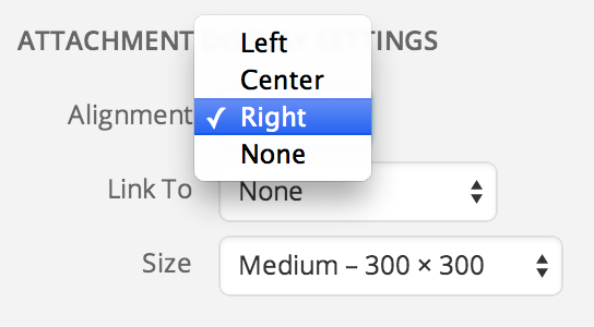
- Provide rest stops along the way. Have you written a long post? Consider adding a few images to give readers some breathing space — a natural place they can rest their eyes and digest your ideas before devouring the next sections of your piece. Experiment by using a variety of photo sizes. Play with the alignment settings as you sprinkle in images in longer posts — you might find that an image looks better to the left or right of your prose, creating a wrapping effect, or in the center instead, which breaks up your copy.
Anna over at girl in the hat not only uses a compelling first image at the top of her personal essays, she intersperses images through longer pieces, such as yellow wallpaper. - Soften the blow. Relating a tough subject but want to keep your readers smiling? Use an image to lighten the emotional load or diffuse anger. Michelle recently used this technique with great success. In “Don’t Undermine Your Comment With a Plug,” Michelle educates readers on the finer points of commenting. Her sparkplug ad, featuring a winking cartoon horse, helps diffuse any hard feelings readers might have on learning that some commenting habits are a no-no.


And now, over to you
What are your best tips for creating image balance within a post? Share so that all of us can learn.
Currently blogless? You’re a click away from sharing your story.
Create your blog at WordPress.com


.jpg)
I feel like many times the photo can even be the focal point, and much writing isn’t needed. Examples:
LikeLike