Get inspired by these photoblogging themes.
A few weeks ago, we kicked off our Photography 201 series on photoblogging and talked about what to consider when choosing a photography theme. Here, we’ve rounded up some blogs and websites using various themes, both free and premium. We know these examples will inspire you to create your own.
The theme: AutoFocus
The look: AutoFocus is a stylish free theme that displays featured images in a tiled mosaic on your front page. On an individual post, the featured image displays at the top, and the rest of the page is clean and clutter-free, leaving room for your prose and post metadata (date, categories, tags).
Different types of images look great on this homepage mosaic — from landscapes to macro photography and even abstract shots — which means you can publish a variety of shots.
Seen on: Martin Soler Photography, Endless Frame

Martin Soler Photography
The theme: Nexus
The look: A sophisticated, sleek front-page grid that covers the page. If you hover over a thumbnail in the layout, the tile dynamically changes to display the post title. It’s a premium and professional theme ideal for serious photographers. Collections of landscape images looks especially stunning with this theme, and with Infinite Scroll, activated on the blog below, you can wow your visitors with a stream of beautiful images.
Seen on: Gemma Fottles, Laura Cook Photography
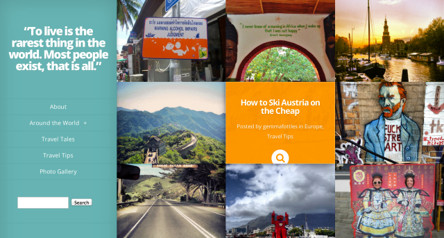
Gemma Fottles
The theme: Triton Lite
The look: Your front page has a masonry-style look on this free theme, and post excerpts are displayed underneath featured images, which offer context even before readers click through to the post. Because of the grid’s staggered style, both horizontal and vertical images work well, although you can quickly change the look of your front page, as seen on Veggie Zest‘s use of vertical images only (below).
Seen on: Veggie Zest, Africa Far and Wide, Laura Nathalie Travels, the official PicMonkey blog
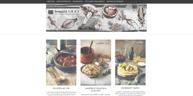
Veggie Zest
The theme: Gridspace
The look: This is a modern portfolio layout for horizontal, vertical, or square images, which you can specify in the Theme Options panel. A premium theme, Gridspace is great for professional portrait or landscape photographers, or even music or book reviewers who frequently display album and book covers; the uniform look of the front page is very clean. Elegant and uncluttered posts and pages mix image and text well.
Some cool extras: you can toggle from the grid view to a list view — to see this in action, look for the pair of small icons at the top right of a site using Gridspace. You can also switch between light and dark color schemes, which dramatically changes the look, as illustrated in Nathan and Phil’s sites below.
Seen on: Nathan De Ruwe (dark scheme, vertical thumbnails), Phil Kneen Photography (light scheme, horizontal thumbnails)
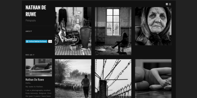
Nathan De Ruwe
The theme: Duotone
The look: This simple, straightforward theme is great for daily photoblogging. Its colors change to match the first image on a post or page. (If you don’t want the background to change, you can set the color in Appearance → Background.) While the themes we’ve discussed so far showcase your photography in portfolio-style formats on the front page, Duotone is perfect for highlighting a single image at a time. In the post, the photo’s EXIF data is displayed, if available.
Seen on: The Amazing Sky
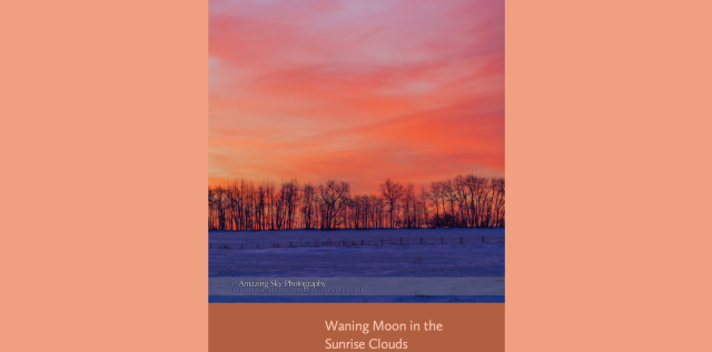
The Amazing Sky
The theme: Modularity Lite
The look: With Modularity Lite, you can showcase photographs on a simple, minimal layout, and this free theme works best when you upload large images (at least 950 by 425 pixels). You can also remove the sidebar, which gives you even more room for gorgeous high-res images, as shown on Christopher’s blog below.
We also dig how Christopher organizes his photography in a custom menu with clear categories (landscapes, wildlife, travel). Not only are his images stunning at full size, but he makes his content easy to find.
Seen on: Christopher Martin Photography
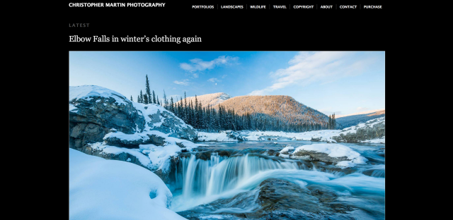
Christopher Martin Photography
The theme: Nishita
The look: Placing this theme alongside the previous two — Duotone and Modularity Lite — you can see how they’re similar, with slight variations. Nishita is also minimal, with light and dark color schemes, and works best when you upload very large images. In fact, in the Theme Options panel, you can choose between two layouts (the photoblog layout for images of 1024 pixels wide, or a slimmer blog layout for images of 768 pixels wide — and better readability of your text). But no matter which option you choose, Nishita makes your photography shine.
Seen on: Life in a Photograph, Emily Robinson Photography (which uses a static front page gallery)
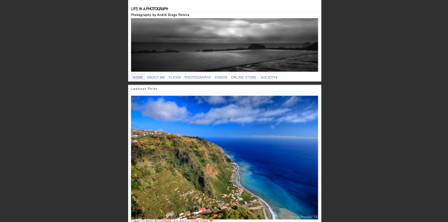
Life in a Photograph
The theme: Duet
The look: As you browse blogs using classy premium theme Duet, it feels like you’re flipping through the pages of a glossy magazine. The two-column layout incorporates prose and photographs into a beautifully woven narrative, so the theme is well-suited for longform writers who also love taking pictures.
It’s a powerful theme: in addition to displaying your posts in two columns in the Standard format, you can also showcase your images at full width using the Image format, as seen on The Squeaky Robot‘s post, “Backstage.”
Seen on: 2 Sojourners, The Squeaky Robot
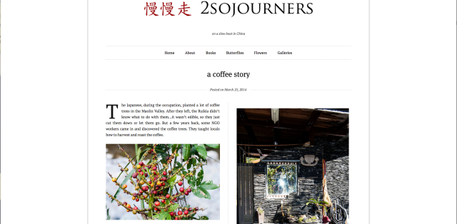
2 Sojourners
The theme: Suits
The look: Streamlined for personal blogging, the recently launched Suits theme has a one-size-fits-all design, and a number of bloggers are already using it to fit their writing needs. But don’t overlook it as a flexible photoblogging theme, as seen below. From single photo posts to photo essays, Suits‘ simple layout offers a great foundation for photography.
Seen on: Art Music Photography
Art Music Photography
Are you using one of these themes for your photography? Are there other themes you prefer?
Currently blogless? You’re a click away from sharing your story.
Create your blog at WordPress.com


Always a fan of new themes. If it weren’t anathema to logic and functionality for my readers, I’d probably try a new one each day. Recently I updated my WordPress.com blog, to begin migrating my (much more complicated) WordPress.org website over to it. I tried out many of the new themes you’re showing here. But I wanted to add an ecommerce connection, for selling my art and photos, and the ease of connecting the blog to a shopping cart made me finally choose Bromley–where I could maintain a “website” look for my pages, with my blog the most engaging, interactive par–and the focal point. I’m quite happy with Bromley, take a look:
http://austindetails.me
LikeLike
HMM…Interesting….you’ve given me something to think about….I will be re examining my blog
Thanks
LikeLike
Great article you have here. 😉
LikeLike