
Your About page is the perfect opportunity to introduce what you’re doing with your blog — and why it matters — to your audience. In About Page 101: Making Them Care, we looked at getting the basics right in terms of knowing what you’re trying to do, telling a compelling story, keeping things brief, and writing in a style that doesn’t come off as more stilted than your Uncle Joe’s wedding party dance moves. Now we’re going to take all of the hard work you did there, all of the blood, sweat, and tears you poured into making your About page rock, and put them through the meat grinder. Because good enough isn’t good enough for us. Ready? Ready.
1. Slash it in half. And in half again. 95% of first paragraphs are a complete waste of everyone’s time (source: the institute of questionable statistics). Often we’re just getting our writing mojo on in those first tentative lines, but by paragraph two we’re working those words like a champ. The same’s often true for endings. You’ve reached a rollicking finale. Everything’s beautiful. And then you add one more paragraph to “wrap things up,” killing the effect of what should have been your last line by smothering it in more needless word-calories than a deep-fried Elvis burger. It hurts to kill your darlings, especially when you’ve spent so long making them beautiful, but more often than not it makes for a more powerful piece of writing.
Action time! Experiment with killing your first and last paragraphs and see if it makes your About page a senseless mess or a leaner, meaner About page machine. In the case of the former, see if you can’t slice and dice a paragraph or two from the midsection to cut out the flab and keep things focused and fancy free.
2. Bite-sized morsels. So, you’ve topped and tailed your About page masterwork. Now it’s time to rescue your readers from the horror that is infinitely long chunks of uninterrupted text. When confronted with more than two or three sentences on the interweb, the human brain has evolved to explode or prevent explosion by switching off. You don’t want that to happen.
When we’re reading a book, we’ll happily shuffle on through scads of text. Web reading is a different experience, and leads people to scan for information. The easier you make it for them to do that, the more chance you have of sparing their screens from a spontaneous headsplosion mishap.
Action time! Try carving your About page up into discrete, bite-sized paragraphs with a little whitespace between them. For bonus points take a leaf from the newspapers and add some subheadings for the sections of your About page, giving people a chance to rapidly identify what’s to come in the next paragraph as they flit through your content at breakneck pace. Examples might include “Where I’m From” and “Where You’ll Find Me”. Alternatively, you could try phrasing them as questions, like “Where are you from?”
3. Signpost your Sunday best. If you’re interested in your readers sticking around or coming back for more, your About page is a great place to point a large flashing neon sign at the posts you’re proudest of on your blog. Failing a large flashing neon sign, you could add some links to them instead. This gives people an easy way to discover your best content and carry on getting to know you and your work, rather than reading your About page, nodding their head silently, and clicking over to that other browser tab with animated kittens dancing, never to return.
Action Time! Quickly jot down the posts you’ve written that you’re proudest of, or that offer the best picture of your interests and passions as outlined in your About page. Now, see if you can’t scatter a handful of those choice links in among the storytelling action to keep ’em reading.
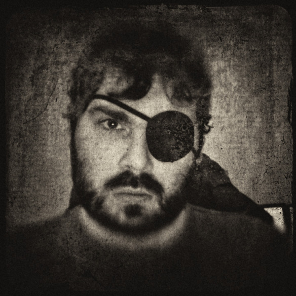
4. Picture this. Chunking your About page into juicy bite-sized morsels certainly makes scanning the content easier, and gives a reader’s eyes respite from the horror of reading gigantic paragraphs on a screen. But what if you were to give your page one or more little visual hooks for their eyes to get snared on? Ok, that’s a nauseating image, but you get the idea.
Adding some images to your About page not only helps to illustrate your ideas, it also gives the eye somewhere to settle when it first lands on the page, and when it starts to scan downward, providing visual cues for the content within. You don’t need to be Picasso to find suitable images. Use photos of yourself or the things you’re writing about, or tap into the huge array of free, remixable images available under the Creative Commons.
Action Time! Scan through your bite-sized morcels of About pageness and brainstorm one or more images you could strategically drop in to catch the eye and illustrate your ideas. It could be as simple as a head shot of yourself, or as abstract as the snowflake that represents your magical uniqueness as a human being.
5. End with some action. In About Page 101 we started off by identifying a purpose for our About pages. You might be trying to convince people to “friend” you on a social media service; to buy your book; to recognize your genius; or simply to introduce yourself to others out there who share your interests. As you bring your About page to a close, bring it back to that purpose and thing about the action you’d like them to take once they’ve finished. If you’re feel particularly ambitious, rather than merely ending your About page with a call to action, weave action in among the whole darned thing, one paragraph at a time.
Action Time! Remind yourself of the purpose you set out to serve with your About page, and see how you can intorduce some calls to action into the end, or throughout your post. It could be that you’re linking to your own or someone else’s content; pointing them in the direction of your Twitter or Facebook presence; asking them to leave a comment or get in touch. The action’s up to you, but you’ll have a lot more chance of someone taking it if you’re explicit about what it actually is.
That’s it, you should now have a lean, mean, fighting keen, erm, About page. It’s taken us some work to get here, but hopefully it’s all been worthwhile. Like all rules, the ten we’ve walked through here are meant to be broken, the more creatively the better.
Let’s see what you’ve got. Link up your About pages or those that have inspired you down in the comments.
Image credit: Based on Hello, my name is… by Carolien Dekeersmaeker, CC-BY-2.0
Currently blogless? You’re a click away from sharing your story.
Create your blog at WordPress.com


Thanks a little inspiration to revamp my about section! I’m very happy with the changes.
LikeLike
Here’s mine:
http://katharinetrauger.wordpress.com/about/
LikeLike
Few words along with a few pictures, let me know what you think.
LikeLike
I know it’s like days later, but I updated my about page and would appreciate your thoughts.
LikeLike