
A Refreshed Reader for 2017
Reader now sports a simplified design, new post layouts, spiffed-up tag pages, and recommended posts.
Reader is WordPress.com’s town square, where you can follow your favorite sites and read them in a distraction-free environment. We’ve been working on a refresh for months, and we’re thrilled to share it with you today. For readers, we hope these changes will surprise and delight you, adding more diversity to your stream and exposing you to posts you’ll love. And for writers, we want to put your awesome work in front of a whole new audience.
A Simplified Design
We want Reader to feel like a magazine you can cozy up with, so we’ve streamlined the design, featuring clean text on a simple white background. We’ve also increased the information density so you can see more of the sites you love with less scrolling.
New Post Layouts
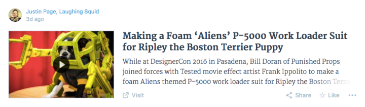
There’s a huge variety of content in Reader. We want to make sure it looks great no matter what, so the layout now responds to what’s in the post. For example, posts with lots of imagery will get the Gallery layout, which highlights the first four images.

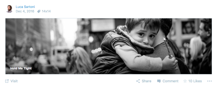
A post with an image and very little text will get the Photo layout, letting the visuals take center stage. Want to see more of the photo? Click or tap and it will expand in place.
Reader is now better at choosing which media to show — like many of you have requested, it’ll start looking for media at the top of each post. If the first media is a video, we’ll show it in the stream — just click the image to watch.
Writers don’t have to do anything new to use these layouts. Reader will automatically select the layout that makes your post look its best.
Spiffed-Up Tag Pages
Tag pages are a great place to find a variety of voices on a subject you care about. In addition to the new post layouts, each tag page now features an image from one of the top tagged posts. This makes the pages more fun, and it’s another chance for your posts to get noticed (hint: tagging your posts and including a large image is always a good idea). Every header image has a credit that links to the post, of course.

You know you can follow tags, too, right? Click Follow Tag at the top of any tag page and it’ll be added to your Tags list in the sidebar.
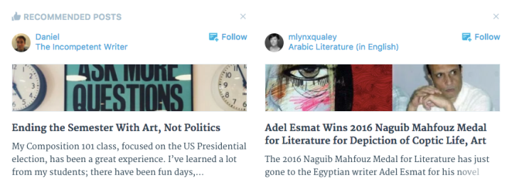
Recommended Posts
There are millions of amazing posts flowing through WordPress.com every day that you never see, and we want to bring a few of them to your attention, so we’re adding a bit of serendipity. We call it Recommended Posts.
This new section will show up in Reader intermittently — more for new members, less for existing members who already follow a lot of sites. You can also see Recommended Posts on the Search page.
The recommendations are selected by a unique collaboration between editors and algorithms. As a new member, your recommendations will mostly come from our Editors’ Picks. As you follow, like, and comment on blogs, the algorithm will recommend other posts we hope you’ll like.
If a recommendation looks promising, click or tap to read it. If you enjoy it, click the star to like it, and we’ll keep that in mind for future recommendations. And if you don’t like a recommendation, click the X icon to dismiss it, and we’ll keep that in mind, too.
Writers, just keep doing what you’re already doing and your work could get recommended, too!
As always, this is a work in progress. These changes will be coming to the WordPress mobile apps soon, and we’ll be tweaking and improving along the way. We’ve got some really exciting stuff coming up.
Give the refreshed Reader a try! WordPress.com members can find it in the usual spot. Not a member yet? Join us.
What do you think of all these updates? Let us know in the comments. And thanks, as always, for being part of the WordPress.com community.
- December 14, 2016
- Features, Reading, WordPress.com

I love it!!!
LikeLiked by 13 people
It’s gonna take me a while to get used to these changes, but I like them so far.
LikeLiked by 12 people
I like the different styling based on the Media… and I really like how any writer is given the chance for exposure… that’s way cool
LikeLiked by 12 people
These are great additions, thank you.
LikeLiked by 8 people
My immediate response: less scrolling = a good thing! Thumbs up so far… 🙂
LikeLiked by 9 people
Awesome! Thank you.
LikeLiked by 6 people
I like the style!
LikeLiked by 7 people
Seems really good!
LikeLiked by 7 people
My immediate response is why my last two posts don’t deserve a photo to go with the title. It’s Dyad theme.
LikeLiked by 5 people
Ooops, taking it back, a photo appeared. Thanks. Now I can say that it’s a big improvement.
LikeLiked by 5 people
I absolutely love it! Really great job!
LikeLiked by 7 people
First thought was it looks good until I noticed images are cropped in the reader…
LikeLiked by 4 people
I love having scroll less. New layout is great. Good job. Thank you for your hard work!
LikeLiked by 7 people
Hi there and thanks for the update. Looks pretty good so far. I’ve been with WordPress for years and must say that things have improved quite a lot since then. This new addition makes it easier to browse through the latest posts from our favorite bloggers, and as Meg Sorick wrote, you don’t have to scroll as much. 🙂 Thanks WordPress!
LikeLiked by 7 people
Really awesome! Regarding the new post layouts, I may have to be mindful of the pictures I’ll include in my posts, especially on posts that are full of images. Hopefully I’ll see this in the WordPress mobile app soon! 😄
LikeLiked by 8 people
Thank you so much! We are in fact working on bringing the refresh to the mobile apps right now. Stay tuned.
And thanks for using WordPress!
LikeLiked by 1 person
I’m wondering if this means I’ll be able to go back to reading WordPress on my phone. After you introduced the first reader it ate up too much data to read on my phone.
LikeLiked by 4 people
Thanks, it loads much better now and it loads faster. Looks great.
LikeLiked by 5 people
I was taken aback at first, but after scrolling a bit, I find I like the cleaner layout.
LikeLiked by 5 people
Reblogged this on crackedrearviewer and commented:
The New WordPress Reader… like or dislike? I think it’s a much cleaner layout, how about you?
LikeLiked by 3 people
I love it too!
Thank you so much for this refresh and look foreword to future updates to the reader.
LikeLiked by 4 people
Dissenting voice here – while I like the cleanliness of the layout and the responsiveness to images I absolutely hate with a passion the way text only posts are cut down to a bare minimum of 1.75 lines.
LikeLiked by 12 people
Hi Jo. Thanks for the feedback!
It’s true that text posts now get 2 lines of excerpt. Because the overall width of the main column is wider, it’s just about the same amount of text as before, and just about the same amount of text as in the other cards – they just have an image, so the text area is narrower, so they get one more line. Note that at narrower browser widths, *all* posts get 3 lines of excerpt. We only reduced it to 2 for text (and gallery) posts at wide browser widths for readability.
Still, we’ve heard you. And we’re looking at ways to make the text posts even better. In the meantime, all the other formats are available to you, should you choose to add images to your posts. (And we’ve got good data to suggest that posts with images get more views/reads.)
Thanks again for using Reader, and for the feedback. We really appreciate it.
LikeLiked by 6 people
Just noticed the new style reader. Really like it, good design, and nice and easy to use.
LikeLiked by 5 people
Destroys poetic forms. Disappointed in the change.
LikeLiked by 2 people
Hi there! Thanks for your comment. We were stripping breaks from the summaries, but you (and your poetry) changed our minds. Breaks have been reinstated. Poets rejoice!
LikeLiked by 8 people
Hallelujah! Appreciate it.
LikeLiked by 5 people
Thank you for the goodies! Happy Holidays!
LikeLiked by 5 people
Actually I like this layout. Well done WP.
I am very pleased to see that the videos have been removed from the Reader feed when we have a picture on our posts. Thank you.
My complaint is the same one I’ve had before and that is when the post title is clicked it goes to a bland page with the full post, like others have also complained about.
LikeLiked by 7 people
It is faster to load up and see more different blog posts tagged with your favourite tag. On the down side, there is more “cluttered” looking feed because of the automated way the platform pulls in large photo, vs.gallery, etc.
LikeLike
I don’t like the fact that if you have a single photo on your post the Reader cuts the photo to a pre-determined size, which means that the photo is not actually shown in full which is very annoying and disappointing. Whereas before I could see a photo in full, now I have to click on the post to be able to see it in full meaning more clicks. It also means that my own photos will suffer from being cropped in this new version. Not happy!
LikeLiked by 6 people
Hi Storki! Thanks for the feedback. And I’m sorry you’re not happy.
Wanna know a secret? I’m actually a photographer, too. (I even ran a photography magazine back in the day.) So I get where you’re coming from.
Here’s the idea: the Reader stream is not the work itself, it’s an excerpt of the work. So, for text, we “crop” it and show just the first few lines. For photos, we do the same. It’s not intended to replace the work, it’s intended to give the reader a taste, and let them click through for more.
The goal is for the Reader stream to be like an index of things. To keep it fair, we’re giving all posts approxinately the same height. For photo posts without a lot of text, we devoted the entire area to the photo. If you hate it, I get it. Add a sentence or two and you’ll get the normal layout.
I realize this may not change your mind, and that’s okay. If it helps, I think your photos look awesome in Reader.
We’re going to continue to work on this, and have a few ideas for how to improve, so give us a little patience and I hope we’ll make you happy.
Thanks again for using Reader, and for the feedback. It’s sincerely appreciated.
LikeLiked by 3 people
Thanks Derek for the response. I have found that most people just want to see my full photo in the Reader without having to click to get the full view. So I think this is not that great for bloggers like myself. Most people these days just don’t want to click through, so I feel that my already limited likes and comments will reduce further as people will just scroll past and just read the headlines displayed. So no I still don’t like it. Hopefully you will try and come up with something that will work for us photo bloggers.
LikeLiked by 10 people
I have no complaints about WordPress in general ever since I started in 2015 I have been really, really happy.
Thanks for all you guys do for us bloggers! Can’t wait to stay for a really long time!
LikeLiked by 1 person
Thank you for using WordPress! We’re glad you’re here. 🙂
LikeLike
I was wondering what happened to my reader. It didn’t take me long to enjoy the new layout. It feels more concise & efficient. Is there a function where I can recommend a post?
LikeLiked by 1 person
Thanks! We’ve been working really hard on it and are excited to finally see it in use.
If you really enjoyed a post and think it should be recommended to others, just do what you’d normally do: like it and leave a nice comment on it. We take things like that into account for Recommended Posts.
Thanks again for using Reader!
LikeLike
A big improvement. Thank you!
LikeLiked by 4 people
Love the changes! WordPress os the best blog site. I recommend it to everyone. I appreciate how you all and all of the bloggers using WordPress are so supportive, especially to new bloggers. This has been such a fun adventure getting started, and as I become more comfortable and knowledgeable, thanks to the courses on Blogging U, I am enjoying blogging more and more! Love WordPress!
LikeLiked by 5 people
Thank you so much! We’re glad you’re here. 🙂
LikeLiked by 1 person
Over the last few months reader has grown on me and the new layout is certainly very nice. Any chance of adding more keyboard shortcuts and maybe sharing of text-selection via right-click (in addition to re-blogging) straight to the editor? That would be very nice and helpful 🙂
LikeLiked by 1 person
Thanks, Sven!
As you may know, “j” and “k” currently work to select a post and move the selection up and down. “Enter” takes you into a post and “esc” goes back to the stream. What other keyboard shortcuts were you interested in?
Thanks again for using Reader and for the suggestions.
LikeLiked by 2 people
I am really enjoying WP and the improvements are great. Thank you!
LikeLiked by 1 person
It sounds good and it is always good if there are changes, they make the experience more interesting. Thanks 🙂
LikeLiked by 1 person
Not so good. My followed sites are all photographic / images. It means I have to click on everyone to get the full image. It means I won’t be liking many posts I follow. Does not work in this case for me.
LikeLiked by 7 people
Hey Andy. Sorry it’s not working for you. As I was saying above (https://wordpress.com/blog/2016/12/14/reader-refresh-2017/#comment-231783), it’s true that photos are cropped just like text is excerpted. But we’ve heard the complains from photographers and are working on some things we think might help. We’re not done yet!
Thanks again for the feedback. It’s appreciated.
LikeLiked by 4 people
I don’t mind the idea of change so much, but it seems like you’ve just tried to look like Facebook. I really hate it when you jam carefully formatted text in a lead together, it looks very amateurish and potentially changes the meaning.
Some of the format ideas have potential, but as it is I’d call it a step backwards. This place isn’t Facebook, and shouldn’t be treated like it is.
LikeLiked by 8 people
Hi Dave! Thanks for the feedback.
When we first launched the refresh, we were removing breaks from the excerpts, but we’ve put them back. Give your Reader a look and see if it helps with that “jammed together” problem you mentioned?
As for Facebook, let’s just say that our goal is NOT to emulate them. They’re doing their thing, and we’re doing ours.
Thanks again for the feedback, and for using Reader. We really appreciate it.
LikeLiked by 3 people
Thank you – I think that most of this works well.
Two things that I think could do with improvement:
One is reading the whole post in-Reader when you select it. I think that works when on a tablet, but is a bit of an irritation on a computer, when usually I’d prefer to see the post in its site.
Second, I’d really like it if you could stop the ability to ‘like’ posts from the Reader until you’ve actually selected the post – how can you like something until after you’ve actually looked at it? I think that it leaves liking things open to abuse – as it could be used as a way to advertise your own site rather than because you’ve actually liked the post.
But, overall, I think that this is an improvement, thanks! I like how you’ve merged Followed and Recommended as well.
LikeLiked by 3 people
Hi Graham! Thanks very much for this feedback. It’s really helpful!
You may know this already, but just in case: you can click the “Visit” link at the bottom, left of any post in the stream to go to that post on the original site. (There’s also a “Visit Site” link at the top of the full post page that does the same.)
I also wanted to limit the “like” star to the full post page to make sure people were reading before liking. But when we did some research, we found that many were using “like” as a “read it later” function, liking posts so that they could read them in one sitting from their My Likes page.
We have some plans to address this. In the meantime, I hope the vast majority of the likes that you get are, indeed, people liking your work!
I hope this helps. Thanks again for the feedback – and keep it coming!
LikeLiked by 2 people
I think I’d have agree with Graham on this one. I suspect the” like spammers” far outnumber the “read it laters” at least based the results I see on my site. Besides, how hard would it be to replace that “like” button with a “read later” button and reading list for those who actually do that? Two birds with one stone.
LikeLiked by 3 people
No promises, but let’s just say we’re thinking along similar lines. Stay tuned!
Also, I’m sorry to hear about the like spam. Please consider contacting support and we’ll take a look under the hood for you: https://wordpress.com/support
LikeLiked by 1 person
So, I’ll admit I had my typical first stick in the mud response, “oh no a change, nooo” Once I actually looked through it, I like what I see.
LikeLiked by 5 people
Wow
Super cool
I luv it
LikeLiked by 2 people
Good points: the posts scroll easier and smoother on my old laptop.
Bad points: As a photo blogger who likes to include a few lines of complementary text, the result is that my image is squashed to thumnail size. Photo bloggers who don’t include text get a bigger image displayed. Therefore photo bloggers are being penalised for writing about their photo. Anything which discourages the written word, I feel, is a negative step.
LikeLiked by 6 people
Hi Meanderer! Thanks for the feedback.
I’m glad to hear it’s scrolling easier for you. As the proud owner of an old laptop, I feel your pain. We worked really hard to improve that.
I’m sorry you feel like you’re being penalized for writing about your photos. That’s certainly not our intention.
Our goal is to do the best with whatever we find in the post. If it has no excerpt, there’s nothing to display next to the photo, so we devote more space to the image. If there’s text, we display them both. It’s a tricky balance to always do the right thing with such a diverse stream of posts.
If you want an inside tip, the character count that flips a normal post to the Photo layout is 100 characters. So if you really want to see your post in the Photo layout, just write less than 100 characters. I can’t promise it’ll always stay this way, but that’s how it works now.
Again, thanks for using Reader, and thanks for the comment. We really appreciate it.
LikeLiked by 4 people
Thank you for your response, and the tip about 100 characters; much appreciated.
(Please delete my as yet unpublished comment made on 16th Dec 8.55am).
LikeLike
I hope the “soon” which entails of its availability in mobile apps will be right away.
LikeLiked by 1 person
Thanks, Maggie! The team is hard at work on it right now! Stay tuned. 🙂
LikeLike
I love the changes!!
LikeLiked by 2 people
Big fan of the information density and especially the ‘less scrolling’ 😀
Love the new Post layouts as well.
LikeLiked by 4 people
Great job. Many thanks and best wishes for the holidays.
LikeLiked by 3 people
Some nice visual changes in this iteration. Makes it one of the most visually pretty feed readers out there now while still maintaining a relatively light weight.
I still wish there were more functionality pieces built into it like the indie-reader Woodwind.xyz or even Feedly. While WordPress in some sense is more creator oriented than consumption oriented, I still think that not having a more closely integrated reader built into it is still a drawback to the overall WordPress platform.
LikeLiked by 4 people
I like the new post layout. This will really help feature posts with multiple photographs.
LikeLiked by 3 people
Not a big fan of the horizontal slice of vertical photos. Looses too much in the “translation”. It seems to work okay with horizontal photos, and better yet for multiple photos.
LikeLiked by 14 people
Hey David. Thanks for the feedback. We’ve definitely heard the feedback on the Photo layout (https://wordpress.com/blog/2016/12/14/reader-refresh-2017/#comment-231783), and we’ve got some ideas on how to improve things. Stay tuned.
And thanks again for using Reader and giving us your feedback. It’s appreciated.
LikeLiked by 1 person
I’m with David above about not liking the horizontal slice of a vertical photo – I know you’ve already heard that, I’m just adding another vote for change.
I agree that less scrolling is good, but I’m not a fan of the current small gray line divider between posts. If I’ve got my screen brightness down or my (admittedly nearsighted) eyes are tired, that divider is hard to see, which makes the posts run together unpleasantly.
Thanks for being open to feedback – it makes changes easier to take.
LikeLiked by 7 people
Loving this change. I actually asked for something like this last year, and finally got it. Love the WordPress team!
LikeLiked by 1 person
Hi Derek! Thanks for your reply. It think it would be already great if one could with j/k also navigate from one open article to the next without going back to the timeline first. Essentially, like it is on the mobile apps 🙂
LikeLiked by 4 people
Thanks for the tip! That’s on the list, for sure.
LikeLiked by 3 people
Interesting I really liked it! Can’t wait to start looking for blogs and get mine more out there!!
LikeLiked by 2 people
Absolutely phenomenal loving the new insurmountable reader, living there now the tags are now very visual it’s very alluring. Keep up the good work
LikeLike
I wasn’t too sure about the new layout from a photographer’s perspective with the images reduced in size, but I can see where you are coming from with a clean cut magazine layout, which also helps with increasing loading times, and it actively encourages folk to click on posts to investigate them more rather than simply scrolling away. Nice one, and thank you!
LikeLiked by 1 person
I am really drawn in by the new Reader format, but, honestly, I’m wondering how I will ever get my chores done with all these amazing blogs at my fingertips!
LikeLiked by 3 people
I must admit, I’m not happy with the cropped images. Why not post a thumbnail of the image instead of a cut-down version of it?
LikeLiked by 13 people
That’s awesome! I really like the new reader 🙂
LikeLike
I love it. Louise
LikeLike
I’m with Dina. Your cropping of photos does not respect the photographer’s eye. Please reconsider. A thumbnail would be preferable to your crop.
LikeLiked by 5 people
Hi Derek,
I’ve been very happy with WordPress and the wonderful communication venue it provides. Updates have always been gradual and well considered. Until the move to the new reader. As a blogger and consumer of others blogs, I despise the new reader for all the reasons stated above. The gallery feature does not affect me too much, as I tend to post single images and narratives about the photo, but I am concerned about the order that the reader sorts them in. I enjoyed seeing full sized images from fellow photographers, not cartoon strips.
I want people to click on the posting, see the full sized photos click on links for more information and insights on the photo. I want ‘engaged’ followers, not casual browsers.
Also, as other photographers have stated, the ‘cropped’ view of the image is is a disservice to the photographer, who has spent a lot of time carefully composing the image in the first place.
What would be awesome would be a choice on ‘how’ we publish to the reader, which is what I was doing with my theme, rather than have it decided for me. Please consider this feedback when designing the next iteration of the reader.
Thx,
Ed
LikeLiked by 5 people
Hi Derek, I’m a big fan of the Reader and use it regularly. As a photographer tho, I must join the ranks of those who don’t love the most recent changes. In many cases they distort the photo by cropping inappropriately which is a shame. Not sure what the right answer is, and understand you’re working on improvements so will be patient, just wanted to express an opinion. Thanks for the work you all do to make WordPress terrific.
LikeLiked by 7 people
Thanks for the feedback, Tina! We’re listening.
For now, if you don’t want your posts to appear in the Photo layout, just add some text (over 100 characters) and your posts will use the Default layout.
Thanks for using Reader!
LikeLike
I dont mind the new format for my followed reader, because chances are I’ll go to their sites. For the ‘photography’ tag though, it’s selling the posts short. Apart from the obvious cropping issues, the thumbnails make it hard to pick a really good photo. I dont have time to go to every site and see what they really look like.
LikeLiked by 2 people
Thanks to you and the team for the work you put into making changes an trying to improve the reader. So far I like the new format for scrolling, but as a blogger I’m disappointed that my Monday blog post showed no picture on the reader feed. Is there anyway I can get the picture to show up? Is there a setting I need to change for future posts?
LikeLike
Thanks, Kathy! Reader will skip any image that’s under 350px wide (we’ve always done this to avoid little images like social media icons, and because they can pixelate in Reader). Looks like that’s why your Monday image didn’t appear.
LikeLiked by 1 person
It would be nice to have a choice on how a post is displayed in the Reader rather than automatically chosen based on the number of images a post contains. I prefer the Photo layout for all my posts independent of whether a post contains a lot of photos or not – there’s a reason why I upload a specific “Feature Image” for each post. The Gallery layout looks like a comic strip and looks very jumbled, not simplified. It could be as simple a s checkbox next to the Feature Image – use Photo layer or Gallery layout in Reader.
LikeLiked by 5 people
Is there a way to avoid posts with 4 or more photos being displayed as a gallery?
LikeLike
Not at this time. The Gallery layout will show the first four photos in the post, in order, but will not show photos five or more.
LikeLiked by 1 person
I am not an anti change guy but please make it better….I think this posting states the case well for just how badly single image posts are now treated. Please take a look :- https://davidoakesimages.wordpress.com/2016/12/20/the-new-reader/
LikeLiked by 2 people
I have been working with WordPress for more than 18 months to create my blog for landscape photography in WordPress. Thanks for providing such an awesome content management system to enable that. Today I looked at my blog in the new reader for the first time. I saw horses without a body, landscapes without land, seascapes without sea. Nobody will click on these previews to see more details. You have basically destroyed the work of the last months. And don’t say my images look awesome in the new reader. They don’t. I always loved working with and in WordPress. But may be the wind of change is driving me into another direction. Merry Christmas and a Happy New Year.
LikeLiked by 6 people
Hi Reinhold –
Thanks for being on WordPress and I’m sorry you’re hating how your site looks in Reader now. We’re listening closely to feedback and take it very seriously.
I do want to mention one thing, though. You said that nobody would click on cropped previews, but we have really good data on that, and we see a higher rate of clicks on content when it’s smaller. So, if clicks are your concern, I suggest giving the new Reader some time. You may in fact see your views go up.
Either way, thanks for the feedback, and stay tuned. We’re not done yet.
LikeLike
Just joined the word press family, the experience has been wonderful. Thank you.
LikeLiked by 1 person