
Customizing Radcliffe: From Elegant to Eclectic
Beautiful typography, bold images, and clean navigation — Radcliffe‘s bones are a great foundation for all kinds of blogs.
A December 2014 addition to our library of themes, Radcliffe stands out with elegant yet modern fonts, large featured images, and clean navigation that gets out of the way and puts your content front and center.
Radcliffe looks great right out of the gate, but it’s also got beautiful bones. These five bloggers have five very different styles, but Radcliffe works for them all — you see their work and personalities, not their theme.
Out of the Box: Ollie on the Move
Twenty-year-old UK native Ollie uses his blog to chronicle his travels as he explores his new home country, Canada.
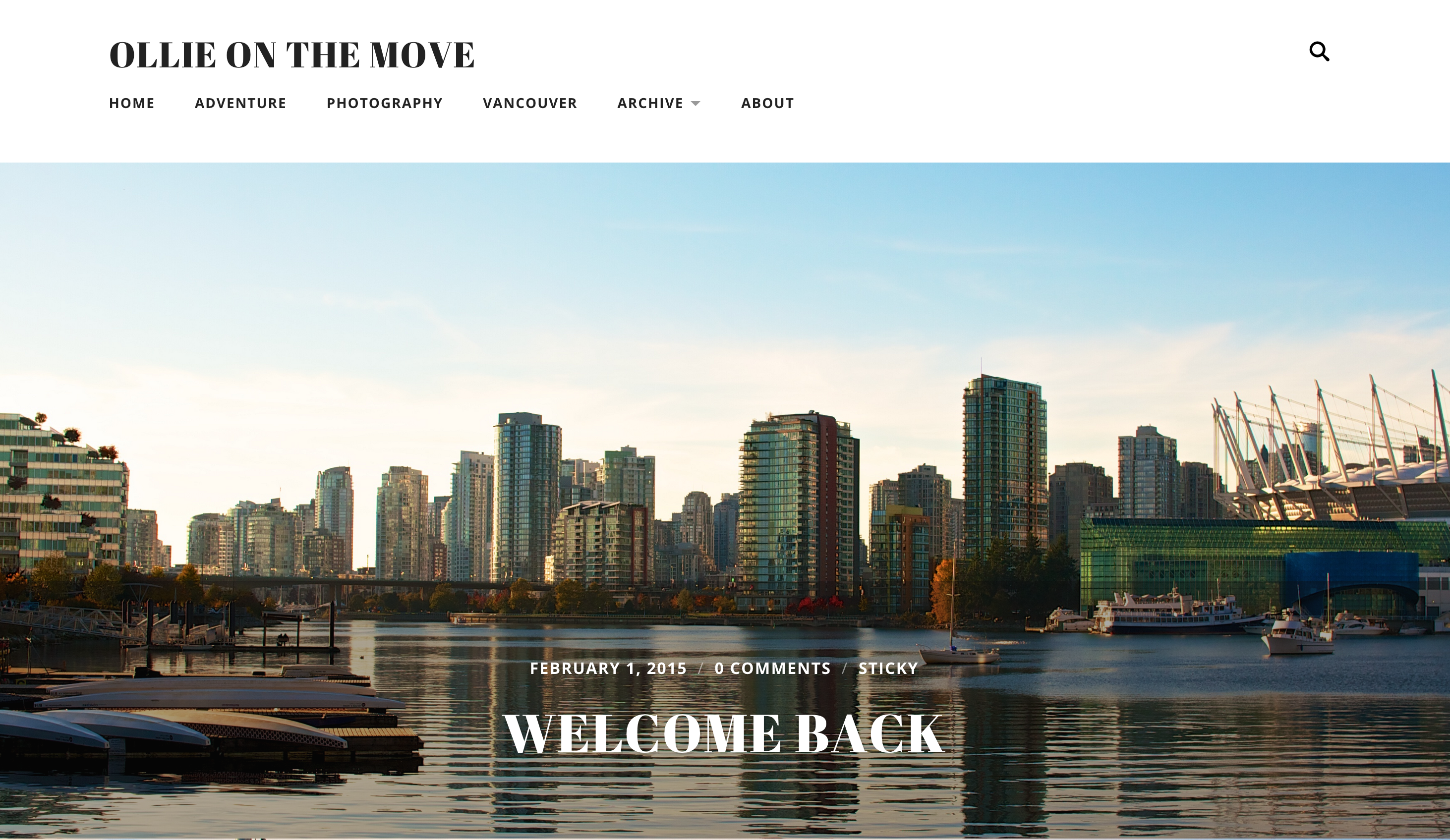
Radcliffe‘s full-width images and classic typography let Ollie’s beautiful images take center stage. His focused, organized menu helps visitors find their way around quickly and easily.
Add a Header: Cat(herine) and mmitII
Custom headers are an easy, free change that can transform the feel of an entire site. Catherine Jue adds a simple but bold text-based header to her blog, Cat(herine):
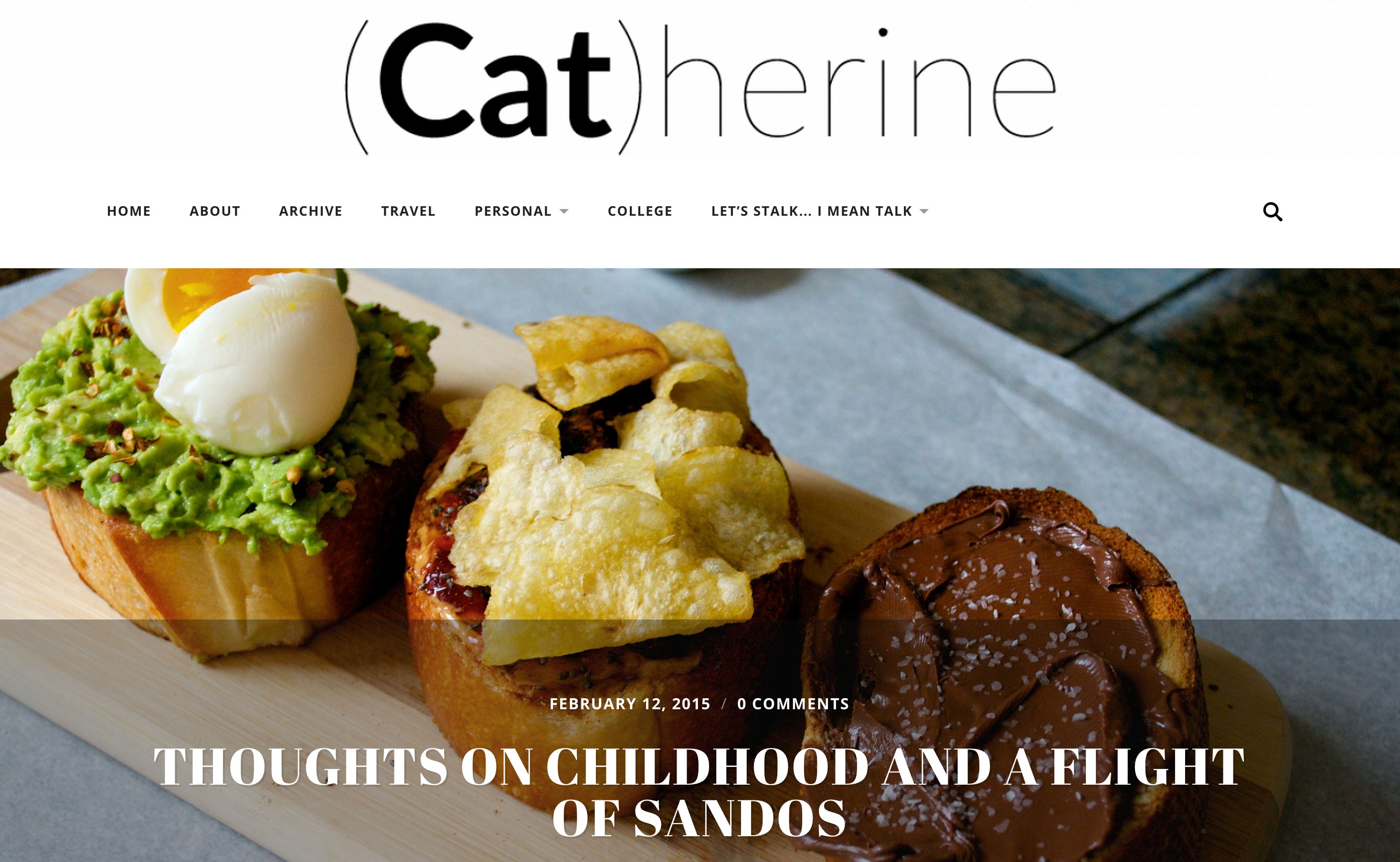
She relies on the same full-width images, focused menu, and beautiful fonts to build her striking site, but the simple addition of a header adds an informal, fun-loving note perfect for this California gal’s personality.
Header images can work just as well — take a look at mmitII:
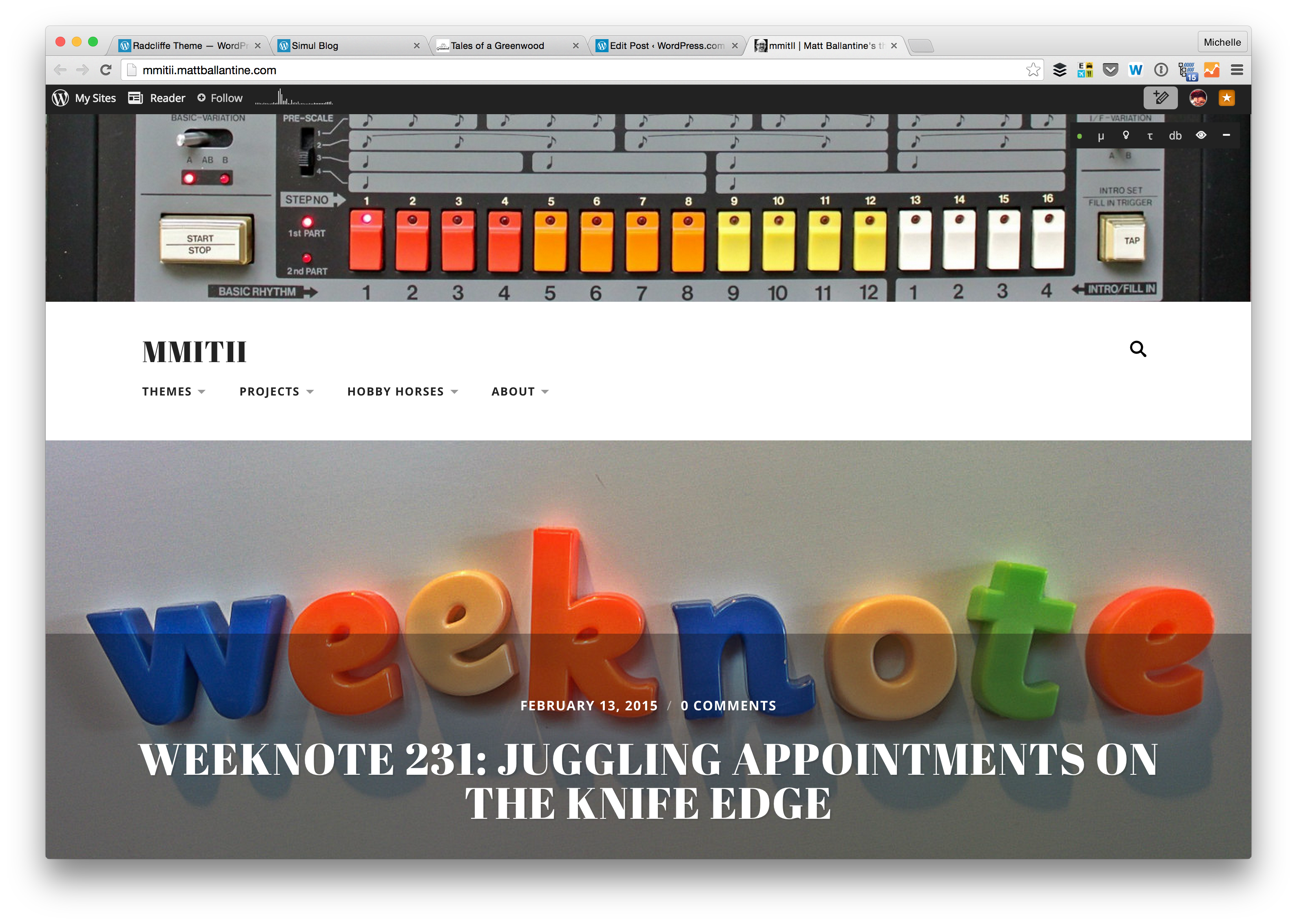
Blogger Matt Ballantine wisely chose a wide photo with strong horizontal lines. Echoing the header’s colors in his posts’ featured images keeps his blog from feeling busy — the images work together rather than compete.
(If you’re using the newer Site Logo feature instead of a header, Radcliffe handles that as well; just check out Tales of a Greenwood.)
Add a Header, Change the Fonts: dutchie love
Nicole and her husband Nathan both come from Dutch backgrounds — hence the name of Nicole’s lifestyle blog, dutchie love:
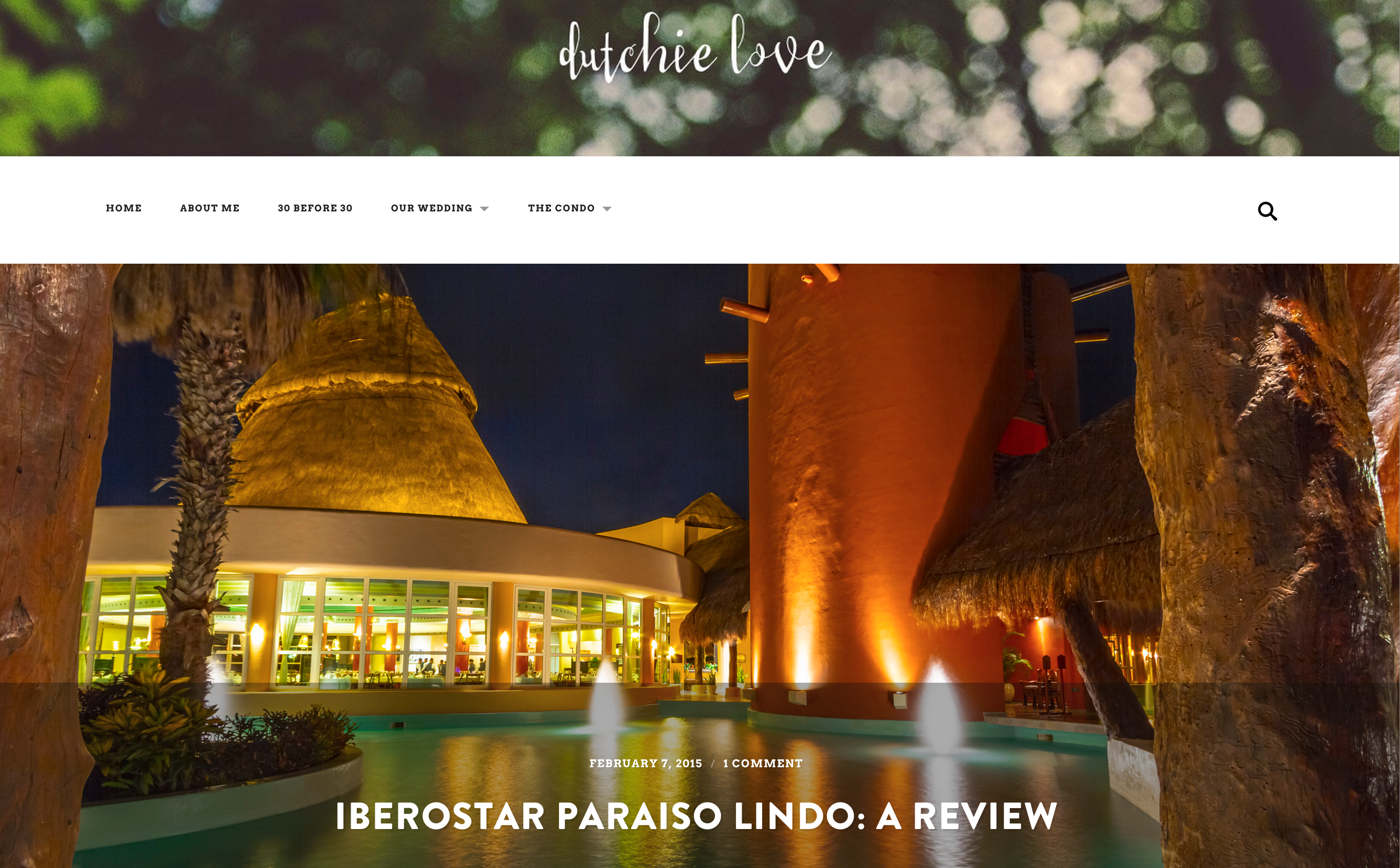
She transforms Radcliffe, removing the default site title text and replacing it with a soft header image with her blog’s title in a fun font. Going a step further, she used Custom Fonts to change her title font to the punchy, retro-modern Brandon Grotesque and her menu and body to Avro, a fuss-free serif.
Add a Header, Change the Fonts, Update the Colors: Simul Blog
If you’re getting the impression that Radcliffe works best for image-heavy blogs, friends Rich, Jacob, and Dan of Simul Blog beg to differ:
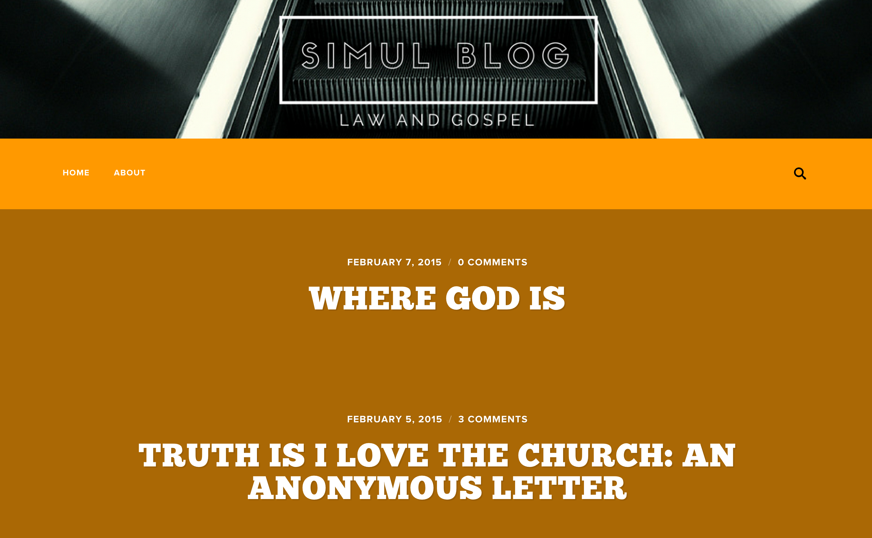
Simul Blog packs a saturated punch: a stark header image, brash oranges, and the aptly-named Chunk font turn Radcliffe into a minimal but high-impact home for their theological musings.
Want some more theme-spiration? Check out these stunning sites:
- Jonas Rask Photography: a scaled-back header helps Jonas’s photos shine.
- Reverse Retrograde: uber-thin sans serif fonts are streamlined and modern.
- Sheer Stomping: a bold header and stripe of black keep this lively fashion site grounded.
- Cultrbox: a splash of color in the site logo adds a pop of personality.
- Omar Shahid: a pared-down look creates a focused home page.
Ready to give Radcliffe a try? Head to the Theme Showcase to activate it on your blog.
- February 17, 2015
- Admin Bar, Customization, Themes

It’s a beautiful theme. I tried using it on my blog but my featured images aren’t HD enough, so it looks messy. I guess I’ll always be a “Spun” person.
LikeLiked by 3 people
These are great customizations. I am a total illiterate to these sorts of code or even “real time” editing aesthetics. Some blogs here were really cool and it’s pretty impressive how you guys gathered all of them 🙂 I do wonder when you guys will publish more cool free themes though — ones good for poetry and well writing long form. Now I always say “journaling” themes and writing themes but I think it’s kinda unfair as I reiterate but don’t elaborate. So, here is an elaborated description: “Radcliffe” is a good theme but it’s default font is too large, this is also with “Editor”. Additionally, I guess I like the idea of scrolling content posts rather than linked posts. I feel it’s best to have a midweight font at times when writing long forms or even poetry as huge fonts and huge content may both intimidate the average reader.I really liked the themes “Goran”, “Sela”, “Edin” and “Harmonic”. I think more free themes like that will be superb and very good. Those themes are great for writing long forms peaceably because neither the default design nor font gets in the way.
Now, I am not denying one thing. I am not good at customization myself. I am no pro nor do I understand blogging aesthetic as deeply as I should though I have had a blog in WordPress since 2007. Now custom upgrade is no longer available so it might become a bit more difficult. You guys did do an overhaul on the piece as in now you want us to get everything in a bundle which may be a cogent choice for many but at this moment it’s not for me.
So I hope more cool new free themes and premium themes are coming around so that we can see what other stuff WP can dish out 😉 the level of even free colour swatches on some of the themes are pretty neat especially the ones you gave for “Twenty Fifteen”.
I wonder what happened to the theme “Vigilance” and if the original “Misty Lake” may make a comeback though I know there is “Misty Lake 2”. I hope we get to see more themes.
LikeLiked by 4 people
I’m with you – I like the same themes you suggested. One I found that worked for me was Blissful Blog. I believe it’s intended to be a photography theme, but it worked for my writing page. Only a few minor things annoy me, but I haven’t found anything better.
LikeLiked by 2 people
We actually just published a post highlighting great themes for writers here:
https://wordpress.com/blog/2015/02/04/writing-reading-themes/
Thanks for the rest of the feedback!
LikeLiked by 1 person
Hi Michelle W. What Theme do you recommend for our family business to use? I would greatly appreciate your expertise and assistance.
Thanks
Brent L. Brooks
LikeLiked by 4 people
Hey there. We have quite a few professional themes here:
https://theme.wordpress.com/themes/subjects/professional/
I recommend looking at the demos and imagining them with the photos and content that you have. If you find one you really like, and you know you have the content to fit it, click on the theme info page to find setup instructions.
LikeLiked by 1 person
Like the look of the Radcliffe Theme. Look forward to seeing samples on due course.
LikeLiked by 1 person
Thanks for featuring Cultrbox on here. Much appreciated. And Radcliffe is an awesome theme!
LikeLiked by 1 person
These gave me some ideas!
LikeLiked by 1 person
I have been using the theme for a couple weeks and I never thought to change the front page fonts or customize I some of these ways. I have a great idea for the header.
LikeLiked by 2 people
These gave me some ideas very interesting!!!
LikeLiked by 1 person
Great, it looks like an interesting theme and the examples of customisation look very good.
LikeLike
This looks really good. I will need to give it a try with my blog.
LikeLiked by 1 person
Great post. I am just about to start looking for a new theme, so thanks..
LikeLike
Thanks for featuring DutchieLove in this post! I love this theme and the versatility of customization options 🙂
LikeLike
My pleasure! Thanks for creating such a great site 🙂
LikeLike
I’m currently using this theme and I really like it.
Not really that good with customization, so have left the design to shine in it’s own.
I think it’s well made and stands out. Of course I agree with a previous commenter that it looks much better with high quality pictures….
However,
I do a bit of a mix on there, pics from my mobile phone one day, high Def another. It works, and I think each post looks appealing 🙂
Now if I could only figure out how to make a custom header… 😉 (I don’t think it’s free.)
LikeLike
You certainly can use a custom header without upgrading! If you need the header instructions, here they are:
https://wordpress.com/support/themes/custom-header-image/
LikeLiked by 1 person