Rowling
by Anders Norén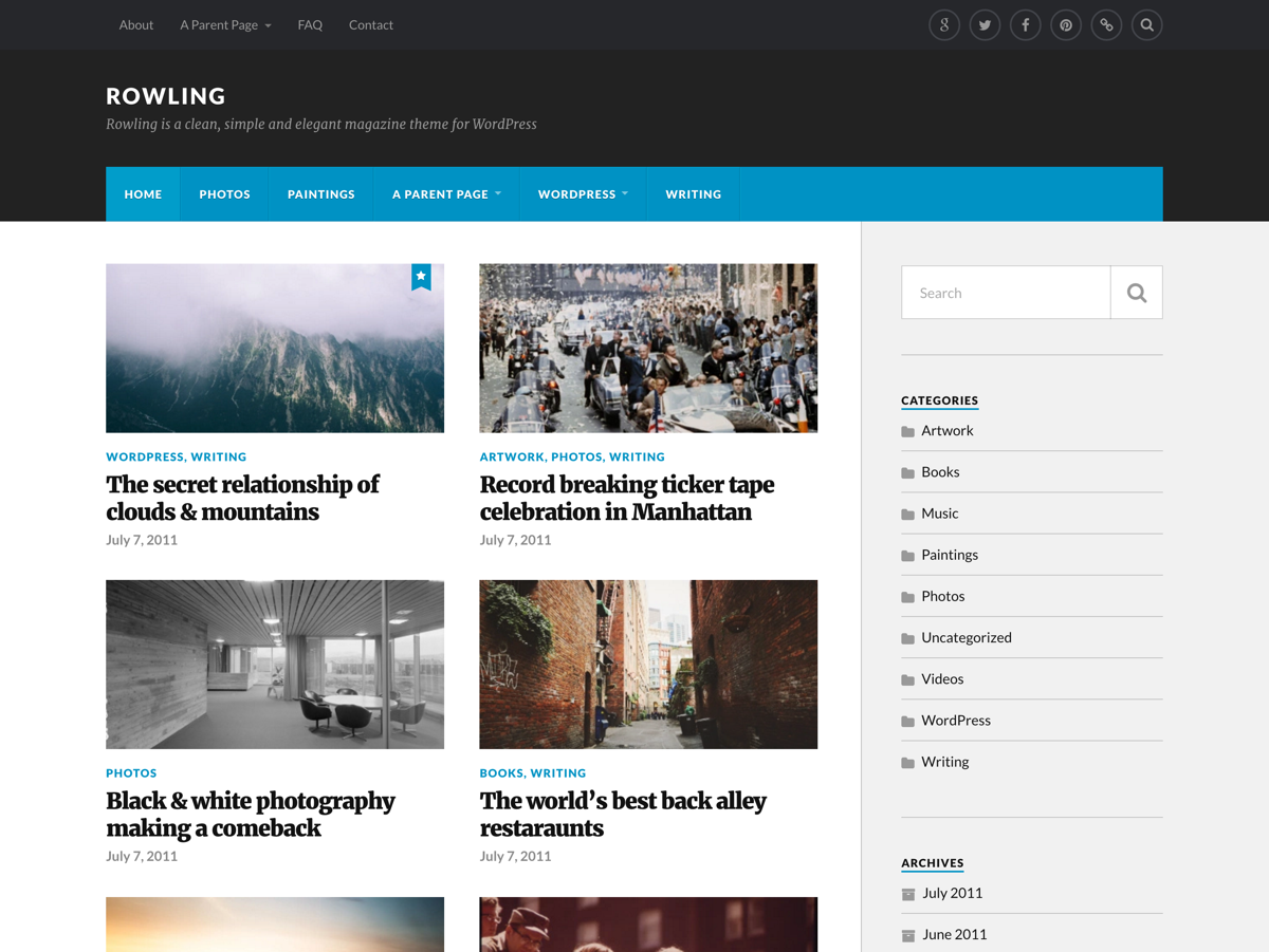
Originally designed by Anders Norén, Rowling‘s clean look and versatility make it a great fit for a wide variety of sites, from online magazines to personal blogs. Its responsive layout is optimized for all devices and great typography keeps your text legible and stylish. It comes with custom accent colors and logo support, so you can tweak the design to your liking. It also has two header menu locations and a social menu, and supports the Gallery Post Format.
Configuring Menus
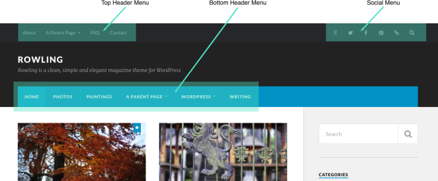
Rowling has three Custom Menu areas:
- Top Header Menu
- Bottom Header Menu
- Social Menu
The Top Header Menu and The Bottom Header Menu can be used together, on their own, or not at all, depending on how many items you’d like to display in your header. To add items to the menu, go to My Sites → Customize → Menus.
Only the Bottom Header Menu will be displayed on mobile phones and tablets.
The Social Menu automatically displays links to your social media profiles as icons. Supported social media icons include:
- Dribbble
- Flickr
- GitHub
- Google+
- Foursquare
- StumbleUpon
- Dropbox
- WordPress
- Tumblr
- YouTube
- Behance
- Vkontakte
- Soundcloud
- deviantART
- Digg
- Spotify
- RSS feed
- Twitch
Featured Images
To help tell your story visually, Rowling uses Featured Images as entry points to your posts. They’re displayed just below the title on blog posts. On index and archive pages — which have a grid layout — Featured Images are displayed as thumbnails above the post title. For optimal results, select a Featured Image at least 1200px wide.
Color Options
Rowling comes with 4 built-in color schemes to choose from including pastel teal & bright red, tan & bordeaux red, orange & dusk grey, and mint green & charcoal. To choose your color or background, go to Customize → Colors & Backgrounds.

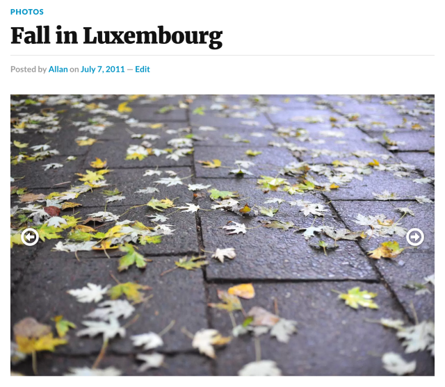
Gallery Post Format
When using the Gallery Post Format, Rowling will display a custom slideshow that gives readers a nice preview of highlighted images:
Quick Specs (all measurements in pixels):
- The main column width is
816. - The main sidebar width is
297. - The site logo appears at a maximum width of
240and maximum height of80.
Keywords
magazine, news, newspaper, personal, blog, gallery, simple
This theme is available for download to be used on your WordPress self-hosted installation.
Download