Baskerville 2
by Anders Norén(Baskerville 2 is a refreshed version of the Baskerville theme, with more features and added flexibility.)
Baskerville 2 is a crisp, responsive theme that displays your writing, photos, and videos in a dynamic grid layout.

Content Options
Baskerville 2 supports all Content Options, including the ability to display your choice of full post content or excerpts on the blog and archives.
Custom Menus
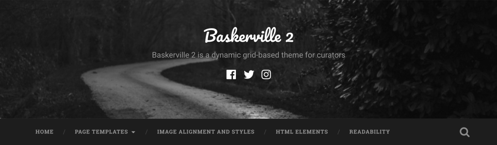
The main menu area, under the site header.
Baskerville 2 comes with a Custom Menu location, which sits below the header and can display multiple nested submenus. To add items to the menu:
1. Go to My Sites → Customize → Menus.
2. If you haven’t created a menu yet, create one and select the menu location “Header.”
Social Links Menu
With Baskerville 2, you have the option to display links to your social media profiles in the header. To display them, set up a Social Links Menu.

Available Icons
Linking to any of the following sites will automatically display its icon in your menu:
- CodePen
- Digg
- Dribbble
- Dropbox
- Flickr
- GitHub
- Google+
- Email (mailto: links)
- Polldaddy
- RSS Feed (urls with /feed/)
- StumbleUpon
- Tumblr
- Vimeo
- WordPress
- YouTube
Widget Areas
Baskerville 2 offers four widget areas:
- The optional Sidebar, which appears on the right in single posts and pages using the default template.
- Three optional Footer widget areas.
If there are no widgets in the Sidebar area, the theme automatically adjusts to a single column.

Sidebar widgets in Baskerville 2
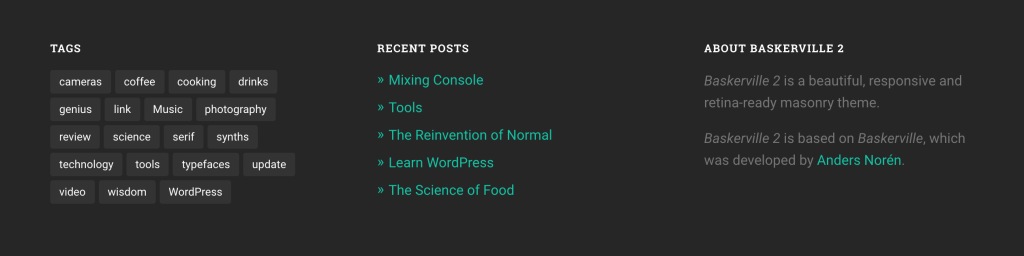
Footer widgets in Baskerville 2
Site Logo
Baskerville 2 supports the Site Logo feature. To add your own image, go to My Sites → Customize → Site Identity. The logo will appear in the header, above the site title.

Custom Header
You can customize Baskerville 2‘s header by uploading your own Custom Header Image, which will appear behind the site title as a background image. Decorative images work best in this space.
Page Templates
Baskerville 2 comes with three custom page templates: a Full-Width template, a No-Sidebar template, and a Contributors template.
Both the Full-Width and No-Sidebar templates feature a single column of content. The Full-Width template’s content area is quite wide, making it perfect for displaying larger media like videos, photos, and maps.

The No-Sidebar template displays a single column of content that is the same width as single posts and pages, and the column is centered.

The Contributors template displays your site’s authors in a grid. Their names, Gravatars, and profile descriptions are included, as well as links to their own post archives and websites.

To change the Page Template of any new/published page, go to My Sites → Pages and click the name of the page you want to edit. On the page editing screen, look for the Page Options module on the left and choose the page template that you want from the Page Template drop-down menu.
Post Formats
Baskerville 2 supports all Post Formats, and includes unique styles to help different kinds of content stand out:
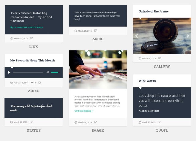
To recreate the image slider for a gallery post as seen here:
- Add a Gallery to a post using images that you’ve uploaded to the post.
- Set the post format to Gallery.
- Go to My Sites → Customize → Content Options and make sure the “Automatically use first image in post” option is unchecked.
Quick Specs (all measurements in pixels):
- The main column width on posts and pages is
756, and1120for the Full-Width template - Custom Header dimensions are fluid, displayed at varying widths and heights, depending on the screen size.
- Featured Images are
945wide;1400wide when using the Full-Width template. There is no height limit. - The Site Logo appears at a maximum width of
600and height of150.
Keywords:
social media, responsive, blog, travel, lifestyle, photography, portfolio, photos, travel, lifestyle, music, movie, media, magazine, press, news, writer, education, listing
This theme is available for download to be used on your WordPress self-hosted installation.
Download