Use the Media & Text block to place an image or video to the left or right of text. This guide will show you how to use the Media & Text block to display media and text side by side on your website.
In this guide
To add the Media & Text block, click on the + Block Inserter icon and search for “media”. Click it to add the block to the post or page.
💡
Using your keyboard, you can also type /media on a new line and press enter to quickly add a new Media & Text block.
For more information, visit our detailed instructions on adding blocks.
When you first add the Media & Text block to a post or page, it will display a media area (for your image or video) and a content area (for your text) like this:
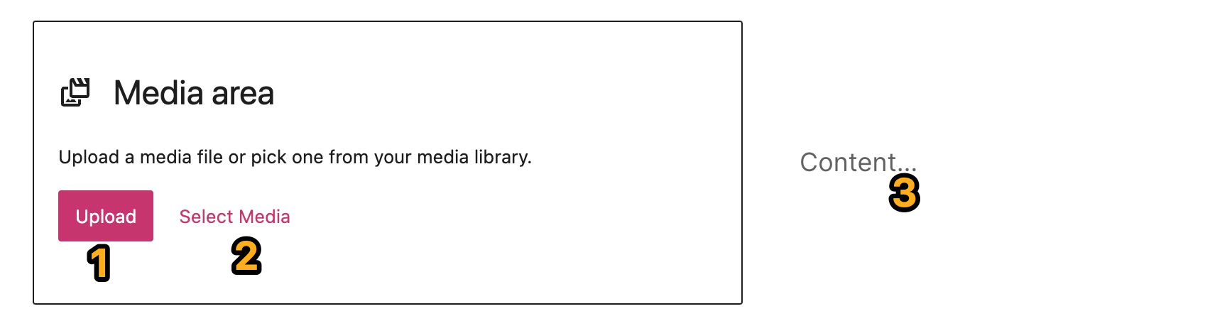
You can add your media and text content by clicking into each of the corresponding numbered sections, as explained below:
- Upload: Click to upload a new image or video from your computer into the Media & Text block.
- Select Media: Click to choose from:
- Existing images in your site’s Media.
- Your phone, via the Jetpack Mobile App.
- Your Google Photos account.
- The Pexels Free Photo library.
- The Openverse library of free photos.
- Content: Click and type to add your text content into this area. This section is not limited to text only — you can also click the + block inserter to choose any other block you’d prefer to use in this section.
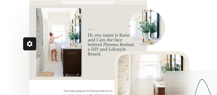
This is an example of what the Media & Text block could look like after you have filled in your own content and customized it:

When you click on the block, a toolbar of options will appear above or below it:
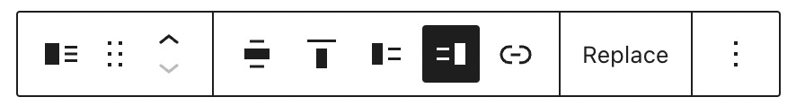
The Media & Text block has the following options in its toolbar:
- Change the block type.
- Drag the block.
- Move the block up or down.
- Change the block’s horizontal alignment or width.
- Change the block’s vertical alignment.
- Show media on the left.
- Show media on the right.
- Add a link to the media item in the block.
- Replace the media item in the block.
- More options.
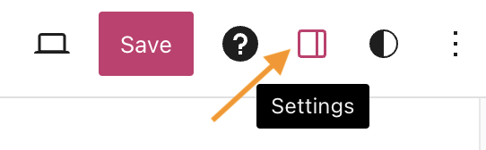
When you select a block, you will find additional block settings in the right sidebar. If you do not see the sidebar, you may need to click the Settings icon in the top-right corner to bring up the settings. This icon looks like a square with two uneven columns:
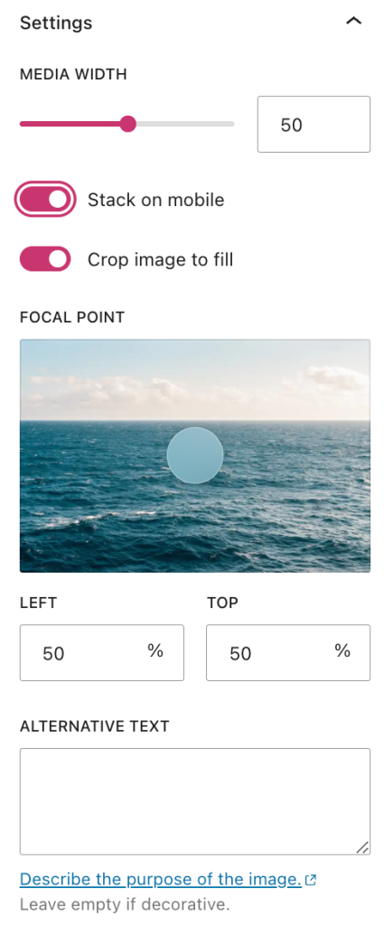
Toggle on the “stack on mobile” option so that on smaller screen devices (like mobile phones), the media and text will appear on top of each other instead of side by side. On mobile devices, the content on the left will show on top of the content on the right.
This option can be helpful if the side-by-side content is not easily readable on a mobile device. If the media and text were to stay side-by-side on mobile, they may be too small to view on narrow screens. This provides a better experience for mobile visitors.
If your image does not fit the entire width and height of its column, you can turn on this option to automatically crop the image to fill the entire column.
Once this option is toggled on, a colored circle called the “focal point picker” will appear on top of the image in the settings. You can click and drag it to select which section of the image you’d like to have centered after cropping.
Add alt text to the image to describe what it’s about. This is recommended for Accessibility and Search Engine Optimization.
The drop-down lets you choose which image size to load in the Media & Text block: full size, large, medium, or thumbnail.
Click and drag the “media width” slider to increase or decrease the width of the media item in the block. This will automatically make the content/text side of the block bigger or smaller in relation to the media width.
For more, visit our detailed instructions on Advanced settings.
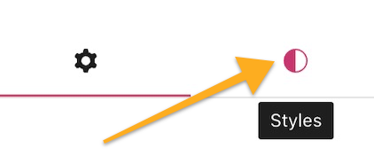
In the block settings sidebar, click on the Styles icon to access the design settings for the block. The Styles icon is in the shape of a circle with half of the circle filled in:
The Media & Text block includes the following style settings: