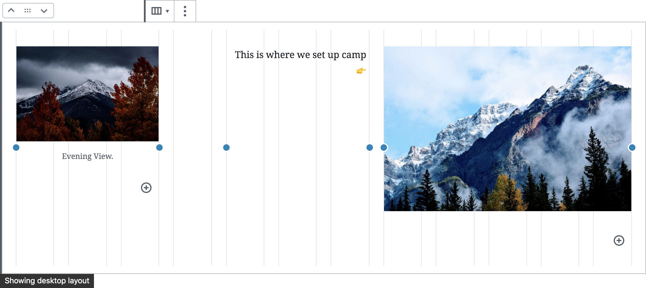
Use the Layout Grid block to align content on your website. This block allows you to define responsive breakpoints, which means you can select how many columns appear side by side on your post or page for both desktop and mobile views.
In this guide
A layout grid provides structure and alignment to the contents of a webpage. It contains a number of vertical lines determined by the viewing device (the responsive breakpoint):
- 12 grid lines for desktop devices.
- 8 grid lines for tablet devices.
- 4 grid lines for mobile devices.
In the Layout Grid block, grid lines are grouped together to form columns (1-4), and you can place your content within each of those columns.
It is common that columns on a desktop layout will be spread over multiple rows on smaller devices. This is automatically enabled when you switch to tablet or mobile views, but you can override it by changing the grid values directly.
Responsive breakpoints are an advanced topic. You can still use the Layout Grid block without worrying about these, and the grid will use the default breakpoints.
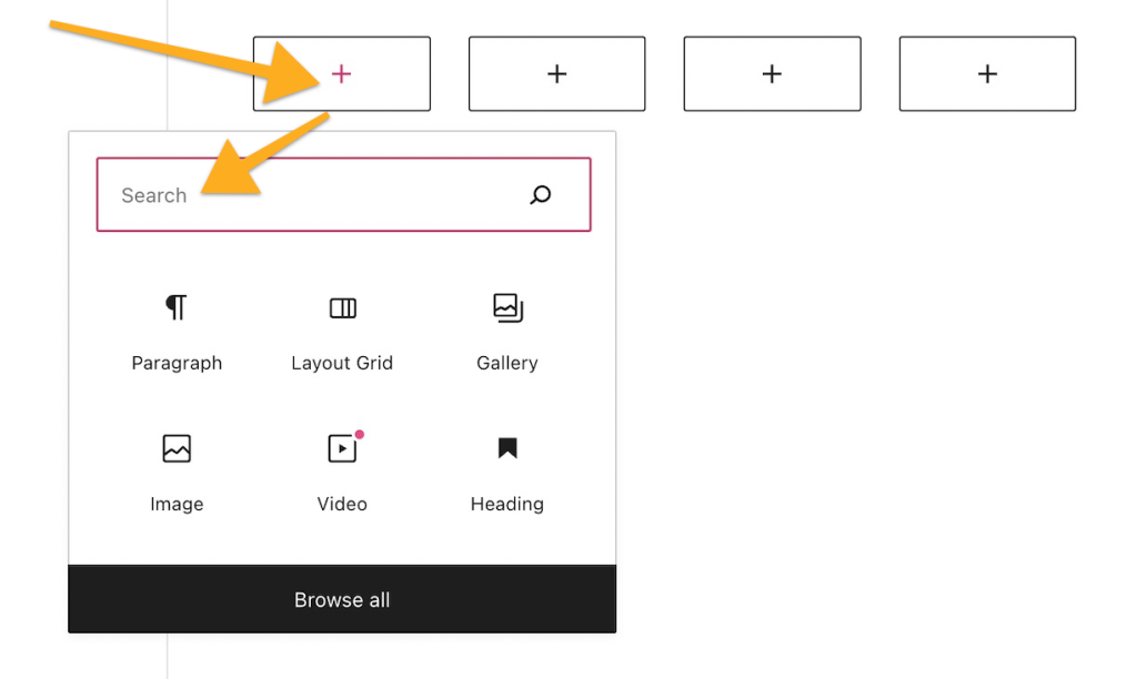
To add the Layout Grid block, click on the + Block Inserter icon and search for “layout grid”. Click it to add the block to the post or page.
💡
Using your keyboard, you can also type
/layouton a new line and press enter to quickly add a new Layout Grid block.

If you have a plugin-enabled site, make sure to activate the Layout Grid plugin at Plugins → Installed Plugins.
For more information, visit our detailed instructions on adding blocks.
When you first add a Layout Grid block, you will be prompted to pick the number of columns:
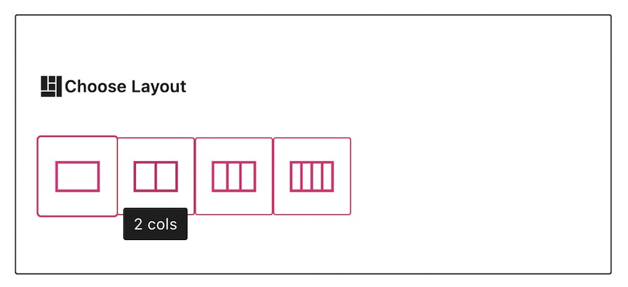
You can change this later from within the Block Settings.
Each column in the grid can contain other blocks. Click the + Block Inserter icon for each column, then search for the block you want to add.
When you click on the block, a toolbar of options will appear:

The Layout Grid block has the following options in its toolbar:
- Change block type or style.
- Change the block’s horizontal alignment or width.
- Responsive breakpoints for desktop, tablet, and mobile.
- Change the block’s vertical alignment.
- Additional options.
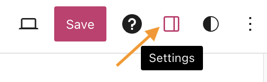
When you select a block, you will find additional block settings in the right sidebar. If you do not see the sidebar, you may need to click the Settings icon in the top-right corner to bring up the settings. This icon looks like a square with two uneven columns:
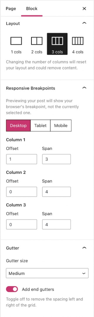
Use this to change the number of columns contained within your Layout Grid block. If you decrease the number of columns by one, the final column (and all its content) is removed.
Customize the Desktop, Tablet, and Mobile views by clicking their corresponding buttons.
Offset
This determines how many grid lines a column skips, to add spacing away from the previous column or from the start of the layout grid.
Span
This is the total number of grid lines that make up the full width of a single column.
The grid gutter is the space between any two columns within the grid.
Selecting No gutter will remove all gutters, including the first and last.
When the gutter size has any value other than No gutter, you can toggle off the button for Add end gutters. This will remove the gutters on the extreme left and right of the grid to make it fill up the entire width of the page.
For more, visit our detailed instructions on Advanced settings.