Use the Columns block to insert text, media, and other content into up to six side-by-side columns. When used one after another, the columns create a grid effect. This guide will show you how to create columns on a page.
In this guide
Working with columns – Transcript
0:00 In this video, we’ll take a look at the Columns block, which you can use to create a grid with up to six columns.
0:13 Then, you can insert text, media, or other types of content into each column.
0:19 To add a Columns block, click the Block Inserter button, and then search for the Columns block.
0:29 Then, press Enter to add the Columns block.
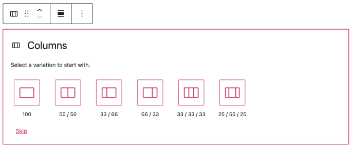
0:33 Next, choose the number of columns you’d like to start with.
0:37 And you can always change the number or click the plus icon between any two columns to add additional columns later.
0:44 In the toolbar, click the button on the left to select the entire Columns block.
0:57 And now we’re ready to start adding some content to each column.
1:00 The great thing about the Columns block is that you can add other blocks into each column.
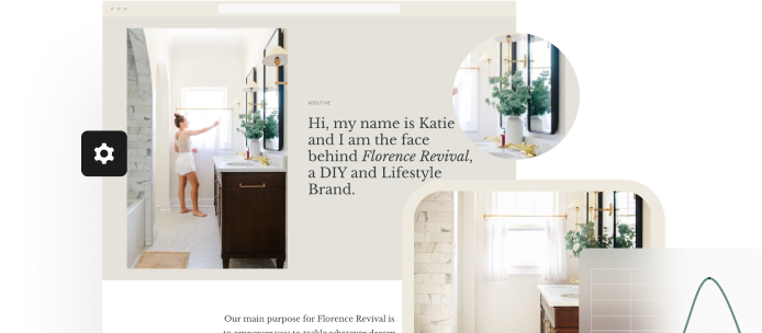
1:05 So, for example, you can use the Columns block to create the structure, and then add image blocks, heading blocks, or paragraph blocks to create a grid of services.
1:16 Or, you might add Cover Image blocks to feature certain pages on your site.
1:22 So, you can use Column blocks to create just about any type of layout you want.
1:31 When you’re finished adding content, click the button on the left of the toolbar to select the entire column.
1:37 And once again, you can change the vertical alignment of the content in this column, relative to the other columns on either side.
1:50 There are some additional settings for the Columns block.
1:58 Here, once again, you can change the number of columns in the block… and choose whether or not you’d like the columns to appear in a stack, one on top of the other, when this page is viewed on a mobile device.
2:11 If you want, you can even modify the colors used for the text that appears within each column… or select a background color for the entire Columns block itself.
2:21 And finally, you can adjust the spacing around each column — or padding — by entering a different number of pixels here.
2:34 Or, click the ellipsis button to show additional options that allow you to change the margin, and even the space between the blocks in each column.
2:50 So, as you can see, with all of these options, the Columns block can be incredibly flexible and can help you create just about any type of custom layout you might need.
You can start with an empty Columns block or group existing blocks into columns:
To add an empty Columns block, click the + Block Inserter icon and search for “columns”. Click it to add the block to the post or page.
💡
Using your keyboard, you can also type
/columnson a new line and press Enter to quickly add a new Columns block.
For more information, visit our detailed instructions on adding blocks.
Once you add the Columns block, choose the number of columns to display. You can change the number and width of each column later in the settings.
After selecting the number of columns, click the + block inserter to add blocks inside of each column. You can add any blocks into a column.
If you have inserted multiple blocks one after another and you want to turn them into columns, you can follow the steps below:
- Click and drag to select all the desired blocks you want to turn into columns.
- A toolbar will appear above or below the blocks. Click the first option on the left side of the block toolbar.
- Under the list “Transform to”, select Columns.

Each block you select will turn into its own column. The number of columns will be the same as the number of blocks you selected before transforming. You can transform between one and six blocks into columns.
There are two levels to the Columns block with different settings depending on what you have selected:
- The overall Columns block. These settings affect all the columns at once.
- The single Column blocks within the Columns block. These settings affect the individual column only.
There are multiple ways to select the block you need:
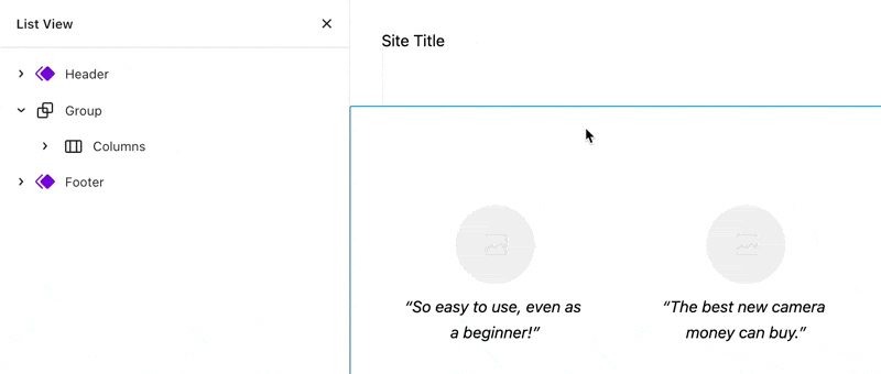
Using List View, you can see the hierarchy of columns, and select the block you need:
If you click on the content inside of a column, you can select the Column block from its icon in the block toolbar:

If you are working on a single column, you can select the overall Columns block from its icon in the block toolbar:

Learn more about selecting blocks.
When you select the block, a toolbar of options will appear:

The Columns block has the following options in its toolbar:
- Change block type or style.
- Drag the block.
- Move the block up or down.
- Change the block’s width (wide and full width if supported by the theme.)
- Change the vertical alignment of content inside the columns (top, middle, or bottom.)
- Additional options.
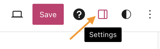
When you select a block, you will find additional block settings in the right sidebar. If you do not see the sidebar, you may need to click the Settings icon in the top-right corner to bring up the settings. This icon looks like a square with two uneven columns:
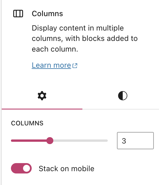
These settings control all of the columns in your Columns block. To access these settings, see this earlier section about how to select the correct block.
You can use the slider to adjust the number of columns in the block from 1 to 6. You can also type the desired number of columns in the field to the right.
This toggle switch determines if the columns are displayed horizontally or stacked vertically when the page or post is viewed on a mobile device.
This is useful for people viewing your page on mobile when the content may not all fit on one line.
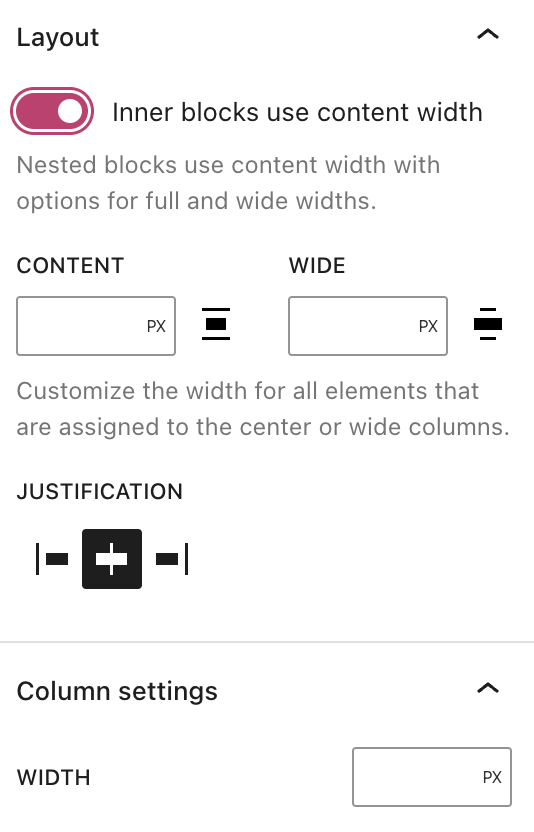
These settings affect a single column only. To access these settings, see this earlier section about how to select the correct block.
Use the layout settings to control the width and position of blocks inside of a column.
When the option Inner blocks use content width is toggled OFF, blocks within the column will fill the width of the column’s container.
For more control over the width of the inner blocks, toggle the Inner blocks use content width option to the ON position. You can then specify the width of the inner blocks using the following options:
- Content: The width of the content area for blocks not set to wide or full-width.
- Wide: The width of the content for blocks set to wide width.
You can use the Justification setting to align the inner blocks to the left, right, or center of the column.
Sets the width of an individual column in pixels or other units. You can change the column’s value to make it wider or narrower. Columns don’t all need to have the same value.
For more, visit our detailed instructions on Advanced settings.
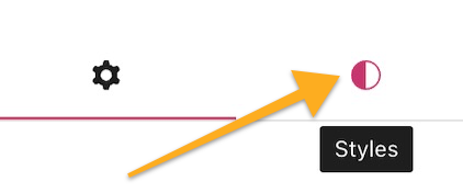
In the block settings sidebar, click on the Styles icon to access the design settings for the block. The Styles icon is in the shape of a circle with half of the circle filled in:
The Block Styles include the following settings: