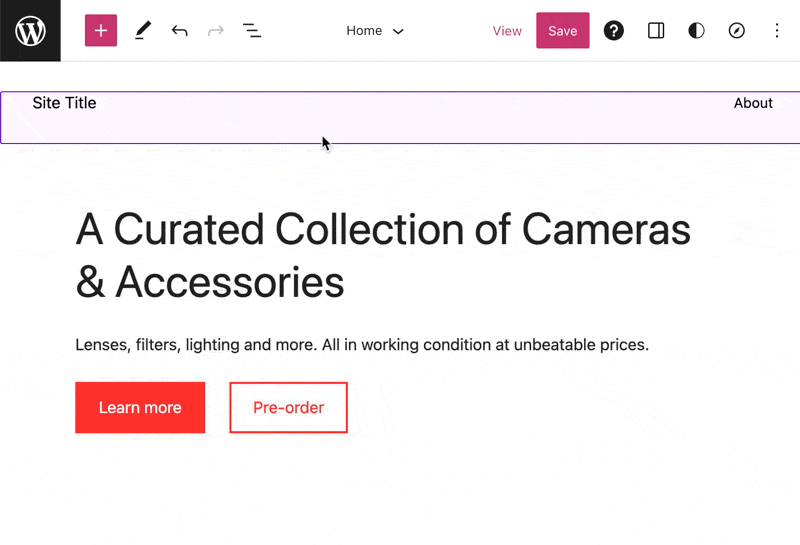
Use the Buttons block to prompt visitors to take action with a button-style link. Your button can link to other pages of your site or to an external page. It’s great for calling attention to the most important thing you want your visitors to do.
In this guide
Video Transcript
The Buttons block allows you to create button-style links that call attention to the most important action you want your visitors to take.
To add a Buttons block, click the Block Inserter button and then search for the Buttons block. Or type a forward slash on a new line followed by the word buttons. Then press Enter to add the buttons block.
There are two levels to this block.
The overall buttons block contains your buttons. This is called a parent block. When the parent block is selected, the toolbar lets you drag the buttons block into a different location on the page, move the block up or down the page, change the justifications of the buttons within the block, or change the width of the entire block.
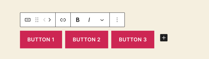
But when you select an individual button, you can change the text that appears within the button itself. And you’ll also notice that the options in the toolbar change.
To the left of the toolbar, you can select the parent block any time you like.
But you can also select a different style for the button, either filled with a solid color or outlined with a border.
And you can drag the button into a different location or move the button to the left or right using the arrows.
And once again, you can change the justification or the alignment of the buttons.
Most importantly, you’ll want to add a link to the button, which determines what happens when your visitor clicks that button. You can enter any web address you like or search for an existing page or post on your website. Select the page from the list below to create the link. By default, links will open in the same tab as your visitor’s web browser unless you choose to open the link in a new tab.
The toolbar also contains some basic formatting options to change the appearance of the button text itself.
Click the Options button to show even more settings for the button.
Once again, you can choose a button style, either filled with a solid color or outlined with a border.
And you can change the width of the button by selecting a different percentage.
Of course, you can also change the color of the button text itself or the background color of the button.
The Typography settings allow you to change the size of the button text, and if you want, you can enter a different value for the padding, or the amount of space between your text and the border of the button.
Click the Unlink icon, and you can enter different padding values for the top and bottom or left and right of the button.
And finally, you can give your buttons a more rounded appearance by entering a border radius.
If you want, you can add multiple buttons to a single Buttons block. To add additional buttons, you can either click the Options buttons and select Duplicate – or select the Parent block, and then click the plus icon. Add the button text, edit the style if you like, and then edit the link for that button.
When you’ve finished creating individual buttons, select the Parent block, and then click the Options button to view additional settings for the entire buttons block.
In addition to the justification options, you can also choose whether to display your buttons horizontally or vertically stacked in a column.
You can also allow the buttons to wrap onto multiple lines on smaller devices like mobile phones.
And last, you can change the space between the buttons by entering a value here.
All right, now you’re ready to create your own buttons so your visitors can find the most important actions on your pages and posts.
For more help creating buttons for your website, please visit WordPress.com/support.
To add the Buttons block, click the + Block Inserter icon and search for “buttons”. Click it to add the block to the post or page. Once you add your first button, you can type what you’d like the button to say.

💡
Using your keyboard, you can also type
/buttonson a new line and press Enter to quickly add a new Buttons block.

For more information, visit our detailed instructions on adding blocks.
There are two levels to the Buttons block:
- The overall Buttons block contains your button(s). This is known as the parent block.
- The single child Button blocks within the parent Buttons block.

You can select the parent Buttons block from List View:
When you select the parent Buttons block, a toolbar of options will appear:
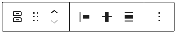
These options are:
- Change Buttons block to another type of block
- Drag the block handle to change the block position
- Move up or down
- Change the item’s justification (left, center, right, or equal space between)
- Change vertical alignment (top, middle, bottom, or stretch to fill)
- Change width (wide or full width if supported by the theme)
- More options
Single buttons offer the following options in the toolbar:
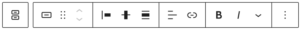
These options are:
- Select the parent Buttons block
- Button styles (more on this below)
- Drag block handle
- Move up (left) and down (right)
- Change the item’s justification (left, center, right, or equal space between)
- Change vertical alignment (top, middle, bottom, or stretch to fill)
- Change width (wide or full width if supported by the theme)
- Change text alignment (left, center, right)
- Add a link
- Bold, Italics, and more text formatting options
- More options
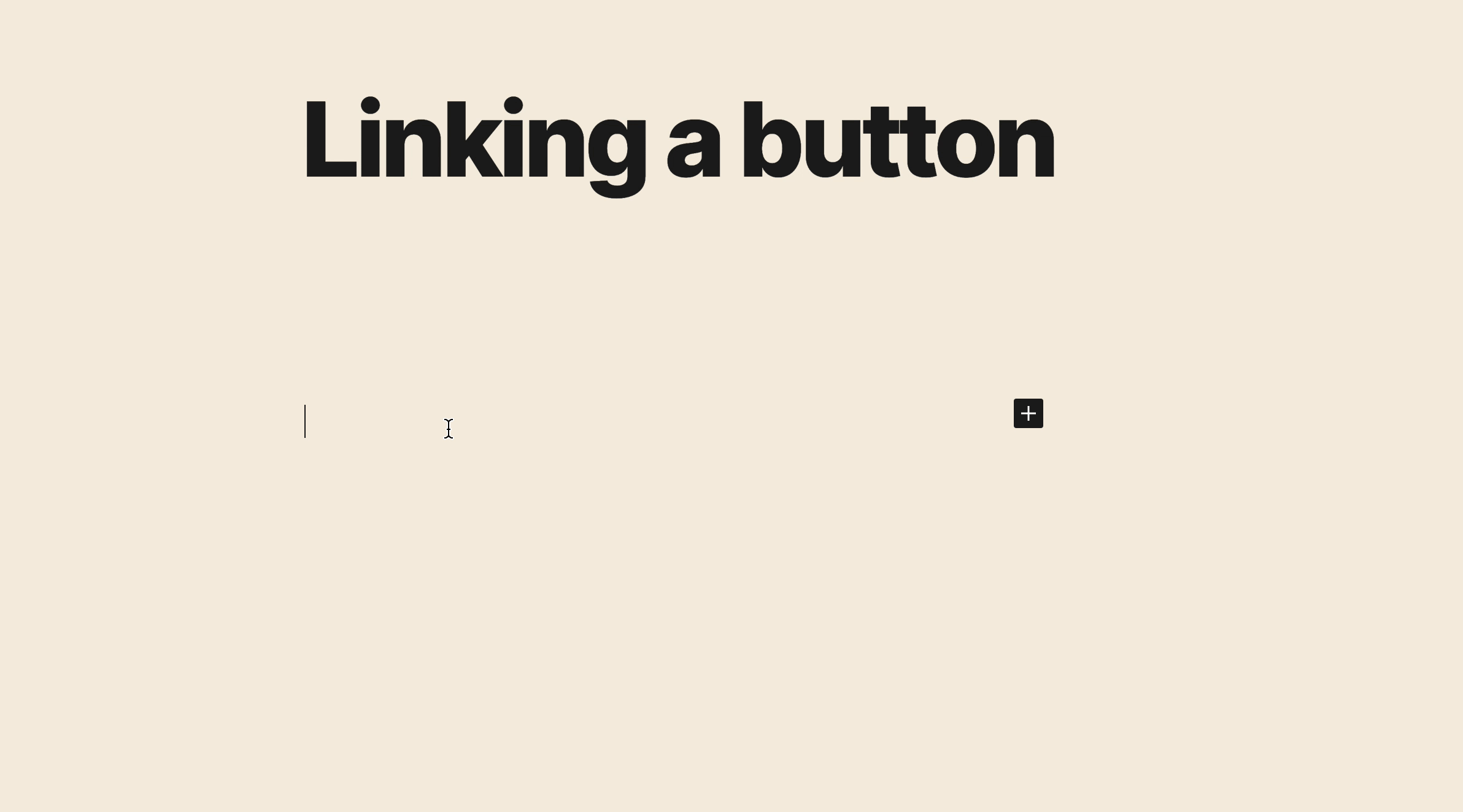
To add a link to your button:
- Click on a button, and a toolbar will appear above it.
- Click the Link icon in the toolbar. The icon looks like an actual link you would find in a metal chain.
- Search for an existing page on your site or type/paste a URL.
- Click Apply.
By default, links will open in the same tab. You can set the link to open in a new tab. For detailed instructions on creating links, see our Links guide.
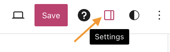
When you select a block, you will find additional block settings in the right sidebar. If you do not see the sidebar, you may need to click the Settings icon in the top-right corner to bring up the settings. This icon looks like a square with two uneven columns:
The parent Buttons block contains the following layout settings:
- Justification: Justify all individual buttons in the block to the left, center, or right. You will also find the option to create equal space between each button.
- Orientation: If you have multiple buttons in the block, this will display them horizontally (next to each other) or vertically (one underneath the other.)
- Allow to wrap to multiple lines: With this option enabled (recommended), multiple buttons will move to a new line if the browser window is too small to display each button on the same line.

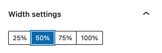
When clicking on an individual button within the Buttons block, you can access the width settings to define the width of each individual button in percentage terms.
For more, visit our detailed instructions on Advanced settings.
In the block settings sidebar, click on the Styles icon to access the design settings for the block. The Styles icon is in the shape of a circle with half of the circle filled in:
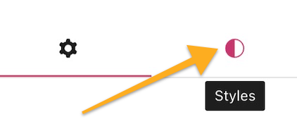
The parent Buttons block provides the following settings:
- Typography: Control the size of the text displayed on all buttons in the block. See Typography Settings for more.
- Dimensions: Adjust the space between each button and the margin around it. See Dimensions Settings for more.
- Border and Radius: Adjust the line around the buttons and shape of the line. See Border Settings for more.
The individual Button blocks provide the following settings:
- Styles: See below.
- Color: Choose the color of the text and the button itself. See Color Settings for more.
- Typography: Control the size of the text displayed on buttons. See Typography Settings for more.
- Dimensions: Adjust the space between each button and the margin and padding. See Dimensions Settings for more.
- Border & Shadows: See Border & Shadows Settings for more.
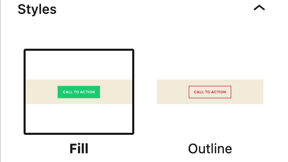
Individual Button block settings include two different Styles:
- Fill: The button will be filled with the color of your choice.
- Outline: The button will have a solid border color of your choice, with no color in the middle.