An accessible website is designed to be inclusive to as many users as possible, including people with disabilities who rely on assistive technology to navigate the web. This guide will show you how to ensure your website is accessible.
In this guide
Video Transcript
Hi everybody. Welcome to Building an Accessible Website on WordPress.com. We so appreciate having you here with us today.
My name is Marjorie. I’m on the marketing team at WordPress.com. And for those of you who didn’t quite catch it on the announcement, so we will be recording this session.
So if you aren’t able to join us all the way to the end, don’t worry. You will get a link. Everyone who’s attending today as well as those who were not able to make it, will get a follow-up email sometime in the next day or so.
And it will include a link to the recording, as well as the presentation slides. So you’ll have that as a reference as well.
So again, my name is Marjorie. I’m on the marketing team. I’m based in Western Colorado. And because this is an accessible webinar, or sorry, it’s a webinar on accessibility and education, I want to point out that I am an Asian American female.
I am in my office and I’m surrounded by books. And there’s a couple of dogs at my feet. Not that that matters. But that is my environment.
And we’re also live streaming this webinar on Facebook and YouTube and maybe LinkedIn, possibly. So hello to everybody out there on Facebook and YouTube and LinkedIn.
We have a Q&A panel. For those of you who’ve used Zoom before or attended a Zoom webinar, if you look at the bottom of your screen, you’ll see a bunch of different options for viewing or start for interacting with us.
So what you need to focus on is the Q&A panel. If you have any questions and you’re welcome to start submitting your questions through that panel, you can type it in there.
And Jackie, who is my colleague on the happiness team, she will be answering the questions, but we’ll also be selecting some questions to be answered live at the end of the presentation, about 15 to 20 minutes before the top of the next hour.
So Jackie, do you want to introduce yourself?
Hi, everybody. I’m Jackie Lock. I am a happiness engineer, as Marjorie said.
I will have my screen off, but I turned it on to say hi to you all. I am a Caucasian female with purple hair. Yes, purple. I am wearing glasses and I am surrounded by all of my children’s toys in my basement, which is where my desk is.
I will be taking your questions and I can’t wait to help answer them. So see you soon. Enjoy the webinar.
Thanks, Jackie. And so now without further ado, I introduce you to Fernando, who’s one of our presenters today.
Hello, everyone. My name is Fernando Medina. I’m a happiness engineer at Automatic. I’ve been a user of WordPress over 15 years now, quite a long time.
I love being able to assist users with my role today as a happiness engineer, building their websites and expanding their accessible sites as well. As a description of myself, I’m a light-skinned man with dark hair, brand new haircut.
Behind me, there is a light gray background. I have a WordPress.com t-shirt and I’ll pass it on to Melissa now for her part.
Hello, my name is Melissa Silverstein and I’m also a happiness engineer at WordPress.com, helping people build their sites and build them excessively.
I’m a light-skinned woman with brown hair and blonde at the end wearing glasses. I have a blue shirt with stripes and behind me is coffee colored walls in my bedroom.
On that note, let’s jump right in to what is accessibility.
So when we talk about accessibility, we’re talking about sort of a big thing. When websites and tools are properly designed and coded, they’re generally accessible from the output.
But many sites and tools, when you add more content, when you stop being mindful of how you add the content, they can become inaccessible and cause barriers for people trying to see your content and interact with your site.
Making it accessible is important for a lot of different reasons. The main one’s inclusion, you want to have your content available to anyone. You don’t want someone to not be able to see your course or your information just because they have a vision impairment or hearing impairment.
Another reason is that increases your available audience. You can nearly double your audience making certain accessibility changes just to make it readable, to make their images have alt text, things like that.
A lot of accessibility tips also help you get a better performing site. It can help things load better. It can help things be identified in case there’s a loading problem with slow connections.
And almost every accessibility tip can help with search engine optimization. And so that really depends if you’re trying to get your site out there and other people to find it, or if you have a site that’s meant for your own class, something like that.
One of the reasons that some people might be here is that it’s also legally required to keep your site accessible in some jurisdictions, especially for government sites or education sites.
And so we would recommend if you’re in one of those jurisdictions to make sure that you know the actual guidelines. But we’re going to try to help by simplifying a few things that match up with those guidelines.
So who’s impacted by accessibility?
Some people ask, how do I know if someone with access needs will be accessing my site?
You don’t necessarily know outright, but you can be pretty certain that people with access needs are going to access your site.
There’s a lot of different tools people use. We’ve listed some here that are assistive technology tools.
A screen reader is one of the most common tools that might be used by someone with access needs. And it can be used for partially or fully blind people to interact with their computer’s content or a website or their phone.
What it does is it will read aloud the information that it sees and you can navigate around with arrow keys, buttons, spacebar, all sorts of stuff.
There’s also computerized Braille displays that will change the display to Braille while you’re navigating a site so you can read what it says that way.
There are screen magnifiers for low visibility. There’s even switch control mode where some people use just a button or joystick to navigate around.
And so let’s take a look real quick at some misconceptions because we really want to make it easy for you to keep your site accessible.
Some things that people think are you can install a plugin and your site will be accessible. Plugins add a lot of functionality sometimes to your site, but there’s no one click way to make it accessible.
The most important thing is being mindful when you add your content, which is the tips we have today, but there’s not going to be a simple, fast solution and it’s not a one time thing.
At WordPress.com we try to make our themes accessible by default. And so you don’t necessarily need a specific theme for that either.
Like I said earlier, it’s not a one time thing. It’s every time you add a paragraph, every time you add an image, every time you add a post, you’re being mindful of how you add that content.
Some people also think because there are design guidelines that it means your site won’t look good, but I promise that’s not true either.
You also don’t need to be a programmer. You don’t have to know any code to keep your site accessible.
So now that we’ve looked at some common myths, let’s take a look at what we can do and I’ll pass it over to Fernando to take a look at creating accessible content.
All right. Thank you Melissa so what we’re going to look into today is just some quick items that you can start doing and working on your site to make it as accessible as possible.
So first one we’re going to be looking at our headings and what I want to illustrate here. I have two examples of a page layout.
And one of the things that I want to highlight here are a couple things actually.
First are this would be an example of a heading block in the WordPress.com block editor you’ll have different blocks that you can use.
You can use a paragraph block to start typing text in it. You can use a heading block to make a header in the system. And that’s an example of what this is at the top.
A timeline of our history would be a heading block. One thing I want to illustrate here that is different is if you see here early beginnings, this would be just a paragraph text that has been bolded.
So it’s set to appear as a heading but in the system it won’t function that way.
If you look on the right side here, this would be a heading block. So that is properly laid out on the page and the system will see it as such.
We’ll take a look at what that it looks like on the next slide.
But that’s something that I wanted to highlight right off the start is you want to make sure that as you’re using headings is to essentially outline the page so that the system reads it the proper way, as well as anyone visiting your site.
If they’re using a screen reader, though notice that that is specifically a heading and not just a piece of text so they’ll market as such on their end as well.
And one of the things we’ll see on the next slide here is how it’s outlined but I did want to highlight just some of the differences in terms of uniformity of headlines, I’m sorry headers, and rather than using different headers just to make a heading look more important or bigger or
it would be, it’s best to keep things outlined in a proper way. And we’ll see that on the next slide here.
This is what the editor will look like as you’re adding pages and things of that nature to the to the site. If you see here this is where that early beginnings part is just bolded pieces of text.
If you see the outline, this quote unquote header is not actually listed here because the system doesn’t see it as such. Whereas, you’ll see you have about our school which is the page title timeline of our history which is this heading right here.
And then there’s a couple other headings on the page. But if you take a look here, the system kind of sees that there’s, there’s not uniformity in terms of where the headings go what pieces of content attribute to those headings.
So this would be an example of a page that might not have the correct structure.
And you can reach this outline that’s available within the editor, you’ll see it at the top of the page. And you’ll see that it has this little symbol here which is in a lowercase I with a circle around it.
It will be to the left of these cascading lines here. And if you click on that actually tell you, you know how many words are on that page how many headings paragraphs blocks, in general, and so on and so forth.
So if you want to look at this as you’re building out the page is a good idea just to make sure that things are outlined as you intend them to be.
And then if we take a look at the next page or the next slide here, you’ll see what it looks like with proper headings, as well as you know what it looks like, styled here so a good rule of thumb is just to make sure to use the headings as the proper way to outline the page, rather than making, you know, rather
a very large heading, just for stylized sake, it is better to keep it as easily readable as possible. If you notice on this one, you know, it does market as for headings because early beginnings is marked as a proper heading, and everything goes in a specific flow.
So the headings is getting this part of the timeline, and then the next section would be some information about sports. So it’s a good thing to have this just to keep things properly formatted on your pages.
So the next thing we’ll discuss is contrast and readability. And this is important because when as you’re designing a, or your website, you want to make sure that everything is easily readable can be viewed by anyone that visits the site, and you have everything laid out in a way that people can see the content in the proper way that you intended to do so.
So the first thing that we recommend here is using contrasting colors. So I have an example here where you have a cover block, which is just an image with text in front of it.
On this one, it’s pretty hard to see that text, you can still read it out, but it is a little bit tougher to do. Whereas on the bottom part here you have the same text, but with white, white colored font so much easier to read as you’re skimming down the page, rather than having to, you know, do something.
You can do something else in addition to try to read this like highlighting it or something like that. So that’s one of the things that are important to do. You also want to make sure that as you’re creating hyperlinks and adding different links to your pages or posts or whatever it may be, you want to try and use detailed link text.
So in this example, you can see here, we have you can read more about his biography here. If you were using a screen reader to go through the flow on this page.
Essentially, the person using that is going to see or hear that the link is taking them to a page here. They’re not going to really know where they’re going.
Whereas if you were to hyperlink the entire sentence, it’s a little bit more clear on where they’re going to be going from that point. So it is always a good idea to try to keep any hyperlinks that you have as detailed as possible.
You know, even doing something like you click here to read more about Coach Eddie or something to that effect is a good idea.
The next bit is keeping font choice and text size in mind. So what that means is, as you’re creating the pages and posts and things of that nature, you want to make sure that if you’re selecting a font, it’s not going to be strictly for
purposes or stylize a specific way. You want to try to think about any visitors on your site and have them in mind as you’re picking a specific font. So picking fonts that are generally, like Melissa mentioned, our themes are built with an accessible
frame of work in mind. So we will typically have a default font that is accessible, but also, you know, if you want to choose a different font, keeping that in mind that it is readable by anyone that goes to your site is a good idea.
And then something that I alluded to before is just making sure that text size is kept in mind. So you don’t want to have something that’s very large on one paragraph and then very small on the next paragraph, or one page is very tiny and the next one is big.
Keeping that uniform, making sure that you can easily read it, but as well anyone that visits the site can easily read it is important. So that’s something else to keep in mind here.
And then finally, regarding not setting links to open in a new tab automatically. By default WordPress will have all links open within your same tab or window. So they won’t automatically take you to a new tab.
So users that use browsers and things of that nature, mobile browsers are aware of how to open links in a different tab. So giving them the option on their end to do that rather than you doing it for them is generally a good idea, because it keeps visitors on the site on your site without being, you know, without having a new tab open for them without them noticing, or
realizing what happened, or going to another window and not being able to go back because that’s one of the things that tends to happen if you open a new tab, you’re not going to be able to go back inside of the browser.
So keeping them on your same site without going to a new tab or windows generally a good idea.
And one of the things to highlight here as well as just the differences between sports is a little bit different. Again, that’s because this setup as a paragraph text that has been stylized to look like a heading.
Whereas this one is an actual heading. So on that outline you’re going to see that sports shows up rather than this which won’t show up on that case.
And then adding to that is something that we have inside of the editor, which actually will tell you if a color combination is harder to read.
And what we base that on is actually a standard called the WCAG, which is the web content web content accessibility guideline.
So we base that kind of color choice and combination on that standard. It’s not something that we set on a bar and that says, you know, gray looks better with red or whatever the case may be.
It’s a specific standard that is set and if it notices that it goes against that standard, it’s going to prompt this little notice.
Now it’ll still let you save and use that if you’d like, but this notice will appear there if it notices that that color combination is used.
So just something to look out for and this will be on the right side in the editor in the block settings.
And kind of continuing with readability.
One of the tips that we have is whenever you’re, you know, creating your pages or content or anything of that nature you want to try and use plain language.
So keeping things as simple as possible using language that everyone can understand is important because depending on who’s visiting your site, you know, it can be someone from anywhere and keeping things as simple as possible for them to read and understand is important.
So the other thing to keep in mind is separating sections of especially large pieces of text. So if you have a large piece of text on a single page or post you want to make sure that you try and use headings, which are important for the outlines that we discussed before,
using bulleted or numbered lists. So bullet points for specific highlighted pieces of pieces of information that you want them to know, maybe in its own section is a good idea, using images to break up large paragraphs is also a good idea, as well as charts and anything
else that you can to just keep the flow a little bit structured in a way that isn’t going to be just a large body of text for that user.
So a piece of information to remember is trying not to use jargon. So any jargon that you might know, or maybe is used by your own students or in your classrooms or whatever it may be.
If you do decide to use it on your site you want to make sure that you also explain it for people that are just visiting the site, and are not familiar with that terminology.
So if you have a piece of jargon that you use frequently, explaining what it means is also important for the reader, just so they can feel like they’re a part of that.
So they’re a part of the information that they’re reading, or at least understand it.
And then finally keeping paragraph text left or right aligned rather than justifying that text. One of the reasons we mentioned this is because as you’re reading a piece, like a page or a post.
You can’t just keep the reading flow throughout the page. So rather than having, you know, a piece of paragraph that is left the line and then right align and then justify it just, it’s best to keep things uniform as we mentioned before, and then justifying that can adjust the spacing of a paragraph so it can
mess things up a little bit in terms of as you’re reading it. So that’s something else to consider. You can, you know, with headings you can keep them centered, you can do left or right align you can kind of play around with that but with text it is good to keep it left or right
aligned just for the reader’s sake.
And then finally what we’ll touch on is media, just an important piece of, you know, as we mentioned adding media to a page and things of that nature can be beneficial.
One of the things I want to highlight here is this image and what I’m going to do is just have three descriptive ways to describe this image.
One of those ways is just if I were to add this image and have no description.
That would be one way. The second way would be if I were to add a description for this image that was just a building.
And then third way would be a Gothic style brick building with trees and cloudy blue sky.
And then there’s three descriptions. I would say the third one is probably the most descriptive if you were just hearing this and not seeing the actual image on your screen right now.
The other two just don’t really give a lot of context to what is actually on the image itself. And this is important because if someone is on your site and let’s just say they are using a screen reader, if they were flowing through the content and they came upon this image,
they won’t hear that third description and they’ll know what is being shown in the image rather than just a building or not having a description at all. They won’t see what or they won’t actually know what is being talked about or placed on the page.
So it’s important to use descriptive alt text on any image that you add. And we’ll take a look at how to, you know, where do you go to place that and more of a, have an example of that.
But one other thing to mention regarding alt text is when to not use alt text. There are some instances where you don’t really want to use alt text. One of those examples is a pattern.
If you have a pattern, generally describing that pattern is a little bit tough and it doesn’t really describe, you know, what the pattern might be exactly. So in that case, you might not need it, you know, alt text, or any item that really wouldn’t benefit from a description.
And on the next slide, I’ll actually show where you can click on within the editor that has kind of like a flow as to whether something needs alt text or not.
The third item as well is with GIFs. You know, a lot of websites are using GIFs now to illustrate different things.
It can also be used for educational purposes. So if you want to show off how to do, you know, a math problem or whatever, you can use a GIF rather than creating an entire big video, you can use a GIF to display that and adding alt text to that GIF is also possible within the editor.
So that’s another piece of content that you can add that as well.
So this is what it looks like in the editor. And if you click on the image itself, this will bring up the image block.
The image block, you can actually add alt text to it directly. You can also add alt text when you add the media to your site is, you know, directly and then it’ll take that alt text and then display it on the on the page itself but just for this purposes.
Let’s just say you’re adding the image directly in the editor.
You can actually add the alt text on the right side and in our example, you know, this is a brick building, screw expansion.
That’s what would appear if you were to hover over the image or if you know, let’s just say a screen reader is being used and then it was going through that’s what the screen reader would spit out in terms of any voice direction.
The example that I mentioned previously regarding that little funnel or flow as to whether an image would need an alt text or not.
If you click this inside of the editor, it actually take you to that flow and then it’ll tell you things like, you know, does this image have a pattern yes or no if yes, you can add this if no, you know, doesn’t need all text just a small example but it will actually go through that as you.
If you have a question on whether something needs it, I would say in most cases, it is a good idea just to have some alt text there, just for purposes that we discussed already, but also as Melissa alluded to SEO purposes is also important so if you have good alt text, it’s also going to be beneficial for your SEO on the site as well.
It’s a good idea to generally have that available.
The last part here regarding media. Anytime that you have video and audio. So one of the things that we do recommend is not setting video or audio to autoplay tends to be kind of a jarring experience if someone is not aware that that’s going to happen as you’re
on the site, they just get audio and video just playing out of nowhere. They’re probably like, oh what tab is doing this I’m not quite sure. So, not setting that up automatically is a good idea.
The user or visitor to your site can start that audio or can start that video on there and when they’re ready to do so. So that’s not something that you would need to set for them.
In most cases on media browsers is not available anyway, by default, so it won’t let you do that so it’s just generally a good idea to have that available on the page itself.
Another thing is avoiding flashing animation or video. This is important, especially if you have someone visiting your site that is easily successful to like seizures and things of that nature.
If that happens in the video and they’re not expecting it, they might have something occur. So it is a good idea to not have that available on the video or any animations that you may have on the site.
And then finally, any videos that you have, it is generally a good idea to have transcripts for that video or captions if available, if not both, at least one or the other.
And then of course, audio files, if you have, you know, maybe a lecture or something like that, you can place the audio on there and then place the transcript or caption for that as well.
So it is generally a good idea to have both if you have a video or audio on there, and then of course, audio files, if you have, you know, maybe a lecture or something like that, you can place the audio on there and then place the transcript or caption for that as well.
It is generally a good idea to have both if possible, but if not both, you can have one or the other.
So we’ll discuss here really quickly how to evaluate your site. If you have a site and you kind of want to know how to evaluate if it does have accessible features or any issues that may come up.
So one of those tools that we have not we have available that are available on the internet is the wave tool, and I’ll show an example of a site that we created on our end that we provide an example of a good wave, basically site or a good accessible site and not good accessible site.
So I’ll go ahead and just show this really quickly here.
Okay.
Melissa, can you see that.
Great. Okay.
This is the example that we have we just created a website on our end that has some some content in it. Generally what we found is common in terms of educational website or school website.
And as you can see here, this is what you would happen. You would place your link of your site here, or there’s another screen but you this is what it would look like once you actually enter this area.
You look here on the right or left side, you have some air. The site doesn’t have errors necessarily but it does have some alerts, and you can actually see here, some of what those alerts are so if you were click on this home, a little menu button.
It says it’s a redundant link with WordPress it will actually create a home link automatically so that’s something that you might see come up a lot again it’s not something that’s bad or an issue.
It’s just informational in terms of like hey you maybe you don’t need this link to appear. This is more important if you had, you know, two contact links or two update links.
If you look here.
It sees it as a possible heading, but it’s not a heading element this is just because on WordPress, and depending on the theme that you use it might not use h1 or whatever so that’s something to look out for but again it’s not an error is just informational.
And then if you look here just justified text.
As we spoke about before is generally good not to use justified text and so on and so forth so you know it’ll read some of the other items here.
This doesn’t have any alt text so of course that’s coming up as an issue.
So let’s go ahead and take a look at, again this is this would be where we consider a broken accessible site.
We’ll take a look at what a fixed one would be. And as you see here, it says congratulations no errors were detected and then the number of alerts went down as well so you will see some some of the same issues that we mentioned before redundant links and so on and so forth.
But if you look here the heading tags go in the correct order.
Images have proper alt text.
The contrast on the cover block is set up so it’s easily readable. So those are just some things that you can do with this tool.
And then one of the things you can do as you’re building your site is use this tool to compare your site as you’re working on it to just give you a better idea on hey what do I need to correct or adjust so that it’s not an issue on to or to as many people as possible.
So something to look out for there.
So we’ll go ahead and continue here.
And we’ll talk about some general tips and I’ll pass it over to Melissa for this part.
All right, so some of these we did already discuss but we wanted to just throw some real general tips out there to free to get started.
And like we said at the beginning accessibility is really just being mindful every time you add content you don’t need to overhaul your entire site.
If you don’t need to, you don’t need to check every single alert in the wave tool because it’s providing information.
It’s a computerized tool and it’s doing its best, but some of them are questions for you to answer like, are you aware that there’s a redundant link so so that’s more for you to be aware of you really want to watch out for the errors though.
So quick, quick tips for any site on WordPress sites you can set a header image instead of a site title.
We don’t recommend doing that because header images are set as a background and don’t have all tech. So we recommend always adding a site title.
So people can read the name of your site, whether or not they can see it.
We also recommend using a tagline because often that is what will show in a search engine as the description of your site so it really helps for a lot of different reasons.
You don’t need a plugin. Again, this is really just about the ways that you add your content.
Accessibility and SEO go hand in hand if you are trying to get your courses out there for people to see and not just your, your specific district something like that.
This can help out a lot.
Elements that move automatically or changes you scroll should be kept at a minimum if you even use them. So this is sort of a more modern design element that you see in some sites where as you scroll down, things will change and move.
And an image will fly off the page and a new one appears and that’s that can be jarring. It can be hard for a screen reader. There’s a lot of reasons that it’s not necessarily the best idea.
Breaking your content into manageable sections can help anyone, whether or not we’re using assistive devices. If someone looks and you have a 2000 word post with no headers, no bullet points, no image that can be much harder to read than just throwing some headers in and an image to illustrate.
Using plain language is is a real basic one. You really want to make your content so people can understand it. So if you do all this work to make your site accessible, and then people get to your site and they don’t understand your text that’s, that’s going to pose a problem.
And as far as tables, there’s a table block in the block editor, you want to make sure that you have a header row and column identifier so that people can see what’s in each row as they look through it.
Just make sure it’s labeled. That’s best practices for a table.
Alright, and so when we send out the recording, we might send a few resources if you want to learn a little more, and we’ll send out a link to that wave tool. But we have some time for q&a. And so we have Jackie to read some questions for us.
Yay.
I have been marking some of your questions you’ve had some really great questions so thank you all for those.
I’m going to start at the top. There’s a couple duplicate questions so excuse me if I didn’t get your question.
I think the name is Rehan. I’m sorry if I’m saying that wrong. They asked which is the best free theme for education websites and which plugin is the most popular to achieve education functionality.
That’s a great question. So at WordPress.com we think that you can use any theme to make your site be anything you can make a blog a website you can make an education site you can make a site for your courses and you don’t necessarily need to use a specific theme.
If you’re going into the theme section right at the top we have our recommended themes which are newer and more accessible and gives you more control over your layout.
So using any one of those is a great idea. As far as plugins, it really depends what you mean by making an education site.
If you’re adding content for people to read you can do that you don’t need any plugin. If you want to add video, you don’t necessarily need a plugin to embed a video.
If you want to set up specific courses with lessons and quizzes and things like that.
So I would recommend Sensei learning management system it’s a free plugin if you’re if you are able to put a plugin on and if you’re selling courses with Sensei you want to use WooCommerce paid courses, which it goes hand in hand with Sensei it’s built to work together.
Thank you Melissa. There are a couple other questions about that but I think that that should have answered because there are a couple people asking questions about themes and page builders and plugins.
So I have a specific question from Cliff. It says, is there a way to let users with accessibility needs know that my site is written with their needs in mind when they are searching the internet.
That is another very good question. One of the common things people do is put an outright accessibility statement on your site so the same way that some sites have a privacy policy your terms of service, you would put maybe right in your header or in the footer, a link to your accessibility statement and you would say, you know, we tried to do this, we added alt text, we did all these things, here’s what we covered.
If you see any problems, let us know is a great thing to add. But people do see that and people will, there are plenty of people, including myself who will check for an accessibility statement when visiting a site.
And that’s a great way to tell people it’s accessible and to tell them that you care about it and they can reach out to you if something is wrong.
Perfect. Michelle asks, is there a block feature to insert or create an accessible table.
No, there’s not a current block for that. You would have to work within the current blocks that we have available so paragraph block heading block.
Like Melissa mentioned, table block. So essentially, you will have to make it accessible within those block settings, unless I’m mistaken, Melissa, I don’t believe that there’s any like specific setting.
Yeah, the blocks are just the way to make any block accessible is to not add too much stuff to it for the most part.
So if you use any of the blocks, use it the way it’s set up, don’t add too many colors and things like that, but there’s no outright, this is the accessible version.
The accessible version is being careful when you add your content.
Yeah, and if you have any questions on that as you’re building the site, like I mentioned, the Wave tool is a good resource for that. You can just continue running it through that just to see if something is conflicting or not.
So as you’re building the site that is a good resource to just keep handy and then just continue building up the site as you would normally and compare it to that tool.
Great. Jose asks, do you recommend only one h1 by post or page.
This is, this is something that you might see an older post about accessibility and SEO tips that you can only use one h1 in every poster page.
This is sort of older advice and browsers on the screen readers they they can figure it out now one more than one h1 isn’t the worst thing, but I would keep in mind that h1 is saying everything comes under this and
you’re thinking about the way that you write your content or even how you might write a paper and outline for a paper you kind of want to write things like that like oh and stuff goes under this header.
So, if your page or post title is an h1 which is common.
You might not want to put another one underneath because your content falls under that page or post title.
WordPress is really good about knowing what the page title is and providing that for search engines. So, generally with WordPress, if you’re using it, and you do have multiple h1 tags, it’s going to say this is the actual page title.
Like Melissa mentioned it is generally good to have one per page or you know post. And then, if you do want to add additional ones or have a separate topic just create a new page or post rather than having an additional h1 tag.
Alright, great. Guy asks, if you add alt text on the page editor for a particular page, will it populate through to the image file and everywhere else the image appears on a site?
It will not, but if you go straight to your media library and add the alt text there, it will then show when you add that image to pages and posts and so that might make it a little easier if you start writing your media library.
Add your alt text there, describe the images, and then anytime you add them to a page or post it’ll have it.
This is from an anonymous attendee. It says, typically if your site is not ADA compliant, do you have time to correct the issue before you get fined?
That is a fantastic question for whoever would be talking to you about your site being ADA compliant. Unfortunately, we can’t really speak to any legal issues, but
I do recommend working with them and whatever district or jurisdiction you might be in to see what you need to change.
I know that they’re not trying to be punitive. They want your site to be accessible. So it’s pretty likely that they will try to work with you to get things on board, but that’s, they’ll be the ones to give you the absolute best answer on that.
H asks, is there a free software you could recommend to create closed captions or how does it work? Does YouTube generate the closed captions by default?
Yeah, I know Melissa mentioned one that is like a software, I believe, but YouTube, if you do add a video to YouTube, it will generate a closed caption on it.
It is not always the most reliable in some cases, but it is a good start if you have that available. If you have at least that available and nothing else, it is a good idea to have that available.
Yeah, it’s a good start. Did you have another one?
No, I mean, if you’re using YouTube already, it does have an option in it. I would just say I would always check what the auto captions saying. It’s computerized, it’s auto generated when you’re doing it that way, and you want to make sure they’re right and that people who are looking at those captions are actually getting the information you’re saying and not sort of a jumbled up version of what it sounded like you were saying.
So it can be important to just review it, but yeah, there are automated tools, there are paid tools, you can pay someone to do it manually so that it’s perfect. There’s all sorts of ways you can do it.
Okay, and let’s see. Raquel asks, how can I ensure PDF file accessibility?
That is, that’s a bit complicated. PDF files have a lot going on. They can have links, they can have text, they can be readable or not readable.
There’s actually whole courses and articles just about making PDFs accessible, so I recommend looking that up.
If it’s not successful and you add it to your site and people can download it, then that’s all good. A lot of this would be built into however you’re making a PDF and not necessarily anything about WordPress.
Yeah, but keeping same kind of structure in terms of what we talked about with paragraphs and headings and things of that nature. Absolutely. Is there really a good rule of thumb for PDF as well?
Let’s see. There was a couple questions about the opening a link in a new tab. Some people have said, isn’t it smarter to open a link in a new tab when it goes outside your site?
And is there any way that you could walk through the steps of maybe a warning that the tab is going to go to another site?
Yeah, so there is a lot of advice out there that you should open a link in a new tab if it’s going to another site.
But really the best way to warn someone about that option and then to give them the option is to not open it in a new tab.
Most people using a site know how to open a link in a new tab.
And if they don’t, it can pose problems other than accessibility as well. If you want someone to stay on your site, it’s actually better to open it in the same tab because then if they hit the back button, they’re right back in your site.
It can get confusing and complicated to open links in a bunch of new tabs especially if you have more than one.
And any browser has an option to open a link in a new tab.
It’s something people do a lot and there’s no huge downside to opening it in the same tab whereas there can be a downside as far as accessibility, confusion, someone thanking, oh well, I’m on a new site now and we’ll go back.
And ultimately it’s up to you but the best advice that we have is to not open links in a new tab.
And people can configure that out as they’re opening them.
Yeah, and there’s nothing that will show up as far as I remember that lets the user know that it’s going to open in a new tab.
You’ll see on some websites there will be like an imparenthesis link will open in a new tab.
And also those are added manually so it’s not something that can be done on an automated level so you can do that on links if you do want to keep it where they will open on a new tab, just add that in parentheses or however you want to stylize that.
But as Melissa mentioned, it’s better to keep people on the site if possible.
And if they do want to open in a new tab, most browsers these days if you long press on a, if you’re on mobile, if you long press on the link, it’ll bring up that option.
So, you know, you’re giving them the power to do that if they like.
Okay, a few more questions are coming in.
We’ve already said that there’s not really plugins for accessibility, but there was a question about accessible quizzes.
Any recommendations for those.
So, we did mention sensei which you can use to make quizzes if you’re if your dot com site is on the business plan.
There’s also crowd signal which you can add a poll or quiz right into your site.
And this is built into WordPress dot com. So you don’t have to go out and find something extra for crowd signal to add quizzes or polls.
And well, so, so to clarify, there are plugins that can help with accessibility but none are going to fix it for you.
The most helpful ones will tell you what to fix. They can scan through all your images and say, these are all missing alt text or these, these in this list are missing alt text.
There are plugins that add what they call an accessibility toolbar to change the contrast and the colors and font size, but most browsers can do this and if someone is used to changing the font size in their own browser and then they have to learn a new toolbar for every site they visit.
That’s actually making a little worse, a little more inaccessible.
And one thing to keep in mind with plugins is the more plugins you add to your site plugins aren’t bad plugins that great functionality they can be really useful.
But each time you’re adding functionality and code to your site, each plugin could conflict with another.
It could overwrite something being accessible. It could interfere and make it harder to read your site.
So you just want to keep in mind that, you know, we try to do our best to have all these features right in WordPress dot com and you can use plugins when you want.
But just, you know, just like when you’re adding content, be mindful when you’re adding plugins.
The other thing to keep in mind as well to add on to what Melissa says is you also need to make sure when using plugins, the developer may stop development of that plugin, or they may stop updating it like altogether.
And if you rely on that plugin in your day to day usage of WordPress, you know, if one day it just stops being updated, then you’re going to have to relearn all of this stuff.
So it’s better to use WordPress as a platform learn how to make your site accessible and keep it accessible within that. And if you have a plugin that just adds functionality to the site, that’s fine.
But just make sure to keep a lookout for plugins that are updated on a regular basis and have good developer to user discussions and support and things of that nature.
Great. You were talking about sensei just a moment ago and somebody had asked, where can you find sensei is it part of WordPress? How do they get it on their site? How do they add it to their blog?
Sensei is a plugin. It’s a plugin so you would need to at WordPress dot com beyond the business plan or hire.
You can find it in if you go in your site to my site tools plugins, you can get to it there search for sensei. It’s S C N S E I, or you can go right to sensei LMS learning management system sensei LMS dot com.
Okay. Let’s see here. Is there a way to evaluate or determine that a plugin is in compliance with WordPress’s programming guidelines and meets security recommendations?
Absolutely. If it’s in the WordPress dot org plugin repository, it has been checked.
You can trust the wordpress.org plugin repository which is where we link you to in WordPress dot com. If you’re going to plugins, there are all sorts of sites you can just Google the plugins you need and things like that.
If they’re not right on dot org, you might even Google it and be able to get it directly from a site and it’s in dot org. You might want to just check.
Check dot org WordPress dot org for that. If a plugin isn’t there, it doesn’t mean that it’s not meeting those guidelines. There can be other reasons. But what that’s a good indicator to start.
Going off the plugin question. Are there plugins that are not accessible in WordPress dot com specifically was for the question. And how do we evaluate plugins for accessibility?
Yeah, so the dot org repo does not require a plugin to be fully accessible. It also can’t tell if what other plugins you have on your site and if that could interfere.
In dot com, it links to the dot org repo. So, so you’ll get the WordPress dot org approved evaluated plugins available to you.
The best way to tell if a plugin is going to make your site accessible is to test it out. You can even write to the plugin creator and say, Hey, can you help me out? I’m making an education site and this is something that I really need for my site.
It’s important. Can you can you talk me through if if you’ve done accessibility work on this plugin.
So, if you’re testing it is important if you’re going to use a plugin. The plug even the plugin creator doesn’t know how it will interact with all of the thousands and thousands of plugins available to us.
So, adding it to your site and then running it through a tool the wave tool for example is a great way to check.
So, one of the things that I think is really important is if you’re in that word press dot word press dot org repository and you’re looking at a plugin. One thing I always do and I always recommend is take a look through the support forums as well.
If you’re looking at a plugin or whatever they may go back in there and ask questions that you might have the same question as well. And the plugin author might respond to it or give more of a description of new updates and things that nature so any plugin that you’re interested in.
I do recommend looking at the reviews but also the support forum just to get a better grasp on how other users are using it. If they’ve encountered any issues things of that nature.
Perfect. There was a question about if using text motion. Is that good for practice for accessibility.
I would not use any anything that that is moving around for the most part. I mean you can use gifts and video but you want to make sure those are captions and transcript if you’re if you have text that’s moving around that can that can make things difficult.
I would I would consider why do I want this to move. And is it important to the information trying to convey.
I’m just looking to see we’ve got a couple questions but they’re not really accessibility. So I’m just looking to see if we have any more.
I do have a quick a quick thing to say if we’re going to wait one minute to check for questions. There was a study done in 2017 in conjunction with Oregon State University and they surveyed over 2000 students and 71% of the students reported that captions, even in face to face and online classrooms
help them learn. They didn’t say this made it accessible. They didn’t say I liked it better. They said they retain the information better.
And that they they were able to pay more attention to the class just from having transcripts and captions.
Awesome. I’m not seeing any more accessibility questions. So last call if you have any accessibility questions.
It looks like someone asked about providing a link to the Oregon study about captions so we can include that in the in the follow up email that we send everybody.
Perfect.
Definitely.
And just so you all know if you’re working on your WordPress.com site and you’re adding your content and you check that wave tool and something that’s not the content looks looks off.
You can you can contact support we do care about accessibility. We work on it.
We do everything we care about. And if you find something on your word press.com platform that you think is not accessible. We want to know. So you should let us know.
It looks like there’s one more question from Michelle about the image carousel.
I’m looking for it. Okay. Michelle asks that she has images that she has put alt text on.
And when you click on it and enlarges with the alt text displayed beneath. However, it has a comment section.
She does not want to have the viewers to be able to have the ability to add any type of comments.
So I think that’s more of a question about how to remove comments on your on your blog instead of accessibility but if there’s anything that you wanted to add about displaying alt text there.
I would just I would just make sure you have in that situation both alt text and captions captions are more likely to be what shows when you’re in an image carousel or opening the images to their own landing page or something like that.
And captions are important as well for people to understand the context of the image.
People don’t generally just see the alt text. So, so you want to make sure you have both and if your carousel showing the alt text that’s great.
As for the comments Jackie’s right that’s you can you can disable those in the WordPress comm settings and I recommend contacting support if you need help with that.
Okay, I believe.
That is, that is it.
Awesome. Thank you for Fernando, Melissa and Jackie for hosting a great presentation and of course this is when my dogs decide they want to start barking when I unmute myself but want to remind folks again if you were well if you’re not here then you’re not hearing this but you will get a link to the recording of this session in a follow up email sometime either later today or tomorrow that will include the link to the recording on YouTube it’s at YouTube comm slash automatic. It should also be on our Facebook page at Facebook com slash wordpress com.
And you’ll also get a links to the slides as well as a link to that Oregon study about captions and students as when you leave this webinar you’ll automatically be taken to a page on your browser that will include a link to our survey.
It’s a feedback survey that gives us information about whether this was useful to you what you liked about it, what other types of topics you’d like to hear about from us in the future.
You know, every single when we read every single one of those and we use that information to provide you with even more top topical educational content, and to make sure that we’re always meeting your needs when it comes to learning everything there is to know about WordPress and to educate you about how to be successful on your WordPress website. So, thank you so much for coming again today I hope wherever you are wherever you may be. I hope you’re safe and healthy and we will see you at the next webinar.
When creating your website, there are some actions you can take to ensure your content is accessible.
Not all visitors to your website can see your images. Some people with visual impairments use tools called screen readers to navigate the web.
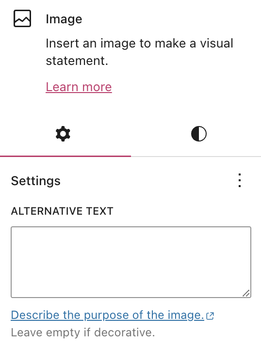
To assist people with visual impairments, add an alternative text (commonly referred to as alt text) that describes what is shown in the image.
In the WordPress editor, you can add alt texts in the settings of the Image block, Gallery block, Cover block, and Media & Text block.
Search engine crawlers also read the alt text to recognize the contents of an image, so alt text has the added benefit of improving SEO.
When you insert an image, consider writing a caption to improve the reading experience for everyone, especially for viewers who can’t see the image.
You can be creative with image captions. While alt text should be more factual, captions can help convey the feeling of the image.
For example, instead of “My son on his swing,” try “My son is playing on his favorite swing. His face is filled with pure joy on a beautiful Spring day. Perfection.”
When adding links in your text, it helps to be descriptive in the linked text. For example, “Click here” is not as explanatory as “Contact me.”
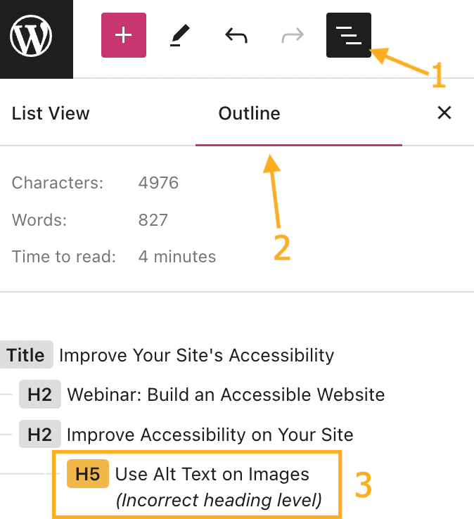
Use headings liberally in your pages and posts to make it easier for readers to follow your content (especially on long pages of content.)
When using headings, you’ll notice that each heading has a level from 1 to 6. If you insert an incorrect heading size, this will be highlighted in the page outline so you can correct it. To view the page outline, open List View and select the outline tab:
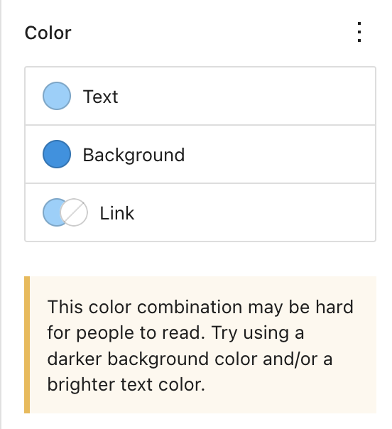
Avoid font styles and sizes that make your site difficult to read. In addition, pay attention to contrasting colors, i.e., the difference between the darkness of your text and the lightness of your background.
The color settings will display a warning message when it detects poor color contrast choices:
If your site includes video or audio content, consider adding closed captions or including transcripts (documenting speech, sounds, and actions seen on-screen).
It’s best if video and audio content does not auto-play, but if that’s not possible, options to pause or adjust the volume should be obvious on the page.
WordPress.com seeks to ensure that all of our themes are accessible. However, some themes may include additional features that add complexity to the site that may compromise certain aspects of accessibility.
If this is of particular concern, you can find themes we’ve tested to ensure accessibility here: Accessibility Ready Themes. If you are unsure which theme to use for an accessible site, the themes here are a safe choice.
At WordPress.com, we are committed to being as inclusive and accessible as possible. We follow web design standards and best practices when building new features and themes. We’re constantly looking for new ways to address specific concerns as web technologies evolve.
While we strive to make WordPress.com fully accessible, compliance with specific regulations such as ADA and Section 508 is ultimately in the hands of the website owner. We provide an accessible platform, but an accessible website is determined by the site owners and their awareness of the accessibility tips on this page.
You can test specific themes for compliance with these guidelines using a tool such as the WAVE Web Accessibility tool. For sites that require 100% compliance, we recommend testing your theme of choice using the demo page for the theme, such as Twenty Twenty-Two, Twenty Twenty-Three, or Twenty Twenty-Four.