Did you know that more than half of your site’s visitors could be viewing your website on their phone or tablet? This guide will walk you through the essential steps to provide a seamless user experience across all screen sizes, from selecting a responsive theme to fine-tuning your content.
In this guide
Choosing a mobile-friendly theme on a WordPress site is crucial for providing a seamless and optimized user experience across various devices, improving accessibility, and positively impacting search engine rankings.
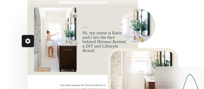
All themes offered on WordPress.com are mobile-responsive, meaning they are designed to look great both in mobile browsers and on the desktop.
If you’re using a third-party theme, ensure it is advertised as mobile-friendly and looks good when you open it on your mobile devices. Check the theme’s documentation for customization options or settings to give you control over the theme’s appearance on mobile.
After choosing a mobile-responsive theme, you’ll likely make changes to the default content to make it your own. As you edit your site in the WordPress Editor, it’s important to ensure it looks good on all devices.
There is no separate “mobile editor” in WordPress. Changes you make to your site reflect on both mobile and desktop devices. As long as your site has a mobile-friendly theme, the content will adapt to all screens big and small. This is referred to as “responsiveness”.
You can click the Preview icon in the upper right corner of the editor to see how your site looks to a visitor. Select Mobile or Tablet to view an approximation of the content in the editor:
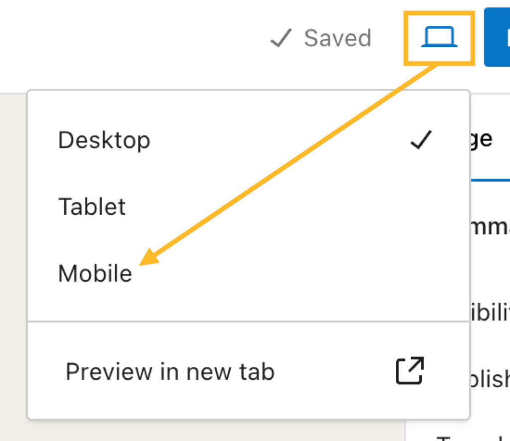
We say approximation here because many elements of the editor view are informed by the site theme. The theme’s styles are not displayed in the editor, only by previewing the page in a new tab or viewing your site in your device’s browser. To view your content with the theme’s styles applied, click the “Preview in new tab” option.
After clicking the “Preview in new tab” option, you can view the mobile version using the inspector tool in your browser. To use your browser’s Inspect mode to preview how a page or post will look in mobile view:
- Click the Preview icon in the upper right corner of the WordPress editor.
- Select the “Preview in new tab” option.
- Right-click on the preview page and click “Inspect” (Chrome, Firefox, Edge) or “Inspect Element” (Safari).
- In the browser’s Inspect mode, click the mobile icon to switch its preview to the mobile view.

After publishing your changes, it can be helpful to open up your phone or tablet to view the site as a member of the public would, giving a final check to make sure it’s presented how you intended.
Here are a few tips for maximizing the responsiveness of your site design, ensuring the content is presented well on mobile, tablet, and desktop.
If an image has text designed into the image itself, that text can get cut off on smaller screens like so:

This is because text designed inside of an image is not responsive.
Using the WordPress editor, you can write text over an image. When adding text to an image this way, the text is responsive. In the video below, we’ll recreate the same image as above using the Cover block, demonstrating its responsiveness on smaller screens:
To maximize the responsiveness of sizing fonts on your page, use em or rem units instead of pixels (px). Using pixels for font size essentially hard-codes that specific font’s size into the page, which means the font will always be displayed in that exact size, regardless of the screen size. By contrast, em and rem values are relative sizing units that size up or down depending on the space available on the viewer’s screen.
Instead of using a text menu for your mobile layout, you can customize your site’s Navigation block to display the mobile menu, called an overlay menu (also known as the “hamburger menu” or “kebab menu”). This feature can help make the header more compact, and the menu more accessible to view and use on mobile.
AMP (Accelerated Mobile Pages) is a third-party open-source framework that enables the creation of websites that load nearly instantly on mobile, giving site visitors a fast browsing experience. To add AMP to your site, you can install the AMP plugin. For plugin-enabled WordPress.com sites created before June 13, 2022, the AMP plugin was installed by default.
Keep in mind that using AMP strips away a lot of functionality on your site (layout, many features) for mobile visitors to make the site load quickly. It’s best to only use that if your theme was created with AMP in mind. All themes on WordPress.com are already mobile-friendly, so AMP is not required to provide a mobile-optimized experience.
If you are experiencing display issues with your site and have AMP installed, we recommend deactivating the AMP plugin to see if this improves your site performance. If you are seeing an “Exit mobile version” option on your website that you want to remove entirely, deactivate the AMP plugin as well.
If your site has been using AMP for a while, keep in mind that Google does not update its results immediately and will continue to show AMP pages for some time after you deactivate it. You may want to set up page redirects after deactivating AMP. Search engines will index the AMP page URLs, and it will take them some time to drop those URLs from their listing, meaning some mobile visitors might be sent to a 404 error page.
There are several popular and free redirection plugins to choose from. You will set up a 301 Redirect and likely need a Regex expression similar to /(.*)\/amp. We recommend doing some testing to ensure you’ve set up the correct redirect and consult the redirection plugin’s instruction guides.