
There are several common website mistakes that can turn otherwise effective sites into underperforming headaches. These mistakes are easy for first-time website owners to make, but are also easy to correct and avoid.
1. Not picking the right website type
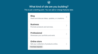
As soon as you begin working on a new website, WordPress.com asks you about the kind of website you want to build. Make it a conscious decision and pick the option that best describes your situation.
2. Neglecting your website address
WordPress.com gives you a free subdomain to go alongside your website (YOURSITE.wordpress.com). Plus, if you opt for any of the paid plans, you also get a custom domain name free for the first year (YOURSITE.com).
When picking the address, make sure that it reflects your site’s name, product name, or business name (depending on the purpose of the site). Setting the correct address right from the get-go is always easier than changing it later on.

3. Sticking with the default theme
WordPress.com sets you up with a good-looking starter theme. For some websites, this might be perfect, but most people will get better results by spending some additional time picking their ideal theme.
Log in to WordPress.com and go to My Sites. Then, click on Design → Themes. Browse the themes available and activate the one you like best.
4. Not customizing your theme
Picking a theme is step one, but did you know you can customize it to match your needs?
Go to Design → Customize. You’ll see a whole customization interface with multiple options.

5. Not connecting your site to social media
WordPress.com lets you hook up your site to popular social media platforms. You can do this in two ways:
- First, go to Tools → Marketing and into the Connections tab. This is where you can tell WordPress.com to share your new posts automatically to platforms like Facebook or Twitter.
- Next, switch to the Sharing Buttons tab. Pick the buttons that you want to feature below your posts to let your readers share your content.
6. Forgetting to moderate your comments
By default, every WordPress.com website has comments enabled. However, those comments won’t appear on your site before you review and approve them manually. You should look at your comments queue each time you log in to WordPress.com. Comments can be moderated in Site → Comments. Learn more about comment moderation.
7. Not customizing your homepage
When you’re first building your website on WordPress.com, you’re getting a ready-made homepage right out of the gate.
However, you can — and should — customize that homepage and add some of your own content to it. Go to Site → Pages and pick Home from the list.
8. Not using the scheduling features
WordPress.com has some powerful features allowing you to schedule posts and pages for later publication.
This means that you can work on even a month’s worth of content in one sitting and then schedule it to be published at equal intervals.
Here’s how to schedule posts in WordPress.com.
9. Not creating an About page
An About page is where you get to tell the story behind your website, explain why you created it, and also share a few words about yourself. This helps make a personal connection with your audience.
Here’s how to build an About page in WordPress.com.
10. Not creating a contact page
Just like your About page, the Contact page is an essential component of your website. This page provides your readers with a way to reach you directly, usually via a functional contact form.
Here’s how to build a contact page in WordPress.com.
11. Overlooking mobile browsing
What devices do people use most to browse the internet? According to Broadband Search, as of January 2022, mobile devices took the lead with 55% of the market share, with desktops coming in at 42% and tablets with 3%.
Because mobile browsing is so common today, your website needs to look good and work flawlessly on these devices, which requires a mobile-responsive design. Otherwise, mobile visitors may leave as soon as they land on your site.
If you have ever used a mobile phone to visit a website that wasn’t mobile-friendly, you know what a pain it can be to find the information you’re looking for. So, make sure your website is responsive. A responsive website will automatically configure itself to fit whatever screen size someone uses to view it.
WordPress.com offers responsive themes that will convert your site to a mobile-friendly layout.
12. Forgetting to replace default theme content
When you set up a website, make sure not to leave any of the default pictures or text within your pages.
Lorem ipsum dolor sit amet: This is a common placeholder text that you might find in a website theme, and you’ll want to remove all instances of it before launching your site. Otherwise, your visitors might be confused or think your business is unprofessional. This goes for images, too — replace all generic photos with your own brand’s imagery.
Many website themes come with preconfigured filler content on their pages so that you can see what they’ll look like once you add your own content. For example, the default content on your theme’s About page might say, “Enter information about you or your company here.” If there are any places on your website where you either forgot to replace the default text or haven’t gotten around to it, it can make you look careless.
13. Letting the blog die
“Dead blogs” are commonly found across small business sites. Many new site owners will excitedly write five blog posts once their sites launch, but then become preoccupied with other things and stop writing new content.
Three years later when someone visits one of these sites, they wonder what happened to the blog. Is the business still around? Why did they stop writing content?
If your website includes a blog, you should be updating it regularly, as dead blogs give the wrong impression to visitors. Hubspot recommends that small blogs should post once or twice per week to improve brand awareness and three or four times a week if boosting organic traffic is the goal.
If you have a “dead blog,” and can’t realistically produce new content on a regular basis, you might be better off removing the blog from your website (unless your old posts are generating a lot of site traffic).
14. Overcrowding the homepage
You want to tell your visitors and fans about yourself and your business on the homepage. But have you ever visited a website where looking at the homepage felt like reading a novel?
As Sweor explains, people spend under six seconds reading the written content on a website’s home page, so you should make sure important information is front and center under a useful headline. People spend around the same amount of time looking at a website’s main image, so keep your imagery relevant, engaging, and on-brand.
There are plenty of other places on your website (or blog) where you can elaborate on who you are, why you’re different, and the benefits of your products and services. Use your homepage as an entry point into a relationship, not as a full autobiography that will overwhelm visitors.
15. Hiding important information deep within the site
If your website visitors have to dig deep into your pages to find important information, they’re going to get frustrated and leave.
What are your hours of operation? Is a certain product in stock? What are your store address and phone number? Make a list of the most important and essential information that your site visitors need to know, and provide that information in the upfront of your site. Make sure it’s easily accessible, instead of burying it three pages deep.
16. Using bad stock photography or grainy images
“Hey, it’s the guy wearing a hardhat! I saw the same photo on your competitors’ websites, too.”
Most people can tell if you’re using stock images on your website, and these generic photos tend to be ignored. Stock photography does have a place, but the better option is using high-quality, original photos that tell a unique story. Use pictures that showcase actual examples of your work and real people (not stock models) that work with you. If you’re a local business, name and image recognition can pay off when someone walks into your store and sees the people and products that you feature online.
That being said, there’s a caveat to using original photos. Grainy pictures that are taken on low-quality cameras or images that are resized improperly won’t fare any better than tired stock photos. If you opt to use original photos, make sure they’re the highest quality that you can make them.
If you sell products, use detailed, styled product photos.And don’t forget to provide viewers with alternative product images that they can enlarge if needed.
17. Using illegible fonts
“I would really like to give you my business, but unfortunately, I can’t read your website.” Prospective customers won’t tell you this outright — they’ll just be thinking about it as they open your competitor’s website. If you use hard-to-read typography, extreme font sizes, or harsh color combinations, you could be driving away your potential audience. Using fonts that are too small or colors that are too light to read are surprisingly common mistakes.
Want to make sure your fonts are readable to everyone, everywhere on your site? For starters, pick a good website theme that makes the text easy to read. Before you start promoting your finished site, have your friends and family members proofread it across multiple devices (desktop, mobile, and tablet). Take their feedback to heart and change your font sizes and colors accordingly.
18. Following the leader instead of standing out
What’s the textual equivalent of stock photography? Bland, boring content. “We’re different because we pride ourselves on our customer service.” Doesn’t your competition also pride themselves on their customer service?
Instead of copying others or trying to follow the leader, become the leader by being yourself. Sure, that’s easier said than done, but establishing your brand voice will help you stand out from the crowd.
It’s fine to draw inspiration from your competitors, but you need a unique, consistent brand to attract new customers. TSL Marketing recommends starting with a visually appealing and memorable logo. You’ll also want to give your content and layout a consistent look and feel.
By avoiding these eighteen common website mistakes, you can ensure that your website looks and performs at its best while serving as a strong promotional tool for years to come.

