
If you are going to run a website, it’s very important and helpful that you get familiar with its basic anatomy. Websites have a certain structure and consist of different common components. If you want to make the most of them, you need to know both what they are and their purpose. If you don’t, you risk creating something with limited usability and appeal.
Why be such a stickler for knowing every part of your website?
Because each element plays a critical role in making it a success. Your site won’t be able to fulfill its purpose, such as attracting visitors and turning them into fans and loyal customers, if vital parts of it are out of whack. For something that is supposed to be one of your main business assets, that’s not a good thing.
To avoid this kind of boondoggle (I’ve always wanted to use this word), in this post, you are getting a thorough education on every part that makes up a website’s anatomy. We will talk about everything from the technical infrastructure that powers websites and makes them available on the Internet to design, content, and functionality.
1. Content Management System (CMS)
Let’s first discuss the essential website parts and the underlying software running them. See, in the olden days of the Internet (gather round, children, grandpa is telling a story), you had to write websites by hand. Before any website page would show up in a user’s browser, it needed to consist of an HTML file that you filled with markup code and CSS. That included, for example, wrapping each paragraph in <p></p> brackets.

Nowadays, things are much easier (kids these days don’t know how good they have it). Various software solutions allow you to build websites without coding knowledge. They enable you to create web pages by working in a graphical user interface similar to a word processor instead of a code editor. These are called content management systems or CMS.
The most used CMS in the world is WordPress. It’s an open-source project that also powers all websites on WordPress.com. WordPress allows you to produce web content and make design adjustments using your mouse and keyboard.

It then creates all the necessary HTML and CSS for you – you don’t need to know a single line of code! This makes owning and running a website accessible for anyone, even those without development skills.
Benefits of Using a CMS
In particular, a content management system allows you to do the following things:
- Create web pages and publish them on the Internet
- Automatically have content adhere to the same design thanks to page templates
- Upload, organize, manage, and use images and other visuals in your content
- Accept credit card payments to sell products online
- Set up a navigation menu to help visitors explore your website
- Change your website’s design in seconds through themes (more on that below)
- Add additional functionality to your site via plugins
- Automatically implement a search engine-friendly site structure
All of that and more is what you get by using a content management system like WordPress. Plus, here is more good news: With the right hosting provider, you don’t even have to learn how to set it up. Instead, your web host takes care of all the necessary configuration for you.
2. Domain and Hosting
Speaking of which, hosting and a domain name are definitely essential parts of the anatomy of a website. Without them, no site would be reachable on the Internet at all.
So let’s define them.
A web host is a company that provides the technical infrastructure (i.e., servers) that house website files so others can access them. A domain name, on the other hand, is the address that you and your visitors type into the browser bar to view them.

The good news is that it’s possible to get both a web host and a domain name in the same place. Many hosting providers also offer to set you up with a domain name for your site. For example, you can use the WordPress.com Domain Name Search to find and buy a domain for your site.

What’s more, you even get a free domain for a year on any paid WordPress.com plan.
At the same time, it’s also possible to procure hosting and a domain separately. For the latter, you can turn to domain registrars. Those are companies that specialize in registering and selling domains without offering website hosting. Because of that, if you go this route, you still have to manually connect your domain name to your hosting provider.
How to Get It Right
That leaves the question, how do you choose a domain and hosting for your website?
For your domain, make sure it is concise, memorable, and relevant. The most common option is to use your brand name but it can also be something related to your company, or it can incorporate the location of your business.
In addition, make sure to pick an appropriate top-level domain. That is the .com, .net, .blog, etc. part at the end. For more advice, check our detailed article on how to choose a domain name.

As for the web hosting provider, here, the right choice really depends on your needs. If you choose WordPress as your CMS, it makes sense to go with a provider who is specialized in working with this system. That way, your site will reside in an environment optimized for running the software, leading to better performance and support.
A second consideration is to weigh price against traffic expectations. Shared hosting can be enough for something like a brochure website that doesn’t get a lot of visitors. However, as soon as you receive a healthy amount of traffic, it probably won’t cut it anymore.
Finally, you need to decide how much website maintenance you want to do yourself. From site updates over security and site speed to spam protection, a lot goes into keeping websites in tip-top shape.
If you don’t have the time or knowledge to do this all by yourself, you might be better off going with managed hosting. Managed hosting providers automatically cover many of the more technical aspects of running a website, including backups and security features. That means a lot less to worry about.
3. Website Design, Theme, and Layout
The look of your website is another important component. Visitors decide within 50 milliseconds whether they like your website or not – literally at first glance. For that reason, to give yourself the best chance of success, design is not something you should neglect.
Let’s go over the typical process of creating a website design. Usually, you start off with wireframes and mockups. The first phase of the design process is focused more on website structure and how to arrange content, not so much on making things look pretty.

An additional important consideration here is to settle on the basic website layout. For example, if you were to start an online news site, you would most likely choose a magazine style layout.

On the other hand, when running a blog, it’s common to present content as a single column.

Another way of arranging elements on web pages is to use a z-pattern.

This helps direct visitors’ eyes towards the most important elements and naturally guides them down the screen. A lot of big-name websites use it. You can read more about this in our detailed post on website layouts.
The Solution: WordPress Themes
So, do you need to know all of the above in order to create a design for your own website? Thankfully, no.
If you are using WordPress, you can take advantage of the fact that other people have already done the work for you, thanks to themes. These are readymade skins for your website that you can activate and change with the click of a button.
For example, if you’re a photographer, there are several themes specifically designed to help you showcase your portfolio.

Same if you are a musician, travel blogger, or business consultant.
Each of these themes comes with a fully formed design, color palette, and templates for different pages. That means, you can simply activate them and start filling your site with content; the design part is already done. No need to have a background in designing or web development.
On WordPress.com, you can choose from dozens of free themes out of the box.

There are even more premium options if you are on a Premium plan. Additionally, on the Business plan, you also have the possibility to upload custom themes. What’s more, thanks to the WordPress Site Editor, you can also customize your theme completely in a visual interface.
Fonts, colors, layout, dimensions – it’s all up for grabs
4. Website Header
A part of website anatomy you are likely familiar with is the header, even if you might not know the term. It is the part at the top of most websites that usually contains the logo and navigation menu.

From that fact, you can already deduce what its main purpose is: To provide orientation, a way to move around the site, and find what you are looking for. To do that, the header additionally often contains the following elements:
- Contact information – Especially if you offer contact via telephone or have a brick-and-mortar location for your business.
- Language or location selector – The header is also a popular location for changing the website language, picking a locale, or choosing a store nearby to check their inventory.
- Breadcrumbs – These are links that show the path you have taken on the website. They also fall under navigation.
- Login – If your website offers a way to log in to a user account, placing a link to do so in the header section is common practice.
- Call to action – Sometimes, you can have announcements for sales, notifications, and alerts that need a CTA in the header.
In addition to that, the header provides a lot of design consistency since it tends to stay the same no matter what page of a website you are on.
How to Get the Most Out of Your Header
Because it’s such an important element of your website’s anatomy, the header is something you should really nail. Users will look to it when they feel lost to get them back on track. To help them do that, try the following:
- Keep it clear and uncluttered – Focus on the most essential information that your visitors need to make it easy to find.
- Make sure that the logo links back to the homepage – This is common practice, and visitors will likely expect it.
- Give your navigation clear labels – Avoid misunderstanding by labeling the menu options in a descriptive way, e.g., “website consultation” instead of “services”.
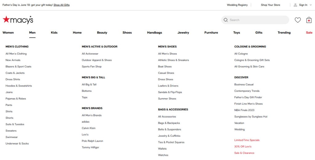
- Try a mega menu – If you run an ecommerce store that needs to offer a lot of different products, consider using a mega menu like the one shown below.
5. Main Content
Next up, we are discussing your website’s main content area. It most likely contains the primary reason why someone visits that particular web page in the first place. For example, on a web page that contains a blog post, the main content will be the written text and images, just like you are reading right now.
It’s the same way on a video sharing platform like YouTube, where it would be the video that you are trying to watch.

However, it can also simply be the message on your 404 error page.

You get the picture. The main content is pretty much the main attraction of any given web page. Without it, the page would lose its purpose.
Make Your Main Content Worth Its Name
So, how can you make the most of this part of your website’s anatomy?
First of all, be really clear about what the main content of each page is supposed to be. Each page on your site should have a defined purpose. So, your responsibility is to ask yourself what that purpose is and what each page needs in order to fulfill it for your visitors.
Step two is to make the content on the page easy and pleasant to consume. For that, first bring it into a logical order. Set it up so that the sections and information build on each other and that readers get all the information in the beginning that they need to understand what comes after.
Note how in this article, we first talk about the basic building blocks of a website, such as a content management system, hosting, and a domain. It wouldn’t have made sense if we started off with, say, how to create a great footer. If we had, you would feel like we skipped several steps (though we are getting to the footer soon).
In addition, make sure that you format your main content in a way that makes it pleasant to read. Give your readers all the assistance they need to lead them down the page in the form of:
- Headings
- Paragraphs
- Ordered and unordered lists
- Visuals that break up the text
- Short and clear sentences
- Proofreading and editing
Your “time on page” website metric will thank you.
6. Sidebar
Where there is main content, a sidebar usually isn’t far away. What is a sidebar? In case you are not aware of what it is, a sidebar is what you often find to the side of the main content, especially in blog-based layouts.

What’s the purpose of this website element?
It usually provides additional information, more navigation elements, or simply secondary content, such as:
- A blog author picture and bio
- Content related to the page or post you are currently on
- A list of the most popular blog posts and latest updates
- Links to the site’s or business’s social media presences
- Email sign-up forms, advertisements, or other calls to action
How to Create a Great Sidebar
If you add a sidebar to the anatomy of your website, how can you ensure it serves its purpose the best?
As usual, the first step is to try and put yourself into your visitors’ shoes. What goal are they trying to accomplish on the page that you think a sidebar would help accomodate? What next steps would you like them to take? What information is relevant to the main content? Answering these questions will help you discover what content you should add to your sidebar.
Note that the answer doesn’t have to be the same for your entire site. You can also have different sidebar content on different pages.
For example, while it makes sense to display the latest or most popular blog posts for someone already reading your blog, this type of content would be very distracting on a different page. Therefore, think about what makes the most sense in each case.

Finally, for anything that you do add to your sidebar, make sure it fits the rest of the site. That means, use the same design principles and style. Allow your visitors to have a pleasant and congruent experience.
7. Website Footer
Moving further down the page, here is where we will talk about the footer. Again, this is a website element you are definitely familiar with, even if you don’t necessarily know it by name. In keeping with the anatomy theme, you find it at the foot of the website, as the name already gives away.

Like the header and sidebar, its role is to provide additional information to website visitors and further enhance their experience. However, in contrast to the header, it usually contains information that can be a bit out of the way. That isn’t absolutely mission critical for website visitors to see all the time but should still be available when they need it.
At the same time, it’s important to keep in mind that the footer is the last part of your website that visitors encounter when they make it all the way to the bottom of your pages. Therefore, it might also be the last opportunity to retain them before they leave your site and possibly never return.
Common Footer Elements
For both of those reasons, here are some elements and information that you often find in website footers:
- Additional navigation – Unless you have a sticky header, if users make it to the end of the page, they would have to scroll all the way back up to access your main navigation. You can help them avoid that hassle by offering another navigation menu in the footer. Alternatively, at least put a “back to top” button in your footer.
- Contact information – If visitors want to get in touch with a real-life human being after going through your content, the footer is the perfect place to tell them how and where to reach you.
- Legal information – In many places of the world, websites are required to provide access to things like their terms of service or data protection policy from any page. The footer is a great location to place those links and satisfy these requirements. You can also assert copyright over your content in the footer or provide credit for assets used.
- Social media links – The goal of social media is to bring visitors to your website, not the other way around. For that reason, it doesn’t always make sense to place them super prominently and have people click away. Placing them in the footer gives visitors the possibility to connect with you right at the end of their website experience.
- CTAs and social proof – As the potentially last opportunity to form a bond with visitors, any last-minute calls to action or sign-up forms definitely belong here. Combine them with any awards and other social proof for a double whammy.
Making the Most Out of Your Footer
The same advice goes here as for your sidebar or header. Think through what makes the most sense for both your and your visitors’ goals. Then, implement it in a way that’s logical, organized, and in keeping with the rest of the page. You can also have different footers on different parts of your website to show the most relevant content in all areas.
8. Responsive Design
The final crucial part of a website’s anatomy that we want to talk about is responsive design. The term describes a type of web design that automatically adjusts to different screen sizes, making your website pleasant to use on all kinds of devices, including mobile.

This is absolutely essential for modern websites. These days, most web traffic comes from mobile phones and tablets.

Consequently, if your website does not provide a good experience for those visitors, you are essentially alienating half of your user base. Not to mention, you will get punished for it in the search results as Google is now operating under a mobile first index.
How Responsive Design Works
There are a number of common best practices to ensure that your site looks good on smaller screens as well as on desktop:
- Mobile first design – These days, it’s common to start with the design for mobile phones and then progressively branch out to larger screen sizes.
- Content stacking – Content that resides horizontally on desktop screens arranges itself vertically on smaller devices, where scrolling is the most common way of navigating. This includes navigation menus, which on mobile usually fold away into a hamburger icon.
- Optimized image sizes –Mobile devices often don’t have as fast an Internet connection as their desktop counterparts. To accommodate that, many websites serve their mobile users smaller versions of their images and visuals.
- Content prioritization – Since there is less screen real estate, it’s common to hide non-essential elements on mobile and focus on the most relevant content.
- Touch-friendly interfaces – Mobile users use their fingers to navigate the Internet, which are less precise than a mouse cursor. That makes it necessary to increase the size of interactive elements like buttons and links to avoid mishaps.
- Fluid typography – Smaller screens need sufficiently large text to be readable. Responsive design takes that into account.
- Performance optimization – Overall, mobile devices are less powerful. For that reason, accommodating them also always means testing and optimizing your website speed so that it performs at its best.
How to Apply It to Your Website
To achieve the above, over time, developers have come up with many technical measures. One of the main ways is using relative instead of static units. Responsive design declares sizes as percentage, em, rem, and similar units instead of absolute units like pixels. Doing so allows website elements to adjust relative to the screen that they appear on. In addition, we have a lot of web technology to define fluid layouts and grids, such as flexbox and CSS grid.
Another main staple in the technology stack of responsive websites are media queries. They allow you to define conditional style directives, telling browsers to render elements or properties differently depending on the size of the screen they appear on.
@media screen and (max-width: 800px) {
#site-header {
     display: none;
  }
}
There are other techniques web developers use to make websites responsive. The important thing to note is that, as a WordPress user, you don’t really have to worry about the specifics of this.
At this point, every modern WordPress theme is responsive. That means, if you use one, your website automatically adjusts to mobile devices, including everything mentioned above.
In addition, WordPress itself automatically creates and serves up images of different sizes for smaller devices without you having to lift a finger. If you combine that with a hosting provider that is optimized to run WordPress, you already have this in the bag.
Final Thoughts: Anatomy of a Website
As you have seen above, there are many parts that make up the anatomy of a website. Web presences consist of many moving parts and if you get each of them right, they create something greater than the sum of their parts. Let’s quickly recap:
- Your content management system determines what’s going on under the hood of your site
- Domain and hosting make sure your site is available to outside visitors
- A proper theme provides top-notch design and layout options
- The website header helps visitors find their way around your site and is part of your branding
- Your main content is what really interests your visitors
- Sidebars and footers provide additional relevant information and assistance
- Responsive design makes sure users on all devices can enjoy your site and content
It’s important that you understand the role that each of these parts plays in the anatomy of a website so you can make sure they do what they are supposed to. Only when they all play well together can your website deliver the results that you are looking for.
However, Rome wasn’t built in a day, so don’t pressure yourself too much to get everything perfect right away. Pick what you feel capable of and implement that first. Then, gradually apply the rest to your website step by step.
And if you are looking for a partner to get the most out of your website and provide the necessary infrastructure, we’d be happy if you give us a try.
Want more tips? Get new post notifications emailed to you.
ABOUT THE AUTHOR

 Go WordPress