Use fonts that complement each other.

Hi bloggers! My name’s Kjell Reigstad, and I’m a designer at Automattic. This is part nine in my series “The Principles of Design.” In this series, I share some of the basic tenets of design, and we explore how to apply them to your blog.
Previous installments:
Clarity
Visual Hierarchy
Color Harmony
Design Iteration & Feedback
Accessibility
Choosing Fonts
Readable Typography
User Experience
In the past, we’ve discussed some tips for choosing fonts. Today we’ll talk about how to navigate choosing more than one font for your site.
If you look closely at most websites (like The Daily Post), you’ll see that they’re often using more than one font. In most cases, that’s a stylistic choice. The site would probably function fine with just a single font, but the designer has chosen two to introduce a little more visual hierarchy to the typography.
You can use more than one font on WordPress.com too. When you open the fonts section of the Customizer, you can select both a headings font and a base font:

In general, I’d recommend using no more than a couple fonts in one design. Less is more when it comes to typography.
This quick set of dropdown menus can be quite intimidating! Choosing one font isn’t too tough, but how do you know that two fonts will go together nicely? To make this process a little easier, I thought I’d share a few tips.
Look for complementary moods
If you’re in a silly mood, it’s difficult to be stuck working with someone who’s serious and unfunny, right? Same goes for fonts. If your core font is bouncy and playful, it can be awkward to stick it next to a stark, rigid font.
Harmonious moods are the key to choosing a font pair. Figuring out the mood of a particular font is not always a straightforward process, and involves trusting your gut. The best strategy is to take a long look at the font and analyze what it says to you. Here are a few examples:

Playfair Display and Libre Baskerville have a very sophisticated, serious feel. That helps them pair together nicely.

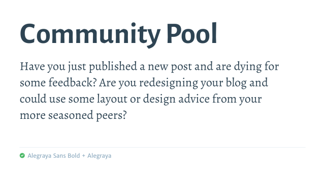
Coquette and Alegraya Sans share a playful, quirky feel. They both have a slight bounce and flourish to them which helps them work together.

Abril Fatface has a cute, friendly feel. The letters are rooted in traditional typography, but it’s got a playful twist to it. Ubuntu on the other hand, feels futuristic. They don’t have much in common, from a mood perspective.
Embrace differences
Matching moods is important, but you also have to be careful not to choose fonts that are a little too alike. Fonts that are too similar can seem like a mistake to your visitors — as if you meant to use the same font everywhere, but didn’t.
If you suspect that your font pair is looking a little too similar, it might be worth considering whether two fonts are even necessary for your site. It’s absolutely fine and acceptable to use a single font everywhere. You can even change things up by using a different weight or style (bold or italic for example).

Muli and Lato are a little too similar. If you aren’t looking closely, you might not realize that there are two different fonts in use here.
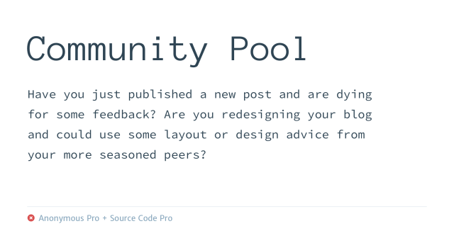
Anonymous Pro and Source Code Pro have slightly different styles (hint: look at the L’s), but they’re altogether too similar. In this case, I’d just choose one or the other to use.
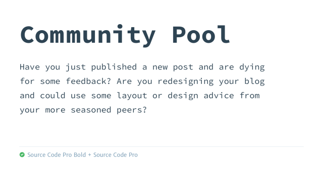
Try using a single font and changing the weight of the headline version. Sometimes that can give you the hierarchy difference you’re looking for without having to pair two different fonts at all.
Try a ready-made font pair
You’ve probably noticed that a number of the fonts in the Customizer have similar names: Merriweather and Merriweather Sans, for instance. When you see names like that, you can be reasonably sure that these fonts work well together. They were usually both drawn by the same typographer, to be a ready-made serif and sans-serif font pair. The two fonts will share a mood and the letters will have similar shapes and line quality.


Expert suggestions
In addition to the examples above, you can draw inspiration from these pairings put together by fellow Automattic designer Mel Choyce:


The examples above use the fantastic library of fonts available for free WordPress.com users. Upgrading to a Premium plan gets you an even wider set, powered by Typekit.
The most important thing to do is to try things out. The WordPress.com Customizer lets you swap fonts with just a few clicks. You can use it to preview potential font pairings before making them live on your site.
You may have noticed my subtle plug for the Community Pool throughout this post. 😉 If you have questions about your blog’s design, it’s a great place to ask the WordPress.com community for suggestions. We post a new Community Pool thread every Monday.
Do you have a favorite font pairing? Let us know in the comments.
Currently blogless? You’re a click away from sharing your story.
Create your blog at WordPress.com


Embrace a white background with dark lettering, preferably very dark gray or black.
Also, I do NOT like the “mini menus” for the fonts. We used to be able to adjust font sizes more precisely. The new interface is primitive by comparison. The new “improved” format is significantly more difficult to use.
As a wrote,. designer, and blogger, I’m way past “small-med’large” for font sizing. I want precision and point sizes — like you had, but took away. Sorry, WordPress, but for those of us who pay for premium packages, you took away half its usefulness when you “fixed” this. It wasn’t broken.
LikeLiked by 2 people
In the examples of paired typefaces, the headings are serif while the body is sans serif. I was taught that serif typefaces is used to enhance readability, while sans serif is great for headings. Of course, this was back in the day when we actually published on paper, using ink, not on a screen using electrons. I’m wondering if a screen typeface for the body is better as sans serif.
Thanks for all the great information.
LikeLiked by 3 people
We do include a few examples that use sans-serif headings and serif body text. That can work wonderfully!
On the topic of using serif text for readability’s sake, there is definitely some merit to that argument (I was taught that way too!). In practice though, I’ve found that the difference can vary greatly depending on the reader and the context. At this point, the choice between serif and sans-serif for body text often tends to be just about aesthetics.
Thanks for reading!
LikeLiked by 3 people
I like 100% black on white/light gray background. I wish that were an option to free users.
LikeLiked by 1 person
It is, with the Book lite theme. On the older editor, which I prefer, you can also alter the text colour.
LikeLiked by 2 people
Cool!
LikeLiked by 2 people
Great post… except now I want to go swimming! Seriously, these tips will really help but I making my little graphics for my blog.
LikeLiked by 1 person
You totally read my mind with this post. Thanks!
LikeLiked by 2 people
For my headings, I have a dramatic, playful font, and my text is a nice clear sans-serif. I write sensibly, with a touch of drama and playfulness, so the contrast is perfect for me.
I noticed how much I dislike the “m” in Anonymous Pro- it is all squashed together, like on a typewriter. Letters don’t all need to be the same width now.
In my own font, I don’t think the ! looks good. It looks slightly better in italics!. I find I use it less.
LikeLiked by 3 people
I love this😊
LikeLiked by 2 people
When I did print publications (back in the pre-computer dark ages), I liked Symphony for headlines and Times Roman for text. I haven’t found a favorite, easy-reading combo online yet, but I certainly do fancy your use of Coquette. Almost inspires me to start a fun new blog just so I could use the font!
LikeLiked by 1 person
Cool ! and i love this
LikeLiked by 1 person
Thank you! This is very helpful
LikeLiked by 1 person
Lovely post! I just love bold fonts as headings and smooth, slightly cursive ones as posts (readable ones).. I tried to do that on my blog frandela.wordpress.com. It’ll be cool of some could check it out and tell me what it looks like. Good or not…
LikeLike
Strictly a note on the featured image/thumbnail, and on design as a whole, from an art historian’s perspective: June Corley makes wonderful sculptures made of those same things. I believe she calls them type sculptures. Definitely worth a glance! https://www.flickr.com/photos/junecorley/sets/
LikeLike
I would like to change fonts within the post intself. Is there a way that can be done on the free plan?
LikeLike
The Visual Editor provides a number of general text style options inside of posts:
https://wordpress.com/support/visual-editor/
It does not support changing or specifying a new font though (for free or paid plans).
LikeLiked by 1 person
Thanks for your reply 🙂
LikeLike
a lovely post
LikeLike
Cool post, thanks for putting some samples together, I love the playfair display + PT serif
LikeLike
Thanks for this useful post. One I can refer back to, I expect.
LikeLike