Learn what makes a blog responsive.
 By
By 
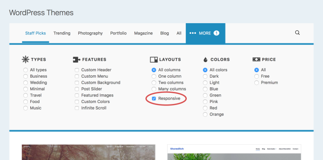
What does “Responsive” in the WordPress.com Theme Showcase mean? Let’s find out.
Responsive design is a term that’s been tossed around in the design community for a while now, but you might not be familiar with it yourself. Let’s talk about where the term comes from, and how it relates to your blog. First, here’s a definition that’s easy to remember:
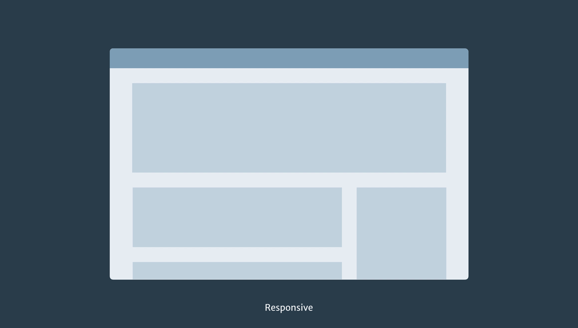
A responsive theme is designed to adjust itself to any screen size.
Whether being viewed on a smartphone, a desktop computer, or somewhere in between, a responsive theme will preserve its look and feel while optimizing its content and menus for the display. Responsive themes are a great theme choice nowadays, because they ensure that no matter how your visitors access your site, it’ll look fantastic. But where’d they come from in the first place?
The history of responsive design
Let’s take a trip back in time to the mid-2000s. We all usually “surfed the web” from desktop and laptop computers. A lucky few of us had giant displays, but for the most part our screens were all around the same size. Web designers typically designed sites that were somewhere between 800 pixels and 1024 pixels wide. That way, we could be fairly certain our sites would fit on people’s monitors nicely.

At first, designers usually built websites to fit just one screen size.
Fast forward a few years. After smartphones became common, people started to browse the web on small screens too. Unfortunately, those larger websites from before didn’t look great on our phones. This was a bit of a challenge for web designers, but we had a solution: two separate websites! We’d design our usual version for desktop screens, and a smaller version for mobile devices. This was a bit of extra work, but it was worth it to deliver fast, beautiful websites to everyone.

Later, we designed websites for two environments: computers and smartphones.
That approach worked for a while, but the number of different size screens exploded between 2010 and today. Now we have small phones, large phones, tablets, laptops of varying sizes, desktop computers with giant screens, and internet-connected TVs with even bigger screens. We clearly can’t design a separate website for each one, so web designers came up with a new approach: design a single, smarter website that changes its layout in response to the screen size. That’s the core idea of responsive design.
Ethan Marcotte’s article “Responsive Web Design” is widely recognized as the de facto manifesto for responsive design. Give it a read if you’re interested in the details of how this works!
Responsive websites adapt themselves for any screen size.
This was a breakthrough, but it was also a fundamental change to how websites were designed. Web designers had to stop relying on hard specifications for width and height of page elements. Websites needed to be fluid and flexible. Content would need to flow differently depending on the screen width: three columns of text on a larger screen might need to drop down to one on a tiny screen. Images had to scale up and down as needed, and paragraphs learned to adjust to available space. It was a lot more complicated, but the payoff was great for website visitors.
Responsive design on WordPress.com
When you’re in the Customizer, you can preview how your site will look at various sizes by tapping the desktop, tablet, and smartphone icons on the lower left.

Since its emergence, responsive design has become a standard practice on the web. For example, your WordPress.com dashboard and The Daily Post are both fully responsive. Try visiting them on different devices and take note of how the layout adapts.
In addition, all new themes on WordPress.com are designed responsively, ensuring your site will look great everywhere.
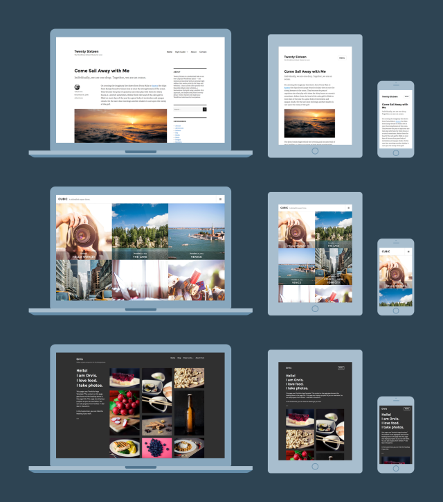
From top to bottom: Twenty Sixteen drops its sidebar and menu as the screen gets smaller. Both Cubic and Orvis transition from many columns down to one when viewed on smartphones.
You can view our responsive themes in the Theme Showcase. What’s your favorite responsive theme? Feel free to share in the comments.
Currently blogless? You’re a click away from sharing your story.
Create your blog at WordPress.com


 The Daily Post
Awesome.
LikeLiked by 2 people
The revelar theme. Loved it 😀
LikeLiked by 3 people
Love the themes ❤
LikeLiked by 2 people
I started using WordPress in 2011, and every year it just keeps getting better and better. I’m appreciative of the ways it enables people to tell their stories in visually appealing ways on any device.
I can only imagine where things will be in the next 5 years.
LikeLiked by 3 people
The Dyad Theme….Recently changed to this theme and I’m loving the experience so far!
LikeLiked by 3 people
been using sapor theme for quite sometime now and it hasn’t disappointed. i however change themes after 1-2 months but stuck between a haystack trying to figure which one is cooler than the other.
LikeLiked by 3 people
I love my current theme (which I paid for) and was deeply disappointed when I checked using the “Customizer” how it would look on tablet and mobile. The mobile in particular looked awful in the Customizer preview. I went off looking for a new theme. Then I decided to check how my site looked on my phone and it looked nothing like the Customizer preview. So I’d say if you like your current theme it’s worth checking on actual devices rather than the Customizer before deciding to change your theme.
LikeLiked by 4 people
Awesome, I’ll have to check out some new themes. But I love my current theme so much!
LikeLiked by 2 people
Very cool theme. What do you guys think would it look good on mine?
LikeLiked by 2 people
Responsiveness is so so so important! Thank you!
Love
Kristy ww
LikeLiked by 2 people
I had no idea. Thank you for teaching me something so early in the morning 🙂
LikeLiked by 2 people
Love this! Very helpful. I think my blog is responsive… https://thebeautyanalyst.net let me know if it’s not fellow bloggers x
LikeLiked by 2 people
Loved my Theme, thanks
LikeLiked by 2 people
I love the Hemingway Rewritten theme. But is it responsive ?
LikeLiked by 2 people
Yes, it is! Hemingway Rewritten is a beautiful responsive theme.
If you open the Customizer, you can tap the desktop, tablet, and smartphone icons on the lower left to see how your theme adapts to different screen sizes:
https://wordpress.com/support/customizer/
LikeLiked by 1 person
I love 😍
LikeLiked by 2 people
Thank you.
You always show phones held portrait, but many people hold them landscape to read, so it has to change for that, too.
What if I put in a picture and align it left, with text by the side of it? Does the text drop below the picture?
LikeLiked by 2 people
LikeLiked by 2 people
It’s very hard to be completely responsive without access to CSS. And you don’t seem to be able to get CSS customization without getting all the other things in a premium account. I don’t want to move my blog away from where it is, but I’d really like CSS customization so that my two column newsletters could be responsive on mobile screens – at the moment they look rubbish 😦
LikeLiked by 2 people
You can just pay 30 $ a year for customization. You don’t need the premium plan.
LikeLiked by 1 person
Hi there! WordPress.com no longer offers a standalone Custom Design upgrade — we bundled that in with our Premium Plan as of September 2014.
Thanks for reading!
LikeLiked by 1 person
Why?
LikeLike
We’re often experimenting with plans to help serve our users well. In this case, we found that simplifing and bundling our options was a better experience and added benefit for most bloggers.
LikeLike
That’s brilliant. I asked this question on on the forums and got no answer. Do you have a link?
LikeLike
Interesting, my reply appears to be completely out order here – I was saying great to the $30 a year reply, but it seems that doesn’t exist. I’m note sure I understand how increasing the price helps bloggers? Especially if you’re paying for lots of stuff you don’t want in that increased price?
LikeLike
Yeah. They go rid of it.
LikeLike
I have Rebalance for my theme. I like it because my projects are the front page instead of hidden away, but I can still write personal posts for people to enjoy.
LikeLiked by 3 people
Simple.. I like it…👍
LikeLiked by 2 people
I use Oxygen. It’s really nice and works well for me.
Sela is also a good responsive theme.
LikeLiked by 3 people
I was using the Galactic Theme before. wasn’t cool on my Mobile.
LikeLiked by 2 people
I should say that I am new to all such stuff. However the way WordPress present ideas and things, is awesome. They are really easy to use and very sophisticated.
LikeLiked by 1 person
Hi. Thank you for giving information on what is responsive theme. I too have a responsive theme i.e. cubic theme. I love it…
You can check it out on my blog..
It’s pretty amazing. The look, and simplicity through which we can use is quite interesting. I am looking forward to use more new interesting themes..
LikeLiked by 1 person
Thank you for the information.
LikeLike
I really like this, however the dashboard doesn’t seem to like my smartphone at all and isn’t responsive which can be frustrating when I want to check things on the go. Every other element of the website is responsive though ☺
LikeLike
Hi there! The WordPress.com dashboard is responsive, and is built to work nicely on phones. What part is causing issues for you?
Also, you can try using one of the WordPress mobile apps on your phone as an alternative to the admin interface on the web:
https://apps.wordpress.com/mobile/
LikeLiked by 1 person
I do use the app most of the time, just if I’m out and about I can’t publish a post that I’ve written on the laptop from the app so I occasionally use both chrome and my default browser on my Samsung phone to publish. It always takes a few attempts as the site itself works fine but as soon as I hit the dashboard button it only loads parts of it, you can’t click on anything like stats or posts. In Chrome on the phone it does work to an extent but the draft post button is never there. It just doesn’t seem to like having the dashboard on my phone, but other than that everything else works fine on the phone.
LikeLike
I use ‘The Responsive Theme’. I wish it had been named something else, because when you try to look for some information in the forums about that theme, mostly you just get information about responsive themes in general.
LikeLike
I swear to good old fashioned Twenty Fourteen.
LikeLike
I greatly appreciate this article/post. WordPress is such a wonderful blogging platform!
LikeLike
Love it! Thank you!
LikeLike
WP has all awesome themes and it only requires a little customization to create it according to my style.
It is also improving my abilities and knowledge regarding to web development, hopefully I will try to create one or more themes for WP in future.
LikeLike
One suggestion about drop down menu: drop down button should not have any link to other page because it is assumed be static(no action performed).
LikeLike