Make educated decisions about typography.
Hi bloggers! My name’s Kjell Reigstad, and I’m a designer at Automattic. This is part six in my monthly series on “The Principles of Design.” In this series, I share some of the basic tenets of design, and we explore how to apply them to your blog.
Previous installments:Clarity
Visual Hierarchy
Color Harmony
Design Iteration & Feedback
Accessibility
There are millions of beautiful typefaces out in the world. They’re easy to appreciate but sometimes it can be daunting to actually choose one. On WordPress.com, we’ve recently added a number of new typeface options for everyone, so I thought I’d share a few pieces of advice on selecting fonts for your blog.
Context is key
When choosing a font, the most important thing to consider is the sort of text it’ll be applied to. This will help determine whether you’re looking for a display face or a text face.
Display faces are meant to grab your attention and convey a feeling. They tend to be very stylized and look great when used for short bits of text. On your blog, display faces are generally best suited for headers.
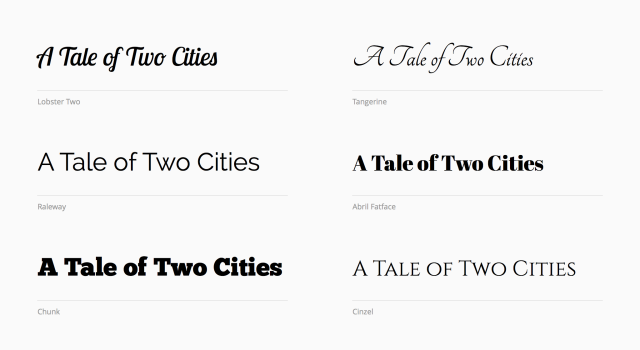
Six display typefaces available on WordPress.com.
Text faces on the other hand, are meant for reading. They’re usually more modest than display faces, and their lines and curves are fine-tuned to lead your eyes through a paragraph. Text faces often work well for both headers and paragraph text.
If you’re using the Customizer on WordPress.com, we take some of the guesswork out of this for you: the display faces we offer are only available for use in your blog headers.
Two text typefaces available on WordPress.com.
Serif vs. sans-serif… does it matter?
The difference between a “font” and a “typeface” is actually pretty simple- a typeface refers to an entire family of fonts (Helvetica, for instance), while a font traditionally refers to a specific size and style variant (like 12pt Helvetica Bold).
When people describe typefaces, they’ll often start by identifying it as either a serif or a sans-serif typeface. You may already be aware of the differences between the two: serif fonts have little shapes hanging off the ends of the letters, while sans-serifs do not.

Examples of a sans-serif letter (left) and a serif letter (right).
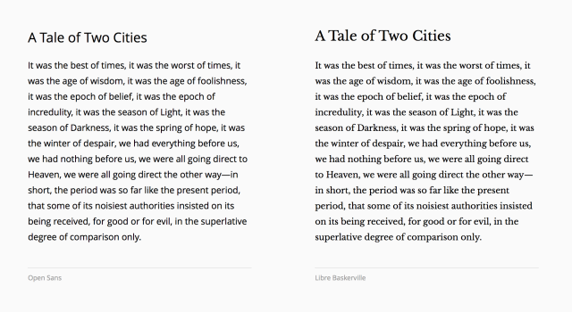
When it comes to choosing one or the other, the question is largely one of opinion at this point. It’s been argued that serifs helped guide your eyes through words, but in practice, the difference is mostly negligible and depends on the reader. A more useful distinction is that sans-serif fonts tend to feel more modern, and serif fonts tend to feel more traditional. Depending on the feeling you’re trying to evoke on your blog, one style may feel more appropriate than the other.
A part of your story
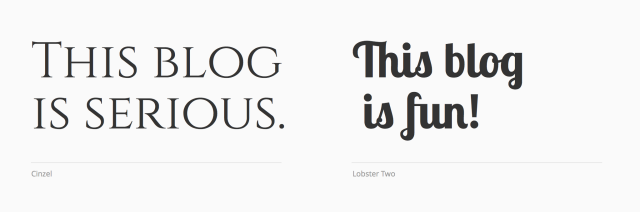
The key to a great font choice often comes down to a thematic similarity between the context and the typeface. For instance, if your blog is about 18th-century literature, maybe a font with roots in the 18th-century makes sense. If you write about early computing, a fixed-width font might invoke the perfect amount of nostalgia. Sometimes the link will be clear, but other times it may be purely emotional. Some typefaces are bouncy and fun, while others are rigid and serious. Think about the tone and voice of your blog, and look through a bunch of fonts for one that appears to be speaking a similar language.
The best thing you can do is try things out! When I start a brand new project, I’ll regularly try anywhere from 10-50 different typefaces before I land on the right one. On WordPress.com, our Customizer is a great way to test all the different fonts available and preview the changes directly on your blog.
Iteration and feedback is essential to the design process, so don’t be afraid to experiment! As always, the Community Pool is a great place to ask for feedback from other Bloggers.
Currently blogless? You’re a click away from sharing your story.
Create your blog at WordPress.com


As an apprentice hot metal compositor, a few years ago now, I worked with these on a daily basis, the fond memories those wooden blocks bring back, wonderful, incidentally, the height of them should be, 23.317mm or -918 inches, certain things you never forget
LikeLiked by 2 people
I have not worked with fonts from a design viewpoint but I am very interested in experimenting with them on my blog until I find a proper balance. Right now I am using Merriweather and I feel it looks good.
I have shared this post on my blog, FB and twitter and commented:
This is a wonderful article! I have always loved to tweak with fonts. Though I am happy with my current fonts I would like to learn more about finding a great balance from the design viewpoint. I hope you will enjoy reading this article too 🙂
Anand 🙂
LikeLiked by 2 people
Thanks for the post. I really like customizing the look of everything I do but thought I was limited with the theme I chose for my WordPress blogs. I’ll definitely be testing this out soon.
LikeLiked by 2 people
Great example. And what an opening paragraph. The book sits a few feet from my desk always.
LikeLiked by 2 people
I wonder if they are for free…
LikeLiked by 2 people
Hi there! The 30 new fonts we added on July 31st are indeed free for all users. You can read more about them here:
https://wordpress.com/blog/2015/07/31/free-google-fonts/
LikeLiked by 5 people
Thanks for the info. Appreciate it much. Can’t wait to try them. All I have to find is time 🙂 Thanks again.
LikeLiked by 2 people
I’ve just learned loads of stuff that I never knew before – serif vs. sans-serif – who’d have guessed. Fabulous stuff 🙂
LikeLiked by 3 people
This is a great blog. Full of really good information and you describe it so well that I understand all of the technical terms better because of your concise explanations. I will be checking out the rest of the articles listed in the top portion of your article. Thanks again!
LikeLiked by 3 people
Thanks for the advice. Going to put it to good use 🙂
LikeLiked by 4 people
Experience is the best teacher. Curiosity is the best school . So never hesitate in doing something new .
LikeLiked by 5 people
Well said!
LikeLiked by 1 person
Love love love the fact that I have some fonts to choose from. I’m definitely a font fan and love the style choices. Currently Open Sans is a favorite of mine. Thanks for the freebie!
LikeLiked by 4 people
realy good .. but my thema not working.. thema important
LikeLiked by 4 people
Hey there! If you’re having trouble with your theme, feel free to get in touch with our Happiness Engineers:
https://wordpress.com/support/contact/
LikeLiked by 5 people
Is it possible to change the fonts and headers for just one post or page and leave the rest of the blog alone?
LikeLiked by 4 people
Hi there! Unfortunately, selecting different fonts for individual posts or pages is not currently possible through the Customizer. Your font choices there impact your entire theme.
Thanks for reading!
LikeLiked by 4 people
Thanks for your prompt reply. I enjoyed your article. Ω
LikeLiked by 3 people
So excited! learned all about this subject in Art & Design classes in 2003! nice to be brush up! I found the Typography subject very interesting…visual enhancement of the written word!
LikeLiked by 4 people
My theme, Book Lite, makes the title of posts and pages capitals automatically. I chose the font Fondamento for them, to be something both serious and fun, something rich and strange. Little bits of Fondamento, for example “please comment” or the occasional heading, spice up the posts. And Quattrocento sans is both modern and timeless for the text, though I don’t like its !s. Come and have a look.
LikeLiked by 4 people
As a small note since we might have many people who are no longer much exposed to handwritten calligraphy nowadays: fonts with serifs, if you look at old manuscripts in museums, the scribes wrote those wonderful scripts in calligraphy with “feet” or serifs at the end of each stroke.
I personally tend to choose a font without feet, sans-serifs for easier reading…especially when people nowadays are reading blogs on their tiny iPhone screens.
I took several courses in steel nib ink-dipped calligraphy. (Western)
LikeLiked by 3 people
Great for new bloggers! 🙂 Thanks for your content
LikeLiked by 3 people
Thanks. I just customized my headings to Fondamento and my base font to Libre Baskerville.
LikeLiked by 3 people
Great blog!!
LikeLiked by 3 people
this really helps if you are new blogger 🙂
thanks 😀
LikeLiked by 3 people
AWesome blog !!!!!
LikeLiked by 3 people
Cool….Thank you for sharing the information. I am interested to experiment with it.
LikeLiked by 2 people
Thanks for sharing! I like your concept that about thematic similarity between the context and the typeface.
LikeLiked by 2 people
This is good. I’m trying to convey these principles to my students who think that they can use creative fonts (and gigantic sizes lol) on their essays. 🙂
LikeLiked by 2 people
I should reread this one ☺
LikeLiked by 1 person
Wow…..great! I’ll try it!:)
LikeLiked by 2 people
Just went through this the other day when I discovered the new font options available. Took a while to find two fonts that both married and were site-appropriate, but I got there. Very happy with them!
LikeLiked by 3 people
though read some earlier but it reminded some forgotten stuffs and clap for the way of your writing and presentation. Both were great. it’s hard to find. keep it up. i m novice.
LikeLiked by 2 people
Customization is never easy! That’s why you have to ask other people to take a gander at your blog. You may like one type of font, but it may not work with your blog!
LikeLiked by 1 person
Thanks a lot for letting me know so much, by following these techs I designed my new blog’s thumbnail, mind checking it out here https://iamjishnu.wordpress.com/ ?
LikeLiked by 1 person