Design for all of your readers.
Hi bloggers! My name’s Kjell Reigstad, and I’m a designer at Automattic. This is part three in my monthly series on “The Principles of Design.” In this series, I share some of the basic tenets of design, and we explore how to apply them to your blog.
Previous installments:
Clarity
Visual Hierarchy
Color Harmony
Design Iteration & Feedback
Not everyone who visits your blog will experience your design the same way you do. For instance, two colors that seem totally distinct to you may appear quite similar to someone else. A paragraph that looks great to you may be unreadable to others. There are a number of visual impairments that can drastically alter how people see your blog. As designers, it’s important to create a positive experience for all readers. This is the concept of accessible design.
Below, we’ll learn about some common types of vision impairment and review tips for how to design for them.
Low vision and color blindness
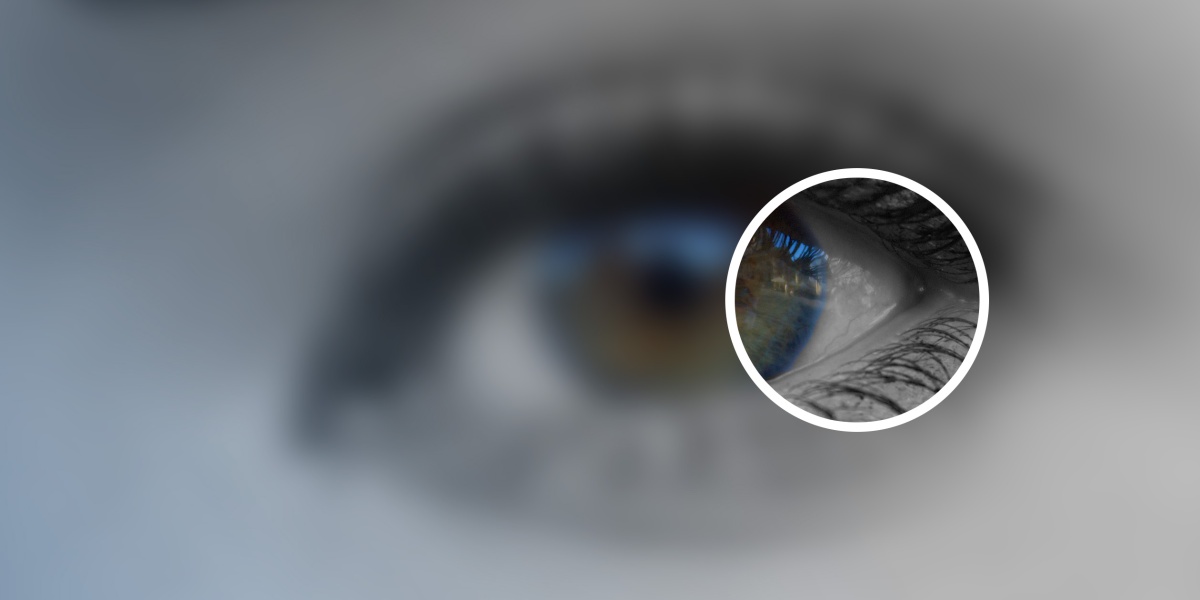
Low vision refers to a wide set of issues that aren’t solved by typical glasses, contacts, or eye surgery. According to the World Health Organization, this condition affects approximately 246 million people worldwide. Low vision can make reading, driving, recognizing faces, and differentiating between low-contrast text and colors a challenge. People with this condition may experience things to be hazy or blurry, and can have blind spots in the center or periphery of their vision.
Color blindness is also extremely common. It’s estimated that 1 in 12 men and 1 in 200 women experience some form of it. Color blindness can take on many forms, but two of the most common types are protanopia and deuteranopia. Both of these can make it hard for people to differentiate between reds, oranges, browns, and greens, and sometimes between blues and purples. This graphic aims to illustrate the effect:
For more in-depth information about low vision and color blindness, visit The University of Michigan’s Kellogg Eye Center and Colour Blind Awareness sites.

Making accessible design choices
You can learn about accessibility on WordPress.com by visiting our Accessibility support page.
On WordPress.com, a great place to start designing for these conditions would be to activate one of our accessibility-ready themes. These themes have all been tested specifically for accessibility. Beyond your theme selection, there are some simple design choices we can make to aid the visually impaired.
Easily readable text
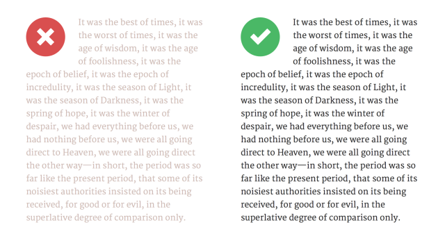
Maintaining high text contrast is probably your most important consideration. You want to make sure people can actually read what you post! If your text sits on a lightly colored background then make sure you’re using a dark text color, and vice versa. Not only does this help your vision-impaired readers, but it makes reading easier for just about everyone.
In our Customizer, if you choose text and background colors that are too close, we’ll automatically apply higher contrast to maintain readability. Give it a try!
In addition to the color of your text, make sure your font size isn’t too tiny. We all know that small text is hard to read, but it can be near-impossible for those with vision impairments. 10pt text is a good absolute minimum, but it doesn’t hurt to go larger than that. Personally, I try not to drop below 14pt for article text.
Not sure how to create headings? Our Visual Editor support page can help!
It also helps to break up your text with headings (like I’m doing in this article!). The larger heading text will help low-vision readers and screen reader technology scan through longer posts.
Clear, descriptive links
This high-contrast rule applies to your links too. Make sure your link color is sufficiently distinguishable from your normal text color. It’s also a great idea to incorporate underlines or italics to distinguish your links from your regular text. Adding another visual cue like this means readers won’t have to rely on color alone to recognize where to click.
Also, make sure that your text links are descriptive. This helps ensure that people using screen reader technology (and anyone who’s just tabbing through the links on your page) can get a sense of where the links lead. Generic text like “Click here” probably doesn’t make sense out of context.
Color blind-friendly palette
Referring to the color wheel examples above may be helpful when choosing your overall palette too. You might want to avoid layering red and green colors, since they may be indistinguishable for some of your color blind readers. Same with purple and blue. If you do use either of those color combinations, it’s a good idea to introduce a hefty amount of light and dark contrast to compensate.

The blue and purple color scheme on the left gets a little hazy when passed through the colorblind filters. Everything is a similar shade of blue! On the right, we’ve lightened the blue background and darkened the purple text. This makes the page items much more distinct for everyone.
Accessible images
Our Image Settings support page explains how to add alt text and captions.
You may think that blind readers are out of luck when it comes to your photoblog. But that doesn’t have to be the case! Be sure to include captions or alt text for your images so that everyone can get the picture. We’ve shared some great tips for writing captions in Quick Fixes to Images in Your Posts, and David Kennedy has some great tips on writing alt-text on his blog.
Another good image-related tip is to use actual text (as opposed to text inside an image) whenever possible. This helps visually impaired readers who use their browser’s zoom feature to enlarge text. Unfortunately, text in images gets blurry and hard to read when it gets bigger. Actual text does not. In addition, screen reader technology won’t be able to read text within images to blind and low-vision visitors.

10pt text, zoomed up to 12x. Text in images (at left) becomes full of blurry pixels, while the actual text at the right scales up beautifully.
More tips
There are a number of tools that could be helpful when designing for accessibility. Here are a couple of my favorites:
- Many online tools let you test out color contrast. One my favorites is Contrast Ratio. All you have to do is input the names (or hex values) of your foreground and background colors, and it will let you know how they match up to a common set of accessibility standards.
- Vischeck lets you upload an image to preview how it might look to those with color blindness. Try uploading a screenshot of your site if you’re curious! Alternatively, if you use Photoshop, the app has built-in color blindness filters that you can use to test out your graphics.
Have any other ideas? Feel free to share in the comments!
Currently blogless? You’re a click away from sharing your story.
Create your blog at WordPress.com


Thank you for this informative post.
LikeLike
Great post!
LikeLike
Good info!
LikeLike
Useful information. I worked for many years designing software. I was married to a man with blue-green color blindness, and at least one of my bosses was color blind, too. Both of them really resented that so much design work was done in colors that looked entirely gray to them. I have learned to be careful about making things easy to see. Especially since so many people I know and love are aging.
LikeLiked by 1 person
Thanks for the great info, it’s super important to make our content accessible to everyone. 🙂
LikeLike
LikeLike
Good catch! The image is just meant to illustrate the effect in this case. Thanks for the comment.
LikeLike
Thank you for the interest
LikeLike
Honestly, what is the point of writing about design if no-one can find your blog?? The reader was not particularly user-friendly: one had to click “xxx more words” in order to get to the actual blog; but now that link has gone, and any link from the reader to the whole post just leads to a charmless, boring, screen only showing the words, always with the same ugly font. What is the point of having themes if no-one can see them? How can I get a feel for a blog from the reader if there is no way of seeing the blogger’s design choices? Please, please tell me there is a way to get to the actual blog!!
LikeLike
Hey there! There are a couple ways to get to the original post in the new Reader. First, you can click on the “…” button and select “Visit Site”. Alternatively, you can right-click or (or option-click on a Mac) on the title and then pick “Open in a New Tab” from the context menu. On phones, long-pressing on the title usually gives you similar options.
I hope that’s helpful!
LikeLike
It is. Thank you.
Why is it not obvious? Surely the reader should have clearly marked buttons for this? No doubt some people wanted a bland screen which might be necessary on an old, slow mobile phone, but why make that the default?
LikeLike
Thanks for the feedback. We’re still iterating on the Reader, so if you’d like to share any more thoughts, this forum thread is probably the best place to do so:
https://wordpress.com/forums/topic/reader-view?replies=83
There’s already a lengthy discussion going, so don’t be afraid to chime in there!
LikeLike
The main thing I want to say is, don’t lie to me. When someone subscribes, your email says, “They will get an email every time you publish a post”. This is not true when I subscribe, and not true when
The other lie is, “There’s now an easier way to create on WordPress.com! Switch to the improved posting experience!” Actually, it isn’t. It is bug ridden. Often it does not save a post: I do not post immediately because I always revise, so a failure to save is a great inconvenience.
If wordpress did not tell those two lies to me most days, I would trust it more. You see, I am enormously grateful. WordPress means I can relate to people I have never met, and is my favourite social media. I have had visitors from 170 countries, and one post has had over 8000 views. But when you take away functions, such as the option to add a title to a picture or a link without burrowing into the html, I resent it. I love titles and have learned the simple html, but why remove a function? I asked on the forum for the reason why, but did not get an answer.
LikeLike
Thank you, THANK you, THANK you for this blog post. I am totally blind and have been moderating the blog for Easter Seals Headquarters in Chicago since 2006. I worked at Easter Seals HQ as an intern before then, and during my internship I was asked to use my talking computer to try different blog platforms to see which would be the easiest one for a person who is blind or visually impaired to access. I tried out all sorts of platforms and ended up recommending, you guessed it: wordpress. We still use wordpress at http://www.blog.Easter seals.com and since 2007 I’ve had my own personal blog on wordpress at http://www.bethfinke.wordpress.com Reading (okay, listtening to) your post today just confirms that you guys really have a strong interest in users who are blind or have visually impairments. Thank you so much, and keep up the good work.
_____
LikeLiked by 2 people
And don’t forget us who are neurodiverse. I wrote a blog myself about dyslexia and fonts, which is something worth considering too https://thedyslexicstudent.wordpress.com/2015/02/09/dyslexia-and-me-ayyy-its-the-fontz/
LikeLiked by 1 person
Because I like to read blogs too, I try to keep my blog readable. I always get discouraged when I read a blog and its unreadable! Gah!
LikeLike
Thankyou for good information
LikeLiked by 1 person
Thank you for the information!
LikeLike
Loved the post, nice and easy to understand and implement. Good Job!
LikeLike
Still annoyed that you removed the hover text that told readers exactly what links went to, so that lengthy titles, for example, didn’t have to be included in our posts.
The other tips, however, are excellent.
LikeLike
You can still have the hover text.
If you go to “text” from the edit page, the start of the link comes up as <a href. If you put between a and href, title="", your desired hover text goes between the quote marks. So <a title="hover text" href="link". Try it. Look at my blog, and you will see links with hover text.
LikeLike
This is a workaround to the simple solution we had before. Not at all satisfactory, IMO.
LikeLiked by 1 person
I am new to wordpress thanks for this. really helps.
LikeLike
These are great suggestions. I never thought of the color blind issue but now that you mention it I have to go back and double check my link colors.
LikeLike
I definitely agree with breaking 1 post with subheaders. Mine are green which makes me wonder what colour I should try instead for accessibility. Any suggestions?
LikeLike
mantap gan perkembangan teknologi sekarang, , klw kita gak ikuti bisa ketinggalan kereta , Aerith
LikeLike
I love the fact that WordPress has a section dedicated to accessibility. I was thrilled when this article popped in to my inbox the other day. I’m not saying that all blogging platforms should have an accessibility section, but it really does help.
Thank you WordPress 🙂
LikeLike