Take control of your color palette.
Hi bloggers! My name’s Kjell Reigstad, and I’m a designer at Automattic. This is part three in my monthly series on “The Principles of Design.” In this series, I share some of the basic tenets of design, and we explore how to apply them to your blog.
So far, we’ve discussed clarity and visual hierarchy.
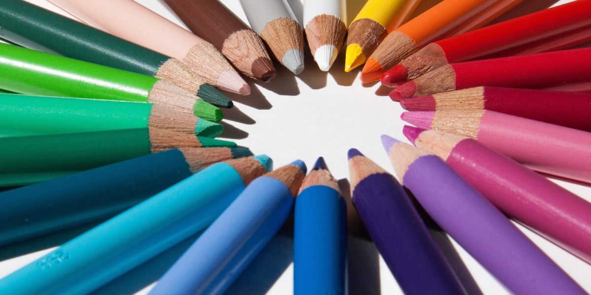
Colors can be very powerful. They stir up our emotions, convey personal and cultural messages, and set the mood. A bright red can shout “Stop!” while a deep blue can be calming and quiet. While individual colors say a lot on their own, most of what we see in the world involves more than one color. The way those colors work together is called color harmony.
Have you ever noticed that a bright pink rose stands out against a green bush? Or that a blue top goes well with khaki pants? That’s basic color harmony. While certain color pairings come naturally, choosing the color scheme for a blog can be a little daunting. There are so many colors to choose from! Some colors look great together, and others clash dramatically! Learning basic color theory can help bring a little structure to the color-choosing process and lead to more harmonious colors.
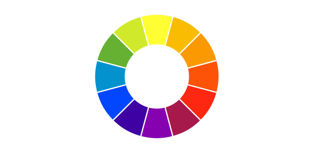
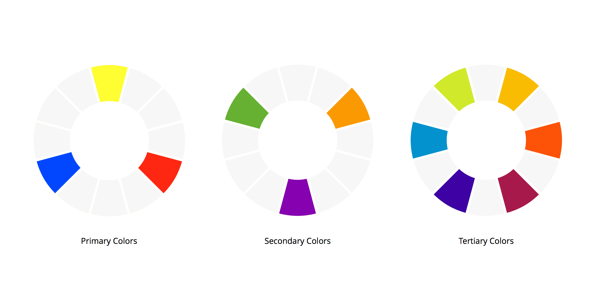
A common color wheel contains 12 colors: Three primary colors, three secondary colors, and six tertiary colors.
Learning the “color chords”
You’ve probably seen a color wheel one at some point or another. Color wheels can help us choose colors that work together well. We can analyze the positions of different colors on the wheel using “color chords” to predict and describe the effect the colors have together. There are an infinite number of combinations that work, but here are a few common examples:
Analogous colors are next to each other on the color wheel. If you want your blog to have a calm, comfortable feel to it, choosing analogous colors is a great starting point.
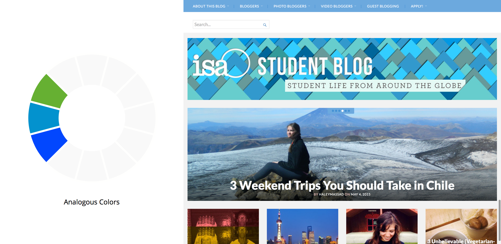
The ISA Study Abroad Student Blog uses analogous colors to great effect. The calm blues and greens in the header give the site a friendly, harmonious feel.
Complementary colors are opposite each other on the color wheel. Complementary colors are very high-contrast and active. They will often create a visual “buzz” when paired with each other. They’re a little tricky to use in practice, but can do a good job of conveying vibrancy and excitement. It’s worth noting that using complementary colors for text will usually make things pretty tough to read.
“Hold the phone! That’s not red, it’s pink!” That’s an astute eye you’ve got there! When we’re discussing the color wheel relationships here, we’re ignoring tints and shades. Breaking things down to the pure color hues helps us compare the relationships more easily.
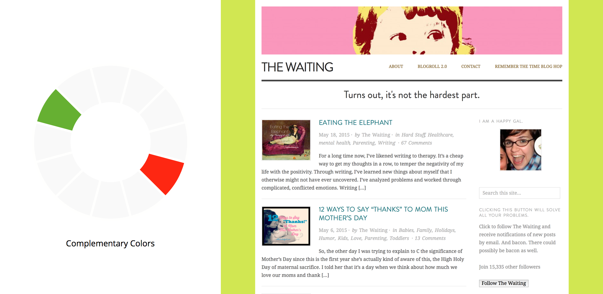
On The Waiting, Emily Austin combines variants of red and green to give her blog a bright, playful feel.
Split-complementary color schemes are a mix of the last two examples. They involve two colors that are near-analogous paired with a complementary color. Split-complementary palettes end up with the best of both worlds! They have a great sense of balance and harmony along with some vibrancy thrown in. Chances are, many of your favorite blogs, websites, and brands use split-complementary colors.
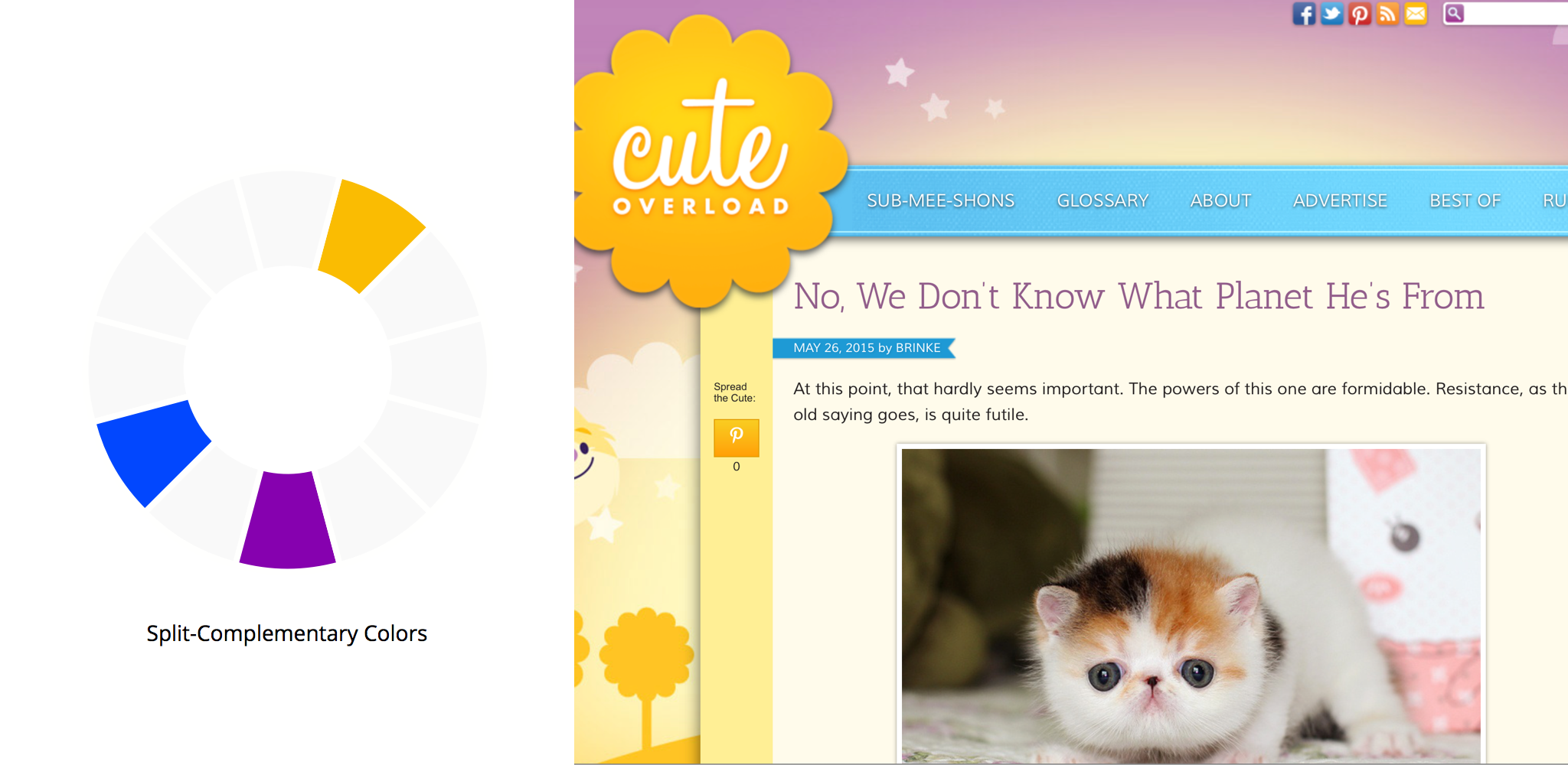
Cute Overload uses a split-complementary palette to create a fun, balanced palette.
Ideas and resources
A good thing to keep in mind is that these are just starting points. Once you have colors you like, you can tweak the exact hues, tints, and shades to your liking. The best way to choose colors is just to experiment! While the color wheel can help inform color relationships, there’s no concrete way to tell if a palette will work until you see it in your design.
If you’d like to get some feedback on your colors, try pairing up with someone for a design audit.
Here are a few additional tips for building a harmonious color palette:
- COLOURlovers is a great resource for browsing color palettes. Just looking through the examples there can spark some great ideas. In fact, if you have the Premium upgrade, WordPress.com puts COLOURlovers palettes in the customizer for you by default.
- Nature is a master of color harmony. Sometimes it helps to get up from the computer and go outside for inspiration!
- The photography community here on The Daily Post has a fantastic grasp of color. Looking through some of the more colorful photo challenge responses might spark some inspiration for you.
- Pull together a mood board of images that have a similar feeling, and analyze the colors they use. As you’re likely aware, Pinterest is a great tool for that sort of thing.
We’ll explore other aspects of color theory in future posts. In the meantime, I encourage you think about your colors in the context of the message you’re trying to get across, and as a tool to direct the eye through your page.
Currently blogless? You’re a click away from sharing your story.
Create your blog at WordPress.com


COLOURlovers has helped me out on more than one occasion! Look forward to the rest of the series. Might I suggest an ebook compiling these posts, in the line of the other ebooks that WordPress has rolled out off late 🙂
LikeLiked by 4 people
That’s a great suggestion! We’ll keep that in mind for once we have a few more posts published in this series.
LikeLiked by 4 people
This is great! Now I know I have chosen a complementary colour theme for my blog…Love this article!
LikeLiked by 3 people
I especially love referring to design-seeds.com/search for color pallets 🙂
LikeLiked by 4 people
Me too! Design Seeds have wonderful palettes!
LikeLiked by 4 people
Another site to discover “colour” is Adobe Color (former Adobe Kuler) – http://color.adobe.com/. It’s been my go to for years.
And yes, it pained me to spell colour as color. 😉
LikeLiked by 6 people
Love Adobe Color. I use it all the time.
LikeLiked by 3 people
Nice one. Thanks for the color tones.
http://wp.me/60y6a
LikeLiked by 4 people
Hi Rishabh,
Please don’t leave a link to your blog as your signature in your comments. It’s a bit spammy and we’ll be removing them.
LikeLiked by 3 people
Thank you for this post…it really helps to look at your blog from a different perspective:)
LikeLiked by 2 people
I agree with Julia, it’s absolutely an awesome post. Thank you!
LikeLiked by 5 people
That is exactly what I love and try to achieve in my blog. Colour reflects life diversity and infuences daily choices, thus enhancing performance and vigour. I enjoyed this publication, thank you for sharing it! 🙂
LikeLiked by 2 people
This is great!! I use these principles in my painting, but I never thought about applying it to my blog! Right now, my theme is mostly shades of blue paired with a chocolate brown, so complementary. I would like to think that it stands out a little, but is still soft and welcoming. 🙂 Thanks for this!
LikeLiked by 2 people
Thanks a ton for sharing this!!
LikeLiked by 1 person
I think the last time I checked something about colour was at University few years ago, thank you for the post, it was quite entertaining and useful.
LikeLiked by 1 person
The colors look beautiful and fun.
LikeLiked by 1 person
My blog is hideous and I’m trying to figure it all out. Thanks for the great tips!
LikeLiked by 1 person
This has been really helpful. I need to have a play with the colour palettes and find something that works better for me.
LikeLiked by 1 person
Great Post!!
LikeLiked by 1 person
I picked my blog theme, Kelly, because of its pink and turquoise color scheme. I guess it would be complementary.
LikeLiked by 1 person
You put it across so well! I have read about colors a few times before but never understood it this well till I read your post! Thanks 🙂
LikeLiked by 1 person
Quite interesting..thank you!
LikeLiked by 2 people
wonderful – lots of this is instinctive, and the your breakdown details are super useful to understand how to use colours for best results. I love colours and automatically put a rainbow in my new blog header, your advice will be priceless to develop the blog and – hopefully- improve it step by step
LikeLiked by 1 person
this was really helpful…i finally figured out what i should do with my background colour! thanks for this information! 🙂 and its very nice …
LikeLiked by 1 person
Excellent synopsis of color! Thank you.
LikeLike
Great post! It’ll be really useful to me… will keep the links, spacially the browsing and construction of pallets presented on the post and by others in the comments!
I also know this one: http://paletton.com/ but I’m figuring out how to use it.. This article clarified some points to me
LikeLike
so, thanks
^^
LikeLike
Excellent! I worked hard for the color on my blog. (Analogous) I’m still pleased with it. It’s nice to know a few of the tips needed when dealing with color.
LikeLiked by 1 person
Wonderful!!! Every work of art needs color….. I’ll keep everything in mind
LikeLike
Awesome!! Thanks for the post.
LikeLike
Nice article, even I believe nature is best guide for colour harmony
LikeLike
Thank you for a lovely & interesting & helpful post!
LikeLike
Colors are an important part in rainbows
LikeLike
Thanks so much for the post!
LikeLike