Guide users through your page.
Hi bloggers! My name’s Kjell Reigstad, and I’m a designer at Automattic. This is part two in my monthly series on “The Principles of Design.” In this series, I share some of the basic tenets of design, and we explore how to apply them to your blog.
Last month, we explored Clarity.
As I mentioned in last month’s column, the main goal of any design is to tell a story. Just as any good story has a beginning, middle, and end, a good design story does too! It’s up to a designer to make sure that people progress through their stories in a way that makes sense. One of the key ways to do that is to establish a clear visual hierarchy to guide the viewer’s eyes through the design.
Let’s go through a quick example. Take a look at the image below. Which of these two shapes do you notice first?

Chances are, you probably said the one on the left. Why? Because it’s bigger and easier to see than the small star! That was easy, right? Let’s take this one step further:

My guess is that you noticed the orange one first this time, right? Orange grabs people’s attention much faster than black does. After that, your eyes shifted to the large black star, and finally to the small one. That’s a simple example of how visual hierarchy can guide your eyes around.
Visual hierarchy in practice
Things get a bit more complicated when you’re dealing with a web page full of shapes, letters, and colors. Luckily, hierarchy still works similarly in practice to the exercise above.
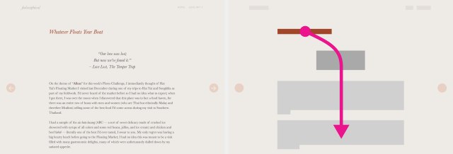
We’ll start out simple. Feelosophical features a clear, minimal article layout based on the Spun theme. I’ve included a screenshot of an article page on the left, and distilled the page down to simple colors and shapes on the right to help illustrate the flow. The arrow indicates the path someone’s eyes will typically take through the page.
Some of the shape colors here represent their visual weight. Visual weight is relative: even though the font color for the quote and the article text is the same, the quote shape is slightly darker to take the font-style (italic) and the larger font size into account.

Feelosophical, running the Spun theme.
When I look at the page, I’m first drawn to the dark orange shape (the post title). This stands out because of the dark color, and because the font size is larger than any other on the page. After that, my eye drifts down to the next-most-prominent item: the quote. This part stands out because it uses the second largest font size, and also because the white space around it lends it prominence. From there, my eyes drift into the body of the article itself. This happens because of its proximity to the quote, and because of the general weight of the copy. This design tells a very clear story! We’re drawn to the title first, then an introductory quote, and finally we jump into the article itself.
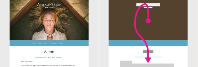
Now for a slightly more complicated example. Amanda Mininger’s blog makes great use of the McKinley theme’s bold image placement:

Amanda Mininger’s blog, running the McKinley theme
Faces (or even objects that seemingly resemble faces) almost always grab our attention first. We can’t help it, it’s human nature!
At first glance, my eyes are immediately drawn to the face in the center. From there, I drift up to the nearby title of the blog, and then the blue menubar pulls me back down through the article title and into the article itself. This is another great flow — the image and blog header start you off with context about where you are, and then the blue navigation bar pulls your attention back down through the article itself.
Hierarchy on your own blog

Looking at a blurred version of your blog can help you get a sense of the visual hierarchy.
Here’s a quick way to test hierarchy. Head over to your own blog. While you’re there, squint your eyes just a little bit, until things look a little blurry. That will reduce what you see to simple colors and shapes. Just like the examples above, you’ll be able to pick out the elements that jump forward, the elements that recede backwards, and those that are somewhere in the middle.
When you’re looking at your blog from that new perspective, it’s easier to assess visual flow. Depending on what you see, here are a few tips for how you can tweak the hierarchy on your blog:
- Inside of posts, use different font sizes, colors, and styles (bold, italic, etc.) sparingly. Just a little tweak here and there will do the trick.
- Empty space can come in handy when establishing hierarchy — it gives the eyes a little break while jumping around, and makes the page feel calmer overall.
- If your header is too bold (or not bold enough!), learn about creating a new custom header.
- Maybe you need to move things around a bit. It never hurts to try out a new theme and see how that affects things.
- If you have a Premium or Business plan, you have much more control over the colors and sizes in your layout through custom CSS.
Like I mentioned last month, creating a test site for experimenting is a great way to make sure you don’t mess up your blog.
As always, it’s important to experiment! You’ll never really know if something works until you try it. Don’t be afraid to get feedback from friends, family, or in the community pool.
Currently blogless? You’re a click away from sharing your story.
Create your blog at WordPress.com
GREAT article, Kjell! As a “quantitative guy”, I never really appreciated good design until recently. You don’t generally notice it unless it’s BAD. I think the combination of the sheer volume of information we receive daily (combined with advances in neuroscience) have forced a sort of renaissance in the study of design principles. Turning your back on design is like thinking a black rabbit will survive just fine in the arctic wild. Whoops! Looking forward to your next article!
LikeLiked by 4 people
Very interesting post. I will definitely apply this to my own blog to see how the results turn out. on another note keep on posting!!
LikeLiked by 1 person
This is super helpful. I still think of my blog’s desktop-Web presentation as being the main event, with mobile presentation next, and feed presentation third. I optimize for the desktop Web. Probably need to think about shifting toward greater balance with mobile given how it has surged. Can’t do much about how my feed is presented, unfortunately.
I’ve got a text/photo blog on Photolia. There’s a bug in it at the moment with the header image that I reported and that I hope gets fixed soon, as on the desktop Web it currently consumes most of the space above the fold. That messes with the visual flow.
LikeLiked by 1 person
Nice post. Thank you for sharing
LikeLiked by 2 people
Definitely, visual hierarchy is something that counts, that is undoubtedly true.
I myself feel open to welcome changes as diversity could be alluring, attractive and interesting and we usually fall into the trap of novel and smartly designed temptations.
Besides, sizes, fonts, colors are real advantages and I personally like to experiment with them in harmony with current moods and topics.
Furthermore, the empty spaces can both give your eyes some break, plus they are pregnant with some meaning. Leave it all to inner interpretation and imagination. 😉
So, I woul take further advantage of the article tips and advice. Thank you, Kjell for your great job! 🙂
LikeLiked by 1 person
Thank you for this simplistic lesson. When I can afford to upgrade, I will start here for pointers. Blessings!
LikeLiked by 2 people
Thank you so much for this post…it helps a lot to have a different look at my blog and find key elements that my readers see first:)
LikeLiked by 2 people
This is great! I’m going to have to jump back to last month, too. Not only does this information lend itself to helping with blogs, but also presentations in the business and arts worlds, as well. Is there a recommended flow that seems to be “clean” for the average reader?
LikeLiked by 1 person
Glad you liked the post! To answer your question, since layouts and design goals can vary so much, there isn’t a foolproof “clean” flow to follow. But as long as you make the most important information the most prominent and work down from there, you’re on the right track.
LikeLiked by 1 person
Thanks!
LikeLike
Like the article!
LikeLiked by 1 person
I like the squinting and blurry exercise. That helps a lot!
LikeLiked by 1 person
This is a great post. It fills in a lot of knowledge gaps for me. Thanks for your advice
LikeLiked by 1 person
Great tips, thanks for sharing.
LikeLiked by 1 person
Great tips!
LikeLiked by 1 person
I am familiar with the Elements and Principles of Design. I think that there many psychological aspects of page design that control the reader’s attention more than typography. The importance of the graphic aspects of layout and composition is significant when design is considered in isolation, however, there are factors such as tradition, experience, habits of perception and culture that frequently override the impact of graphic layout. In most of the examples given here, the traditional scan patterns actually control eye flow more than color or typography. The example of focussing on the face and “reading” it first is a good example a unique control technique. The facial expression will condition and bias the viewer and the direction of the facial view can override the typographical control of flow. In summary, don’t get lost in the esoterica of design and layout and ignore the more pragmatic aspects of design.
I don’t claim to be a master of these things because I struggle constantly with pedantic style and awkward presentation. As I work to overcome this problem, I become very aware of these issues.
LikeLiked by 2 people
Very helpful post. I have been thinking that my blog needs improvement but it’s very difficult to decide what to change and how to look out for good themes. Thank you for this!
LikeLiked by 1 person
Super advice, thanks!!!
LikeLike
This post is so well written, that the advice seems secondary. You bring with it such clarity and sensible direction for new bloggers like me. You make this art sound so common sense, when in fact it must be an acquired art. Thank you for the clarity and new perspectives.
LikeLiked by 1 person
Thank you. This is very interesting. Looking forward to next month :-). But for now, I don’t see on the Edit Post screen how to change font sizes… or is it only a part of the Premium plan?
LikeLike
Hi there! The premium plan is not required to change font sizes in your posts. 🙂
From the edit screen, you can hit the toggle button to open up the second row of editing options:
https://wordpress.com/support/visual-editor/#row-2
In there you’ll see a dropdown menu that lets you switch between a variety of different sizes defined by your theme: paragraph, headings, etc.
https://wordpress.com/support/visual-editor/#styles
For more advanced customization, you can look into learning CSS:
https://wordpress.com/dailypost/2014/02/26/should-i-learn-css/
I hope that’s helpful!
LikeLiked by 2 people
Thank you! Yes 🙂 that helps a lot. I just didn’t make the connection between paragraph and font size. So thanks again. Going to see what is CSS now 🙂
LikeLike
Huh, I usually take a gander at my blog and if it looks good, it is good, but this technique is totally different! Thanks for this.
LikeLike
Really great advice here! Thank you, Thank you!
LikeLike
Thanks for framing the design in terms of a story. That’s something that I can relate to when thinking of my blog layout.
LikeLike
Thank you Kjell,
Great reminder that the principles (regarding guiding the viewers eyes), that I learned 30 years ago for shop window displays are still current and of value even in blog design. I recently looked at my blog and thought I’d like to change it to a more plain background to not distract from the text and increasing amount of images I am now using, but with limited computer skills decided not to mess with the theme, just in case I could not find my current one back. I am definitely going to look into finding a different back ground image though…
LikeLike
Hi Kjell!
That’s a great post on how the placement of design elements influence the navigation path of our eyes. All of this happens in a jiffy and yet can have a profound impact on the overall impression of the post.
While reading this article, I happened to think of destructive design, a chaotic one. Wherein the purpose of the post is to leave the reader entangled in thoughts. Somewhat like the ‘Inception’ of posts. Can the same concepts, in the complete reverse logic, be applied to those situations too.
For eg, I like to write really short stories that have a twist. Could any of you fellow bloggers suggest how the reader’s attention can be stolen by design, and then crash him or her into the twist, by design, of course?
Cheers, mate!
Looking forward to more from you!
Aamir
LikeLike