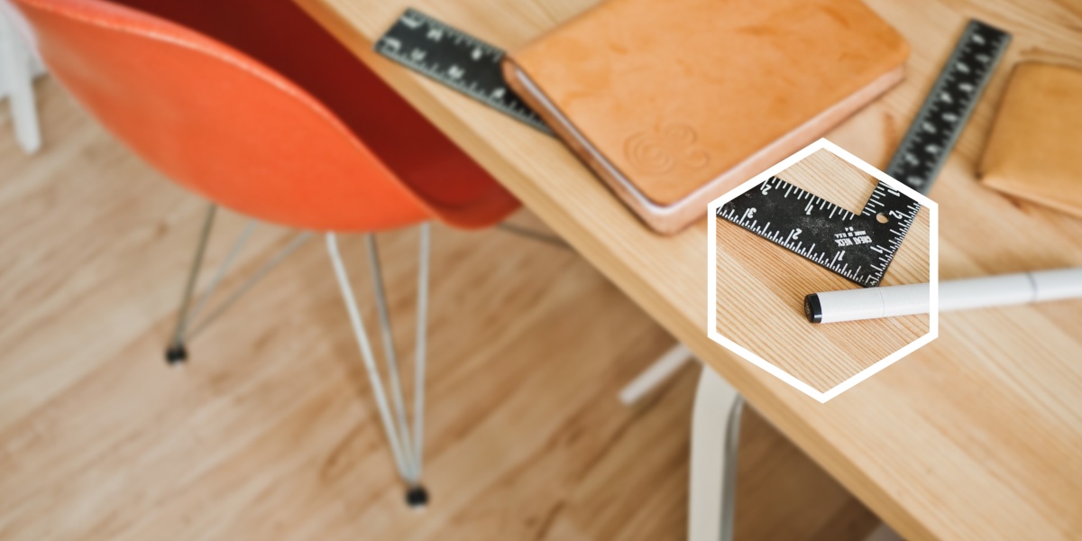
Tell a clear story with your design.
Hi bloggers! My name’s Kjell Reigstad, and I’m a designer at Automattic. I’m happy to introduce the first post in a new monthly series on “The Principles of Design.” In this series, I’ll share some of the basic tenets of design, and we’ll explore how to apply them to your blog.
This week, we start out with a simple design concept: telling a clear story.
The main goal of any design is to get a message across. It may be a straightforward message (“Buy this product!”), or it may be a complicated one, but in all cases, there’s a story to be told. In an excellent design, every shape, color, photograph, and font choice works together to create a strong, clear message. Great designers add elements that contribute, and (just as importantly!), they weed out elements that distract.
The classic Joseph Müller-Brockmann poster below is a great example of design elements that work together to tell a story. The shapes flow like a symphony, while the simple, organized typography fills in the details.

Even empty space can be a part of the story! In the FedEx logo, the negative space between the E and X forms an arrow to convey speed and urgency.
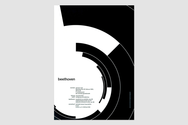
Source: Design is History
What’s your message?
On your blog, your main goal is also to get your message across. That message could be a favorite recipe, a personal experience, or an amazing idea you’ve had. Whatever the case is, you have something to share.
Every image, block of text, and button on your blog tells a piece of the story. Sometimes, elements unrelated to your message can distract your visitors and obscure what you’re really trying to say.
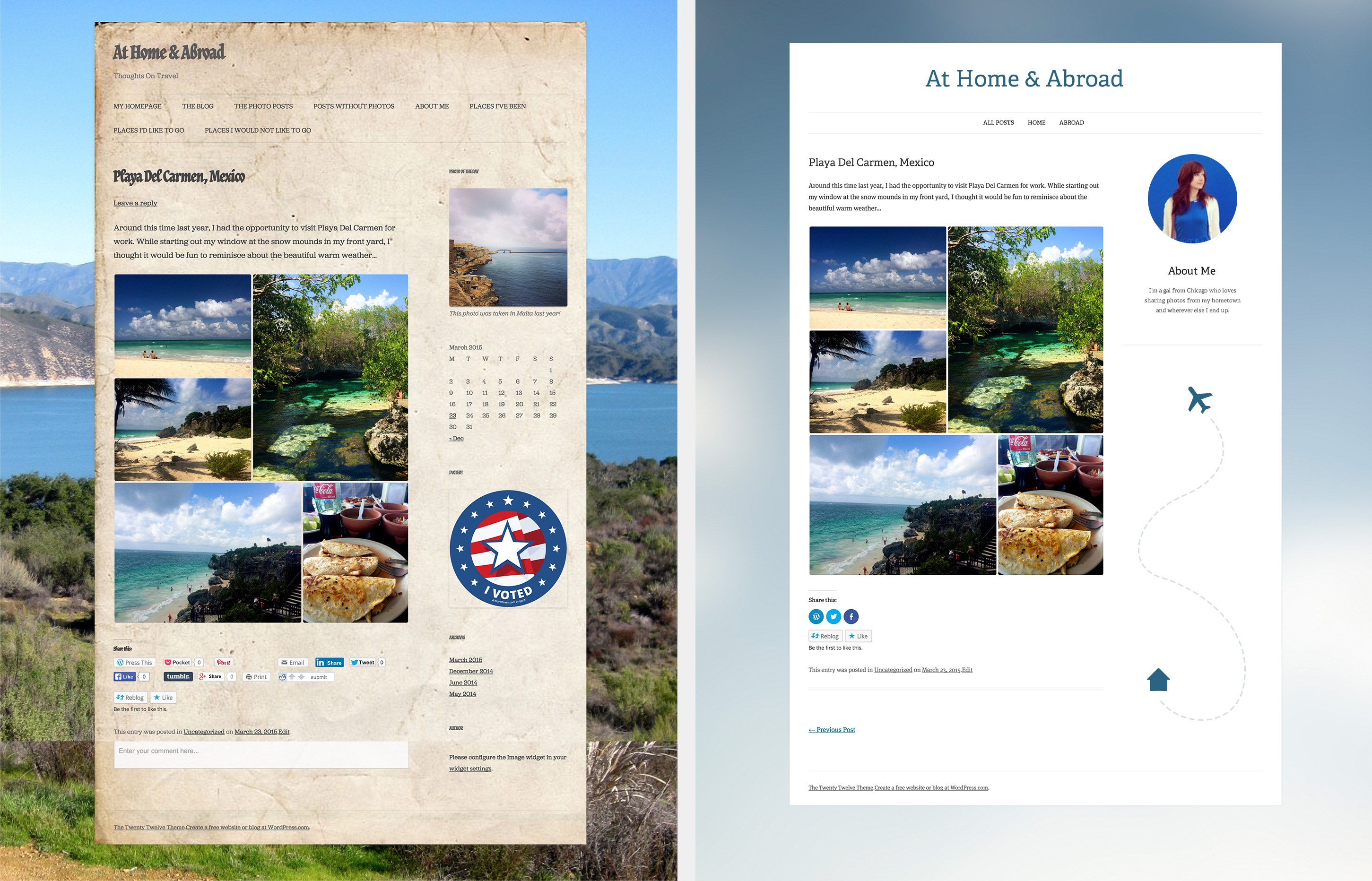
Take these two screenshots for example:
Keep in mind that there isn’t necessarily a right or wrong way when it comes to design — the goal is just to tell the story that you’d like to be telling. Explore and see what works best for your blog!
On this blog, the story is about the author’s travel photos. On the left, some page elements get in the way of that story. The backgrounds are busy, and some of the widgets battle for attention. It takes some effort to focus on the real hero of the story: the photos.
On the right, the author has made a few changes that help clarify. The photos jump out right away to lead the story. The background is less overbearing, and the illustration in the sidebar helps reinforce the story rather than distract from it. Although the actual blog post is identical on both versions, the one on the right appears much more clear and concise.
Working toward clarity
We tend to build up our blogs over time, so it’s a good idea to take a step back from the screen every now and then and look at your whole design. What’s the main story you’re trying to get across? Does everything on your page work together? Or are there items that distract? If there are, it’s a good idea to start clearing them out. Even small things can have a big impact! Here are a few suggestions to get you started:
- Is your background a little too distracting? We have some tips on making backgrounds a little quieter.
- Are all of your widgets necessary? If not, it’s easy to remove widgets that you don’t need anymore.
- Sometimes the small things can really add up! Do you have a few too many share buttons? Try to trim down to the ones your audience is most likely to use.
- If you have WordPress.com Premium or Business, you can use custom CSS to hide unnecessary elements by using the
visibility: hidden;property. You can learn more about CSS in our Intro to CSS.
Interested in trying out some customizations, but don’t want to risk messing up your blog? Try experimenting on a test site.
Whenever you work on design, it’s good to experiment. Don’t be afraid to try things out and see how they look! It’s also a good idea to get feedback from friends, or in the Community Pool. Outside perspective can spark great new ideas.
Do you have other ideas on how to make your designs more clear? Feel free to share in the comments.
Currently blogless? You’re a click away from sharing your story.
Create your blog at WordPress.com


I wish all bloggers read this post!! I’m so over busy backgrounds and lots of widgets!
LikeLiked by 4 people
Being a new blogger, this post was very clear and easy to understand. Thank you for posting
LikeLiked by 5 people
Absolutely important to all bloggers, as @Anna mentioned in the previous comment!
I’m a passionate photographer and programmer (next to my corporate job) and have decided to code my own theme for my photography blog (aydinphotography.com).
I highlighted what was really important for me –> the image and took away everything that distracts (menu and widgets are hidden but accessible via buttons).
Judging by the comments I get on my blog, it seems that I have hit a sweet spot.
Less is absolutely more sometimes 🙂
LikeLiked by 2 people
Are not these matters questions of fashion? At one point, blogging 101 tried to get us using lots of widgets, now minimalism is good? Also, it depends what screen the reader is using: mobile, laptop or desktop.
LikeLiked by 1 person
Definitely a matter of personal preference, that’s for sure. There is no right or wrong approach. When we cover widgets in B101, the aim is to expose bloggers to the concept of widgets and how they can enhance a blog. Most folks are brand new, have never heard of them before, and aren’t sure what widgets do and how to use them.
The aim here is to help you look at your blog’s design with a critical eye, with a view to re-evaluating widgets and other elements from time to time. As an example, maybe the “I voted” widget is still relevant to a given blog’s story. Maybe if the election is over, it might be past time to take it down. It all depends on what the blogger is trying to achieve.
LikeLiked by 3 people
This will defiantly come in handy then. I think I have too many things on the sidebar but did’t know where to put them. I was taking a look at adding them to the footer. Kjell has a great idea for a new feature. Thanks
LikeLike
So can I get the classic edit screen back? If I click “edit” beside a post, it goes to the beep-boop, which I find poorly designed, change for the sake of it, and which sometimes does not work, failing to save a post. The dropdown from “My Sites” used to get to the usable editor too, but now it goes to the useless Beep-boop.
LikeLike
To return to wp-admin, use this link and bookmark it for the future. This is a bit off-topic from the subject of the post. In future, the best place to go for support is the WordPress.com Forums.
LikeLiked by 1 person
I completely agree that we are so inundated with information that it can be hard to see the message. I’m going to use this to try to reduce some of my own clutter.
LikeLiked by 1 person
Thank you for this post. I am very interested in reading about design. I live in a rural area and my internet service is not always very fast. I tend to avoid blogs with too many photos, busy backgrounds, etc.
LikeLiked by 3 people
Lots of interesting points. I’ve found the ability to hide widgets under different circumstances very useful: well worth experimenting with!
LikeLike
Really looking forward to reading more in this series.
LikeLiked by 1 person
Thanks for the suggestions!
LikeLiked by 1 person
Although I agree with this post’s overall message for the most part, the double-screenshot example just doesn’t work.
The sample blog is called “At Home & Abroad” and that title does not lead me to believe that the blog, as a whole, focuses on photography. The only reason the minimalist design works is because the post being displayed is photo-heavy. For a post that consists entirely of text, the design might come across as more than a little vanilla.
Any design must play nice with the diverse array of posts that appear on most blogs.
I wouldn’t endorse the “before” screenshot as-is, of course, because a few elements are just too much. However, some types of blogs benefit from the visual interest that more involved designs can provide when done well. (Emphasis is on “when done well.” I’ve seen a lot of “when done badly.”)
LikeLike
LikeLike
Great tips! I may cut down on my share buttons.
I recently changed my blog to the Able theme. I love the cleaner and more modern feel and larger typeface. Some blogs are super hard to read!
By upgrading, would our blogs be more easily optimized and searched through key words?
LikeLiked by 2 people
Hey there! Upgrades don’t have an impact on how your site shows up in search engines- free and paid blogs are all treated the same. If you’d like some tips on optimizing for search engines, check out this post:
https://wordpress.com/dailypost/2013/04/11/seo-and-your-blog/
You can also learn more about what’s included in upgrades here:
https://store.wordpress.com/plans/
LikeLiked by 1 person
Thanks so much, Kjell! I’ll check out your links.
LikeLike
I think it’s important for images on particular post to “flow” the same way. You don’t wanna have mixed signals.
LikeLiked by 1 person
Thanks for the great advice. Off I go to examine my blog and, hopefully, improve its look.
LikeLiked by 2 people
Painters know backgrounds are important.
Some people are field dependent some field independent.Design that looks great to you may not work for others. Second opinions are always a good idea.
LikeLiked by 2 people
I recently changed the theme of my blog. But actually it was more accidentially – thought I could try a new one and switch back to the old one – no way! I have to try this test version. Thank you for showing me!
LikeLiked by 2 people
This is a fabulous and clear post that I was able to understand. I hope all bloggers get to read this one day.
LikeLike
Hi Kjell. I am looking forward to your next post.
Not only because this was very useful, but also because I was left wanting more 😉
Wait, don’t go. I’ve got quotes.
“Less is more.” by unknown
“True elegance lies in the simplicity.” by yours truly
“It’s a barbarity that clarity is a rarity.” Dr. Dude
LikeLiked by 2 people
Oh thank you! I need all the help I can get in fixing my blog site. Like someone said, LESS IS MORE 🙂
LikeLiked by 1 person
very interested, as I like to do some “trial and error” for my blog design until found that I like, but did you like it? please give some suggestion for this blog. thanks
http://blog.muhammadzen.com/
and
http://muhammadzen.com/mengupas-puisi-mengukir-angan/
both are my blog with different themes.
please tell me what you think about the background and design. Thank you
LikeLiked by 1 person
To get feedback on your blog’s design, post a comment in the Community Pool. It runs each week, starting on Mondays.
LikeLike
very nice sharing, thank you…. 🙂
LikeLiked by 1 person
Thank you! This is great advice…I’m going to go try it now!
LikeLike
Great post! I’m studying design right now and I couldn’t agree more with your less is more mantra.
LikeLike
Great post. I am loving this blog at the moment.
LikeLike
I love this. I just finished blogging 101 and I feel like my overall look has come a long way, but I’m constantly trying to improve as I learn new things.
LikeLike
Although I’ve done some graphic design in the past, it’s been several years. My blog looks more like the simple one in your example, which, in my estimation, is good but after reading your post, I’m thinking maybe I need to change the shade of my background to darker or lighter. I’ll have to do a couple of tests.
I hope I see more posts written by you. You tell things logically and simply. Two good pluses.
LikeLike
Glad to read this – must say I have been a sucker for white space for as long as I design… less is often more – and there is lot of truth in this…
LikeLike
Great post. Trying to learn the basics of good design as I have multiple websites but no background in art or design. I look forward to future posts. Thanks!
LikeLike
I feel in your making a post about simplicity, your blog post is a great example of the effectiveness of the said topic.
LikeLike
Themes, themes everywhere, and which is the one to choose ?!
Clarity, and an uncluttered appearance esp.on a writing blog is so imp.for readability. Looking forward to more tips. 🙂
LikeLike