Using images in your posts? Make Mr. Miyagi proud: seek balance in all things.
Once you’re in a blogging groove and the words begin to flow, you naturally begin to look for ways to enhance the look of your posts.
Adding images is a great way to reinforce ideas, emphasize or illustrate a specific point, provide visual breathing space within lengthy text passages, or even inject humor. When using images, take some sage advice from Mr. Miyagi of Karate Kid fame:
Better learn balance. Balance is key.
But this is blogging, not karate

Ah yes, grasshopper, but did you know that balance is one of the bonafide principles of design?
Balance is embodied in a visually pleasing arrangement of the items on a page. For extra credit, you can read up on the different elements of balance.
Balance dos
While it's your blog and you can do (almost) anything you want with it, here are some fast and loose guidelines to remember when using images in your posts.
- Less is more. Tropey, yes, but oh so true. Is there a representative image that drives home the point of your post or sets the mood? You might choose to use it as a featured image, if your theme supports them. If not, you might plop that compelling image at the top of your post to set the tone for what you’ve got to say. Photographer João Bracourt does this well, using a single eye-catching image at the top of each of his posts.
- Be choosey. Select images that look professional — they’ll elevate the appearance of your blog and the impression you leave on readers. Not sure if your own images shout professional? Check out our free ebook, Photography 101 for tips on how to hone your photography skills. Not into shooting your own photos? Check out our recent primer on where to find free-to-use images on the web.
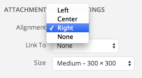
- Provide rest stops along the way. Have you written a long post? Consider adding a few images to give readers some breathing space — a natural place they can rest their eyes and digest your ideas before devouring the next sections of your piece. Experiment by using a variety of photo sizes. Play with the alignment settings as you sprinkle in images in longer posts — you might find that an image looks better to the left or right of your prose, creating a wrapping effect, or in the center instead, which breaks up your copy.
Anna over at girl in the hat not only uses a compelling first image at the top of her personal essays, she intersperses images through longer pieces, such as yellow wallpaper. - Soften the blow. Relating a tough subject but want to keep your readers smiling? Use an image to lighten the emotional load or diffuse anger. Michelle recently used this technique with great success. In “Don’t Undermine Your Comment With a Plug,” Michelle educates readers on the finer points of commenting. Her sparkplug ad, featuring a winking cartoon horse, helps diffuse any hard feelings readers might have on learning that some commenting habits are a no-no.


And now, over to you
What are your best tips for creating image balance within a post? Share so that all of us can learn.
Currently blogless? You’re a click away from sharing your story.
Create your blog at WordPress.com


.jpg)
Just two words: WHITE SPACE.
LikeLiked by 1 person
I’m a big fan of white space too. Looks clean, draws the eye where it’s supposed to (content), doesn’t short-circuit your brain before you’ve even started reading, like a cluttered background can (in my case all the time. I simply can’t cope with visual clutter…).
LikeLike
Yes, preach!
LikeLike
Absolutely. I don’t know what it is but there’s something more elegant about a post that can look appealing just through it’s use of font and white space. Images can really be more of a distraction, i think real readers prefer less clutter and more quality content. No one says you need to have images.
LikeLike
Pretty much what you have already said. If a post is going to be above 500 words then I will always put an image. How I use images is usually for the following reasons:
* As an “introduction” I’ll put an image at the top before any text to give an indication of what the post will be about (so it works in conjunction with the headline)
* To break up the text (usually smaller images and I will alternate left and then right)
* For comic effect
I use the header image rarely, mostly because I have a large banner and really want to use it for big features or if I think the text will be particularly enhanced, like a series I did on how to portray the seasons in your writing: http://sweattearsanddigitalink.com/2012/06/20/writing-the-seasons-summer/
Don’t forget videos! Sometimes a quick introductory video from YouTube can substitute a lot of explanatory text
LikeLike
Well done, Krista, for giving us tips and advice on the use of images. How, when, where, why and what images can/should be used and balanced are vast topics indeed!
SoundEagle would like to add that knowing, differentiating and diversifying the types and roles of images used in a post can also be highly effective in a post. Whether animated or static, images can be used as visual documents, banners (in a post, not just at the top of a blog), videos, photos, posters, signs, symbols, logos, graphics, maps, illustrations, drawings, cartoons, cliparts, icons, avatars, first-letter captions, dividers, decorations and so on.
LikeLike
As examples, see the following:
LikeLike
This one is an art review at http://soundeagle.wordpress.com/2013/01/06/soundeagle-in-john-clinocks-art-rat-cafe/.
LikeLike
Another example of art review is at http://queenslandorchid.wordpress.com/2014/05/18/orchid-urinal-sculptures-by-clark-sorensen/.
LikeLike
Please pay attention to how different types of images are used in the post at http://soundeagle.wordpress.com/2013/07/13/soundeagle-in-debating-animal-artistry-and-musicality/, where SoundEagle attempts to be simultaneously witty and serious about a number of outstanding issues.
LikeLike
Image enhanced post is always a delight to the eyes of the readers. The reality of likely lagal implication is sometimes discouraging. Thank you for giving us the sources.
LikeLike
This was a great post and I tend to love using images in my post because it keeps the mood light and gives a longer post some entertaining space but I liked the suggestions of playing with the spacing of the image. I have been a bit afraid to jump out of the norm with image alignment but I think I will give it a try!
LikeLike
Thanks for sharing. Always helpful.
LikeLike
Great post!!
As a photographer, the images often are the story. Sometimes I write a story to go with my photos, sometimes the photos the story. I love posting a series of snapshots telling a story. I’ve noticed that what appeals most to my readers is mixing blog post with photos that are more proffessional one day (often a series of photos from a photo shoot), and the next day create a blog post that are a bit more personal (those usually have less photos and a written story instead.)
/Maria
LikeLike
Interesting. How often would you say you “mix” or alternate your more personal and more professional posts? Do you schedule this or play it by ear?
LikeLike
I always post one business/professional post every day, and I try to post a personal post at least every other day. I prepare and schedule my business posts ahead of time. I usually schedule them for the morning. During the day I try to make time for a more personal post. If I don’t make the personal post every day I don’t kill myself for that, but I’ve noticed that my blog loses momentum if it goes several days without a personal post.
This was my business post today http://discoveringranchlife.com/2014/05/26/bronc-riding-sunday-red-bluff-round-up-2014/.
This was my personal post, with photos and a story, from our ranch http://discoveringranchlife.com/2014/05/26/make-your-idea-your-horses-idea/
/Maria
LikeLike
Simplicity.
LikeLike
I love to include a image in my short writing, since a image can speak thousands of words.
Here are something short I have lately written, with images included:
http://cxianliu.wordpress.com/
LikeLike
Exactly! Give those fingers a break and let the picture say it in a way you never could…
LikeLike
I ALWAYS use pictures in posts
LikeLike
I’m not sure if this has been said, but as illustrated in your post, images aren’t the only way to separate or enhance text. Within the text itself, using bold, italics and hyperlinks are ways to give character to a post. I think a post can be sterile without these, even with some images.
LikeLike
I’m inclined to agree with you. I’ve started to experiment with this in my future scheduled posts; I feel like it adds a little pizazz if your blog is text heavy like mine.
LikeLike
I agree with lots of people who commented: white space, font color and types, and images all keep it fresh for your viewer. I have yet to develop a personal style
LikeLike
I agree, use visualization, don’t forget to use paragraphs.
LikeLike
I find it always helps too to break down those long chunks of text into easy to digest sentences with spaces in between.
For example, I usually only post one sentence or two, tops, with these small paragraphs since I tend to write lengthy posts, and comments as well.
I think it helps, but these tips about images definitely got me to think.
We never stop learning when it comes to blogging (or life) if we are doing it right.
LikeLike
Half my column is text, half is image. Occasionally, I have text between two long, narrow images. I chose my theme to enhance my images, and my images to complement or contrast with my text, but would love to hear what others think.
LikeLike
I always try to embed an image within the first paragraph. I have subheadings with coloured green font to draw attention and to guide the reader along through a longer blog post. My shortest post has 2 photos at minimum and the images are photos that I have taken or my partner has taken.
Some of my readers have commented that I provide useful photo captions and I date my photos. Why disappoint a reader who visits the same place you blogged a few months later when actually the photo was taken 5 years ago? Places do change.
Not all my photos in 1 blog post are the same size –it depends on the position of the photo to the rest of the related text nearby and whether or not the photo is a landscape, panoramic or zoom in photo.
LikeLike
Maybe it’s just me but i think the trend now is moving towards less use of images. There is definitely more focus on simplicity now.
It’s a bit like books, ones with lots of images are easier to read. But the high quality ones don’t usually have too many images in them :p
LikeLike
I’ve always believed that we shouldn’t overstuff our posts with pictures 🙂 I once read that it’s not recommended to use memes too often.
LikeLike
An extremely interesting posts. I have just started blogging and it has given me some useful suggestions.
LikeLike
Those images over at João Bracourt’s blog are indeed stunning, and obviously being a photographer he has access to many great images… his own. (at least I guess they are his own). I do post some images up on my site but then not being a photographer I use them from elsewhere and give proper credit and a link back to the original person (if I can find that).
I have found with most free-to-use image sites that I’ve found is that it is difficult to find an image which would match with what is being written, or they are more like clip art cartoons.
But I agree less is more. Wading through a ton of images is a challenge to say the least. Although if the post is relatively short then having no image is fine, as long as it isn’t a wall of text.
LikeLike
I’ve had a fair bit of luck by searching Flickr for photos added under the Creative Commons Share Alike license: https://www.flickr.com/creativecommons/by-sa-2.0/
Many of the featured images on The Daily Post come from Flickr’s Creative Commons pool.
LikeLike
Cool, ill take a look under there too. Thanks.
LikeLike
Yes, they are my images, but I dont mind people “stealing them” it´s the internet and sharing is caring… As a photographer I know once the pics are up they are gonna be used, in a good or bad way. Feel free to use mine, credit is nice of course.
LikeLike
Hi there João, thanks for replying. Your images are truly excellent. I may take you up on that :), I always credit and link back to source where known.
LikeLike
be my guest, thx again.
LikeLike
Thank you for the tips.
I almost always put my image or video at the bottom of the post. Maybe this is a mistake. I’m thinking I should mix it up.
I need to review Featured Image. I don’t really understand what it is. I think I’m missing something because I remember once I clicked off set as featured image in a post and didn’t notice anything happen.
LikeLike
When I’m dissecting live productions I’ve recently seen, I use their production shots to frame what I’m discussing. Where possible, I try to find shots that show a particular piece of action that I’m talking about. If that doesn’t work, then I use the promotional photograph, but it’s been a while since I was in that position – a lot of the shows I’ve seen recently were pretty well publicised 🙂
For my other posts, I use my own photographs to frame the post’s theme/atmosphere. Less is more, in my eyes. That being said, I’m not sure I’ve quite achieved complete balance yet… 🙂
LikeLike
Great advice, I’ve been worried my blog was not polished enough, but realize now that my love of white space and crisp professional fonts with minimal images is the way to go. Thanks.
LikeLike
Good idea.
I enjoy reading the blogs which stand out with their clever use of images
LikeLike
White space. Limited fonts. reduce clutter, thirds.
LikeLike
I use powerpoint and copy movie pics in it. Further around it add some text – that is my idea based on the movie script but it is in real sense. Save ppt as jpg file, or take screenshot. Upload the image on the wordpress.
Check this link for better understanding:
http://yourwellwisherprogram.wordpress.com/category/movie-2/
LikeLike
Thank you, Krista, I remembered the advice-wax on-wax off, of O’harra the master to k’rate kid, and him, in balance on a post, so I’ll try to keep in mind yours while writing
Many thanks, for you great job
LikeLike
People should make blogging is a form of getting things up because I really enjoyed this article
LikeLike
oh…
LikeLike
Thank you, that was really a informative
LikeLike