Get inspired by these photoblogging themes.
A few weeks ago, we kicked off our Photography 201 series on photoblogging and talked about what to consider when choosing a photography theme. Here, we’ve rounded up some blogs and websites using various themes, both free and premium. We know these examples will inspire you to create your own.
The theme: AutoFocus
The look: AutoFocus is a stylish free theme that displays featured images in a tiled mosaic on your front page. On an individual post, the featured image displays at the top, and the rest of the page is clean and clutter-free, leaving room for your prose and post metadata (date, categories, tags).
Different types of images look great on this homepage mosaic — from landscapes to macro photography and even abstract shots — which means you can publish a variety of shots.
Seen on: Martin Soler Photography, Endless Frame

Martin Soler Photography
The theme: Nexus
The look: A sophisticated, sleek front-page grid that covers the page. If you hover over a thumbnail in the layout, the tile dynamically changes to display the post title. It’s a premium and professional theme ideal for serious photographers. Collections of landscape images looks especially stunning with this theme, and with Infinite Scroll, activated on the blog below, you can wow your visitors with a stream of beautiful images.
Seen on: Gemma Fottles, Laura Cook Photography
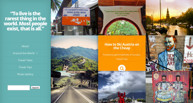
Gemma Fottles
The theme: Triton Lite
The look: Your front page has a masonry-style look on this free theme, and post excerpts are displayed underneath featured images, which offer context even before readers click through to the post. Because of the grid’s staggered style, both horizontal and vertical images work well, although you can quickly change the look of your front page, as seen on Veggie Zest‘s use of vertical images only (below).
Seen on: Veggie Zest, Africa Far and Wide, Laura Nathalie Travels, the official PicMonkey blog
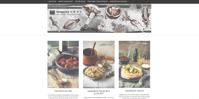
Veggie Zest
The theme: Gridspace
The look: This is a modern portfolio layout for horizontal, vertical, or square images, which you can specify in the Theme Options panel. A premium theme, Gridspace is great for professional portrait or landscape photographers, or even music or book reviewers who frequently display album and book covers; the uniform look of the front page is very clean. Elegant and uncluttered posts and pages mix image and text well.
Some cool extras: you can toggle from the grid view to a list view — to see this in action, look for the pair of small icons at the top right of a site using Gridspace. You can also switch between light and dark color schemes, which dramatically changes the look, as illustrated in Nathan and Phil’s sites below.
Seen on: Nathan De Ruwe (dark scheme, vertical thumbnails), Phil Kneen Photography (light scheme, horizontal thumbnails)
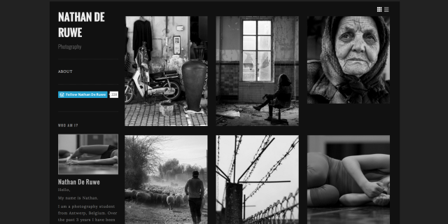
Nathan De Ruwe
The theme: Duotone
The look: This simple, straightforward theme is great for daily photoblogging. Its colors change to match the first image on a post or page. (If you don’t want the background to change, you can set the color in Appearance → Background.) While the themes we’ve discussed so far showcase your photography in portfolio-style formats on the front page, Duotone is perfect for highlighting a single image at a time. In the post, the photo’s EXIF data is displayed, if available.
Seen on: The Amazing Sky
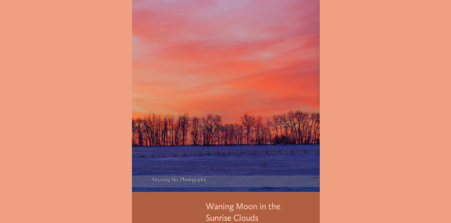
The Amazing Sky
The theme: Modularity Lite
The look: With Modularity Lite, you can showcase photographs on a simple, minimal layout, and this free theme works best when you upload large images (at least 950 by 425 pixels). You can also remove the sidebar, which gives you even more room for gorgeous high-res images, as shown on Christopher’s blog below.
We also dig how Christopher organizes his photography in a custom menu with clear categories (landscapes, wildlife, travel). Not only are his images stunning at full size, but he makes his content easy to find.
Seen on: Christopher Martin Photography
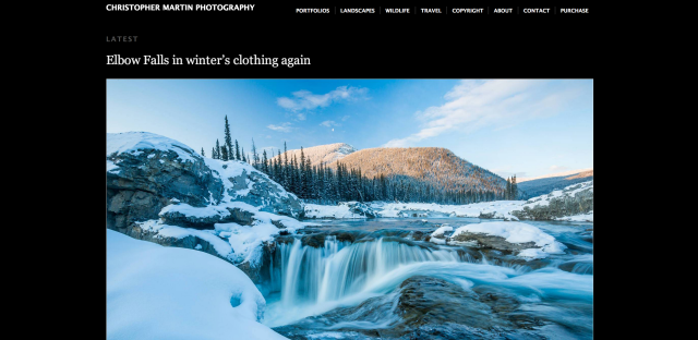
Christopher Martin Photography
The theme: Nishita
The look: Placing this theme alongside the previous two — Duotone and Modularity Lite — you can see how they’re similar, with slight variations. Nishita is also minimal, with light and dark color schemes, and works best when you upload very large images. In fact, in the Theme Options panel, you can choose between two layouts (the photoblog layout for images of 1024 pixels wide, or a slimmer blog layout for images of 768 pixels wide — and better readability of your text). But no matter which option you choose, Nishita makes your photography shine.
Seen on: Life in a Photograph, Emily Robinson Photography (which uses a static front page gallery)
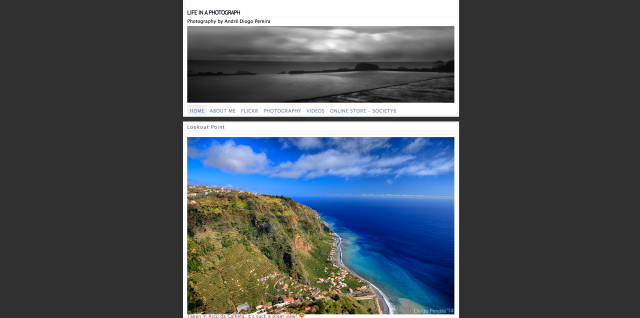
Life in a Photograph
The theme: Duet
The look: As you browse blogs using classy premium theme Duet, it feels like you’re flipping through the pages of a glossy magazine. The two-column layout incorporates prose and photographs into a beautifully woven narrative, so the theme is well-suited for longform writers who also love taking pictures.
It’s a powerful theme: in addition to displaying your posts in two columns in the Standard format, you can also showcase your images at full width using the Image format, as seen on The Squeaky Robot‘s post, “Backstage.”
Seen on: 2 Sojourners, The Squeaky Robot
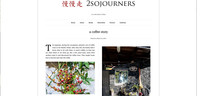
2 Sojourners
The theme: Suits
The look: Streamlined for personal blogging, the recently launched Suits theme has a one-size-fits-all design, and a number of bloggers are already using it to fit their writing needs. But don’t overlook it as a flexible photoblogging theme, as seen below. From single photo posts to photo essays, Suits‘ simple layout offers a great foundation for photography.
Seen on: Art Music Photography
Art Music Photography
Are you using one of these themes for your photography? Are there other themes you prefer?
Currently blogless? You’re a click away from sharing your story.
Create your blog at WordPress.com


These themes look great. I’ve been using Fontfolio for about a month and am still loving it – it has everything I want for my blog – but I might give these a try.
LikeLiked by 1 person
Twenty-Twelve should be on this list.
LikeLiked by 1 person
So many themes (over 250!), so little time.
I agree that our default themes (Twenty Eleven, Twenty Twelve, Twenty Thirteen, Twenty Fourteen) could very well be included here! They’re all flexible and versatile and look great, no matter the content you’re publishing.
LikeLike
I use 2012 in full width. My “about” page is set up like a fixed page with widgets at the bottom, but it does not load like a fixed page. That way I have a full width tumble blog with infinite scroll and the widgets are tucked away on the “about” page.
LikeLike
Wow these themes are breathtaking!!! I’m a amateur photographer who likes to take pictures of scenery, wildlife, museums, and the occasional historical battle with cannon and musket fire for fun.
LikeLike
I just looked at your blog abwarren2014 and it was very well structured well done! 🙂
LikeLike
Great Article Cheri! And thank you very much for using my blog as an example, you just made my day! 😀
LikeLike
You’re welcome 🙂
LikeLike
Thanks for the helpful information and instruction.
LikeLike
I use Modularity Lite and like the clean lines..
I see a few other themes I like as well!
LikeLiked by 1 person
Nishita also has become my favorite for two of my blogs: Gallery Ludwig ( http://galleryludwig.wordpress.com/ ) and Silver Canvas ( http://silvercanvas.wordpress.com/ )
LikeLike
great themes , well done
LikeLike
Thanks Cheri. So much choice and all brilliant.
LikeLike
Hello! For my photo blog I use the theme “vision” http://theme.wordpress.com/credits/artetic.net/. I’m quite new with WP but I think this theme is a great theme to show my photo work. Don’t you?
LikeLike
These are all excellent themes for photoblogs, in fact I used Modularity Lite for years. Now I use Full Frame and just love the full width feature images on the home page as well as the large images for individual posts. WordPress has something for everyone! Many thanks.
LikeLike
This is great! Thanks for this information. I was wondering if you have any cool themes to show case poetry or smaller works of prose?
LikeLiked by 1 person
For poetry, I would use Syntax. Gives you option of a photo.
LikeLike
Thanks a ton Jean. I will check it out 🙂
LikeLike
I don’t think we have themes made specifically with poetry in mind, but this is a great question and perhaps something we can address in future post.
That said, I’m sure a lot of our themes will work well with poetry and shorter posts. You could try hunting through the poetry tag for examples in the meantime.
LikeLike
Hi Cheri! Thank you for this. Are the themes all device-agnostic (the photoblogging themes features here)? Tnx!
LikeLike
Do let me know if I haven’t answered your question, but when you say “device-agnostic,” I’m guessing you’re wondering if these themes display properly and at their best on any device/screen size, from laptop browser to Android phone to iPad mini. The general answer is yes, and our newer themes are responsive (layout is supported on all screens), although you can check the quirks/specifics/details of each theme on its page in the Theme Showcase.
LikeLike
Greetings Cherri. Am using Customized Photographer Theme, which suits my combination of photos & stories. Allows the pics to be viewed in large scale which is great. Thanks for all the info on other possibilities.
LikeLike
I might have a wee addiction to looking at blog themes…thanks for feeding that today :-). And thank you for including my blog! I feel so honored. (I love your tiny house blog by the way. I get to live one of my dreams vicariously through your adventure.)
LikeLiked by 1 person
Happy to feed your addiction! Thanks for checking out my tiny house blog.
LikeLike
Thanks for the post !!!!
I use “The Under the Influence Theme”. I remember the days when I spent continuous nights trying to finalize the design for my blog. Under the influence had severed me really well. It is free, width can be custom set (this was critical for me as I was looking to use all the real estate for the photos but still have a side bar, header is customization, decent menu and color combinations !!!
LikeLike
Great themes I will check them out 🙂
LikeLike
Out of curiosity i checked few, and liked most
LikeLike
nice theme.. like this..
LikeLike
Awesome
https://www.facebook.com/Kegarchaslifema
LikeLike
This is really nice.
LikeLike
Cool
LikeLike
I’ve been using the Duotone theme for several years now, its design is timeless and never outdated. It also it one of the last photo blog themes to have right-click disable built into it. Thanks for sharing this theme.
LikeLike
I’m one of those who can become a tad obsessed with finding the prefect theme. After hours, no days searching I settled for the free The Ever After Theme for my Green Rivers blog – http://greenrivers.wordpress.com
It gives a large framed main image for each photo album and the images within the site (even without customising) look great 🙂
LikeLike
Reblogged this on UNMASKED and commented:
Great information for those of us who are overwhelmed by choosing the best site for our work. Love it!
LikeLike
Come check out my blog post please!
LikeLike
This designs are lovely. Actually they giving me motivation to do photography.
LikeLike
nice
LikeLike
Really helpful, thank you!
LikeLike