Photographer Ming Gullo discusses the fundamentals of color.

Our next stop in our Photography 101 series focuses on yet another essential element of photography: color. In this two-part post, talented WordPress.com photographer, Ming Gullo of A View with Ming, introduces us to the fundamentals of color, from temperature and white balance to hue, saturation, lightness, and contrast. The images on her blog, and below, are vibrant and stunning. Enjoy!
How a camera looks at color
To understand how our cameras recognize colors, let’s first talk about how our eyes recognize colors.
As you may know, white light consists of many different color lights with different wavelengths. For example, we see a red apple. The reason why it’s red is because the surface of the apple reflects the wavelength of red light into our eyes. At the same time, the apple’s surface absorbs the rest of the color lights, so we see the apple only as red.
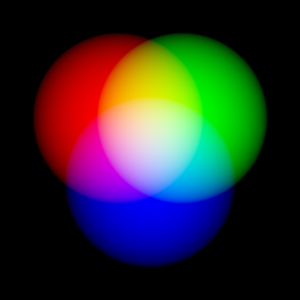
Our eyes have three different sets of nerves to recognize three primary colors: red, green, and blue (or the RGB spectrum). These three colors can be mixed together in different variants to produce different colors. So, let’s say we’re looking at a flower. If the surface of the flower reflects more blue light, a little bit of red light, and no green light, we will see a purple flower (or close to purple, depending on the ratio). When an object reflects the three primary colors in the same ratio, we’ll see this object as white.
Camera films and digital camera sensors recognize colors in a similar way. Here, I’ll focus on digital cameras since they’re commonly used among many of you. Digital camera sensors consist of pixels, which collect photons (energy of light) when the shutter is pressed. To be more accurate, instead of saying “collecting photons,” let’s say “capturing the intensity of photons.” More photons means the pixels are brighter, and vice versa.
So, if all we’re measuring is brightness and darkness, how do we get color? That’s why our digital cameras have filters. A filter works in the same way our eyes work — filtering red, green, and blue. The filter causes pixels to register photon intensities for one of the three colors, and once the full image is captured, it is digitized into an output like RAW, JPEG, or TIFF, which we’ll cover later, in part two.
Color temperature and white balance
Understanding color temperature is crucial in photography, and visual fields in general. In simple terms, each light source has its own individual color. Indoor light sources, such as candles and tungsten bulbs, give off light that’s close to red. Some outdoor lighting, such as sunsets, also looks reddish. These light sources give photos “warm” looks. On the other hand, daylight gives off a “cool” bluish light.
Here’s a set of macro droplet shots captured in a controlled environment. The light sources are a couple of sets of compact fluorescent lights (CFL). At a glance, you can see how the shot varies in three different settings:

Drops of Beauty, with auto WB setting.

Drops of Beauty, with preset WB setting.

Drops of Beauty, with manual WB setting.
This first photo, which I shot using the camera’s automatic white balance (WB) setting, has a very warm tone:

Drops of Beauty, with auto WB setting of the camera.
I shot this second photo using the camera’s fluorescent preset, in which the camera applied its best guess corrections:

Drops of Beauty, with preset WB setting.
Finally, the third image uses manual WB settings, which is adapted for the white CFLs I used:

Drops of Beauty, with manual WB setting.
A closer look at temperature and white balance
To understand how we achieved these different images, let’s talk more about color temperature. Color temperature is stated in Kelvin (K) — if you’re curious, take a peek at the color temperature chart below on the right.

Source: DigitalCameraWorld.com
When I try to capture accurate colors, I take color temperature into account and set the camera’s white balance based on my experience with familiar light sources (or using the camera’s own smarts). Digital cameras usually provide a number of color temperature presets, such as Tungsten, Daylight, Cloudy, and Shade.
If you’re not picky about being accurate — since the preference of color is highly subjective — 8 out of 10 times your camera presets do a pretty good job. However, fluorescent bulbs usually don’t provide consistent color of light, and since compact fluorescent lights (CFLs) emit light from chemical reaction instead of heat, it’s more confusing when you’re trying to figure out the color temperature.
Luckily, vendors like GE and Sylvania usually provide a figure known as Color Rendering Index, which measures how accurately a light source represents standard color. A bright white CFL usually measures from 3500 to 4100 Kelvin (K), warm/soft white CFL usually measures from 2700K to 3000K, and an average daylight may range from 5500K to 6500K. That said, the shot #2 above appears a little too “cool” for me — it didn’t accurately capture the daisy’s powder pink color.
Shooting outside in daylight
Most of us take photos under daylight. Daylight is produced by the sun — and so is moonlight. Daylight is visible even when we can’t see the sun! So, the color temperature of daylight can vary greatly. When sunlight is direct, it can be bright and harsh. The color temperature of a sun-filled noon may be 6500K. At other times of the day, when the sun is not as high, the color temperature on average is around 5500K. During golden hours (the one hour before dusk and after sunrise that Wenjie mentioned in a previous post on light), the color temperature of daylight may dip as low as 2000K.

Halo
Capturing a satisfactory moment requires dedication and patience. I shot this halo photo during one of the coldest days of winter, on the south shore on Long Island, New York. If you know the geography of Long Island, you know most of the shoreline doesn’t face east or west. I’d been trying to scout a sunset location for a while until I found a west-facing marshland on Long Island’s south shore. Beyond the marsh, there is a wide-enough waterway where nothing blocks the sun. The best sunset here, from my experience, is in January and February.
That day, I got there around 5 pm, walked about a mile in 4 ºF (-15 ºC) wind chill to reach my location, and waited. I’m happy with how the wind-swept reed came out! I also got some additional rewards on the way:

Looking Back. A young deer jumped out of the reed and looked at me.
An assignment from The Daily Post editors:
Phew! Ming has introduced a lot in this post about color, temperature, and the settings that affect our shots. If you’re up for it, let’s experiment! We can start simple:
- Choose an object and shoot it indoors under a light bulb. Then, photograph it under a different light source. Notice any differences?
- Drag a photo into an easy-to-use photo editor like PicMonkey and click on the Colors tab to adjust the “temperature” setting. What happens to the image? What type of temperature do you prefer? (You can also experiment in your software or editor of choice, like Photoshop, Picasa, or something similar.)
The Colors setting in PicMonkey.

In part two, we’ll take a look at hue, saturation, lightness, and contrast, which some of you may already know about. Ming will also share more of her colorful photography — check in tomorrow!
About Ming Gullo
 I’ve been always a lover of art. I went through formal training of painting and illustration when I was younger, where I learned the basics of art. Over the years, I’ve been a freelance children’s book illustrator, graphic designer, and web designer/programmer. For me, photography is a perfect marriage of art and technology, which satisfies both sides of my mind. Currently, I’m based on Long Island, New York. You can see my work on Facebook, 500px, and WordPress.com. You can also find my work in magazines — such as Photography Masterclass and N-Photo — or on Nikon Germany’s Facebook page.
Previous posts in the Photography 101 series
- Philosophy of Photography
- Viewing the World with a Photographer’s Eye, I
- Viewing the World with a Photographer’s Eye, II
- The Fundamentals of Light
- The Quality of Light
- The Rules and Elements of Composition
- Finding the Best Shot — Portrait or Landscape?
- Finding Your Focus
- Establishing a Point of View
- Shape, Line, Texture, and Pattern
Currently blogless? You’re a click away from sharing your story.
Create your blog at WordPress.com


Love Ming’s work – nice to see it highlighted here! Excellent tutorial.
LikeLike
Glad you enjoyed this — she’ll have another post tomorrow, which is great as well. The photos selected to illustrate her points are spot on.
LikeLike
As someone who doesn’t have any background or education on photography, this was a VERY insightful post. Absolutely loved it, thank you so much for sharing it! I feel like I’ve just been inspired.
LikeLike
Glad to hear this! More on color tomorrow, so please return for part two 🙂
LikeLike
I’m excited!
LikeLike
So perfect photos ❤
LikeLike
Picmonkey is a cool tool btw, easy to use.
LikeLike
Thanks for informative articles like these, but the color temperature and such technical terms are difficult to understand. It will be better if the author could have a small box at the end indicating what we need to do on the camera, in which situations (in short). Thanks.
LikeLike
Thanks for the feedback — there’s so much packed into this (and the next) post…so much we can share. Noted for the future.
LikeLike
UR sooooo Good… 😉
LikeLike
Superb tutorial, very informative.
LikeLike
I really enjoy these photography tutorials. This weekend I hope to get some good photos outside too and try to implement some of the techniques mentioned here.
As Ming said, “Capturing a satisfactory moment requires dedication and patience.” So true.
LikeLike
Great tutorials on how to create such wonderful pictures. Thanks.
LikeLike
Excellent work. Good tips 🙂
LikeLike
this explains a lot that I never really understood about photography. Thanks!
LikeLike
Great article! Helped me understand photography more than I ever thought I could. Thank you 🙂
LikeLike
WOW!!!! Amazing!!! 😀 thank you!!
LikeLike
I know nothing about photography, but I’ve always had a keen interest and my daughter is currently going to school for photography. This picture of the flower with the water drop with the flower reflected in it is just incredible! Really beautiful. I look forward to learning more on your blog.
LikeLike
Oh! I’m so happy to see this! 😉
LikeLike
Thanks, Merilee, for suggesting Ming for this topic — as you can see, the results were stunning!
LikeLike
I’m so very, very pleased. Her work makes me stop dead in my tracks. She is simply amazing and I’m very happy that her work is being seen! Thank you 🙂
LikeLike
I am fascinated by photography, so reading up on technique and obtaining new insight to improve photos is always great. I hope to be able to improve my photography skills.
LikeLike
Wow! This is wonderful! Thank you for sharing these tips and gorgeous images!
LikeLike
a very well written article!
LikeLike
You surely have an eye for beautiful things/nature….I love it!
LikeLike
You are even talented in the art of being clear 😉 Thanks!
I will follow you.
MARTA
LikeLike
I agree — this post was not only thorough, but very clear.
LikeLike
Ming has explained colour so well that I feel I must read, write and remember once and for all – truly inspirational
LikeLike
Wow!!!
LikeLike
Very Nice!
LikeLike
Great pic’s and great tutorial! Well done, Ming!
LikeLike
This is great, thanks!
LikeLike
how wonderful it is……
LikeLike
Nature is teaching us to see what is beautiful
LikeLike
What breathtaking pics.
LikeLike
Beautiful photos, love the nature theme. “Drops of Beauty” is just incredible.
LikeLike
I have been wanting to pick up some photography skills for some time now and I must say this post explains things really well and makes it easy to understand! Thank you!
Lovely photos too!
Looking forward to more posts like this!
LikeLike
beautiful http://maykhoandetu.wordpress.com/
LikeLike
Wow, makes me wish I was a photographer
LikeLike