
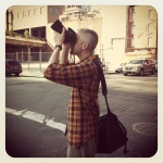
Now that we’ve covered a number of fundamentals in photography, from composition and light to focus and POV, let’s now think about elements out in the world that we can use to create more visually interesting images: shapes, lines, textures, and patterns. Today, we’re excited for photographer Evan Zelermyer, the blogger at Urban Mosaic, to share his ideas and illustrate shape, line, texture, and pattern through his urban, architectural, and abstract photography.
Urban Mosaic is the result of many years spent exploring New York City’s five boroughs, searching for interesting sights and finding lesser-known nooks and crannies. New York is a large and varied place, and serves as an endless source of visual inspiration. The goal on my blog is to provide a fresh perspective on familiar urban sights (streets, subways, architecture, etc.), and also to reveal hidden beauty in the marginal, little-noticed details of everyday city life.
Take your photography blog to the next level with a custom domain, advanced design options, and more storage space — find a WordPress.com plan that’s right for you.
An introduction to four elements
Shape
Particularly in a busy city environment, isolating a subject’s unique shape is an effective way to create an image with dramatic impact. Recently, I’ve produced successful material by shooting directly upwards and finding unusual shapes outlined against the sky. And don’t forget — negative space counts, too! The “blank” areas in a photograph can be just as important to a composition as your ostensible subject.
Billboards in Manhattan.
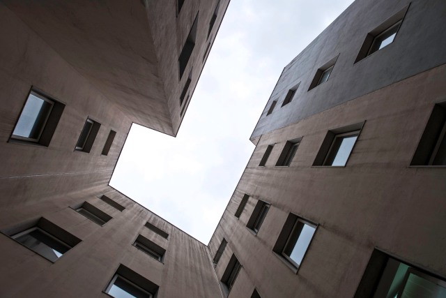
Architecture in Lisbon, Portugal.
Another way to highlight an object’s shape is by using lighting effects — for instance, interposing the object between the camera and a light source to create a stark silhouette. (Editor’s note: For more on lighting, check out previous posts on light fundamentals and the quality of light.)

Winter leaf.

Water tower in Brooklyn, New York.
Line
I frequently make use of strong diagonal lines to convey a sense of motion and energy in a photograph, whether it’s a close-up or a wide-angle overview.

Close-up: subway detail.
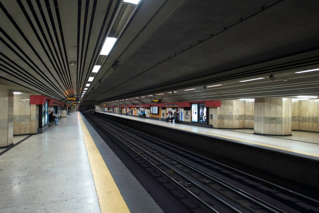
Wide-angle overview: metro station in Lisbon, Portugal.
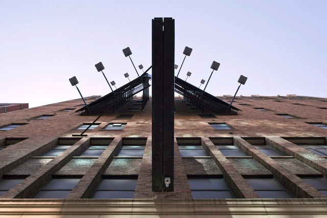
In architectural photography, you’ll often see converging lines of perspective. I sometimes magnify perspective by shooting very close to the subject — producing a set of strongly angled lines that pull the viewer into the picture.
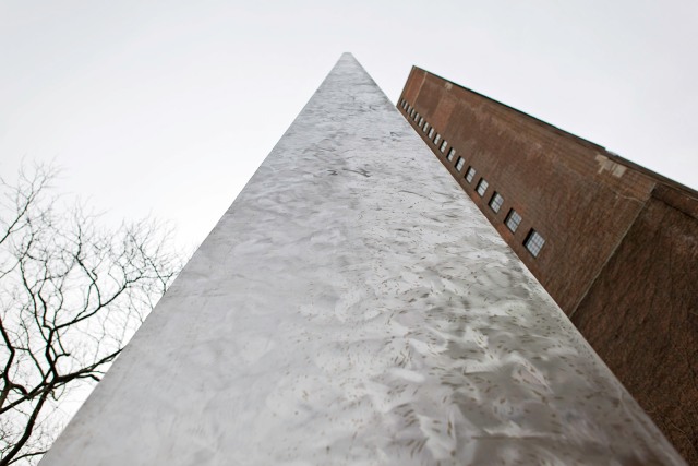
Outdoor sculpture in Manhattan.
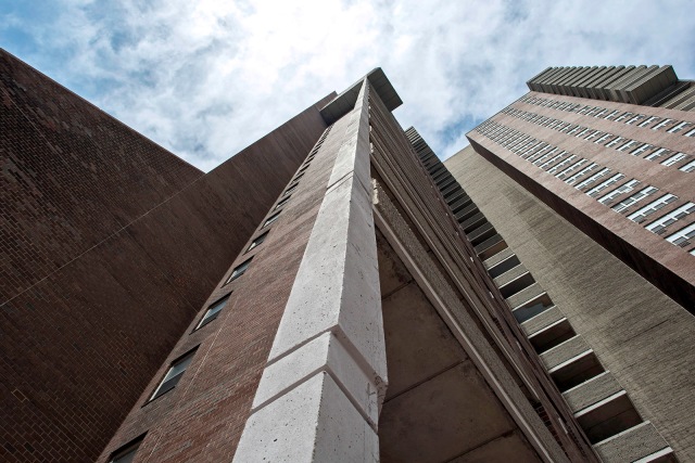
Apartment building in Manhattan.
Texture
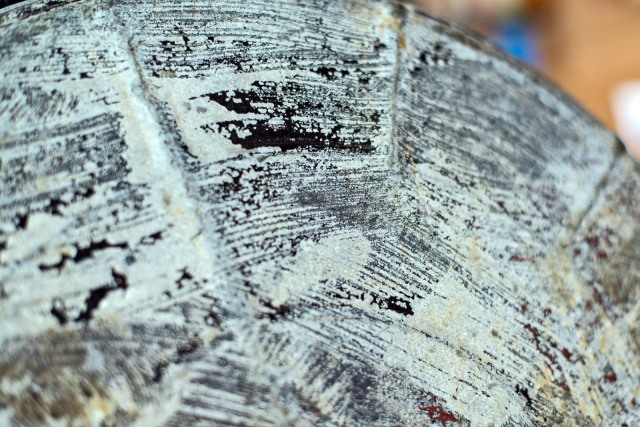
Textures surround us, on every object or surface. Zoom in closely enough on almost anything and it will start to look really interesting. The trick is to decide exactly what level of magnification creates the most effective image. Remind yourself to point the camera at subjects you wouldn’t ordinarily pay attention to: even surfaces that from a distance appear ugly or dirty can be revealed as startling, and even beautiful.
Detail of a trash can lid.

Metal texture detail.

Architectural close-up.
Pattern
One of the simplest ways to produce a striking image is by filling the entire frame with a strong pattern.

Library card catalog.

Windows in Lower Manhattan.
To add a level of complexity, find subjects that interrupt regular patterns, like the shots below. The interplay between the pattern and its disruption brings an element of surprise that keeps the viewer’s eye moving back and forth around all areas of the picture.

Winter stairs.

Street crossing in Manhattan.
Where can we find shapes, lines, textures, and patterns when we’re out taking photos “in the wild”?
The short answer is: everywhere! My advice, especially to beginning photographers, is to look at your immediate surroundings with a fresh eye — to make the familiar and ordinary into something new and striking. One of the most exciting things about photography is that your relationship with your camera is a two-way street: although you choose what direction to aim your camera and when to take a picture, the viewfinder can teach you to see your environment in completely new ways:
- Point the camera in unexpected directions . . .
- Tilt the frame at unusual angles . . .
- Zoom uncomfortably close or oddly far back . . .
. . . and be open to surprises!
A mini-assignment:
Pick an ordinary object that you see every single day — something at your home or office, or along your daily commute — and find as many different ways of photographing it as possible.
- How does its shape change under varying lighting conditions?
- What kinds of lines and angles are created when you view it from different perspectives?
- What textures and patterns do you discover as you zoom in or out?
If after this experiment your subject looks different to you — even when you’re not pointing your camera at it — you’ll know you’ve learned something both about photography and about seeing the world.
Some of your work is abstract, which creates a very different feel. How can bloggers use abstract photography to enhance their own sites?
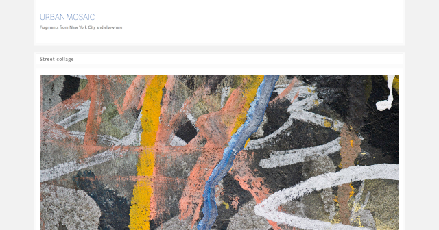
Some bloggers stay firmly focused on a particular subject matter or perspective, which can work very well, especially if you have a very specific point of view to get across. But on my site I take the opposite approach, using a variety of perspectives to try to keep the blog fresh and surprising. Since I personally am drawn to abstract art (painting, collage, etc.), I create these kinds of images with my own photographic techniques, and add them to the more traditional urban subjects on my blog.

Street collage in Manhattan.
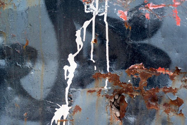
Construction dumpster detail.
Why did you choose the Nishita theme for your blog? How does the design complement your images?
For photoblogs, I prefer clean and simple designs that allow the photography to stand out on the page. Nishita provides just enough framing detail to look “designed,” while remaining subtle enough not to compete with the blog’s content. I appreciate the way Nishita gives my photos that extra “pop” — similar to what an elegant picture frame would do for a print hanging in a gallery.
What features in your WP.com dashboard do you especially like for displaying your images?
I recommend using the Top Posts & Pages Widget. It encourages newcomers to explore older posts that might not otherwise come to their attention, and also gives a sense of what kinds of posts on your site are provoking an enthusiastic response.
A few more tips from The Daily Post editors:
Tiled galleries. Images with prominent shapes, lines, textures, and patterns look great, side by side, in tiled galleries. Abstract and close-up images juxtaposed in a square tiled gallery look especially interesting, too.
Image widgets. Add textures and geometric designs to your sidebar by displaying image widgets down the side. While they can link to somewhere else, they don’t have to: they can be purely ornamental.
Design with care. If you have a photoblog, remember that your images take center stage — ultimately, you don’t want your site to look too “busy.” Some of the sleekest photoblogs we’ve seen have solid backgrounds — rather than patterns and images — and keep their custom header design minimal, so it doesn’t detract from their posts.
Look for inspiration. Love Evan’s photography? Check out other bloggers who experiment with textures, patterns, and abstract images, like Luigi Benedetti, Documenting the Obvious, and Focused Moments.
About Evan Zelermyer
 Evan Zelermyer is a photographer and designer living in Brooklyn, New York. A longtime Nikon user, he shoots with a Nikon D800 and a small selection of prime lenses, his favorites being the 24mm f/1.4G and 50mm f/1.4D. An overview of his abstract photography can be seen at evanzelermyer.com, and you can follow his explorations of New York City on WordPress.com at Urban Mosaic or on Twitter or Facebook.
Previous posts in the Photography 101 series
- Philosophy of Photography
- Viewing the World with a Photographer’s Eye, I
- Viewing the World with a Photographer’s Eye, II
- The Fundamentals of Light
- The Quality of Light
- The Rules and Elements of Composition
- Finding the Best Shot — Portrait or Landscape?
- Finding Your Focus
- Establishing a Point of View
Currently blogless? You’re a click away from sharing your story.
Create your blog at WordPress.com


nice
LikeLike
Nice 🙂
LikeLike
Some wonderful tips. I especially liked the Potugal shot looking up with the white space. Interesting shapes and completely different POV than I normally take. Great idea!
LikeLike
Great tips .I will be doing a walking tour of Brooklyn in Oct. and will be putting your advise to work! Thanks from a beginner!
http://giberson9.wordpress.com/2013/09/17/photography-10…re-and-pattern/
LikeLike
Super – I loved the shots that focused the buildings above. Tall buildings might be required for them or short ones also create a good effect? I wonder if we need to lie down while taking shots that focus vertically up?
LikeLike
I’ve found myself lying down on the ground sometimes (anything to get a good shot!) 🙂 I think tall buildings work great for these types of angles, though I think you can experiment with any kind of structure/height.
LikeLike
And I bet you’ve gotten some really strange looks while you were at it too. I know I have. 😀
LikeLike
Reblogged this on tothetable.
LikeLike
Love the dynamic abstraction in a lot of these shots…
LikeLike
Me too!
LikeLike
Reblogged this on Wind Against Current and commented:
This is the tenth installment of Photography 101.
LikeLike
Love, love, love these photography posts. They’ve helped me out so much that I’ve thrown editing out the window and am focusing on taking better photos at the start. I confess I don’t do much of this type photography but, after reading this, I will. Inspiring. Fun, too!
LikeLike
Really glad to hear you’re enjoying these photography posts and hearing from various photographers in our community — It’s been fun hearing about different techniques and insights into the craft.
LikeLike
Yip i feel more educated after every post =P
LikeLike
Reblogged this on blogagaini.
LikeLike
great tips
so many angles can be taken on one object
photography makes life more fun…
LikeLike
this looks really cool, especially in that point of view.
LikeLike
Reblogged this on karmilahippy and commented:
Yeyy
LikeLike
Reblogged this on xandervillanueva2 and commented:
awesome
LikeLike
The Shapes of Man vs. The Shapes of Nature http://wp.me/p3O4MN-ep
LikeLike
Reblogged this on Made With Love, Props & More! and commented:
This is such a GREAT article about shapes, lines, textures and patterns in Photography – I just had to share!!
LikeLike
Reblogged this on Charles Ray's Ramblings.
LikeLike
wow
LikeLike
Reblogged this on Dancing in the Reign and commented:
This photo is absolutely amazing!
LikeLike
Reblogged this on kmwebster2013's Blog.
LikeLike
thanks a lot for the honorable mention of .documenting.the.obvious! and yes, evan’s stuff is fantastic 😉
LikeLike
that’s .documenting.the.obvious of course… missed the http…
LikeLike
Reblogged this on Jasper Smits.
LikeLike
Reblogged this on DePaul University.
LikeLike
Reblogged this on Magic, Gaming, and all Things NERD & Otaku.
LikeLike
Reblogged this on Alejandra JL and commented:
Nice, Tower, Lines
LikeLike
Reblogged this on Kansa Muse on Micro Farming and More and commented:
Nice post on photography.
LikeLike
Hat dies auf Aylin's Wonderland rebloggt.
LikeLike
Reblogged this on Bridget's Blogfolio.
LikeLike
Yet another awesome post, great how you can change the way you take pictures just by using contrast and lines basically. Awesome info, thanks!
LikeLike
Reblogged this on and commented:
This photo reminds me a lot of one of the main digital assignments we had last semester. It really captures the idea of shape, line, texture, and pattern, and has a really nice composition in general. I love the way the light and shadows are cast on the side of the building.
LikeLike