Every week we read scads of amazing content via our WordPress.com Reader — everything from personal think pieces to political diatribes, travelogues to photo essays. Sometimes a post makes us stop in our tracks and read (or view) it again. We’ll take a closer look at some of those pieces and what made them stand out, in the hope that we can all learn something about how to make our blogs the best they can be.
One of the pieces that really stuck out for me as a fascinating experiment, this week, was “foodface – my friends and what they ate (part two).” I was drawn in not just because the photographs in the post are beautifully inventive and really nicely executed, but also because they embody something I think everyone hopes for in a stand-out post: arresting imagery, a different take on familiar themes, and fascinating ideas that add up to more than the sum of their parts. Here’s the lowdown.
Arresting Imagery
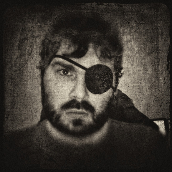
Now, in the case of this post, we’re literally presented with some incredibly arresting images. Images that call out to you from the Reader, and invite you to spend some time with them. Images like this:

Image by Elize Strydom @ Olive and Oak.
But whether we’re looking at a photo journal like Elize’s, or a written piece, the importance of a powerful image, or an evocative opening line, makes all the difference. We’re constantly bombarded by images and words throughout the day, and to stand out and make us pay attention calls for more than a dash of inventiveness.
In this case, Elize wanted to go beyond — and perhaps embody a critique of — the endless images we see online of people’s meals. While there are some truly beautiful, incredible examples of foodtography, there comes a point where seeing one more image of a nice table setting and a well arranged meal, with some soft focused background goodness gets… well, a little old. Instead, in this sequence, we have photos that create a double-exposure superimposition of the eater and eaten, and the novelty proves arresting.
A Different Take
It’s this different take on a familiar idea that attracts us, and a lot of readers, to posts that really inspire and stick around in the memory long after we first find them. We’re at once presented with the familiar — something we may either be interested in, be tired of, or even antagonistic toward — but then have our familiarity disrupted, and the result is impact, and a feeling of having seen something refreshingly different.

Image by Elize Strydom @ Olive and Oak
It’s something that works whether you’re writing about politics, or taking photos of your pets. In the case of “foodface – my friends and what they ate,” the familiar portrait and food shot are combined creatively, in such a way that the one has been thoughtfully juxtaposed with the other. The idea would still be novel if any old food photo had been paired to any old portrait, but here we find that the composition lets the two play off one another, and the results are remarkable.
More Than Their Sum
That feeling of the remarkable comes from the sum of the ideas put together transcending their individual parts. An inventive photo sequence like this, much like any well considered post — be it creative writing or sports commentary — finds a way to put seemingly disparate ideas together and make them feel compellingly, refreshingly whole. That “why didn’t I think of that” feeling often happens when confronted with these moments, and that’s more a testament to the creativity of the author than the obviousness of their endeavours.
Creative Clash
How could you, or have you, arrived at compelling or arresting ideas for your posts or photos by playing with unexpected pairings, or taking a wilfully different approach to a familiar subject? Let us know in the comments.
Currently blogless? You’re a click away from sharing your story.
Create your blog at WordPress.com


I can see the cleverness, the technical skill in making the composites, however for me they serve to put me off the eater, the meal, and the blog. I much prefer a composite that fits the pieces together instead of showing how they can merely be put over each other.
I have both seen and attempted new perspectives, new images, created from the mixture of two or more separate concepts, but putting the items together was only the first step. After that the posts I found successful created a greater whole from the mixture, rather than a concealment of parts of each.
LikeLike
I agree. I like the idea behind the photos but is their relationship between person and food?
LikeLike
I did a post like that just recently. I was thinking to myself how surprising it is that we could have an iconic song about teenagers that starts with the words “load up on guns and bring your friends.” And it was released 8 years before Columbine…
What I decided to do was write a fictional piece about school shootings in which I incorporated the full lyrics of the song. (The result ended up addressing a second issue as well: problematic teenage sexual behavior. The post contains some strong language but no explicit content.) It’s either one of the best or worst posts I’ve written:
The song lyrics are in standard typeface and the whole song is in there; my additions are in italics. Each color of text represents a different speaker.
LikeLike
Years ago when I was studying photography the imposition of multiple images on a piece of light sensitive photographic paper was every first year student’s pet project. As you gain technical expertise in the darkroom however the learning curve insists that you up the ante so-to-speak and challenge this initial instinct to visually attract a viewer’s attention and evolve your inner creative spirit.
The pictures offered here are that initial attempt to shock and fire up a viewer’s sensibilities. However even the most talented pyromaniac realizes that anyone can strike a match but the truly talented person can astound an audience with a bit more planning, forethought and at times non gratutous visualizations that detract from the artist’s deeper creativity.
LikeLike
I love this. It’s so much fun!
LikeLike
Me TOO 🙂
LikeLike
Awesome!! Just totally mind boggling a true innovative skill – http://bbanublog.wp.com
LikeLike
I like the creative process here; i used the same technique for a different purpose … in drawing awareness to conservation issues … http://wp.me/p1wyZM-yf Would love to get feedback.
LikeLike
I Love these site!
LikeLike
V clever
LikeLike
I like to layer meaning, too. I enjoy pairing unlikely partners and giving readers a payoff for taking the time to pay attention to what I am trying to say. It is difficult to grab a stranger’s attention with something subtle, but the best epiphanies are those that come after a bit of work.
LikeLike