Backgrounds are just there. They’re the stage sets to our existences, and, as it happens our blogs. As humans, we’re more often far too interested in what’s going on center stage to give a damn what’s going on in the blurry, insignificant old background. Sword fights! Riots! Beautiful people! Dancing cats! Mars Rovers made out of chocolate! The background has a hard time keeping up with all that drama.
The thing is, while they’re never going to steal the show, backgrounds play a subtle but important role in setting the mood, tone, and feeling of any given scene. And your blog is no exception. So today, we put on our best overalls, get the roller out, and think about the joy of custom backgrounds.
I’m not going to bore you with too many technical details, because you can find them all in our handy-dandy support doc on Custom Backgrounds.
No, wait. Come back.
The main thing you need to know from a technical point of view is that if your theme supports Custom Backgrounds, you’ll have a “Background” option under the “Appearance” menu of your dashboard. It will probably look a bit like this:

If you don’t have one, move along. Or, erm, get a new theme. Luckily, most themes support them, so let’s assume you’re on board.
Now, as you’re armed with the right menu option to head to, the will to experiment, and a support doc on the minutiae of Custom Backgrounds, let’s put aside the how and instead think about the why:
Standing Out
There are hundreds of themes on WordPress.com, but there are also millions of bloggers. If you want to stand out from the rest of them, you’re going to want to make a bit of effort to customize the look and feel of your blog’s design. Changing the background is about as easy as it gets. Head to the Appearance > Background menu, and, um, change the background!
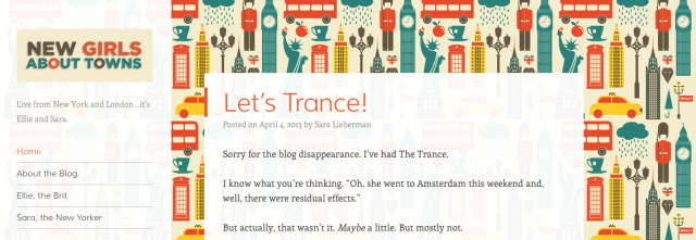
Here’s a great example from New Girls About Towns:

It makes all the difference to see a custom background, rather than the one used by default for a theme, and in this case the colors are vibrant, but also matched to those of the logo and headline typography.
If you want to stand out, then, you don’t need to pick a garish day-glo green, or that tiled repeating background with Santa’s head on it. While you might decide that those are winning options for you, first you’ll want to think about:
Setting the Tone
Is your blog about Axe Murderer Movies of the 1970s? Then, yes, that repeating blood spatter on a bright yellow backdrop might just reinforce the tone you’re trying to convey with the content in your posts. If, on the other hand, you’re writing about The Exquisite Elegance of Parisien Couture, Circa 1958, well, you might decide to choose something a little more gentle. Or, you know, elegant. Restrained. Or black. Because black is timelessly chic, n’est pas? Regardless, steal from the best by seeing how the designers of sites, books, films, or products choose to set off their work.
One Theology does a great job of tone setting through the minimal use of typography that repeats the key themes of the blog, as featured in the tagline, both in statement and in using a paired typeface that holds things nicely together:
So you’ve considered how to stand out without sticking out like a sore thumb, and how to hint at the tone, mood and content of your header. Before you finish, think, as both of our examples have so far, about:
Unifying Your Site’s Design
Too many colours, too many patterns, too much wild crazy action in the background, make for a busy, busy design that distracts the eye from what really matters. Remember, the background is there to gently reinforce the content in your posts. One way to do that might be to unify the background colour (or image, or pattern) with the colours featured in your header, for instance. Is your header image a pig’s head with an axe in it? Sample one of those Francis Bacon fleshtones with a browser-based color picker (here’s one if you’re using Chrome or Firefox) or else eyeball the rough colors of your image to find something complementary for your background. Boom! Instant design harmony.
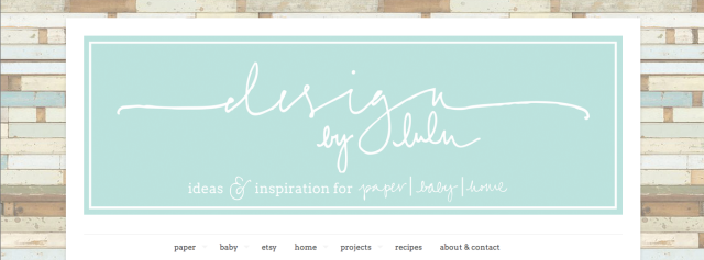
Design By Lulu is a great example of how, even with a repeating textured pattern, you can tie the header of your blog into the color scheme of your background to unify your site’s design. In this case, note how the pastel blues of the header are mirrored in some of the background, with the rest of the background colours proving complementary:
Moar Inspiration?
Check out Cheri’s post over on en.blog, where she talks through some of the design decisions made by bloggers tweaking the backgrounds on their blogs.
Over to You
Have you customized your background? How did you decide on the colour, pattern, or image you chose? Let’s see them!
Currently blogless? You’re a click away from sharing your story.
Create your blog at WordPress.com


Reblogged this on নিঝুম and commented:
তোমার অস্তিত্ব হীন অনুভূতি আমার সান্ত্বনার প্রথম উপাদান ।
LikeLike
I changed the theme on my blog from a customized one to one that was available on the site. but now i’d like to change it back. how can i go about this?
LikeLike
Thanks to everyone who shared their backgrounds and feedback!
LikeLike
Hey Michael, thanks for the post, do you have any suggestions (aka inspiration) for me as it relates to my blog? I’ve been holding off backgrounds until I know better.. any thoughts would be awesome! http://jcholman.wordpress.com/ Oh.. I did do a post on developing a mobile background that changes with the day.. would love, love, love and comments good or bad on it http://bit.ly/12Rk1Nd . thanks again, J
LikeLike
Hi there — took a peek at your site, which uses colorful featured images atop the Mixfolio theme. I actually like the plain white background for your site — your images are bold enough that if you added a background, especially a patterned one, it’d compete with the visuals. You wouldn’t want your site to be *too* busy.
LikeLike