
Setting up a blog is kind of like buying a house: first, you have to decide what neighborhood you want to live in. (Welcome to WordPress.com. You’ll receive your fruit basket shortly.) Then, you have to figure out what kind of home you’d like to have — that’s the theme you choose. Finally, you fill this new home with stuff — or, your content. Step number two can be a bit tricky, so that’s what we’re going to focus on today. Let’s pick a theme!
If your blog’s appearance is something you care a lot about, explore our different WordPress.com plans — some, like the Premium plan, come with advanced customization options and unlimited premium themes.
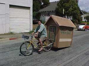
I’m not sure we have a theme that matches up with this one. (Photo courtesy of YardSale.)
There are many themes — 200+ — so you have a lot of options. It might feel overwhelming, especially if you don’t have a particular vision. Maybe you want a minimalist loft, like Publish. If you have a big art collection to showcase, perhaps you need a gallery like Hatch or Gridspace. If you want a home with personality, maybe you need a space that’s bold and stylish, like Resonar; or whimsical, like Balloons; or clean and elegant, like Libre.
Decisions, decisions! And within each of these broad categories, there are multiple options. Your loft could be dark and edgy like Vertigo, or clean and bright like Watson. Maybe your photographs will share space with the written word, so you need a design like React.
(It’s enough to make you want to move back into your parents’ basement.)
So what are some guiding principles that will get you into the perfect place? Let’s stop torturing the real estate metaphor and get to some concrete tips. Here are the big three to consider when you’re choosing a theme:
Your style.
No matter how popular your blog becomes, no one is going to spend more time on it than you, so make it a place that is comfy, good-looking, and reflective of you. You might admire the bold typography of Blog Simple, but if you’re personally drawn to the softer look of Toujours, you’ll be happier with that in the long run.
Why? Let’s beat down another metaphor: I might admire the woman who can pull off a perfect pair of skinny jeans, but when it comes down to it, I’ll only ever be comfortable in baggy trousers. If I put on the skinny jeans, I’ll be self-conscious and will spend all night tugging at my clothes to get them just so. Eventually, I’ll give up and leave them in the closet (my closet can attest to this).
So it is with your theme. Pick something that doesn’t speak to you, and you’re looking at lots of tweaks to try and make it feel like you. Eventually, you may find yourself blogging less and less, and all because you won’t admit to yourself that what you really love is the colorful, in-your-face look of Eighties. Set yourself up for blogging success by picking a theme you’ll like looking at every day. (Or, if you’re like most of us, a dozen times a day. You know you do. There’s no shame here.)
Your content.
If you have an idea of your blog’s focus when you’re starting out, you can narrow down the world of available themes. If you love photography and know you’ll post images in your posts, consider themes that will showcase them, like Harmonic and Snaps. If you haven’t touched a camera since your Polaroid bit the dust but you love writing poetry, there are themes that make your text the star, like Syntax and Manifest. There are also themes for specific purposes, like Soundcheck for your band’s website, or Restaurant for your — you guessed it! — restaurant.
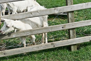
True story: if you search for Creative Commons photos of “confused house” on Flickr, you find a lot of sheep. (Photo courtesy of infomatique.)
What if you’re not sure what your site will be, or you envision yourself posting a bit of this and a bit of that? First, welcome to the 99% of bloggers. Second, the theme world is your oyster — there are plenty of themes well-suited for housing different types of posts. Chalk! Trvl! Passenger! Twenty Sixteen! Take a look, see what kinds of visuals you’re drawn to, and then consider our third pillar: your time and energy.
Your time and energy.
Our themes are designed to be easy to work with, but some can handle more customizing and futzing that others. Some, like the festive Cheer, are pretty much going to look how they look. Others, like Hemingway Rewritten, will let you upload a custom header image and make other tweaks to your homepage. Still others, like Zuki, have a variety of layout options for your front page and are highly configurable.
How much time and energy do you want to put into your theme, as opposed to the content you’d like to create? Be realistic about what you want to do. The last thing we want is for you to feel frustrated by your site — we want you to stick around and publish. When you consider a theme, look at its features and customization options, and let that be a factor in your decision.
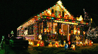
Perhaps this is your style; we won’t judge. Well, we might judge a little. (Photo courtesy of McBeth.)
There’s more to building a site than picking a theme (and note that you can also upgrade to WordPress.com Premium to make every little last detail just so). Still, your theme will be the skeleton on which the rest of the site hangs, so make sure it’s one you love. If you’re still trying to find The One, head to the Theme Showcase and take a look around (and use the filters at the top to narrow your search).
Bonus secret!
Maybe you want a seasonal holiday theme. Maybe you’re changing the focus of your site. Maybe you’re just indecisive. In any of those instances: you can always switch themes. Just go to My Site → Themes, search for and select a new theme, and click Activate or Purchase (both accessed under the three dots icon). This might not be something you want to do every week, but there’s no harm in trying something new or giving your site a fresh look.
Currently blogless? You’re a click away from sharing your story.
Create your blog at WordPress.com


Journalist 1.3 is the way to go. It has a minimalist look with one column. The column is 720 pixels wide.
LikeLike
I use Triton Lite for my photo blog (cat photos, of course!) and Notepad for my main one. I like Notepad but I’m always browsing through the themes and looking for something better…in other words, I waste a lot of time looking at new themes when I should be writing 🙂
LikeLike
Me too!! I must have changed my theme about eight times and in that rime wrote 2-3 posts, ridiculous|! I finally coughed up for a premium theme but it took me weeks to make that decision – but I am happy with the look and like others on this thread, t feels more like me than all the others so it was worth it. Now I’ve just gotta write…
LikeLike
I’ve changed my theme once, and my focus is, well, unfocused. I’m all over the place with nature blogs, humor, seriousness, wisdom, art, crafts and anything else I feel like writing at the time. I’m just happy to have a place to do it and meet some lovely people.
LikeLike
I’m using Parament because it is the ONLY theme that works with the look I want for my blog. I don’t foresee switching themes anytime soon.
LikeLike
Wow that was great,thanks
LikeLike
Loving Watson by the Theme Foundry — who incidentally provide brilliant customer service 🙂 — my secondary blog uses Linen (another of theirs) but this time I wanted a responsive theme. I also like strong typography with clean, white background, and most of their themes come with choices of font (also love Portfolio and React) — without needing a custom upgrade.
LikeLiked by 1 person
I’m very happy with my theme, Coraline. I like that I can use a header photo, and I like the menu tabs across the top. I don’t want it to look too cluttered, but I have a lot of widgets, so I like that I can just run them all down the right column. The typeface is bold, easy to read and uncluttered.
Whenever I read a post like this, I think about changing my theme, and start browsing. I think that maybe I’m in a rut and need to change periodically, but I keep coming back to the same one. Other times when I’ve changed themes, I couldn’t always get all my widgets to work, and that makes me a little afraid to step out there and try something new, even though, as you say, I can always change it back. Thanks for the information. Maybe one of these days you’ll spur me into making that change.
LikeLike
Darn it – now you’ve got me distracted looking at themes when I should be finishing my Christmas cards. 🙂
LikeLike
Spring Loaded’s theme still mine.. good and awsome.
LikeLike
I use FUNKI because it’s a simple layout and easy to read with a giant featured image at the top to grab attention. I’ve gone through plenty of themes and so far Funki is easily my favorite.
LikeLike
I use Adventure Journal because I like the paper textures and layered feel. Because my blog has multimedia content, I wanted a scrapbook to house my work and customized the theme with my own header and background. I wanted to expand on the existing theme and shape it around my personality.
Upgrades can help complete the look, and are ideal for creative types and tweakers who want more control of their blog. But as someone rightly said above, a good background and header can work wonders.
LikeLike
Hi @michelle
Thanks for writing this piece and I love this statement
“Pick something that doesn’t speak to you, and you’re looking at lots of tweaks to try and make it feel like “you.” Eventually, you may find yourself blogging less and less,”
It’s so true and it happened to me. When I first started blogging, I could not find a theme that “defines” me. So I was busy finding ways to tweak the theme than come closest. But wordpress.com had it’s limitation on customization and I did not really want to pay.
I discovered tumblr. Amazing… I thought. Custom CSS, however I want it. I was tweaking my theme every one two days. And I start to realize I was blogging less and less and spending all my time on tweaking the themes. I was also feeling less happy. Blogging/writing makes me think. Tweaking CSS does not.
So eventually, I set my mind on a theme on wordpress.com started writing. Because I did not want to pay, I was not able to tweak on my css. And that prevented me from busy tweaking and spending more time on writing.
I am now more focus on my writing and I think better. Thank you wordpress.com.
LikeLike
I use Twenty Eleven. I like the big custom header to capture a reader’s interest. Certainly I preview and fantasize for a few minutes with every new Theme, but come back to my present theme for blog. Part of my problem now is if I switch to another theme, it may require considerable time to realign text and photos. Then I ask myself: which is better more time spent crafting good blog posts or changing to nother theme.
I’ll revisit in a few months but I like my theme for its legibility and pleasing classic layout choices to jive both photos and text together in 1 unified whole.
LikeLike
Why don’t we see more dark themes to prevent eye stain. The few dark themes available have the tiniest annoying font. I use Motion but I have to tweak it a lot.
LikeLike
When I started blogging in 2008, I used Andreas04. I loved the dark grey background and thought I’d never change templates/themes. A year ago or so, I switched to Coraline because it’s user friendly and offers me the flexibility to play around with it. I love it and plan to keep Coraline for a long time. If I could, the only thing I’d change is to re-size the page so my photos can be bigger. Otherwise, I’m happy! 🙂
LikeLike
I am using Koi. I chose it because I liked the colors and overall look and feel – pretty and relaxing and tranquil. I’ve been really happy with it.
LikeLike
I use a theme called “Coraline”, unless I’ve spelt that slightly incorrectly. I got it pretty much when I started the Blog in May 2011. I do think about refreshing my pages, but I’m always worried about either deleting my Blog by mistake, or making a hash of the changover leading to unforseen chaos. Silly I know
LikeLike
I am fairly happy with my theme (2010). It’s easily customizable and it’s easy on the eyes. My main problem is that I can’t seem to make new pages without a plugin to do that.
And the fact that I can’t have the same Gallery as the people who use the WP site to blog.
But maybe that will get implemented some day.
LikeLike
Twenty Ten forever!
LikeLike
I am fairly happy with the theme I chose. It took me awhile to figure out how things work here. (I moved here from another “country”–multiply.) Sometimes I think my theme is a bit narrow on the text part and it posts differently from what I see when writing the entry. However, now I prefer to spend my time visiting the neighbours. 🙂
LikeLike
I’m very happy with my theme and having stuck on to my theme for so long I have have great difficulty moving over to a new theme. All my widgets and pages are in their right place. 🙂
LikeLike
We shall 🙂
I’ve been dealing with this for a very long time now as I won’t find a suitable theme for our blog, meeting all the requirements concerning layout, widgets and typography.
It’s not that there weren’t lots of really great looking themes on here, but I’m very picky on the layout, and every theme ever tried so far has come up with one or more flaws that I just couldn’t live with. (or they are premium, which non-profit bloggers can’t afford ;-))
For instance, I will never understand why web designers create themes where the link color is black.
In 99% of cases the text color is black as well, so how should readers then be able to clearly identify a link?
I also think that quotes must be highlighted in a special way and not just bold or italic like in so many themes.
Some themes have a transparent background image – very nice feature, but if (like in “Triton Lite”) the text color is gray, it just becomes unreadable.
And no, switching themes is not as easy as you say, unless you’re fond of editing half of your posts after switching. In most cases the layout of older posts changes heavily (especially if you have photos included with a certain alignment).
If themes were able to adapt the former post layout to the new one, this problem would be solved.
The featured post slider is a very attractive addition we’d really like to use. Problem here with most of the themes: When the featured image of a post written years ago is smaller than required, it won’t appear in the slider.
Currently we use “The morning After”, it has a clean magazine style layout that makes it
look close to perfect, but as standards change, there is still something missing.
Maybe a better way to show off important (featured) posts…
Greetz from Berlin (GER)
LikeLike
After changing my theme I think perhaps 5 or more different times I finally found “Oxygen”. I am an amateur photographer & storyteller and I needed something that could feature both aspects. The Oxygen theme gives the versatility I require. With the slider option for the static page I can change-up the appearance of my front page quickly and easily. Also I really craved a left hand column — I just like that look. I think it appeals to my old web designer self…that was a common layout back in the early days of site design.
I recently setup a photography only page and after alot of change-ups decided to use the same theme. Again, it was the versatility in the design, as well as the full-page option that decided me. Can’t wait for the day I can justify upgrading…in time, in time.
I am a very happy wordpress blogger. Tried a couple others, but I didn’t find one that had the versatility that wordpress offers. Reminds me of using Macromedia/Dreamweaver back when WYSIWYG was first developing. I’m having fun, and that’s what’s important.
LikeLike
I’ve just recently switched to Bold News and happy with it for the most part. It feel it looks more professional than iTheme2, which I was using before. Now I just need to teach myself CSS so that I can customise it and get it more like how I want it to look.
It was a relatively easy choice as it was really important to me to have a post slider, and there aren’t actually that many posts that have this feature.
LikeLike
I just started using WordPress last month and I admit I got lost on some of the controls here. I wasn’t comfortable with some themes and I have been changing themes a lot. I am actually on my fourth theme and I hope I will eventually be comfortable with it,
LikeLike
I’ve spent a lot of interesting time looking at themes. I’m still fascinated by blogs that support featured images, and blogs with front-page sliders. I’ve used 5 or 6 WordPress themes over the years, but usually stick with something that’s clean and functional. Twenty-ten is one of my favs, and Pilcrow and Coraline. So why am I using Twenty-twelve for my main blog. Because I think it provides excellent display for both photos and text.
Someday I might spring for one of the really sharp Premium blogs. But for now, I’ve found that Custom fonts provides the customizing I need. I’m fanatical about readability. Some of the very thin sans-serif typefaces are almost impossible for my old eyes to read, especially if the blog features long, wide lines of body type. I avoid using the full-width feature. Usually one sidebar, or even two, makes the main post narrower and therefore the lines shorter and easier to read. I choose classy and readable typefaces and usually bump up the size.
An excellent way to make your blog unique is with a well-crafted custom header that incorporates your title. On most themes you can deactivate the title field and use only the custom header. When I get some spare change, I’m going to pay a good designer-artist to create a custom header for me.
LikeLike
I am using BUENO cause there is a fun quality to it which I would like for my blog on doodles. It also showcases the comic strips reasonably well. 🙂
LikeLike
So many houses with open doors.
LikeLike
I love my theme, Sight. The only problem I have with it is on my Macbook screen (it looks perfectly all on S III), my tagline seems neither here nor there. You can see it, but it looks like it’s too shy to be there.
I had a designer do my static frontpage and to me it’s 100 percent perfect, save for the tagline Write Here Write Now, which I had the designer move elsewhere. But since the tagline is entered into my setting, it still appears in that halfway spot in the header and the only solution is to leave the tagline field empty in the setting, which I don’t want to do.
I would appreciate any suggestion/recommendation you could send my way.
http://aapatawaran.com/
Thank you!
LikeLike
terima kasih atas kritikan yang positif
pelajaran berharga buat saya yang masih pemula
yang minim bahasa inggrisnya.
thank you saran dan kritiknya
LikeLike
Reblogged this on Hodgepodge and commented:
This is a pretty fantastic article. You should read it.
LikeLike